- Ê
- Â
fjoey has 7 post(s)
Part 1 – About Artist
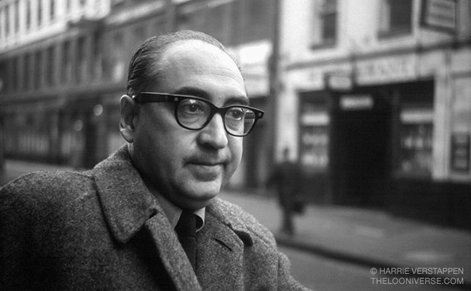
Bass was born on May 8, 1920 in New York City. He became a prominent figure in the graphic design field through his involvement in the film industry. Saul was introduced to Hollywood in the 1940’s and mad himself known by designing print advertisements for popular movies of the time. Bass continued his career with the film industry for quite some time and became quite important in the creation of film title sequences with the release of “The Man with the Golden Arm” in 1955. Bass was introduced to his wife, Elaine Makatura, through this line of work in 1955 and the two became husband and wife in 1961. They put both of their heads together when taking on projects, making them a force to be reckoned with. The two took a step down from the industry when they decided that they had to raise their family in the mid-60’s and this sabbatical lasted through the 1980’s.
Saul Bass is also responsible for creating iconic and long lasting logos in the United States. Bass started his work with logos in the 1950’s and throughout this career made several pieces that are still in use today, such as the AT&T logo and the Boys and Girls Club logo. Bass passed away in 1996 at the age of 75.
Part 2 – Highlights
- Started career in Hollywood in the 1940s
- Began collaboration with Elaine Makatura, later becoming his wife
- Created AT&T logo in 1969
Part 3 – Gallery

Saul Bass - Quaker Oats - 1969
-

- Saul Bass – Quaker Oats – 1969
-

-

-

- Saul Bass – Dixie – 1969
-

-
-

- Saul Bass – Boys & Girls Club 1969
-

-
-

- Saul Bass – AT&T – 1969
-

-
-

- Saul Bass – AT&T (Revised) – 1983
-

-
-
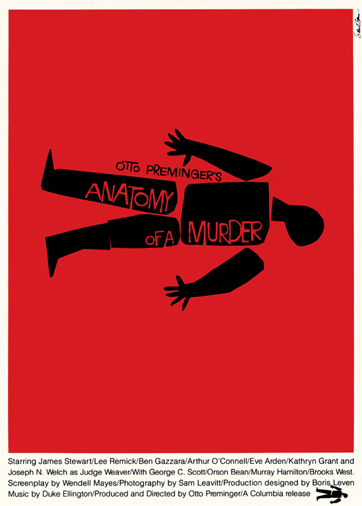
- Saul Bass – Anatomy of a Murder Poster – 1959
-

-

-
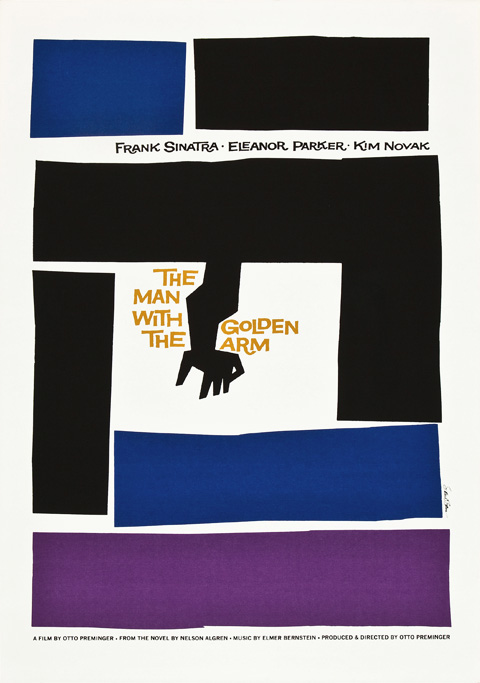
- Saul Bass – The Man With the Golden Arm Poster – 1955
-

-

-
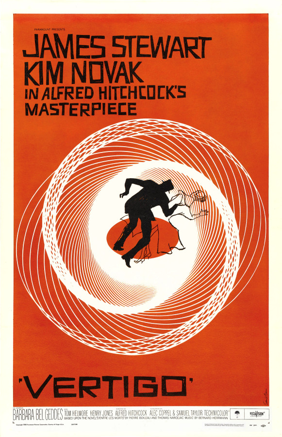
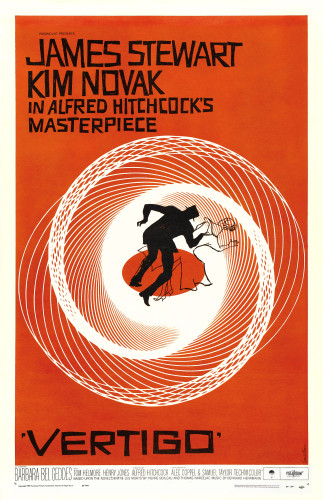
- Saul Bass – Vertigo – 1959
-

-

-

- Saul Bass – West Side Story – 1961
-

-
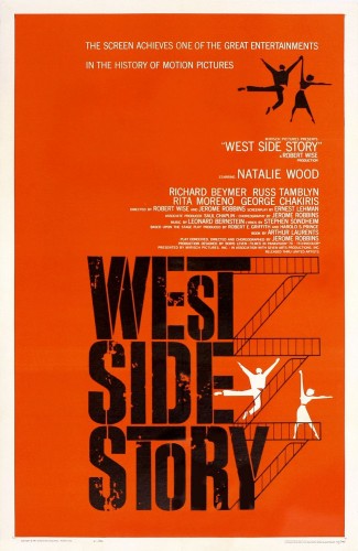
This gallery features works that range from logos to movie posters. Bass had a very distinct style when it came to his design. Saul used a very blocky and almost abstract approach when tackling solutions to his design, as is evident in each of these works. It is also common to see Bass using silhouetting in his design, typically within his movie posters.
Sources
https://en.wikipedia.org/wiki/Saul_Bass
http://www.artofthetitle.com/designer/saul-bass/
http://www.saulbassposterarchive.com/
Leave a Reply Cancel reply
You must be logged in to post a comment.
Visual hierarchy is an important point in any piece of design. Through this reading I came to realize that the way type is represented through visual hierarchy is also quite important. Type can form itself into something quite incredible through the way that it’s implemented. For example, if one were to use a bigger font on a specific section of a project, the focus point may shift to that piece due to the visual hierarchy associated with larger text.
Nashville, Tennessee
37201
Mostly Cloudy
65°F / 18°C
| Humidity | 87% |
| Wind Speed | SE 3 mph |
| Barometer | 30.20 in (1022.3 mb) |
| Dewpoint | 61°F (16°C) |
| Visibility | 10.00 mi |
| Last update | 4 Nov 7:53 am CST |


Review
Upon entering this project, I was skeptical as to how it was going to go. I was pleasantly surprised to discover that this assignment was quite enjoyable. I have never heard of “forced connections” before, but it was fun to explore the endless possibilities. It is a different way to discover potentially innovative ideas that may not be able to be approached any other way than these “forced connections.” I am excited to possibly use this technique in future design projects, because not only is this a fantastic way to brainstorm, but I feel as though it is a great way to set myself away from the rest.
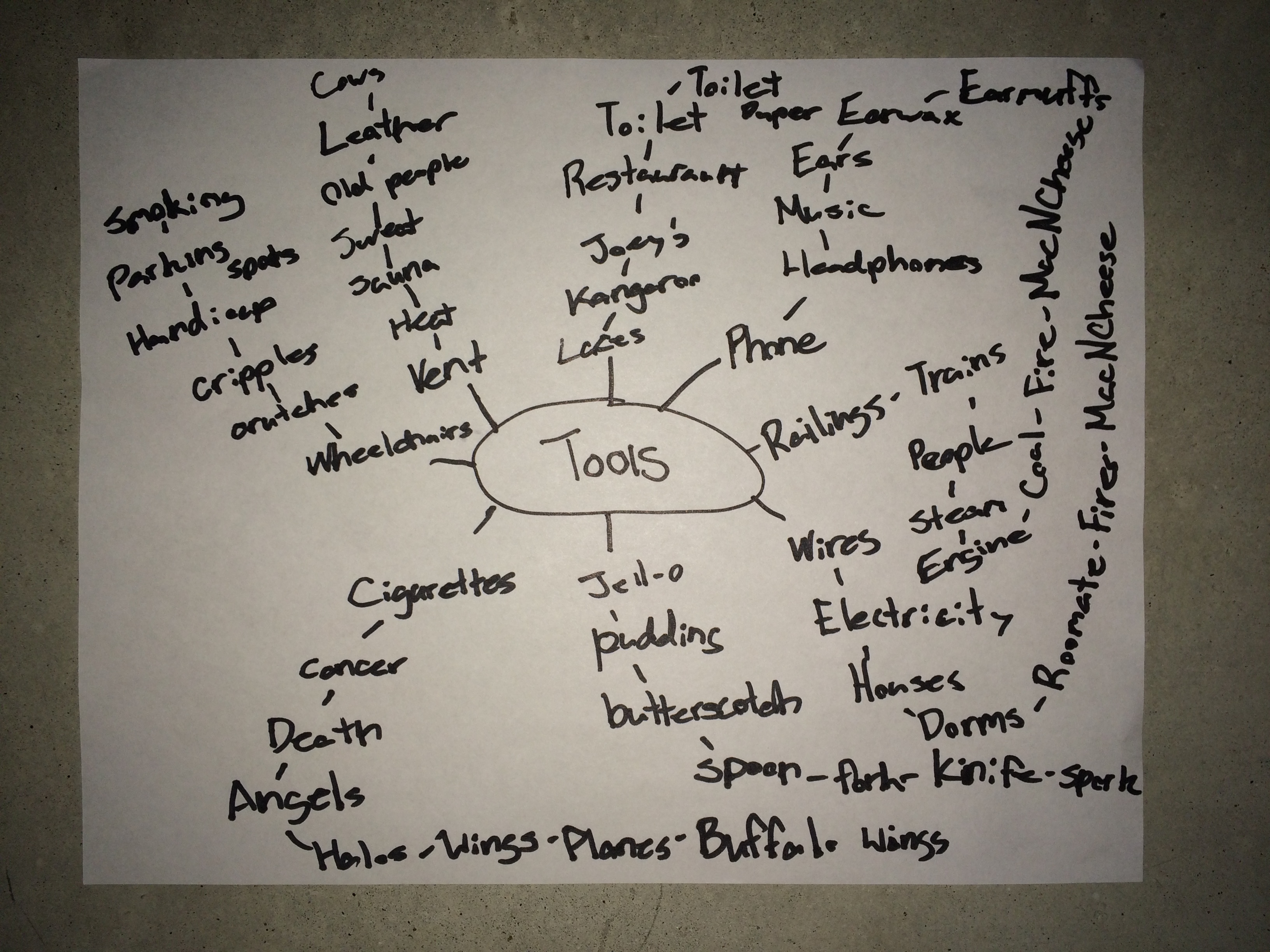
Mind Map
The following is a list of my 25 combinations, items in bold were used in the final product:
Hammer Folder – This could be useful for someone who wants to keep nails with their hammer.
Screw Driver Drill
Marker Chalk
Pencil Laces
Fire Hydrant Hose – A fire hydrant with a built in hose for convenience.
Paper Clip Keys
String Ruler – Very portable; easy to use.
Paint Brush Cup
Lawn Mower Scissors
Dust Pan Broom
Garbage Can Hooks
Wheelchair Crutches – Diverse use of both options for the walking impaired.
Toilet Phone – In case your handset is out of reach and you have to make your business call!
Headphone Earmuffs – Keep warm, and entertained!
Spoon Knife – Sometimes it’s a lot of work to grab another utensil, cut and eat any tough meat with one hand stroke.
Tissue Laces – Be prepared for any messy situation with these laces.
Wire Railings
Marker Ruler
Lawnmower Broom
Screwdriver Fork
Toilet Keys
Paper Clip Hose
Drill Knife – Sometimes its hard to cut the toughest meat, this heavy duty tool will help.
Wheelchair Lawnmower – Now even the handicapped can keep up with their yard work.
These are 3 of my favorite specimen:
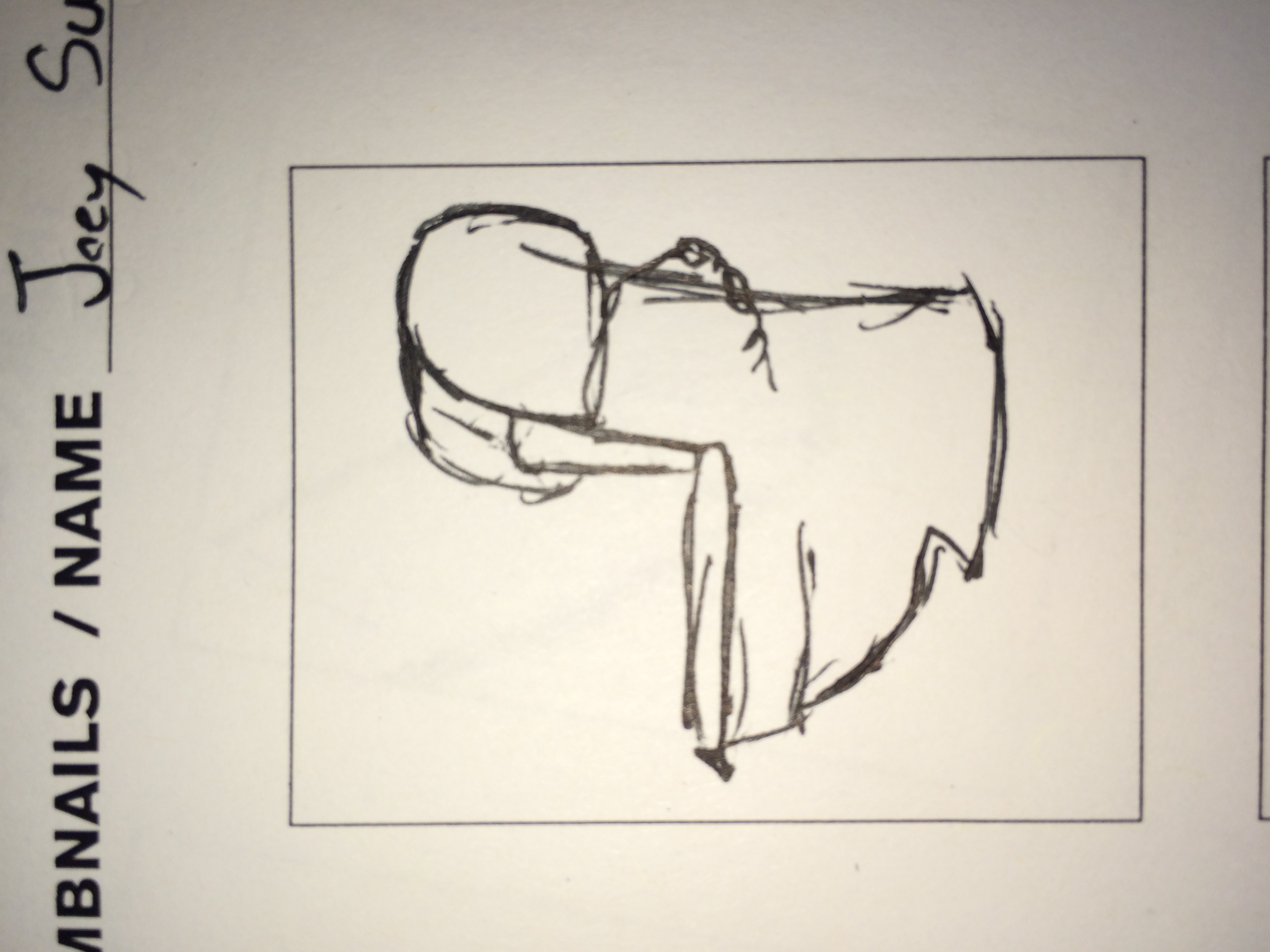
Toilet Phone
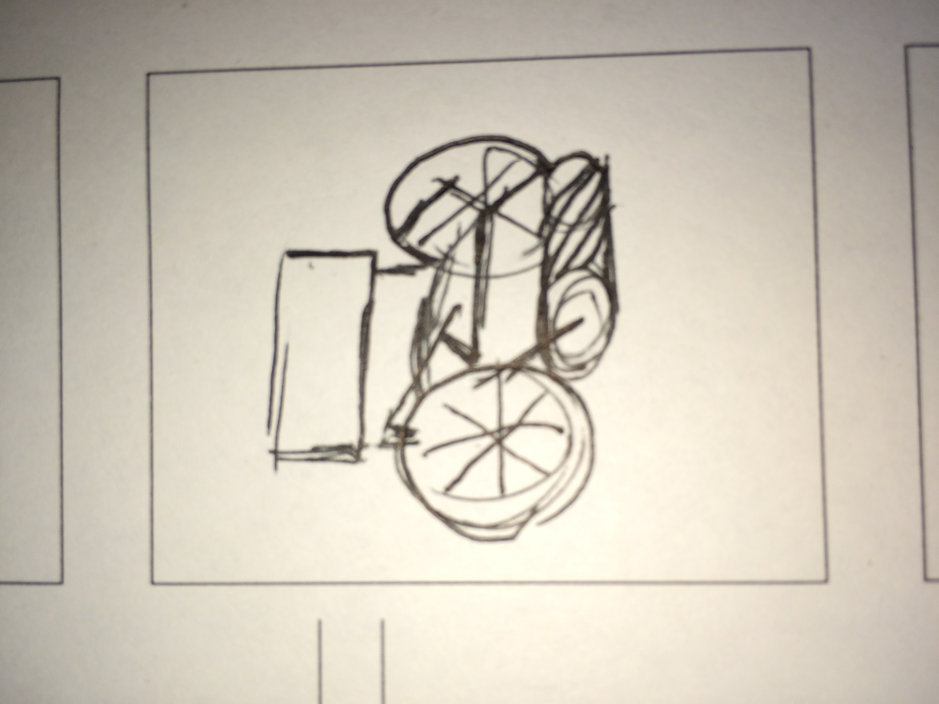
Wheelchair Lawnmower
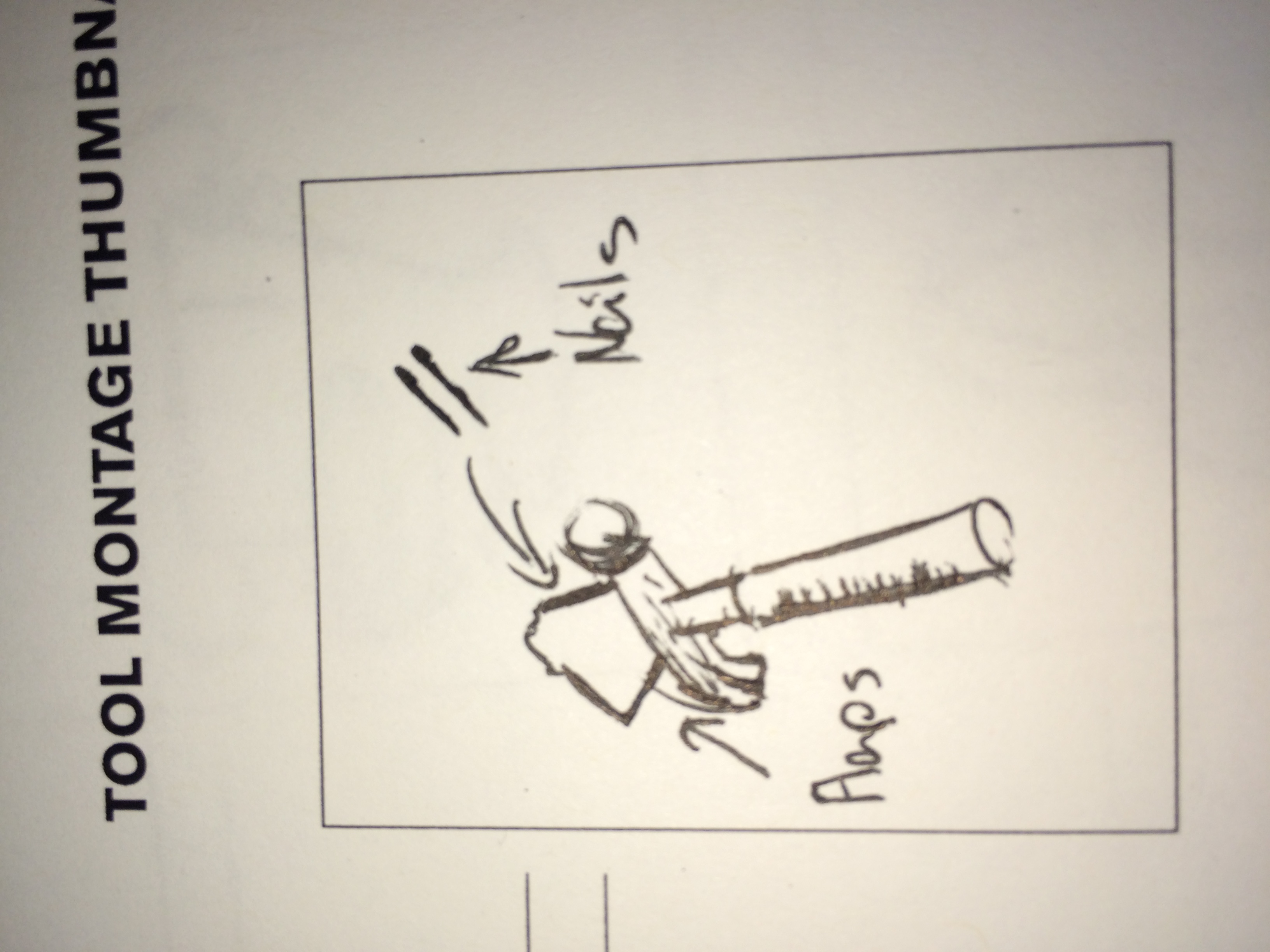
Hammer Folder
Graphic Design has been a subject of interest to myself for quite some time. Ever since I was a child, I have been fascinated by some people’s ability (or inability) to create art. I was always someone who loved to draw and was often praised for it as well. I always believed that artistic ability was something that you had to be born with, and since I seemed to be blessed with this gift I thought that it would be wrong of me not to embrace such a unique trait in my future career. The problem was that I never really knew what to do with my talent, or how to commercialize it so I slowly stopped practicing what I loved so much.
Entering college, I decided that I would be doing myself a disservice if I were to not embrace my ability and I narrowed my goal down into two paths, art teaching or graphic design. The aspects of graphic design that have been of interest to me are publication and advertising design. These two types of design are of particular interest to me because people may not think or even realize how much work goes into those pages, that billboard, or even those commercials. I have never been one who likes to gloat so I feel as though the satisfying perfectionism , while still being able to not draw too much attention to my work, will be perfect for me.


I think that these 2 images are particularly powerful forms of advertisement, the message is quite clear and the images are simple yet aesthetically pleasing. People who see these images will clearly understand the severity of smoking, and that is exactly what graphic design is supposed to achieve, a clear message that is elegant yet powerful.
-
-
Classroom
-
-
Recent Posts
Recent Comments
- Danielle Vizard on Thinking with Type — TEXT
- Danielle Vizard on Digging’ It!
- Jenna on Thinking with Type — TEXT
- Jenna on Digging’ It!
- Elizabeth Robinson on Digging’ It!
Archives
- November 2023
- August 2023
- May 2023
- April 2023
- March 2023
- February 2023
- January 2023
- December 2022
- November 2022
- October 2022
- September 2022
- August 2022
- July 2022
- June 2022
- May 2022
- February 2022
- December 2021
- November 2021
- October 2021
- September 2021
- August 2021
- June 2020
- February 2018
- December 2015
- November 2015
- October 2015
- September 2015
- August 2015
Categories
-
About
KSC GRAPHIC DESIGN

Type out the list! R