- Â
5 04: Kerning
Åw Thinking with Type: Kerning
w Thinking with Type: Kerning October 14, 2015
Åw Kerning in Practice
w Kerning in Practice October 14, 2015
í Kerning

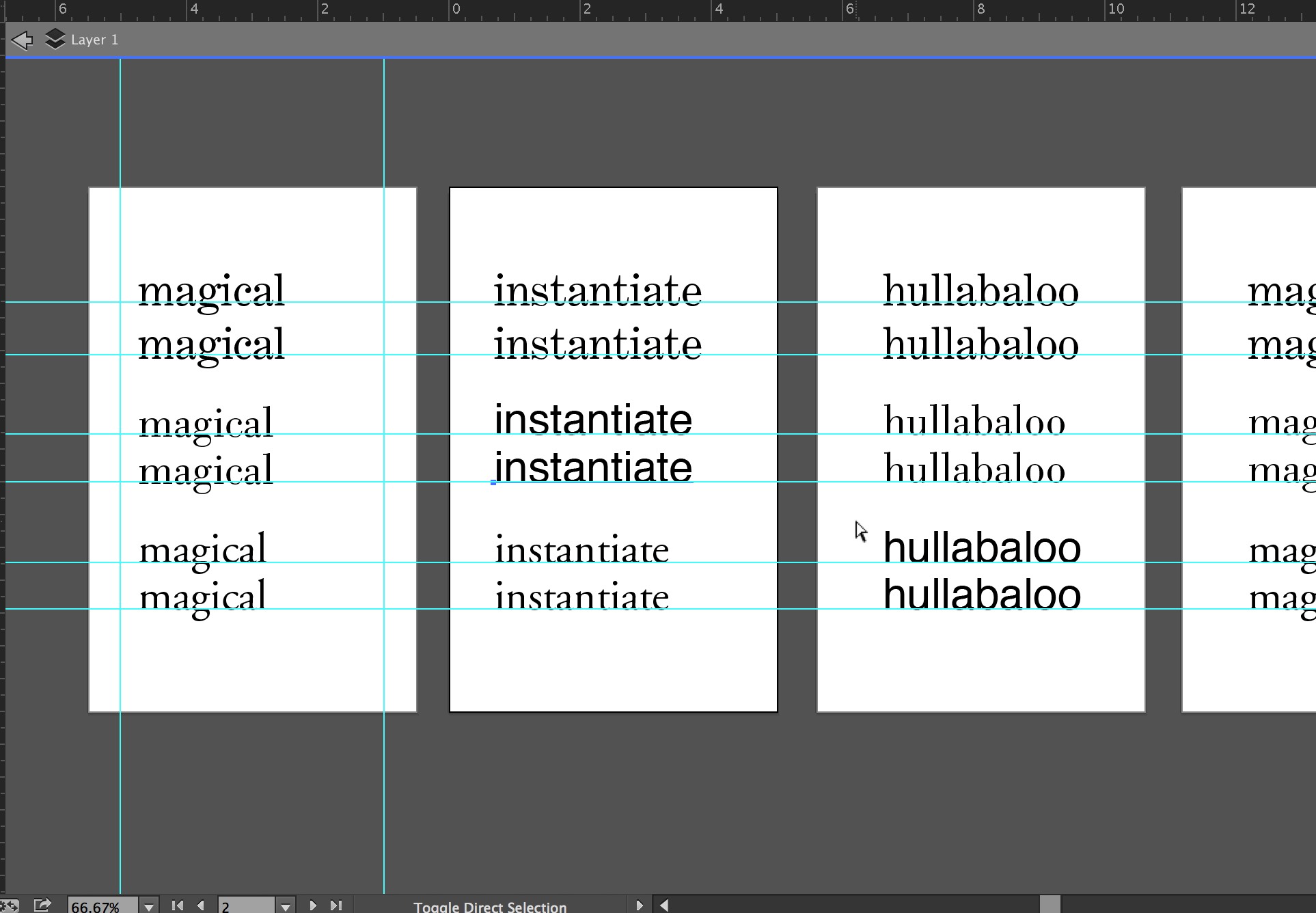
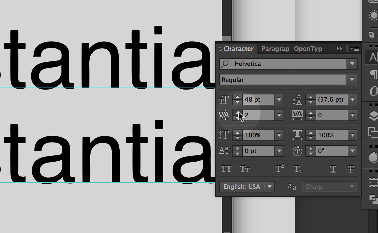
In typography, kerning is the process of adjusting the spacing between characters in a proportional font, usually to achieve a visually pleasing result.
Kern, Baby Kern!
Choose 10 words and kern them in three different typefaces. The original and the kerned word must be together on the page; three sets per page. Mix up the type throughout.
10 words x 3 sets = 30 combinations / 5 classic typefaces = 6 of each typeface
Read the following…
Set up your pages in an organized manner as below.
Use the kerning tool in the Type Panel in Illustrator.
Dimensions: 5″ x 8″ vertical
Program: Illustrator
Typeface: You may only use the five classic typefaces.
Pages: 10 with 3 words per sheet.
Due
Wednesday, September 23
One 5″ x 8″ PDF with 10 words kerned in sets of 3.
Post these to drop box in your “04_Kerning” folder.
-
Classroom
-

Leave a Reply
You must be logged in to post a comment.