- Ê
- Â
5 GD History
Part I
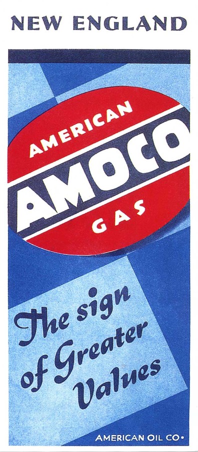
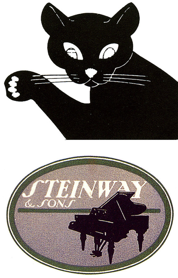
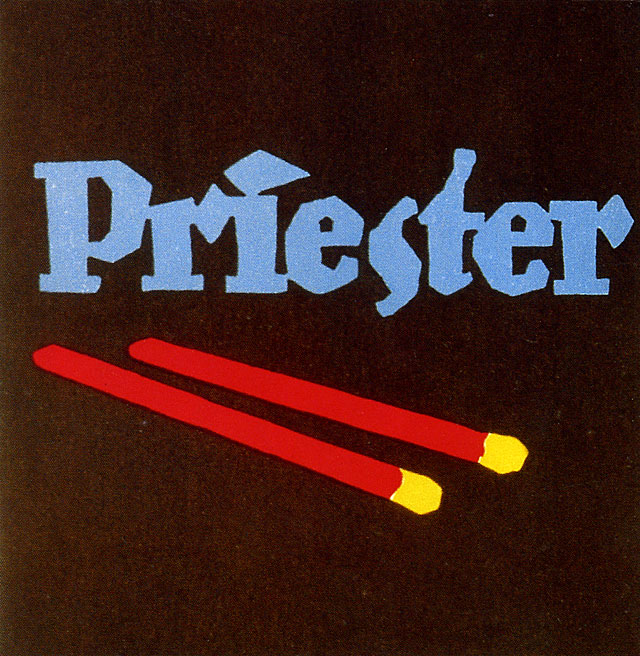
Lucian Bernhard, birth name Emil Kahn, was born in 1883 t0 a jewish family in Germany. As a teenager, he visited many exhibitions of European Art Nouveau that showed inspiring colorful pieces of studio art and graphic design posters. As a matter of fact, Lucian was so fascinated on the exhibition, that when he appeared at home, he had the derive to paint everything in sight in bright wildly colors. The walls, the furniture was covered in modern colors, basically making the whole house into a painting; although, the father was so mad that he kicking Lucian out of the house for good. He was a graphic designer, type designer, and interior designer from Berlin to New York. Lucian began as a poster designer, that let to the big breakout for his career; leading him to advertise for many companies. The Preister Match poster became the most popular advertisement because of its simplicity. There was nothing else like that poster; usually posters would be very wordy and have a lot of objects in it, however, Lucian only chose a few vibrant colors and one object to broadcast something that meant much more. Bernhard helped influence a genre of advertising called sachplakat, or object poster.
Part II
- Lucian Bernhard draws the purity and simplistic of vivid colors, which kind of make him a modern expressionist.
- He won two contests for graphic design and one of them was the very first poster he had made, Priester Match.
- Bernhard’s first typeface was Antiqua, mostly used in books.
Part III

Lucian Bernhard
-
- Lucian Bernhard
-

-

-
- Lucian Bernhard
-

-
-
- Lucian Bernhard
-

-

-
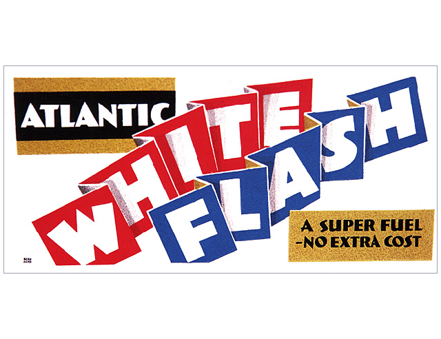
- Lucian Bernhard, Priester
-

-

-
- Lucian Bernhard
-

-

-
- Lucian Bernhard
-

-

About Ladislav Sutnar
In 1897, Ladislav Sutnar was born in Pilsen, Czechoslovakia. Mr. Sutnar was one of the first designers to take practice in the art of information design. Information design is the process of gathering large amounts of data and putting it into a visual form in a simple way for people to view clearly. Two of the main characteristics of his work were that he focused on using a limited color palette and he used a lot of typography. In his work, he often used a lot of punctuation symbols to represent certain ideas. One of the things that he has done that has had a significant impact on our everyday life, is that he decided to put parenthesis around the area code in telephone books. Sutnar moved to New York to do some work, but while he was staying in the city, the Nazi’s took over his home country, Czechoslovakia. That’s when he decided to stay in New York and start a new life living in America. He began teaching at the State School of Graphic Arts in Prague. After that, he spent almost 20 years working at Sweet’s catalog services and that’s where he spent most of his time creating information graphics. He also went on to create trend-setting designs in glassware, porcelain, flatware and other products. Although english was not his first language, his knowledge of information graphics was so strong that he was able to send a message to his audience that was mostly American.

From a personal standpoint, I think it’s extremely interesting that he was the one to decide to put parenthesis around the area code in phonebooks. I never knew that there was a person to make the decision to do so, I just thought that they were there from the beginning. I looked at a lot of his work and even though he specialized in information graphics, he did a few other kinds of design too.
Highlights about Ladislav Sutnar:
- He decided to put parenthesis around the area code of a phone number.
- He was one of the first designers to specialize in information graphics.
- His information graphics work went on to be the “architecture and design of the web”.
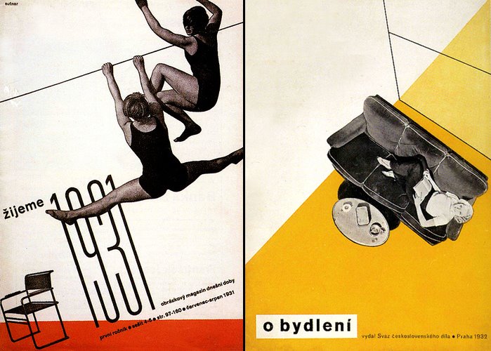
Cover for De Stilj Magazine, Ladislav Sutnar, 1931.
-
- Cover for De Stilj Magazine, Ladislav Sutnar, 1931.
-

-

-

- Venus in Central Park, Ladislav Sutnar
-

-

-
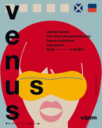
- Venus / Forever Me, Ladislav Sutnar, 1967
-

-
-

- Design for Die Casting, Ladislav Sutnar, 1945
-

-
-
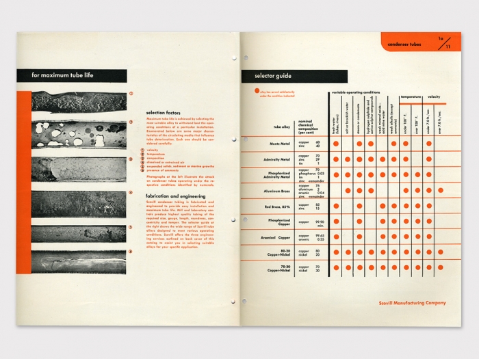
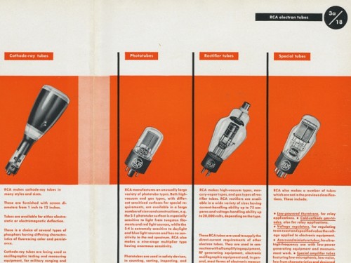
- Scovill Condenser Tubes, Ladislav Sutnar, 1943.
-

-

-
- Some of Ladislav Sutnar’s information design work.
-

-
Sources:
Design Is History: Ladislav Sutnar
ADC Hall of Fame: Ladislav Sutnar
Ladislav Sutnar, Web Design before the Internet
Part 1:
Adolphe Mouron Cassandre was a well known graphic artist who specialized in commercial posters, creating typefaces, and painting. He was born January 21,1901 in Kharkov, Ukraine and studied at École des Beaux-Arts in Paris, France. After he finished school, A.M. Started up his own art studio in Paris, France in which he then started referring to himself with the pseudonym “Cassandre” when he created his first commercial piece, Au Bûcheron in 1925. The piece was made for a cabinet marker and would eventually get a lot of attention and awards in which really put A.M. onto the bigger scene. All of his work was very inspired by by cubism and surrealism because of the place he grew up and the scenery around him. His commercial projects really pushed the line between fine art and commercial art in which was not a familiar thing during this time period. All of his commercial works are very unique and almost none of them share any of the same characteristics other than personal style and creativeness. After time went by and A.M. was moving from company to company, he spent some time teaching at schools such as Ecole Nationale des Arts Décoratifs and later at Rue Férou in Paris. During this time A.M. was experimenting with creating typefaces and ended up creating the European renowned typeface, “Peignot”. The font was a big hit in Europe and landed it’s way into 1937 World’s Fair in Paris, France.
Part 2:
- A.M.’s success was based mostly off of his poster designs, magazine designs, advertisements, logos and typefaces.
- A.M. and several other partners formed the advertising agency Alliance Graphiqe, which worked for a broad client base throughout the 1930’s.
- The Musée des Arts Décoratifs held a large public exhibition featuring A.M.’s diverse works in the graphic and plastic arts.
Part 3:
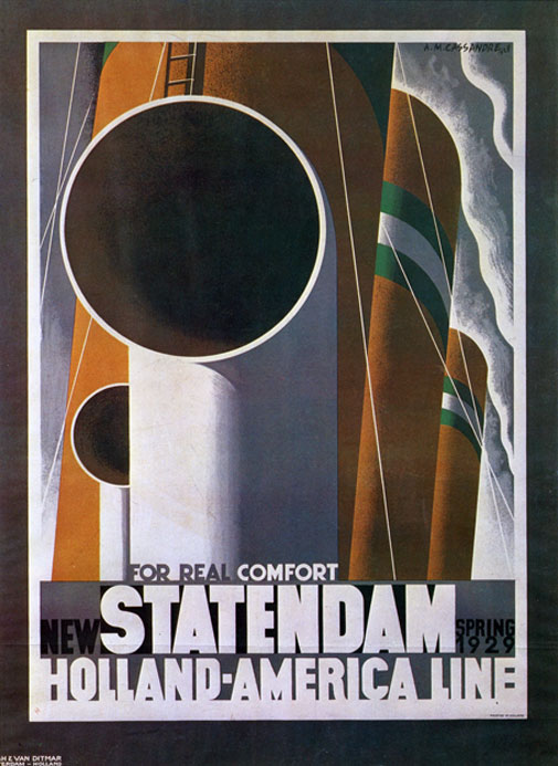
New Statendam, Poster, 1928
-
- New Statendam, Poster, 1928
-

-

-
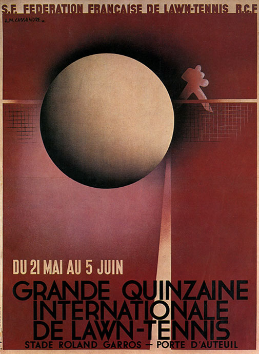
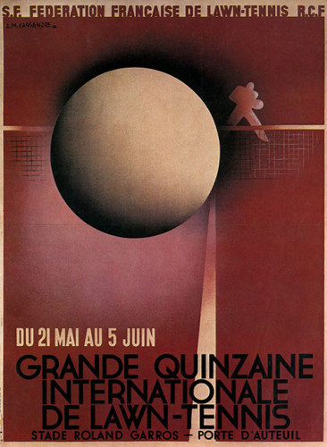
- Grande Quinzaine, Poster, 1932
-

-
-
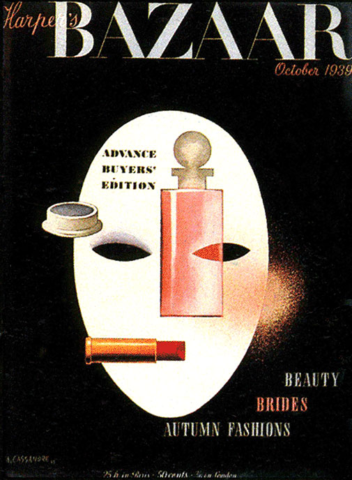
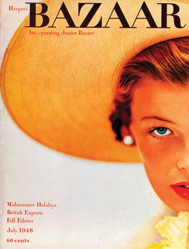
- Harpers Bazaar, Cover, 1939
-

-

-
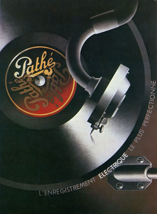
- Pathé, Poster, 1932
-

-

-

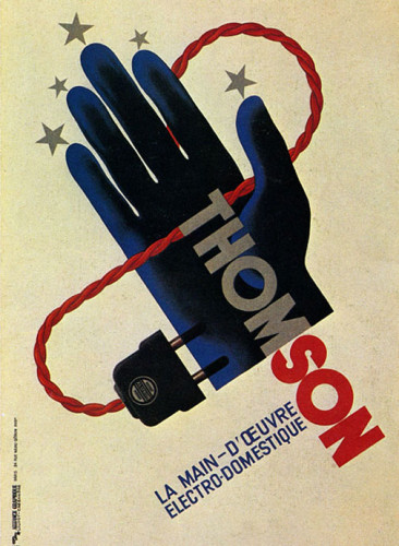
- Thomson, Poster, 1931
-

-
Sources:
http://www.dieselpunks.org/profiles/blogs/the-art-of-am-cassandre
http://www.cassandre-france.com/
http://www.designishistory.com/1920/am-cassandre/
https://drehergraphicdesign.wordpress.com/amcassandre/

Part 1
Alexey Brodovitch was born in Russia in 1898 and died in France in 1971. He is remembered today as the art director of Harper’s Bazaar for nearly a quarter of a century. Brodovitch played a crucial role in introducing a radically simplified form of modern graphic design to the United States. He used photography as a backbone of modern magazine design. He is seen as virtually the model for the modern magazine art director. Brodovitch’s impact on the editorial of Harper’s Bazaar was so great that he achieved celebrity status. He came to the United States in 1930 to start a department of advertising (later known as the Philadelphia College of Art). There he trained students in the fundamentals of European design, while also taking on freelance illustration assignments in Philadelphia and New York. Brodovitch’s legacy as a publications designer also includes the short-lived but influential magazine Portfolio, three issues of which were published in 1949 and 1950. Portfolio was a flashy, innovative quarterly aimed at the design profession. Throughout his career, he continued to teach his “Design Laboratory,” which focused variously on illustration, graphic design, and photography. Brodovitch did not formulate a theory of design. Despite his unbending manner and lack of explicit critical standards, many students under his tutelage discovered untapped creative reserves.
Part 2
1. While politically he was sympathetic with czarist russia, his artistic work shared the ideas of the avant-garde.
2. Bodovitch was one of the pioneers to bring modernist ideas to America.
3. At the Philadelphia college of Art Brodovitch taught by using examples of european graphic design, questioning his students about the placing of the elements and the decisions made by the designers
Part 3
Alexey Brodovitch, Harper's Bazaar, July 1948, Photograph by Richard Alvedon
-
- Alexey Brodovitch, Harper’s Bazaar, July 1948, Photograph by Richard Alvedon
-

-

-

- Alexey Brodovitch, If you don’t like full skirts…, March 1938, Photographs by George Hoyningen-Huene
-

-

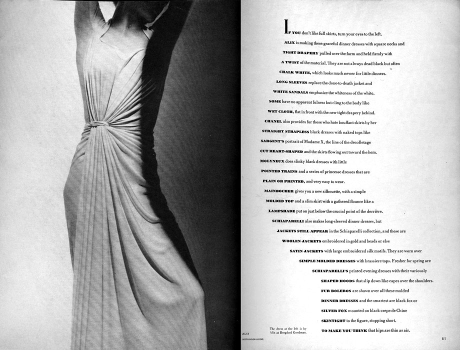
-
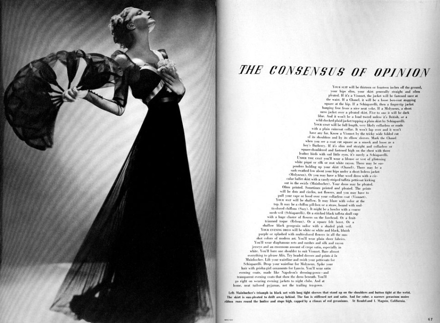
- Alexey Brodovitch, The Consensus of Opinion, March 1936, Photograph by Man Ray
-

-


-
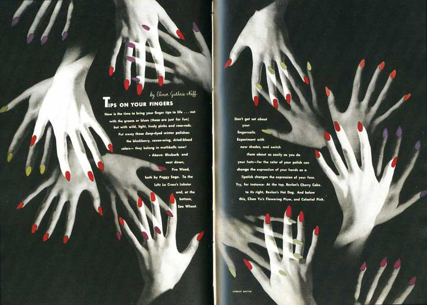
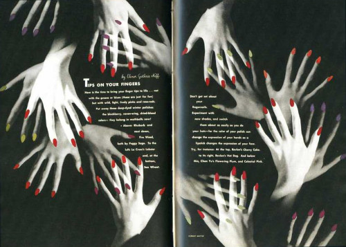
- Alexey Brodovitch, Tips in Your Fingers, April 1941, Photographs by Herbert Matter
-

-
-
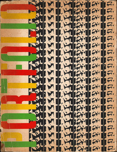
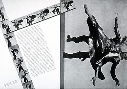
- Alexey Brodovitch, Portfolio, 1950, film strips by Charles and Ray Eames
-

-

-
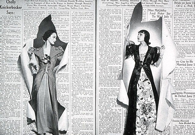
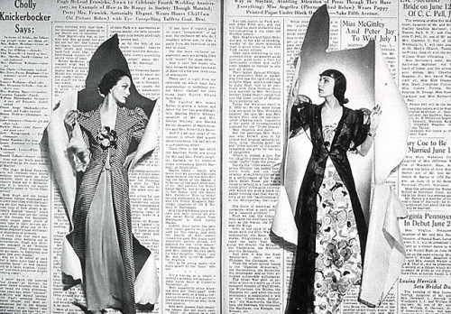
- Alexey Brodovitch, spread from issue of Bazaar, June 1938
-

-
-
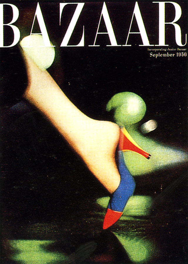
- Alexey Brodovitch, Cover Of Bazaar, September 1956
-

-

-
- Alexey Brodovitch, Ramon & Renita, 1935, Harper’s Bazaar
-

-
-
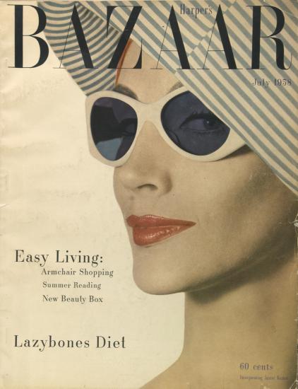
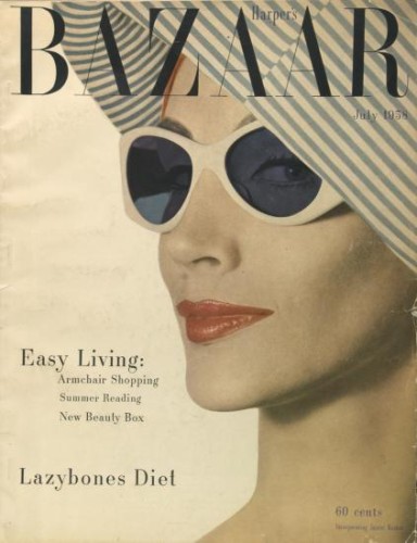
- Alexey Brodovitch, Harper’s Bazaar Cover, July 1968
-

-
These works are related in their use of photographs with the exception of Portfolio which uses film strips and creates a unique visual texture. In the page spreads, the text and photographs work harmoniously as the shapes presented in the photographs are either mimicked by the text or wrapped tightly within or around it. In the case of the cover pages, there is a limited use of text and an emphasis on the female figure photographed. The space that is present is activated by the interjecting shapes and oversized photos of the parts of the female body or face that is shown. Each work has a sense of balance .
Ivan Chermayeff
Part 1:
Chermayeff used words and images together to create poster designs. He was not only known for posters, but also his logos. He had his own design studio, where the Mobil logo was made. Chermayeff & Geismar & Haviv, his design studio, was responsible for hundreds of clients, including the Showtime logo and the Smithsonian. He graduated from Institute of Design in Chicago and Yale University, School of Art and Architecture. He recieved many honors such as the Yale art medal. Chermayeff started off cutting shapes out of paper and pasting them. He came from a family of people who thought like graphic designers. His father encouraged him and supported him. He didn’t consider himself a great artist. He couldn’t draw or paint like others, so he would look in his trash and make creations out of scraps laying around. This helped him make a more graphic look and lead to clearer logos when he got older. He was the creator of the NBC logo, among countless recognizable others. In a time where people demanded clarity and simplicity while still having a sense of sophistication, Chermayeff’s work fit in well.
Part 2:
1-He made his own design studio, Chermayeff & Geismar & Haviv.
2-He graduated from Institute of Design in Chicago and Yale University.
3-He created the NBC logo, one of the most recognizable logos.
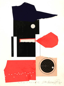
Ivan Chermayeff-Red Talker-1995
-
- Ivan Chermayeff-Red Talker-1995
-

-
-
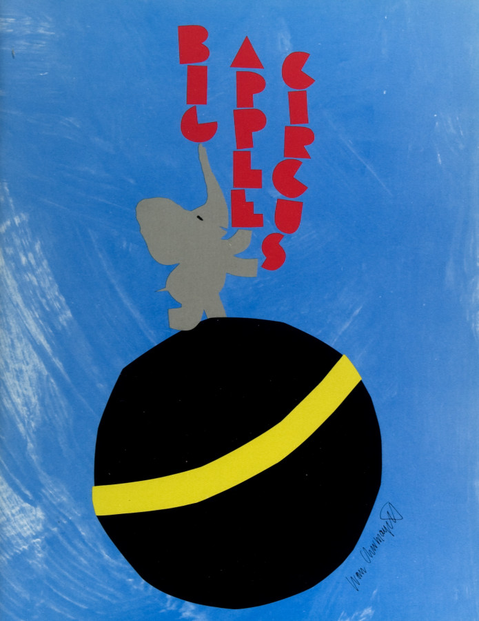
- Ivan Chermayeff-Big Apple Circus-1990
-

-


-

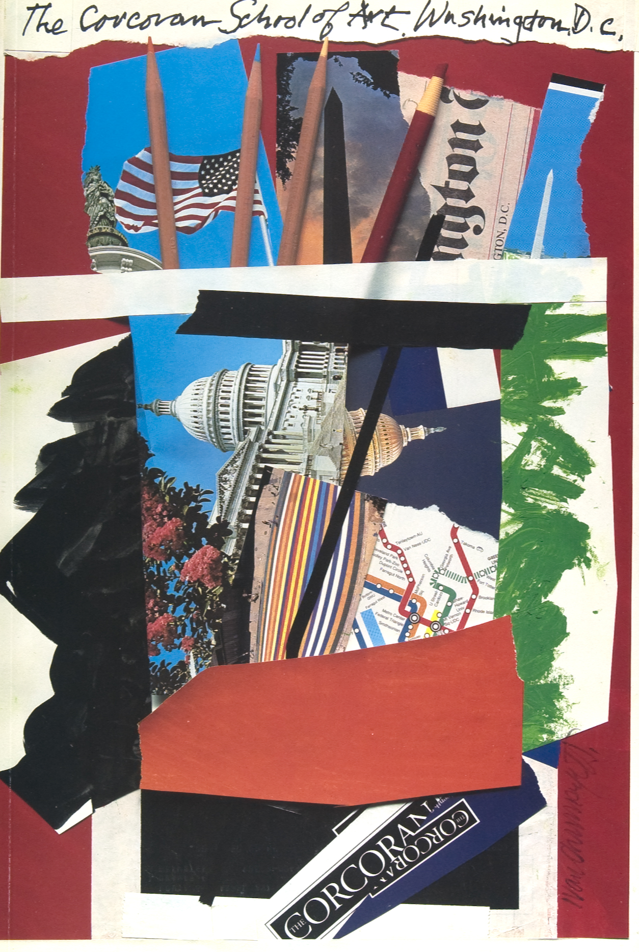
- Ivan Chermayeff-The Corcoran-1992
-

-

-
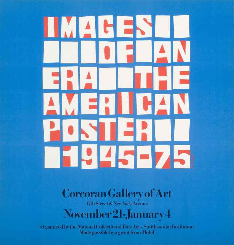
- Ivan Chermayeff-Images of an Era-1975
-

-
-
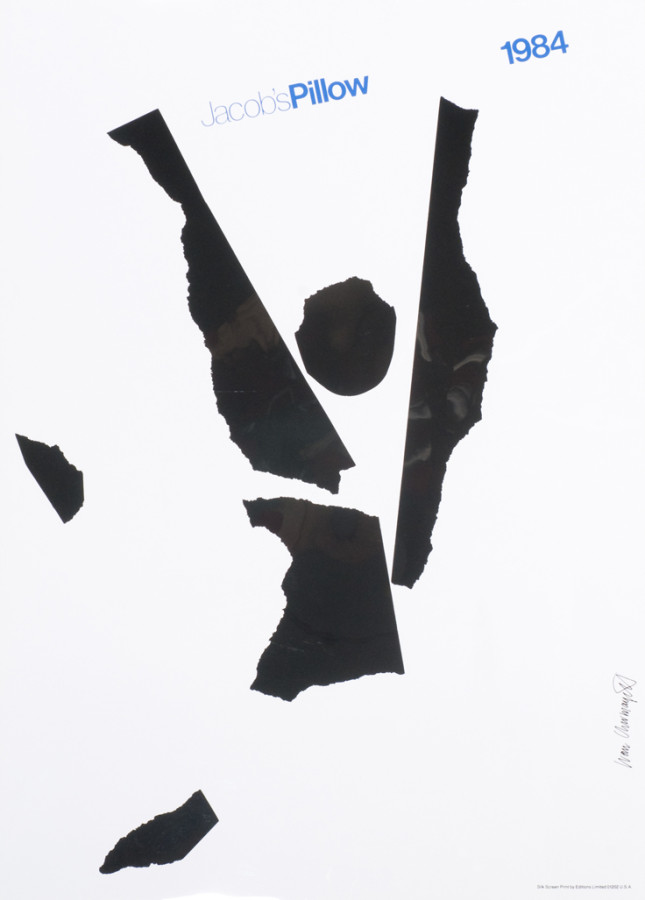
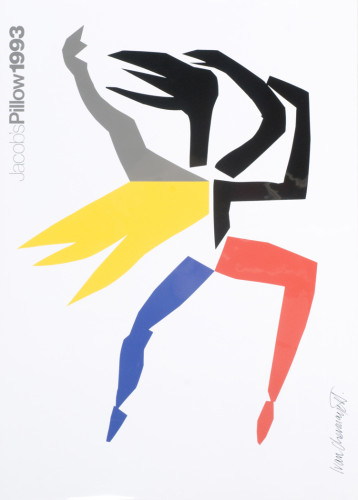
- Ivan Chermayeff-Jacob’s Pillow-1984
-

-

-

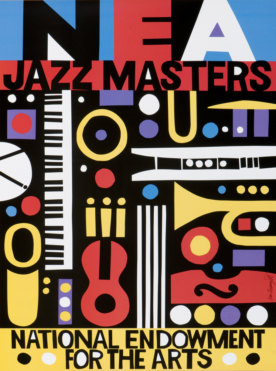
- Ivan Chermayeff-NEA Jazz Masters-no date
-

-

-

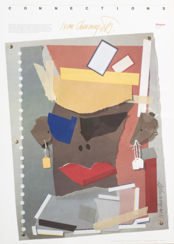
- Ivan Chermayeff-Connections: Ivan Chermayeff-no date
-

-

-

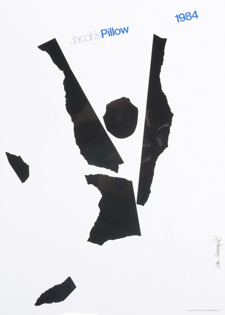
- Ivan Chermayeff-Jacob’s Pillow-1993
-

-

-

- Ivan Chermayeff-Holiday Card-no date
-

-
Ivan Chermayeff’s Web Site
Ivan Chermayeff: The Logo Genius
Article in the The Guardian
Graphic Design Archive Online
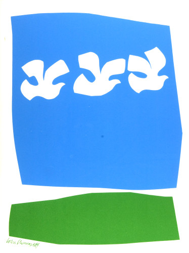
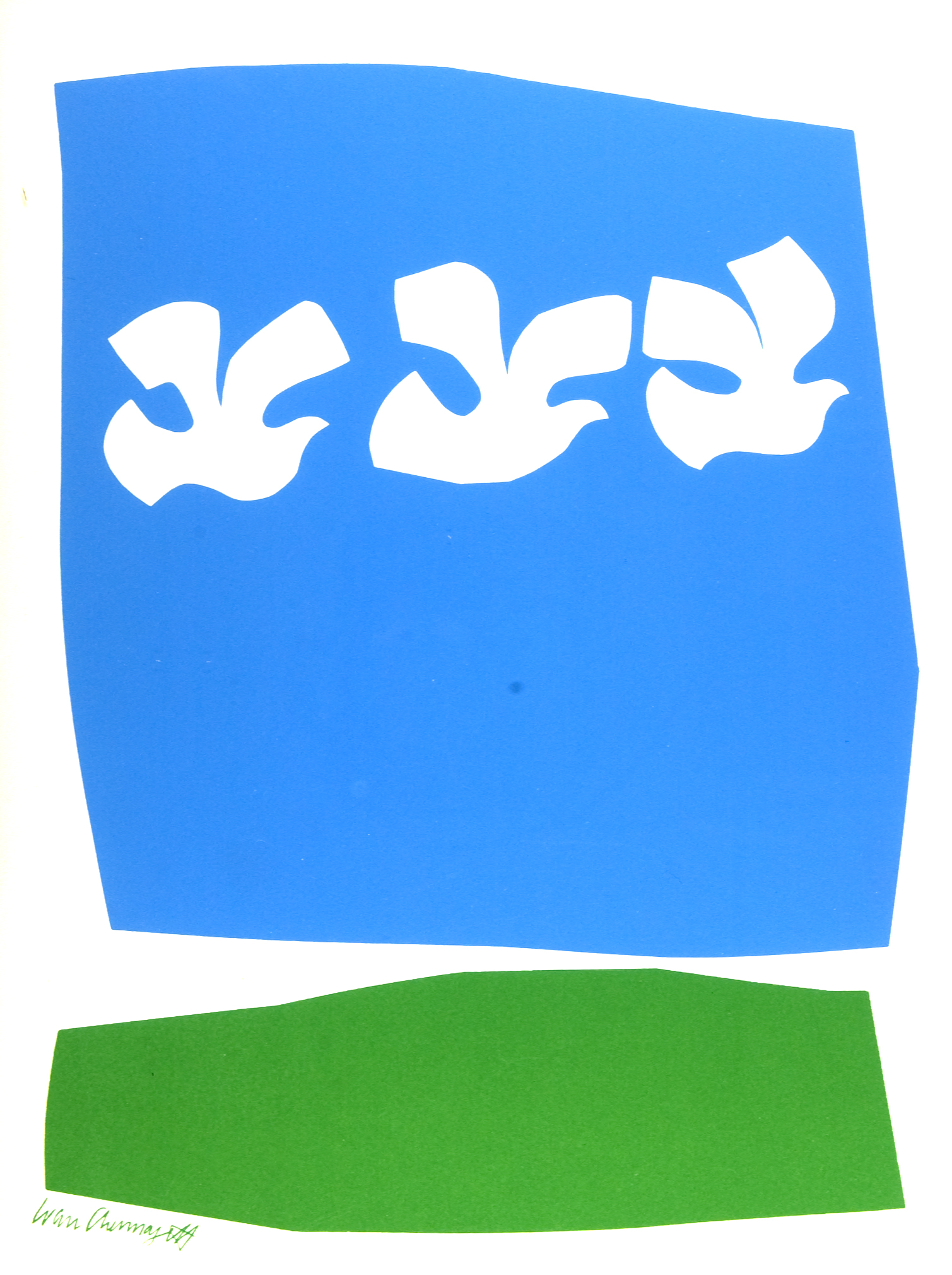
The style is similar throughout the pieces. There is often a ripped paper look that unites all the pieces. Chermayeff’s earliest works included ripped paper. Although he is also known for his logos, the look of layering paper is a common look in his pieces and inspired his later logos. The images represent the event or idea, while still being simple and easy to read. The colors are often similar, bright and eye catching.
Gallery:
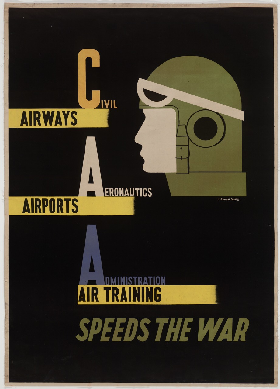
E. McKnight Kauffer "Civil Aeronautics Administration" (1943)
-
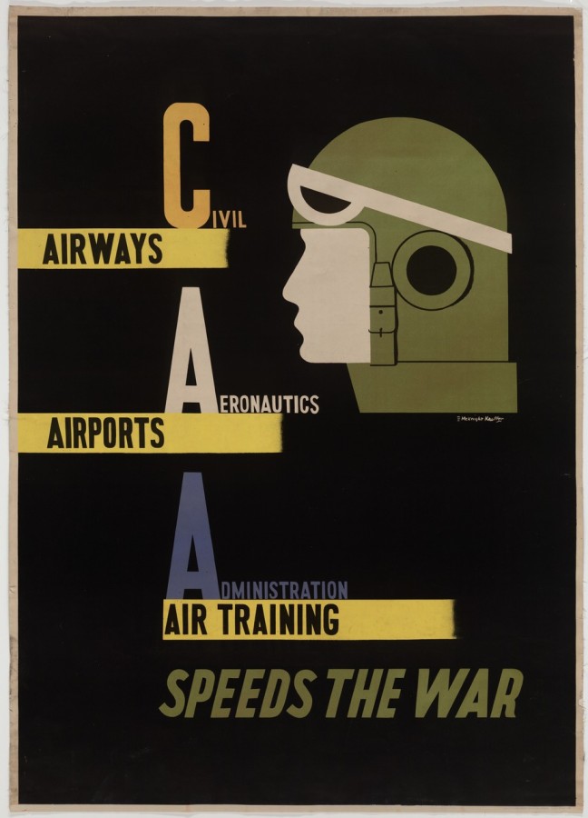
- E. McKnight Kauffer “Civil Aeronautics Administration” (1943)
-

-
-
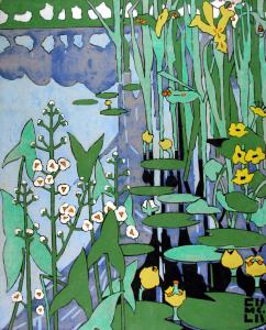
- E. McKnight Kauffer “Flowers of the Riverside” (1920)
-

-
-
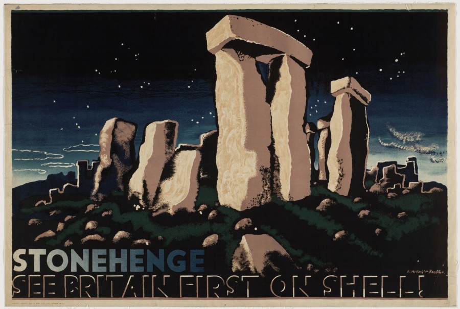
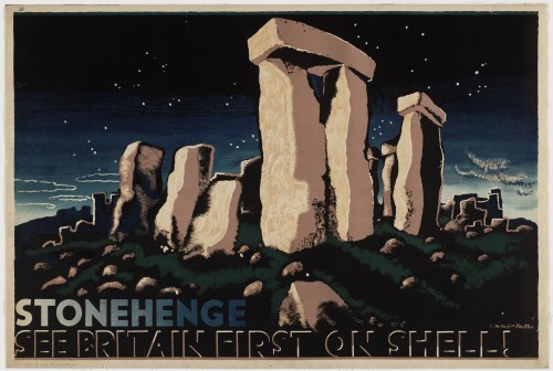
- E. McKnight Kauffer “Stonehenge, See Britain First on Shell!” (1932)
-

-

-
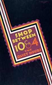
- E. McKnight Kauffer “Shop Between 10 and 4” (1921)
-

-
-
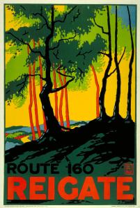
- E. McKnight Kauffer “Reigate” (1915)
-

-
-
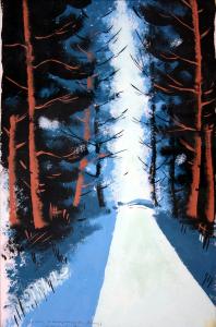
- E. McKnight Kauffer “Now the Pine Tree’s Waving Top” (1932)
-

-
-
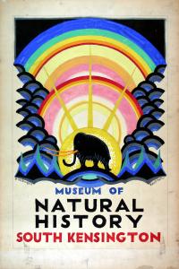
- E. McKnight Kauffer “Museumo of Natural History” (1923)
-

-
-
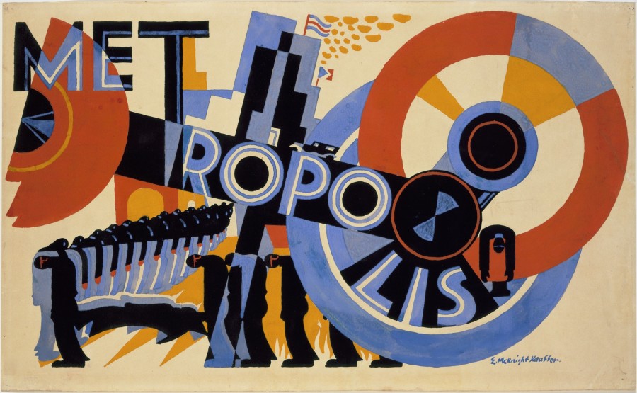
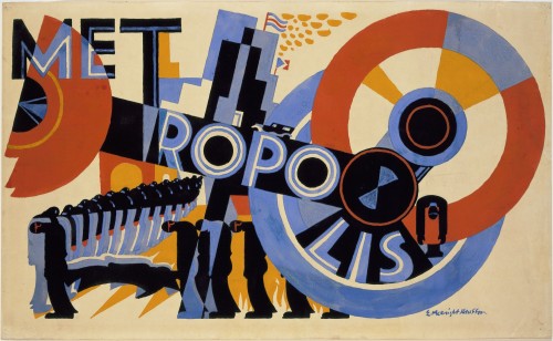
- E. McKnight Kauffer “Metropolis” (1926)
-

-

-

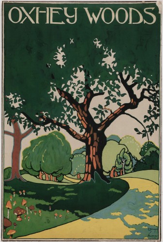
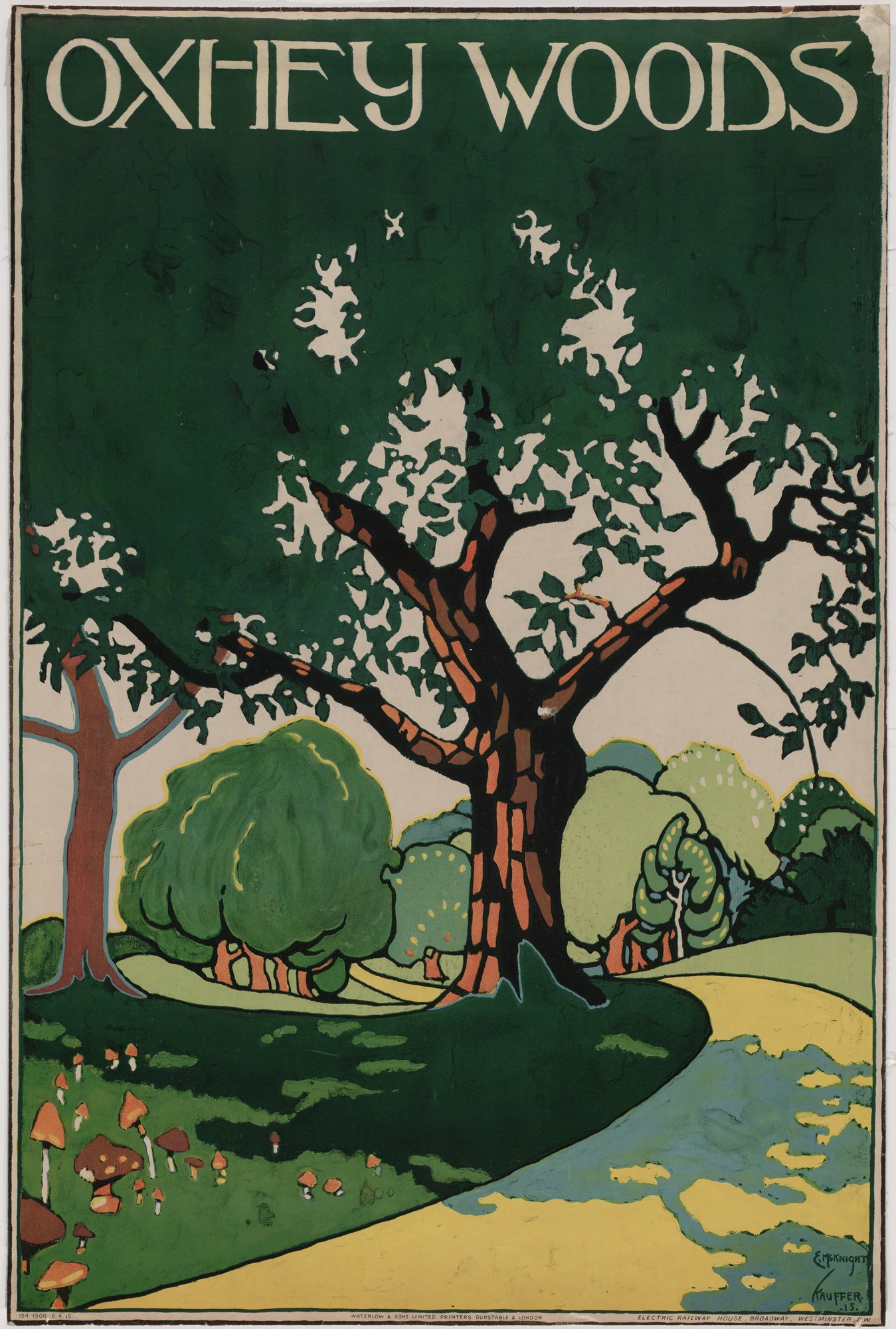
- E. McKnight Kauffer “Oxhey Woods” (1915)
-

-
-
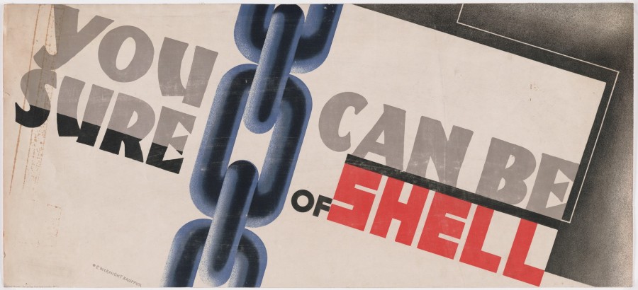
- E. McKnight Kauffer “You Can be Sure of Shell” (1931)
-

-

Part 1:
About the Works:
The works selected above are a selections of works created by E. McKnight Kauffer. A large majority of these are from his time spent in London working for either Shell or the Underground transport system, and just an example of the near 140 posters he’s known for. The range of color used is limited due to its age, however the designs were fairly progressive for their time; including large bold shapes, scattered text, and clear images. Also in this gallery is a few of Kauffer’s artworks which hold a clear almost impressionistic style, which was likely picked up by Kauffer during his time studying in Paris.
Part: 2
About the Designer:
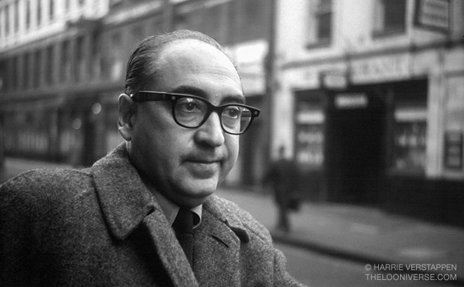
Edward Kauffer is an American born artist. He born in 1890, Great Falls, Montana – however he lived most of his life in England and elsewhere overseas. At the age of 20 Kauffer began to study at the California school of design where he worked both for his studies and independently. In 1912 a professor from the University of Utah took notice of Kauffer’s work and offered to mentor and sponsor him, and spent money to send Kauffer to Paris to further his studies. He studied at the Académie Moderne in Paris for about a year, until he met a textile designer, Marion Dorn. They fell in loved and they decided to reside together in London. There he began to complete some of his most famous works of art. Kauffer was most well-known for his work for the underground transit in london, in which he made 140 posters. These designs were fairly broad as Kauffer dabbled in various styles such as futurism, cubism, vorticism, and impressions from Japanese woodcuts.
Later he returned to American with his wife, however due to the perplexing advancements European styles had over the American art, many saw his art as being too much. In other words, as put by Frank Zachary “America was not ready for him”. This shows how rapidly graphic design changes and alters its borders as the culture around it does. While Kauffer was highly successful and well known in England his work was considered to be too progressive for American culture.
Part 3:
Main Points:
- – Kauffer’s designs took much influence from European and British style arts
- – Though he was born in America, Kauffer’s designs were considered too progressive for American culture revealing a cultural tendency in graphic design.
Part 4:
Sources:
Leave a Reply Cancel reply
You must be logged in to post a comment.
Part 1 – About Artist
Bass was born on May 8, 1920 in New York City. He became a prominent figure in the graphic design field through his involvement in the film industry. Saul was introduced to Hollywood in the 1940’s and mad himself known by designing print advertisements for popular movies of the time. Bass continued his career with the film industry for quite some time and became quite important in the creation of film title sequences with the release of “The Man with the Golden Arm” in 1955. Bass was introduced to his wife, Elaine Makatura, through this line of work in 1955 and the two became husband and wife in 1961. They put both of their heads together when taking on projects, making them a force to be reckoned with. The two took a step down from the industry when they decided that they had to raise their family in the mid-60’s and this sabbatical lasted through the 1980’s.
Saul Bass is also responsible for creating iconic and long lasting logos in the United States. Bass started his work with logos in the 1950’s and throughout this career made several pieces that are still in use today, such as the AT&T logo and the Boys and Girls Club logo. Bass passed away in 1996 at the age of 75.
Part 2 – Highlights
- Started career in Hollywood in the 1940s
- Began collaboration with Elaine Makatura, later becoming his wife
- Created AT&T logo in 1969
Part 3 – Gallery

Saul Bass - Quaker Oats - 1969
-

- Saul Bass – Quaker Oats – 1969
-

-

-

- Saul Bass – Dixie – 1969
-

-
-

- Saul Bass – Boys & Girls Club 1969
-

-
-

- Saul Bass – AT&T – 1969
-

-
-

- Saul Bass – AT&T (Revised) – 1983
-

-
-
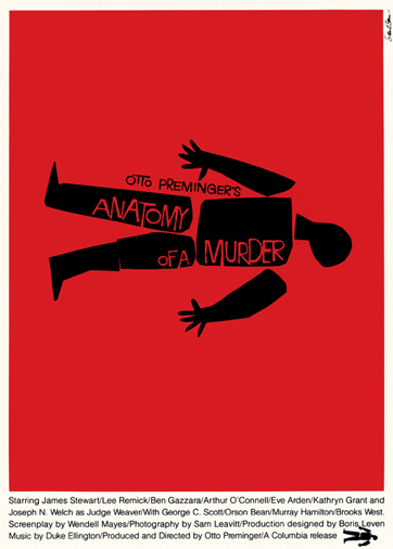
- Saul Bass – Anatomy of a Murder Poster – 1959
-

-

-
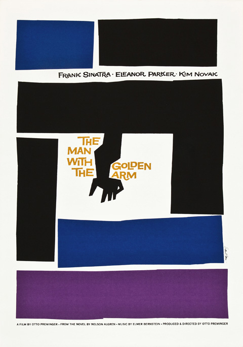
- Saul Bass – The Man With the Golden Arm Poster – 1955
-

-

-
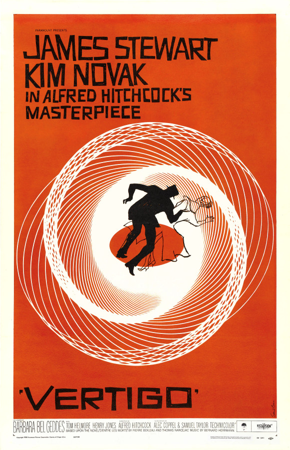
- Saul Bass – Vertigo – 1959
-

-

-

- Saul Bass – West Side Story – 1961
-

-
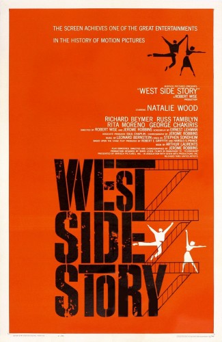
This gallery features works that range from logos to movie posters. Bass had a very distinct style when it came to his design. Saul used a very blocky and almost abstract approach when tackling solutions to his design, as is evident in each of these works. It is also common to see Bass using silhouetting in his design, typically within his movie posters.
Sources
https://en.wikipedia.org/wiki/Saul_Bass
http://www.artofthetitle.com/designer/saul-bass/
http://www.saulbassposterarchive.com/
Leave a Reply Cancel reply
You must be logged in to post a comment.
Part One – About Artist
Peter Behrens was born April 14, 1868 an died February 27, 1940. He was an artist and founder of modern objective industrial architecture and modern industrial design. As a young man he started out as an illustrator and his flowing designs, and curvilinear lines show the style of Art Nouveau. The Art Nouveau is a style of art that is haracterized by highly stylized, flowing, curvilinear designs often incorporating floral and other plant-inspired motifs. Behrens wanted to restrict every form to a two-dimensional plane, reducing everything to an ornament design. His work for the Bunte Vogel in 1899 shows how he uses the object to transform them into the border and the typography forms unity by using similar linear composition.
In his later works Peter Behrens focused more on simple geometric forms such as circle, triangles, simple lines, and squares. Using the influence of those form he designed patterns for the design of his home and also for the advertising posters for the Berlin-based electric company. He also created designs for daily used electrical products. It mainly involved copying the artistic pieces by their shape and the historical decoration (Design History Research). Behrens was the first German to create the first complex corporate identity. He connected art and industry together.
Part Two – Highlights
- Started out as an illustrator transforming objects into borders.
- Created designs for daily used electrical products based on their shape and historical designs.
- Used simple geometric forms such as circles, triangles, and squares to create architectural, advertising and logo designs for industrial companies.
Part Tree – Gallery
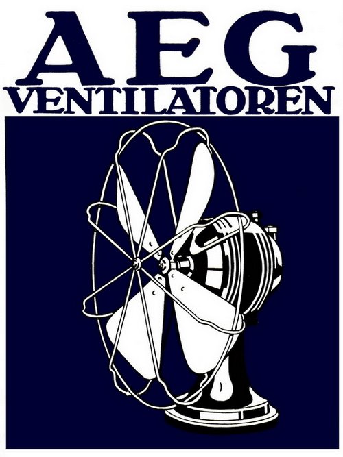
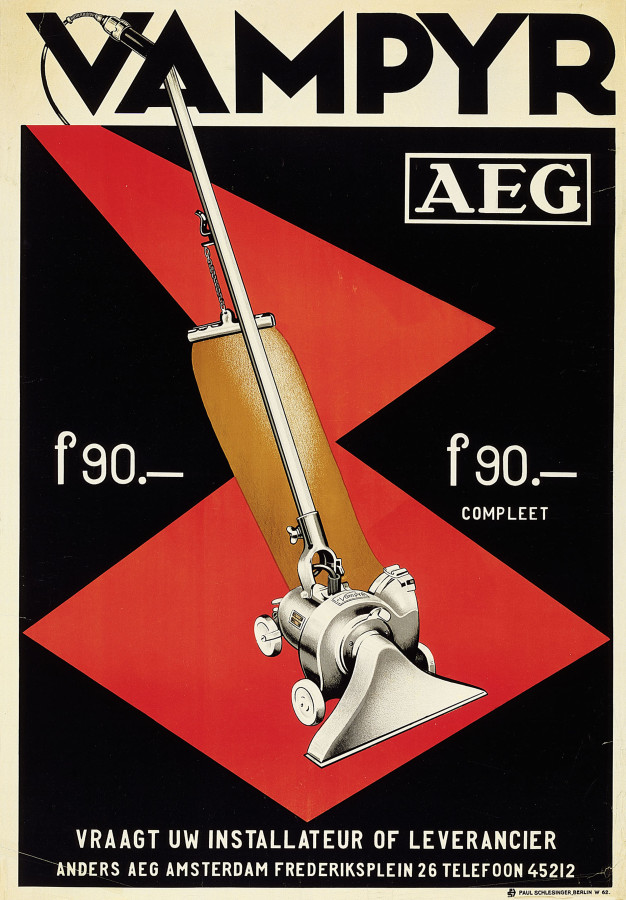
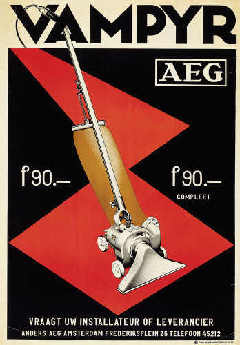
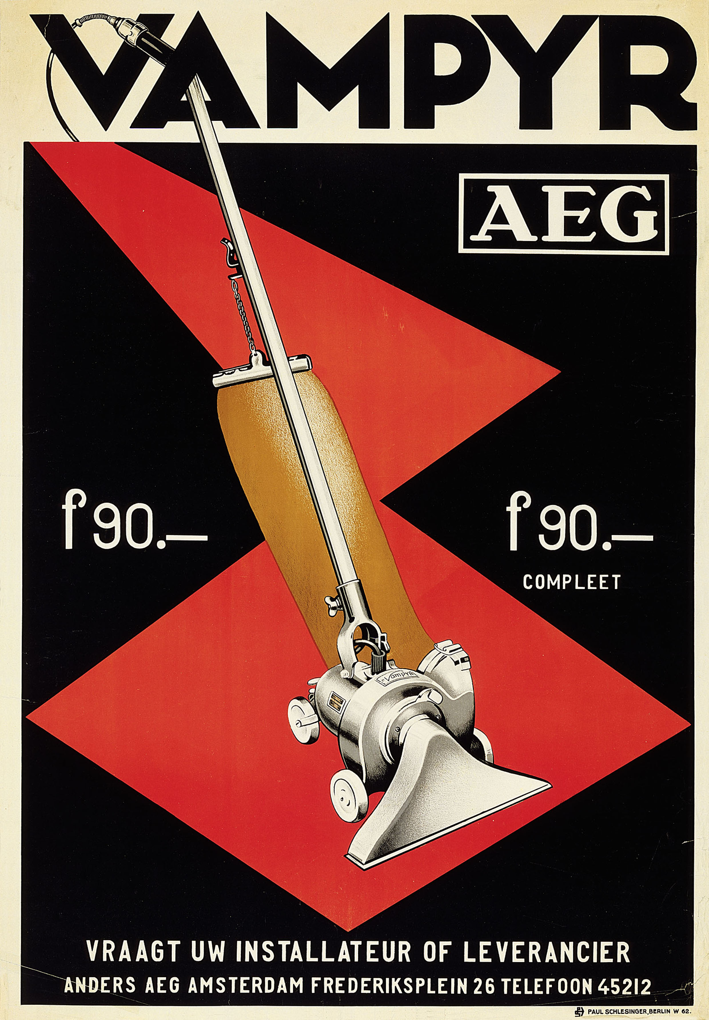
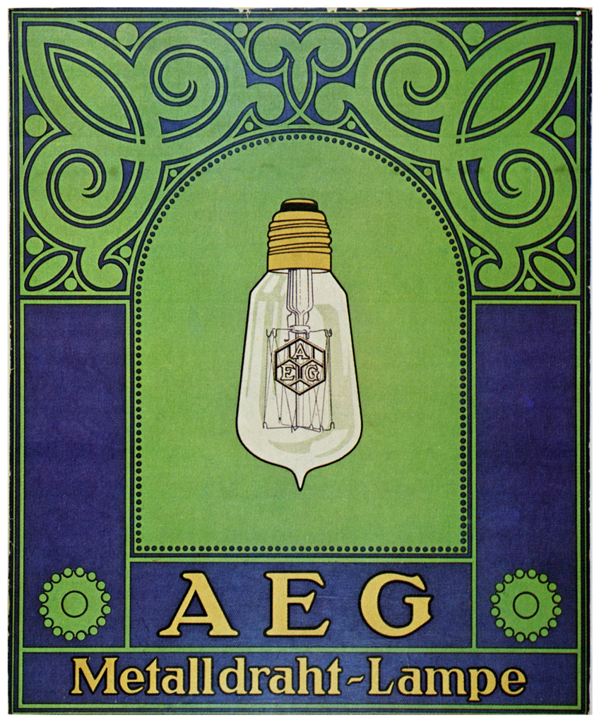
Peter Behrens, AEG Product Advertising, 1910
-
- Peter Behrens, AEG Product Advertising, 1910
-

-

-

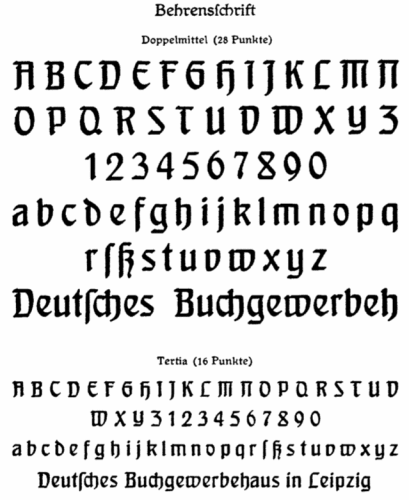
- Peter Behrens, Behrens Font, 1907
-

-
-
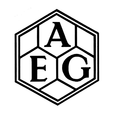
- Peter Behrens, AEG Logo,
-

-
-
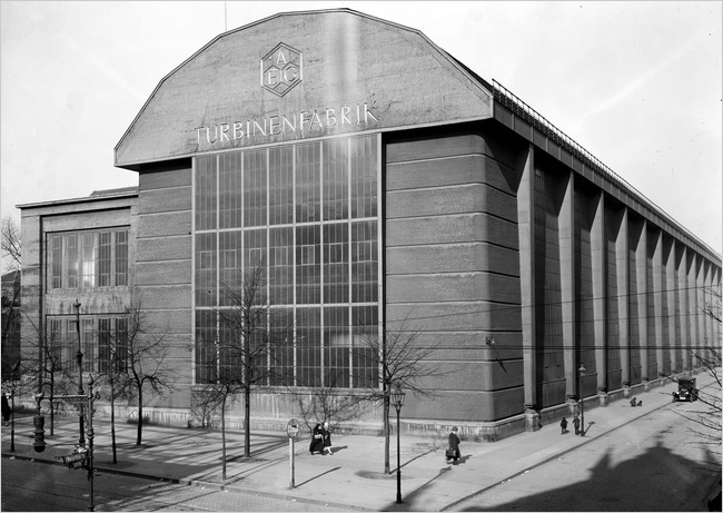
- Peter Behrens, AEG Turbine Factory, 1908
-

-
-
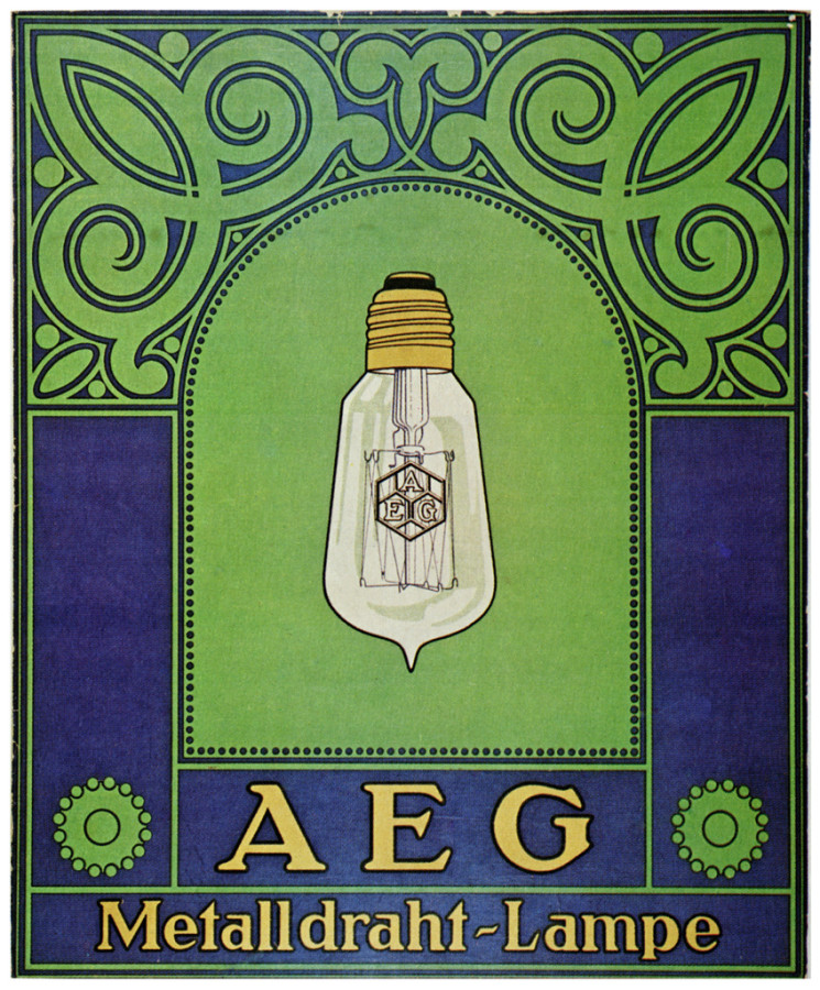
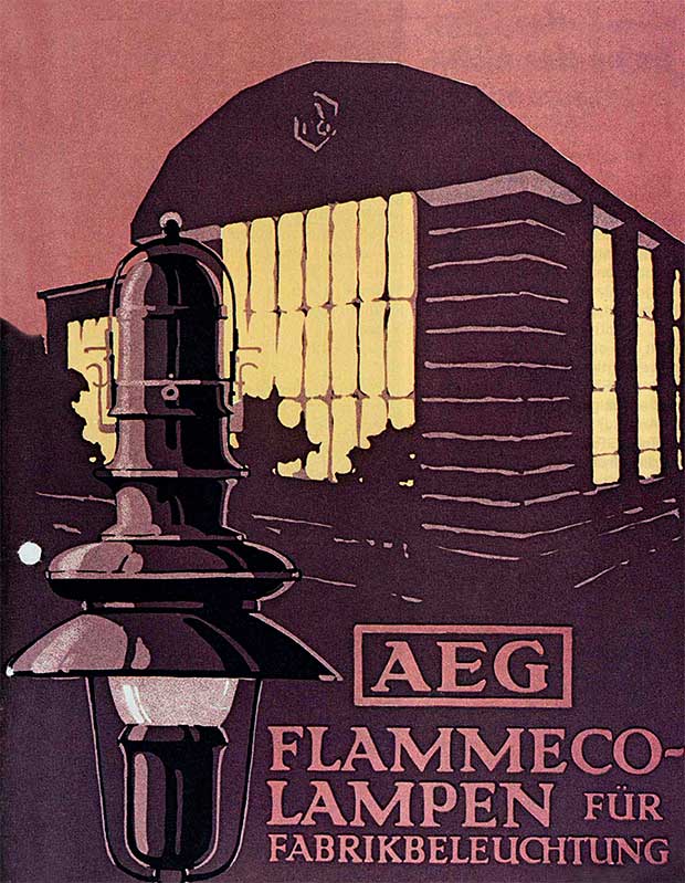
- Peter Behrens, AEG Product Advertising Poster
-

-
-
- Peter Behrens, AEG Product Advertising
-

-

-

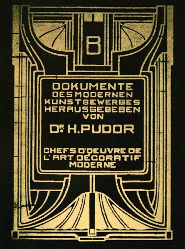
- Peter Behrens, Cover for Dokumente des Modernen,1901
-

-
-
- Peter Behrens,AEG Poster Design
-

-

-

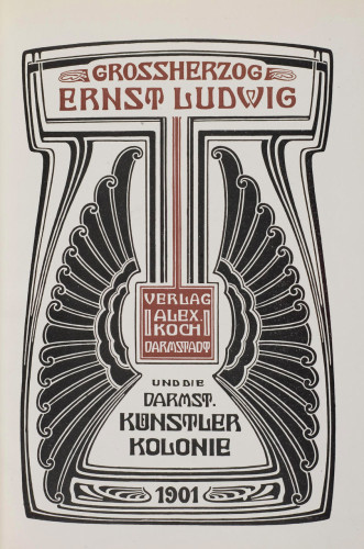
- Peter Behrens. Poster Design, 1901
-

-
Design Style:
Peter Behrens concentrates his designs upon basic shapes such circles, triangles, squares, and simple lines. His main subject tend to be at the center on the page but it still conects through lines and shapes with the rest of the content on the page.
Research Links
Part 1
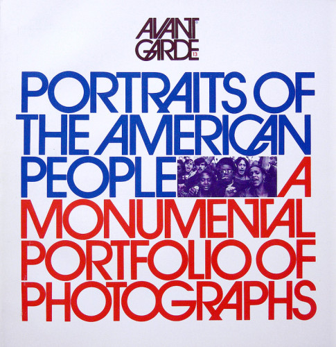
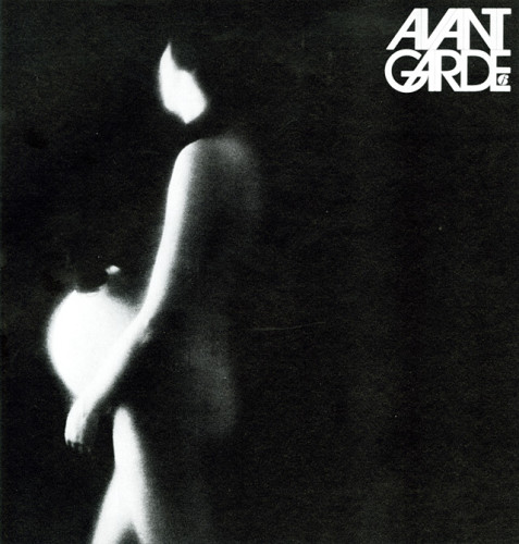
Herb Lubalin was a graphic designer, typographer, and publication designer who had worked his way from many firms to have his own design company. Lubalin had created the Avant Garde font which has been used in many logos everywhere.
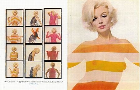
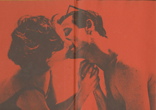
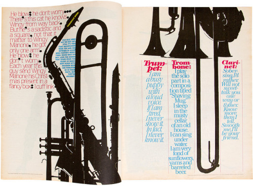
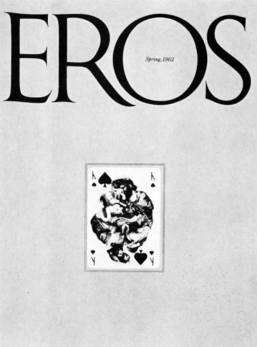
In the mid 60’s Lubalin teamed up with American author, editor, publisher and photo-journalist, Ralph Ginzburg. These two had created the publications Eros, Fact, and Avant Garde, Lubalin being the typographer and designer and Ginzburg was the writer and publisher. Lubalin designed these publications with hard covers which held eschewed colors and simple black and white templates with illustrations which made the publications dynamically minimalist. Eros was the first of the three to come out which talked about topics in love and sex. The beach themed Eros cover caught my eye over all the rest. The yellow sand is great compliment to the red logo which would be the first word you would read on the publication. Once reading the title you can see two lovers just kissing in the sand. The illustration shows how passionate two lovers could go at it, this shows that Eros was super passionate about talking about love and sex. So after the fourth issue of Eros, the government wasn’t about having these going around in mail rooms or sent to people, which soon got Lubalin’s partner, Ginzburg in some trouble. However, the second publication was a magazine called Fact.
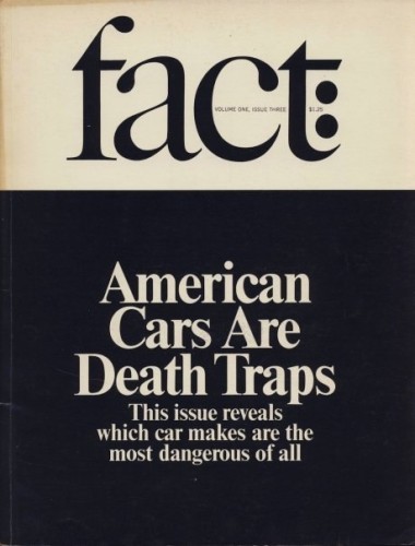
Fact had a similar approach from Eros except switched topics to 60’s culture and Politics. These artists seemed to love to unveil an untold truth about the culture back then and it got them into some trouble with presidential candidates. But would you blame them for how awesome the cover of Fact looks like. Off the bat the title’s typeface looks sharp with the slanted line which connects the lower case f and t’s ascender and bar. The title is just as sharp as the knife they are stabbing cultural and political truths with. Because of the political trouble that the publication got sued for, Lubalin and Ginzburg ceased Fact and created another publication combing both ideas from Fact and Eros, Avant Garde was born.
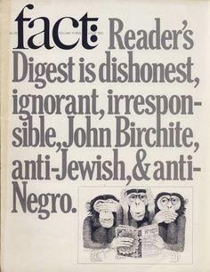
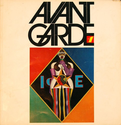
Avant Garde looks like a son to the parents Eros and Fact. The titles slanted A and V’s reminisce on the slickness and sharpness of fact, with sexual imagery on the cover, this shows Labalin and Ginzburg don’t hold back in this new publication. But Avant Garde was forced to shut down when Ginzburg got sent to prison for a scandal with the U.S postal service and Eros. After all this, Lubalin continued with a slightly less controversial publication dedicated to his interest in typography called Upper and Lower Case.
Part 2
Distinctive point 1.
Lubalin was in charge of design for such magazines Eros, Fact, and Avant Garde which shows a minimalistic modern design in both publication and type form.
Distinctive point 2.
The publications Eros, Fact, and Avant Garde used very risque illustrations and touchy topics which caused controversy. This is a perfect example of how graphic design is used in this world, informing readers the untold truths.
Distinctive point 3.
Lubalin worked hard enough after college that he soon began his own company, which he ended up creating a typeface that was used in multiple logos through out the last two decades.
Part 3
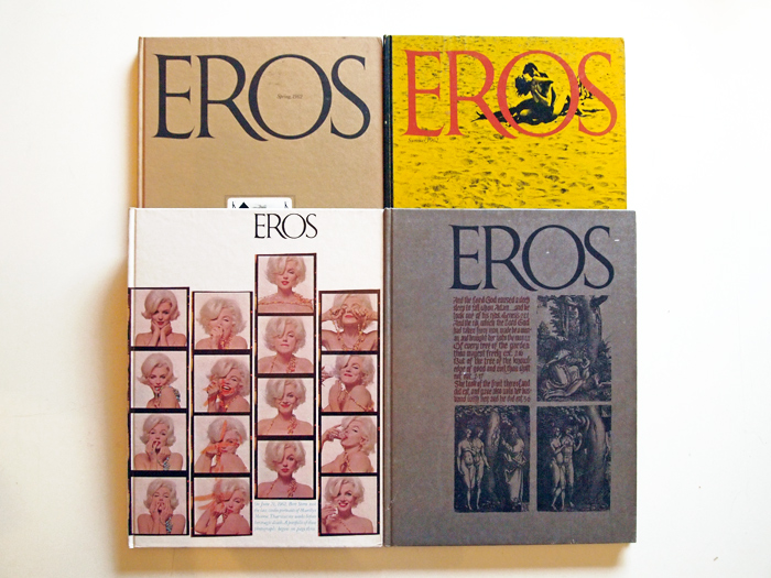
Herb Lubalin, Eros Magazine
-
- Herb Lubalin, Eros Magazine
-

-

-
- Herb Lubalin, Eros Magazine inside
-

-
-
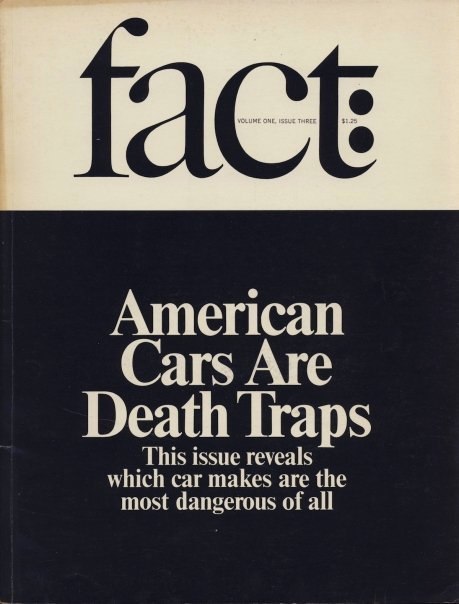
- Herb Lubalin, Fact Magazine
-

-
-
- Herb Lubalin, Fact Magazine
-

-
-

- Herb Lubalin, Avant Garde Magazine
-

-

-
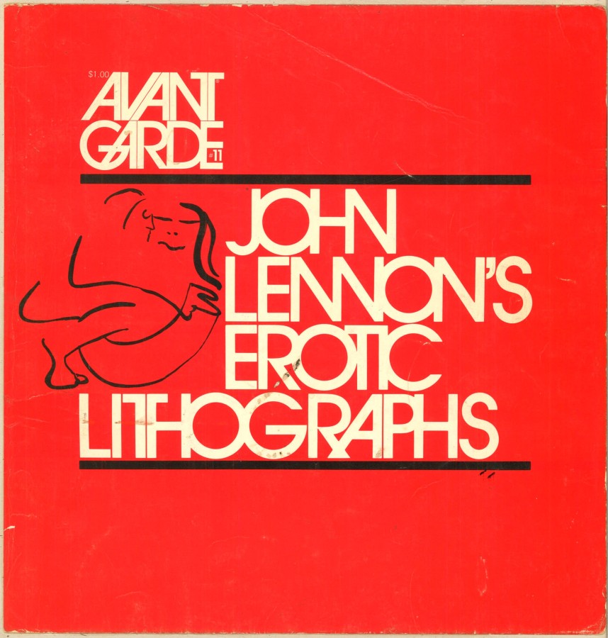
- Herb Lubalin, Avant Garde Magazine
-

-


-

- Herb Lubalin, Avant Garde Magazine
-

-
-

- Herb Lubalin, U&LC magazine
-

-
-

- Herb Lubalin
-

-
-

- Herb Lubalin, Avant Garde Magazine
-

-
-

- Herb Lubalin, Avant Garde Magazine
-

-
-

- Herb Lubalin, Eros Magazine
-

-

Style
Lubalin had a style which you could say was dynamically minimalistic. Graphics wise, Lubalin would use high quality photographs which related to the idea of the publication. Some are silhouettes of objects/people making these photographs abstract to the mind. Lubalin didn’t have the same photoshop technology as we have today, so it must of been a longer process creating a red tint to a black and white photograph of two people kissing. Type wise you can tell Lubalin knew what he was doing with type because the titles of his publications relate to the meaning behind all the publications put out by the designer. Fact magazine’s type has a lot of distinct characteristics like the rounded terminals, the sharp tails, and the angled connection between the ascender and bar between the lower case letters t and f. This type defines the magazine as we see it, its a sharp well rounded publication which tells truths about the culture back in the 60’s. I dig Herb’s style because he didn’t seem to care about what they were talking about with culture, but was more focused on designing with a minimalist approach. The combination of graphics and type worked great with modern design.
Sources: http://www.aiga.org/medalist-herblubalin/
http://www.designishistory.com/1960/fact-eros–avant-garde/
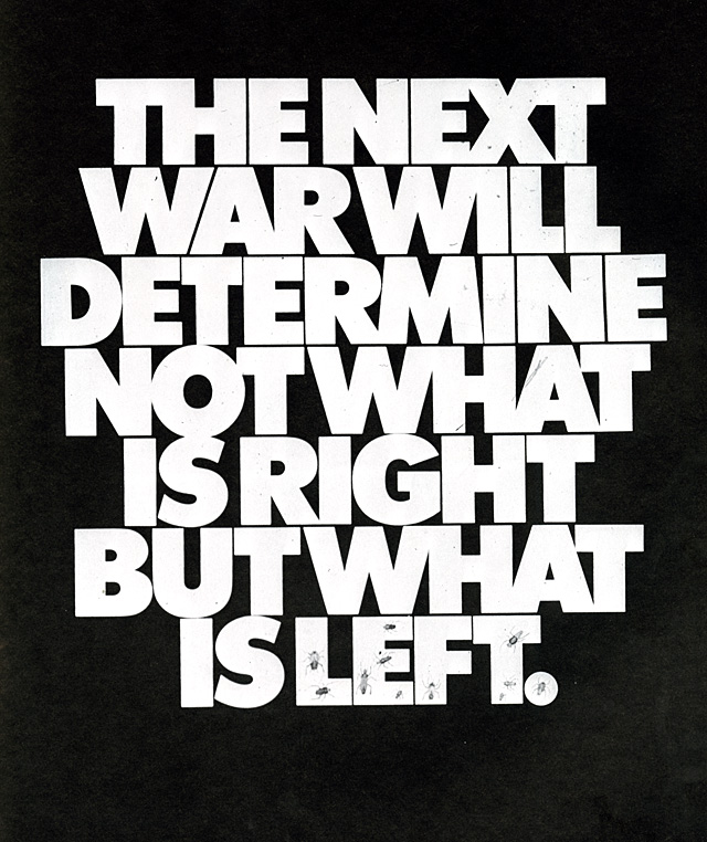
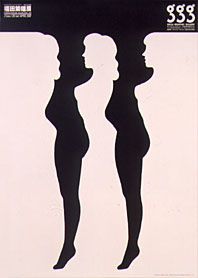
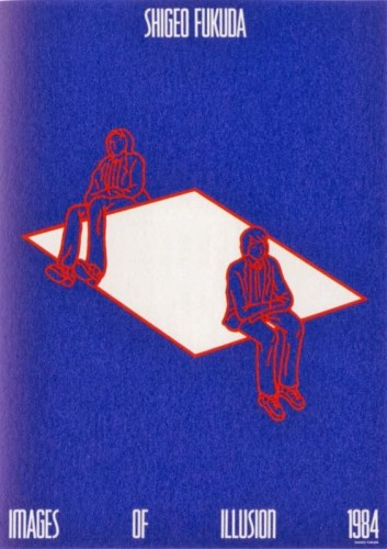
Shigeo Fukuda was born in Tokyo, Japan in 1932. Fukuda is considered to be “Japan’s consummate visual communicator” as the ADC Global puts it. He is the first Japanese designer to be placed into the Art Directors Hall of Fame. Fukuda is known for his illusionism designs as his biggest influence in life was a modern Japanese graphic designer by the name of Takashi Kohno. Fukuda is extremely well represented in his designs where he is very raw, truthful, and real with his artworks. He explains his work as “I believe that in design, 30% dignity, 20% beauty and 50% absurdity are necessary. Rather than catering to the design sensitivity of the general public, there is advancement in design if people are left to feel satisfied with their own superiority, by entrapping them with visual illusion.” Designers should be able to design things that make them happy and what they truly believe in, whether or not it is popular among others. Fukuda really exemplifies his beliefs and his true feelings in his work and he is a great designer in which he pours his heart into his pieces and people can either agree or disagree. ADC Global also talks about the “Victory 1945” which is his most famous poster. He won a grand prize in the 1975 Warsaw Poster Contest. As I looked up the poster, I was amazed at how simple the poster was as it only captured two images but it portrayed such a strong, powerful message. I also saw his work “Legs” and did not know that that was his work. This piece really holds a lot for me as this image was one of the reasons why I wanted to change my major to Graphic Design in the first place. Just the fact that I happened to be placed with the artist behind this work really baffles my mind and makes me really appreciate graphic design and especially Shigeo Fukuda. Fukuda’s illusion designs really cause the audience to really stop and think about his designs. All of them have such an incredible meaning whether it’s on peace in the world or the close knit relationships humans hold with each other, Fukuda has created a way where all his works all have a story and portray great importance.
1. Fukuda is an optical illusion designer
2. His works convey a special meaning towards world issues in his work.
3. Highly respected across the world especially in Japan (representative of Japan) as he was the first Japanese designer to be inducted into the Hall of Fame.
Shigeo Fukuda Shigeo Fukuda: Illustrick 421/GGG/Ginza (1986)
-
- Shigeo Fukuda Shigeo Fukuda: Illustrick 421/GGG/Ginza (1986)
-

-
-

- Shigeo Fukuda “Impossible Seating” (1984)
-

-
-
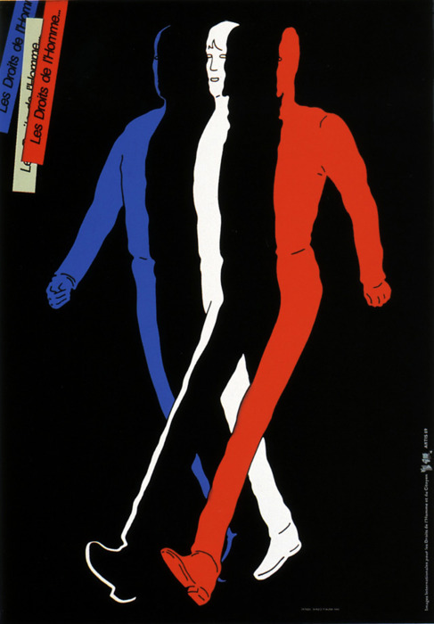
- Shigeo Fukuda “Human Rights” (1989)
-

-

-
- Shigeo Fukuda “Legs” (1975)
-

-
-
- Shigeo Fukuda “Victory 1945” (1975)
-

-


-
- Shigeo Fukuda “Lunch with a Helmut On” (1987)
-

-
http://adcglobal.org/hall-of-fame/shigeo-fukuda/
http://www.designishistory.com/1960/shigeo-fukuda/
http://www.opticalillusioncollection.com/2014/01/shigeo-fukudas-impossible-seating.html
-
Classroom
-
-
Recent Posts
Recent Comments
- Danielle Vizard on Thinking with Type — TEXT
- Danielle Vizard on Digging’ It!
- Jenna on Thinking with Type — TEXT
- Jenna on Digging’ It!
- Elizabeth Robinson on Digging’ It!
Archives
- November 2023
- August 2023
- May 2023
- April 2023
- March 2023
- February 2023
- January 2023
- December 2022
- November 2022
- October 2022
- September 2022
- August 2022
- July 2022
- June 2022
- May 2022
- February 2022
- December 2021
- November 2021
- October 2021
- September 2021
- August 2021
- June 2020
- February 2018
- December 2015
- November 2015
- October 2015
- September 2015
- August 2015
Categories
-
About
KSC GRAPHIC DESIGN

Leave a Reply
You must be logged in to post a comment.