- Ê
- Â
5 GD History
Part 1
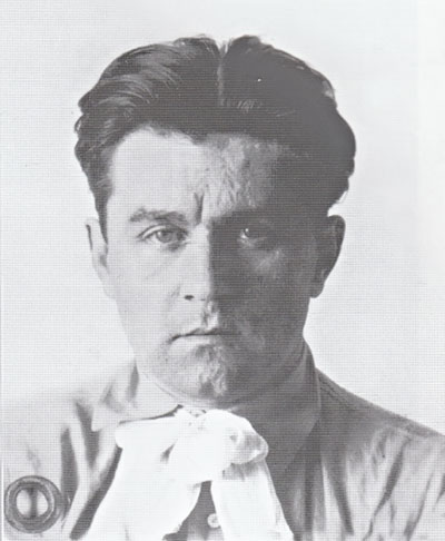
Kazimir Malevich started to draw at age 12 and he knew at a young age that he wanted to take on an artistic career and attended many art schools in his youth. He was a Russian painter and art theorist. He founded Suprematism, which is a form of simple geometric shapes with abstract painting. He combined the elements of cubism and futurism to create an abstract geometric approach of figures in space. In his first paintings, he used geometric shapes in a limited range of colors, in black alone, or against a white background. Later on, he introduced a broader range of colors as well as triangles, circles, and curved shapes. Malevich supported the October 1917 Revolution, In the years that followed he worked in political propaganda, painting posters and contributing articles about new art to the “Anarkkhia” (Anarchy) newspaper. Malevich was very interested in the spiritual movement and in expressing a spiritual reality beyond the physical reality through his art. Malevich says, “By Suprematism I mean the supremacy of pure feeling in creative art. To the Suprematist the visual phenomena of the objective world are, in themselves, meaningless; the significant thing is feeling.” I like how his work is so simple, yet it still leaves an impact on you and you can tell he put a lot of thought into each piece. One of his works was a relatively small painting filled with a large black square in a white background. He is known especially for this piece in particular. In the museum, it acts like a sudden silence. But when socialist realism was declared the official artistic doctrine of the Soviet Union, this painting and many other works by Malevich were removed and hidden from sight. He died of cancer in 1935 and was buried in a coffin made with his own design, the image of the Black Square placed on its lid. His work became internationally famous and acclaimed, but, under Stalin, his art was thought as being anti-nature, and his works were destroyed.
Part 2
- He founded a style of art called Suprematism, a geometric style with simple shapes and colors.
- Malevich supported the October 1917 Revolution, In the years that followed he worked in political propaganda, painting posters and contributing articles about new art to the “Anarkkhia” (Anarchy) newspaper.
- Suprematism, invented by Kazimir Malevich, was one of the earliest and most radical developments in abstract art.

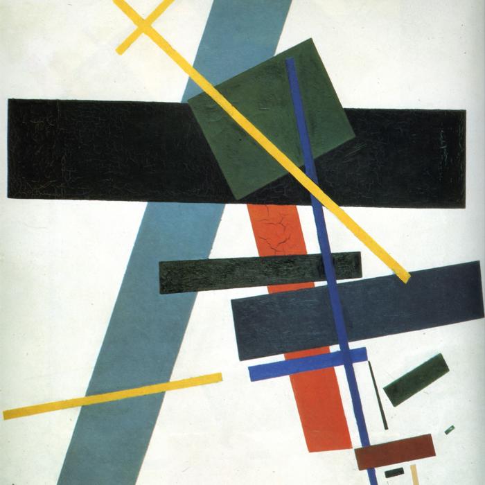
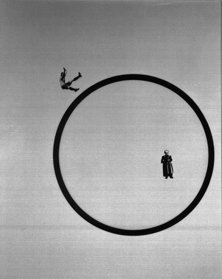
Kazimir Malevich, Black Square, 1915
-
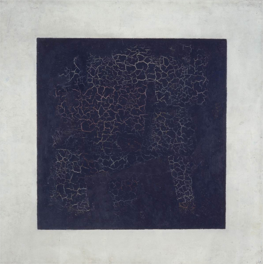
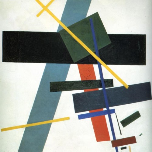
- Kazimir Malevich, Black Square, 1915
-

-

-

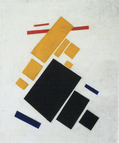
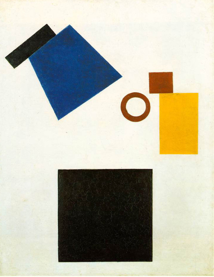
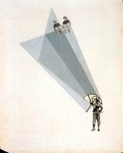
- Kazimir Malevich, Airplane Flying, 1915
-

-

-
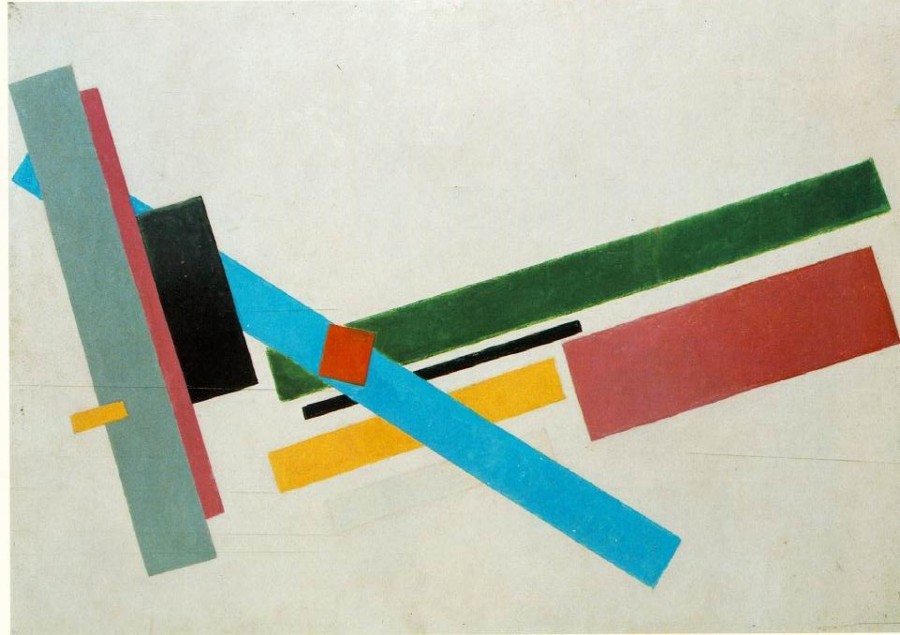
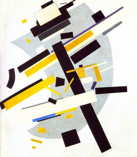
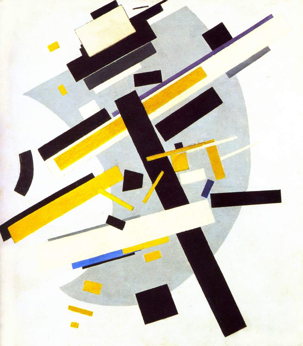
- Kazimir Malevich, Suprematist Composition, 1916
-

-


-
- Kazimir Malevich, Suprematism, 1915
-

-
-
- Kazimir Malevich, Suprematism 2, 1915
-

-


-

- Kazimir Malevich,
-

-
-

- Kazimir Malevich, Suprematism (Supremus N58 With Yellow And Black),
-

-
-

- Kazimir Malevich, Suprematist Painting, 1915
-

-

-
- Kazimir Malevich, Dynamic Suprematism, 1915
-

-

-
- Kazimir Malevich, Two-Dimensional Self-Portrait, 1917
-

-


-

- Kazimir Malevich, Suprematist Painting: Eight Red Rectangles, 1915
-

-

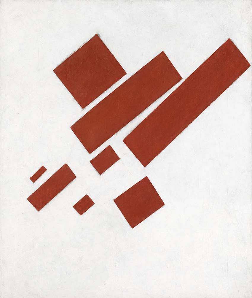
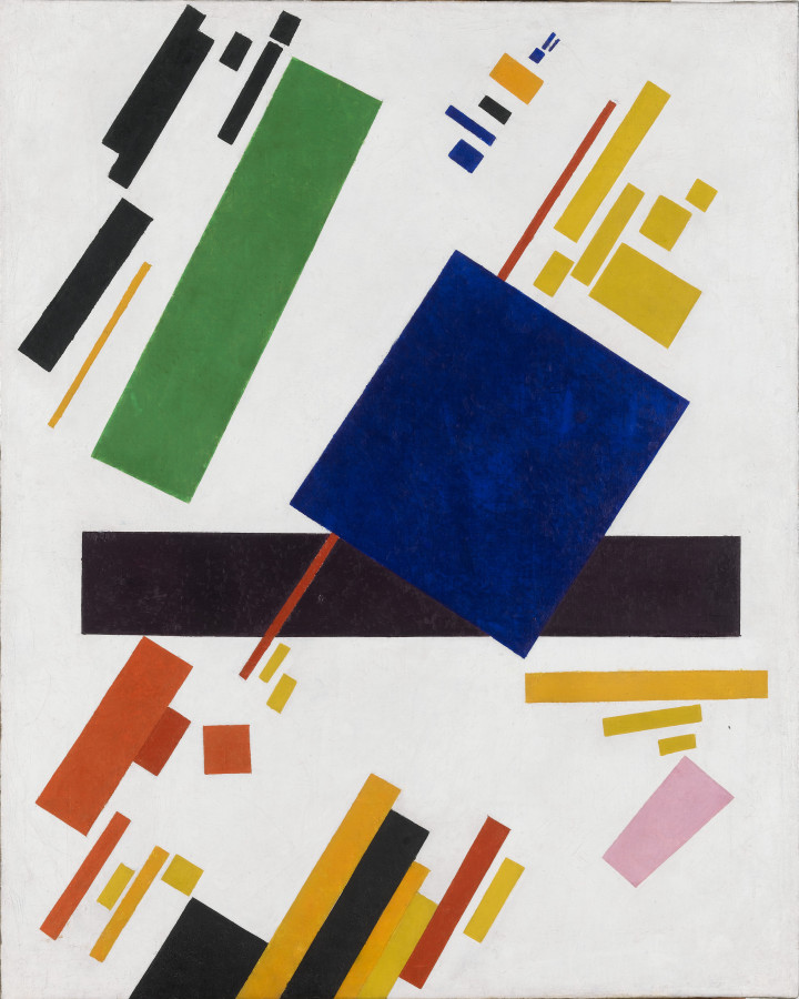
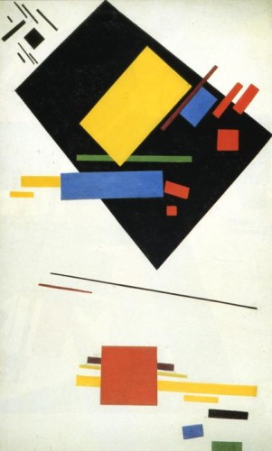
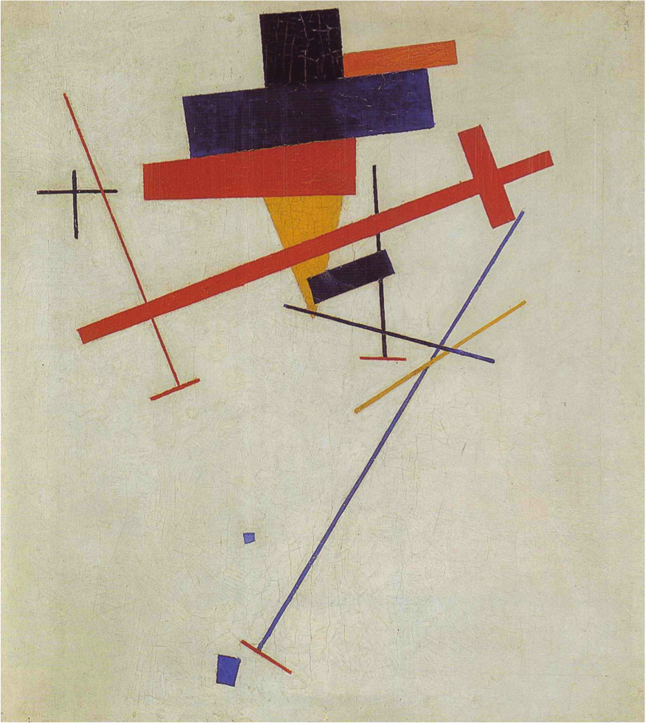
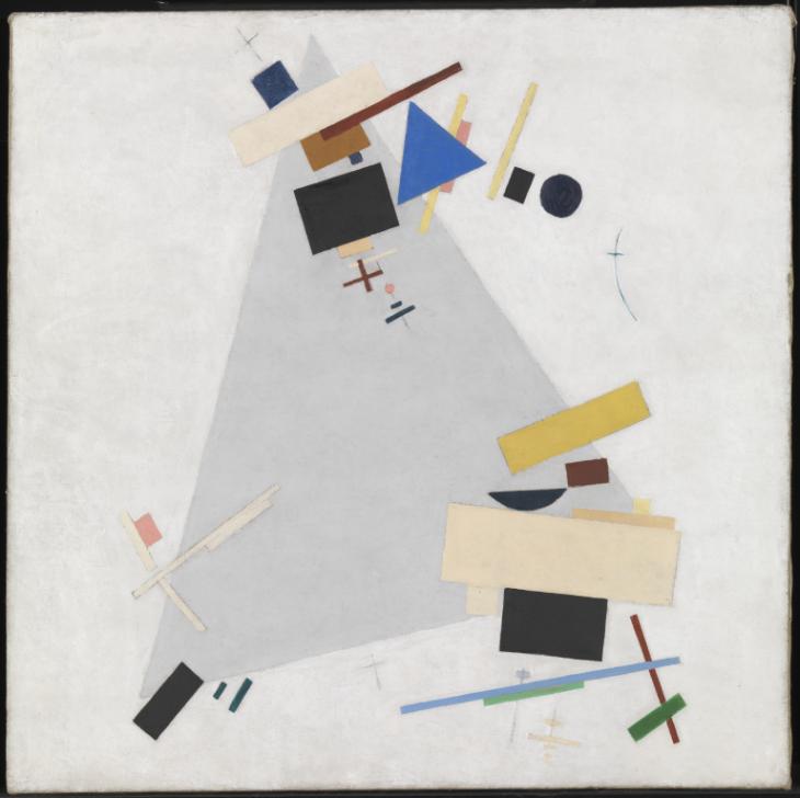
Kazimir Malevich uses geometric shapes in his work. A variety of rectangles, squares, triangles, and circles all combine to form a relationship with each other. The overlapping of shapes shows movement and depth in his pieces. He uses the shapes in a variety of different ways to create a sense of space within the piece and contrast with the white background. All of the selections above contain lots of shapes and creates a unity with one another. The theme of geometric shapes shows his modern approach to his work.
The art history: Kazimir Malevich
Kazimir Malevich Biography
The Guardian- Tate: Kasimir painting
The modernism of Kasimir Malevich
Russian Art- Kazimir Malevich
Gallery

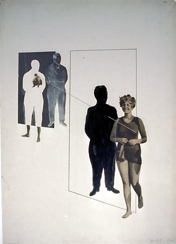
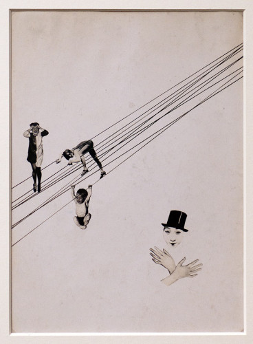
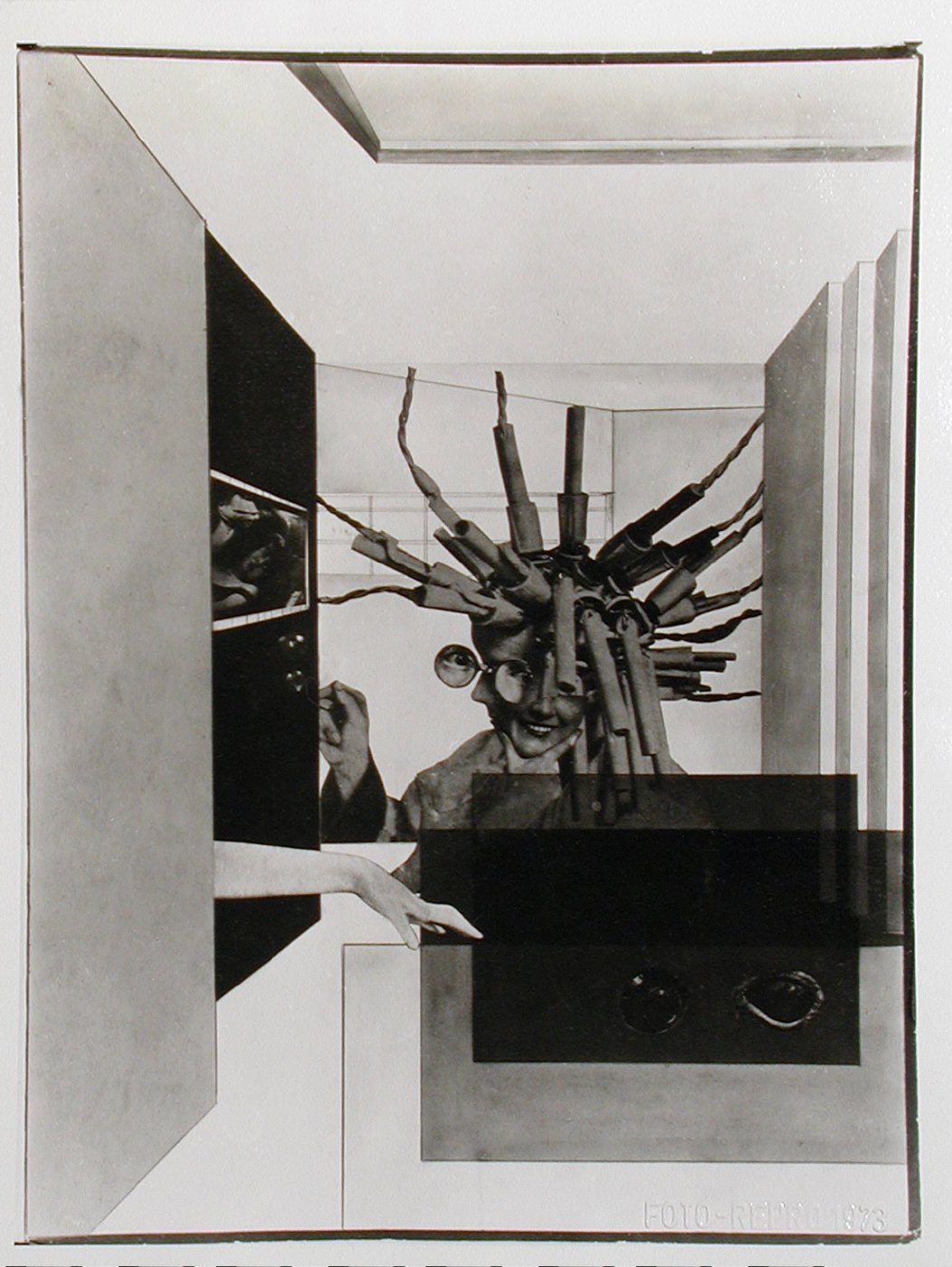
László Moholy-Nagy, Love Your Neighbor; Murder on the RailwayLove Your Neighbor; Murder on the Railway, 1925
-
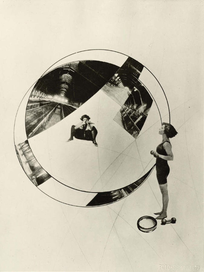
- László Moholy-Nagy, Love Your Neighbor; Murder on the RailwayLove Your Neighbor; Murder on the Railway, 1925
-

-

-
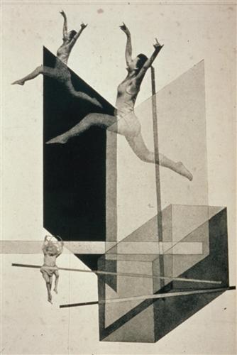
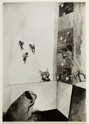
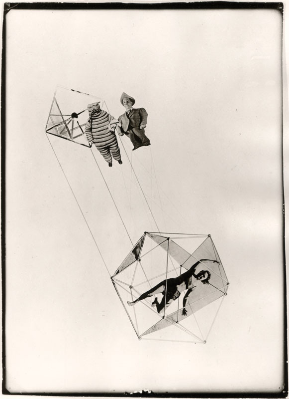
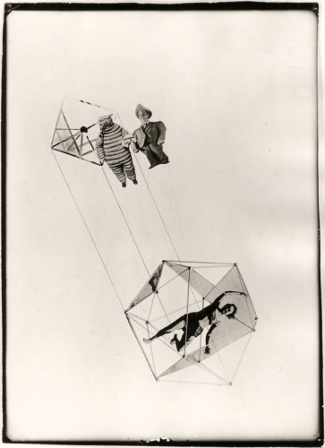
- László Moholy-Nagy, Human Mechanics, 1925
-

-

-
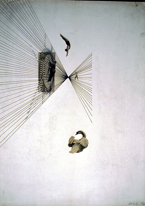
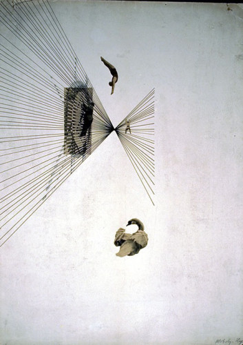
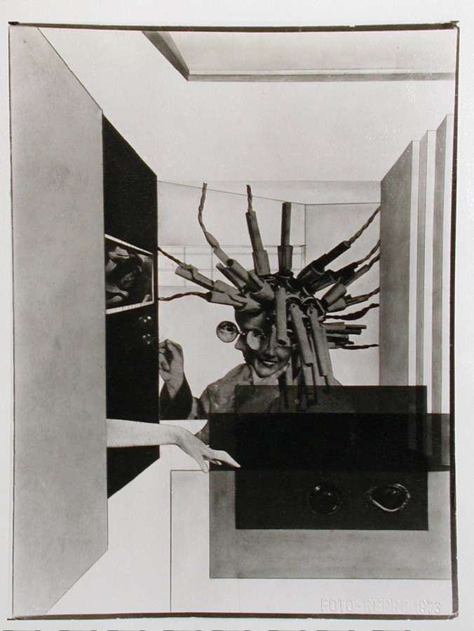
- László Moholy-Nagy, Leda and the Swan, 1925
-

-
-

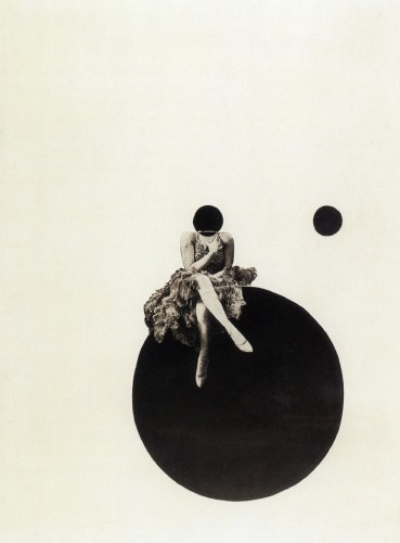
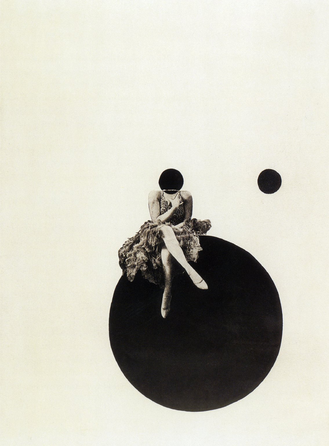
- László Moholy-Nagy, The Olly and Dolly Sisters, 1925
-

-
-
- László Moholy-Nagy, How Do I Stay Young and Beautiful, 1925
-

-

-

- László Moholy-Nagy, City Lights, 1926
-

-
-
- László Moholy-Nagy, Jealousy, 1927
-

-

-

- László Moholy-Nagy, The Mavericks II, 1927
-

-
-

- László Moholy-Nagy, My Name is Bunny Rabbit, I Know Nothing, 1927
-

-

-
- László Moholy-Nagy, Die Korsettstange, 1925-27
-

-
-
- László Moholy-Nagy, Die Zerruttete Ehe, 1925-27
-

-

Relationships Within His Work
The specific area of Moholy-Nagy’s work that I have chosen to focus on is his photomontage, which is seen within the gallery above. Photomontage in the wake of WWI was an attempt for artists and designers to help re-shape society by conveying how a gendered experience of modernity could be envisioned. There are two unifying characteristics of almost all of his montage work that specifically stood out to me: the first, being his use of women as subjects and the second being the inclusion of line and geometric shape. As an artist, he utilized a constructivist approach in placing the photographic elements to create dynamic relationships within his pieces.
About the Artist
Born in Borsod, Austria-Hungary in 1895, László Moholy-Nagy had picked up an interest in literature at a young age. His first ambition was to become a writer, but he was persuaded to study law in Budapest after graduation. His studies came to a halt when World War I began, and in 1915 he enlisted in the Austro-Hungarian army as an officer. Though he had begun to pick up drawing before joining the army, he turned this hobby into a more serious one during his hours in artillery observation posts where he would produce sketches on the backs of military-issue postcards. At the age of 23, he officially began his career as an artist. He became fascinated by the expressive power of lines and the effects of color on composition. His work was highly influenced by Russian Constructivism, and he strove to eliminate “personal touch” from his paintings. In addition to painting, he focused a lot of his time on creating collages on paper and dabbling into photography. He spent five pivotal years as a professor at the Bauhaus school, where his paintings continued to evolve. He then began work as a free-lance designer, creating book jackets, posters and exhibitions. In 1935, he set up a design studio with György Kepes. In 1939, he opened his own school, The School of Design in Chicago, and though it absorbed much of his time and energy, he still continued to lecture, paint, photograph and publish his works. He is noted to be one of the greatest influences on post-war art education in the United States.
Signature Points
- He worked predominantly with light as a photographer and painter.
- His time in the army played a fundamental role in not only his art but his teaching.
- He was an advocate of the integration of technology and industry into the arts.
Research Links
Part One:
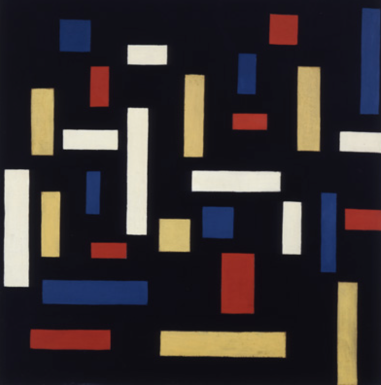
Theo van Doesburg was born on August 30th 1883, in Utrecht, the Netherlands. His real name however is Christian Emil Marie Küpper, he would always refer his stepfather (Theodorus Doesburg) to be his main father, and that is why all of his work is signed Theo Doesburg he later added ‘van’ to his name. Theo van Doesburg was a writer, designer, an art critic, and a painter he was highly influenced by Wassily Kandinsky, who was a Russian painter that was credited to the first abstract work. His work was structured more around a simplistic geometric style. van Doesburg is mostly known for his lead in the artistic movement “De Stijl” it was said “he influenced many graphic designers with his many theories that conveyed the idea that there was a collective experience of reality that could be tapped as a medium of communication.” This appealed to other artist mostly because it pursued abstraction though primary color schemes and geometric shapes. His work would change to a mix of cubism and futurism mixed together.As I looked deeper into van Doesburg’s work I found some of it to be recognizable. It is very interesting to me that his work was something to start a movement in the art world.
Part Two:
1: This artist started an art movement known as “De Stijl” which is dutch for “The style”
2. He was a known painter, writer, designer, and an art critic
3.
Part Three:

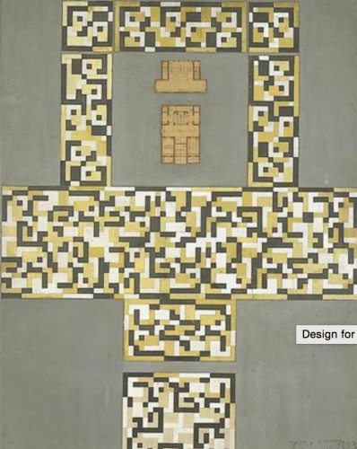
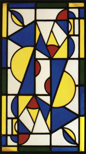
Theo van Doesburg, Design for a Tile Floor and Entrance Hall, 1917
-

- Theo van Doesburg, Design for a Tile Floor and Entrance Hall, 1917
-

-
-
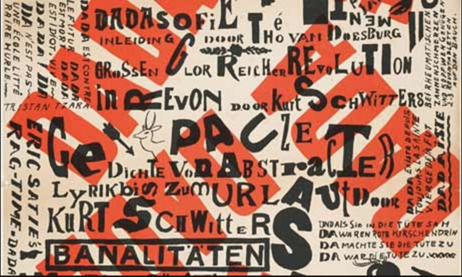
- Theo van Doesburg, Kleine Dada Soirée, 1922
-

-


-
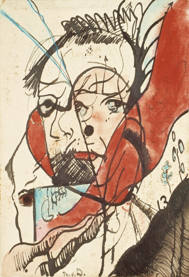
- Theo van Doesburg, Portrait of a Man, 1915
-

-
-

- Theo van Doesburg, Dance I, 1917
-

-
-
- Theo van Doesburg, The Three Graces, 1917
-

-

-
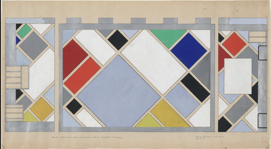
- Theo van Doesburg, Café Aubette, Strasbourg, 1927
-

-


Part One:
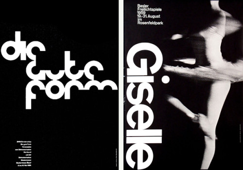
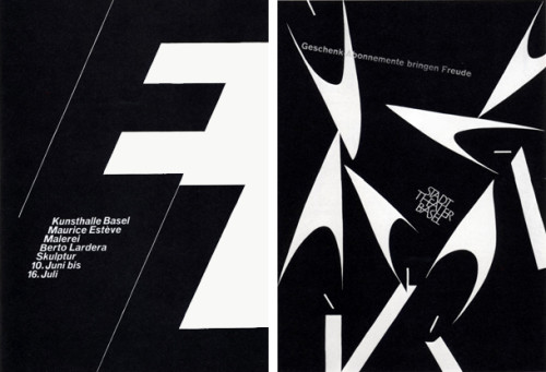
Armin Hofmann, born in 1920 in Winterhur, Switzerland. Grew up to become a Swiss designer, that had a very tremendous influence on the development of the graphic design style known as Swiss International Style. Hofmann believed in simplicity, legibility and objectivity which is the format for Swiss style. Hofmann worked at the Basel School of Arts and Crafts for 40 years and during that time became the head of the graphic design department. Armin thought Swiss International Style was all about communication and he believed the best form of communication was through posters using type and photography, but Hofmann also had written a textbook “Graphic Design Manual” which is still used to teach graphic design today. Hofmann’s former students speak highly of him, in 2011 he even was awarded the AIGA medal which stands for “American Institute of Graphic Arts”. For Robert and Alison Probst, who was also Hofmann’s student, these enduring designs are the work of “a master of his craft with a superior sense of aesthetics. His work deals with the universal language of signs and symbols, often including serendipity and always aiming for timeless beauty”(AIGA, the professional association for design). In the article on the AIGA award he received, they speak so highly of Hofmann and all that he did to help them as students and that is what you want in a teacher.
Part Two:
1) Hofmann had a good sense of structure and the ability to use space, which projected his personality as a designer and an artist.
2) Hofmann sought for musical resonance, in his work and in his students.
3) Hofmann’s teaching was thought of as unorthodox but he would bring you back to the fundamentals of design.
Part Three:
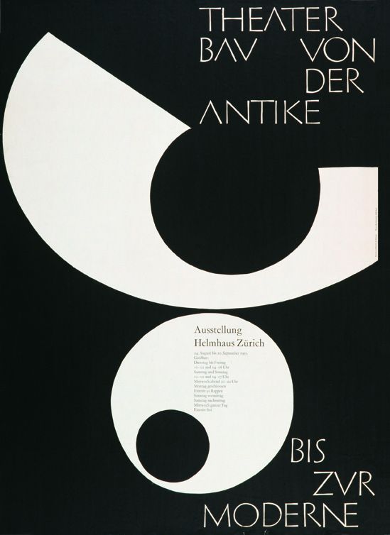
Armin Hofmann, Theater Bau von der Antike Bis Zur Moderne,1955
-
- Armin Hofmann, Theater Bau von der Antike Bis Zur Moderne,1955
-

-

-

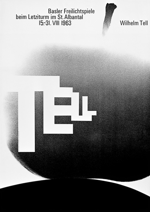
- Armin Hofman, Wilhelm Tell, 1963
-

-

-
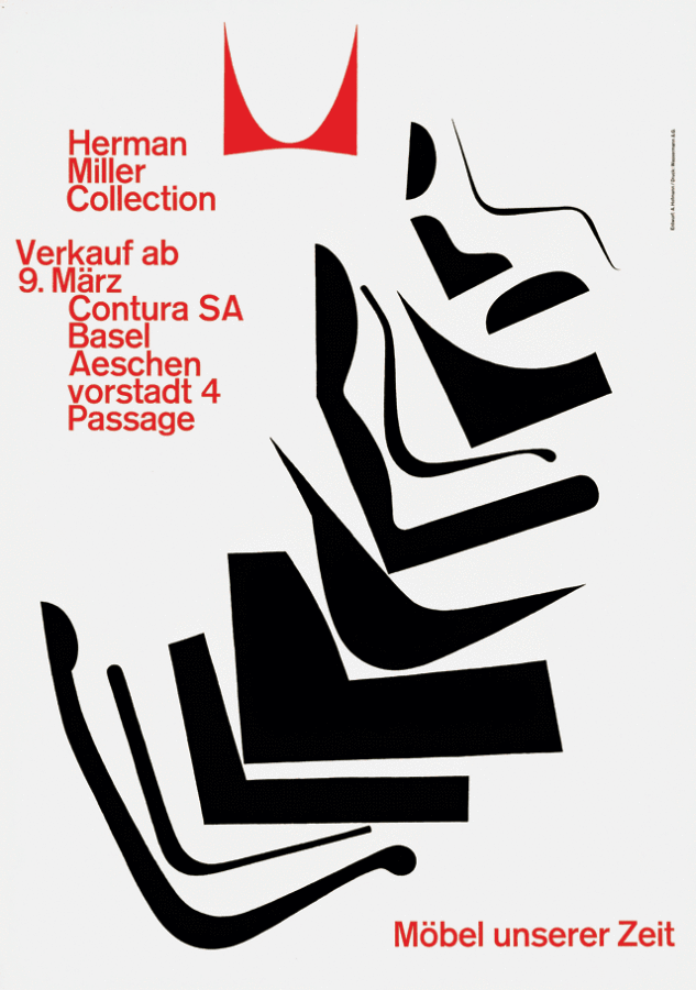
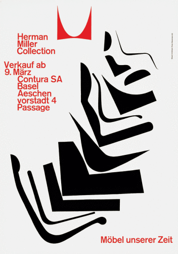
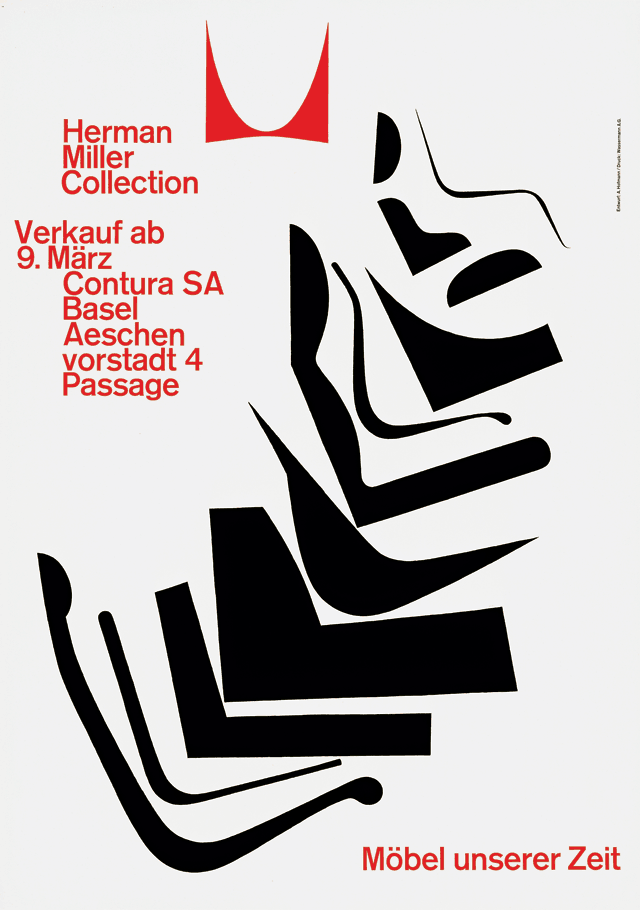
- Armin Hofman,Herman Miller Collection, Möbel unserer Zeit, 1962
-

-
-

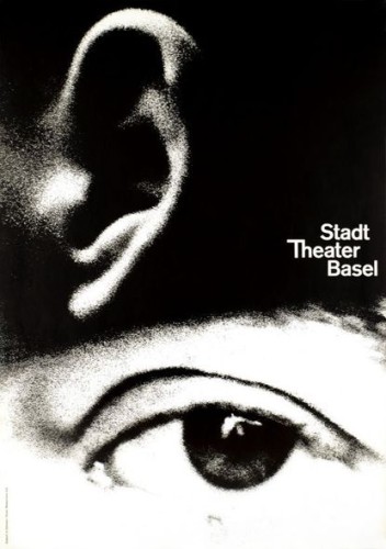
- Armin Hofmann,Stadt Theater Basel, 1962
-

-
-
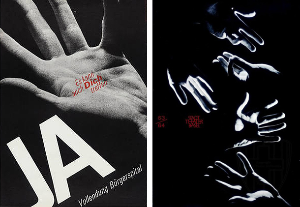
- Armin Hofmann,JA, Vollendung Bürgerspital, Es kann auch Dich Treffen, 1963
-

-

-
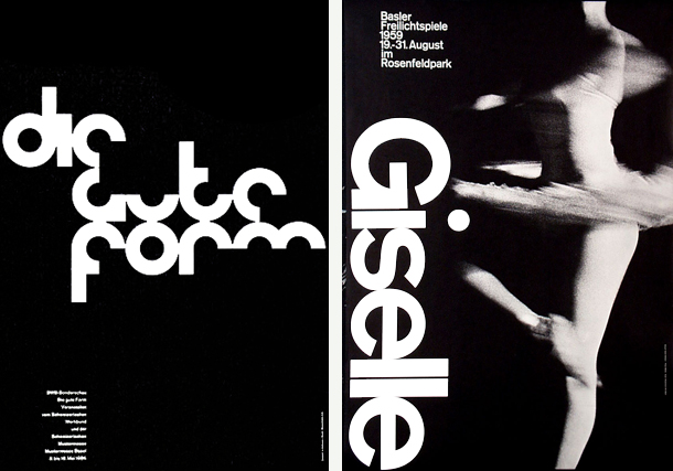
- Armin Hofmann, Giselle, Basler Freilichtspiele, 1959
-

-
-

- Armin Hofmann, Kunsthalle Basel, Maurice Esteve, Malerie, Berto Lardera, Skulptur, 10. Juni bis 16. Juli, 1961
-

-
Sources:
https://kscgd.com/2015fall/gdp1/wp-content/uploads/2015/11/GTGD_CH2.pdf
http://designishistory.com/1940/armin-hofmann/
http://www.famousgraphicdesigners.org/armin-hofmann
http://www.designishistory.com/home/swiss/
http://www.moma.org/collection/artists/2697?=undefined&page=1
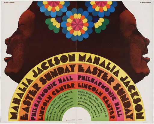
Milton Glaser, Mahalia Jackson 1967
-
- Milton Glaser, Mahalia Jackson 1967
-

-
-

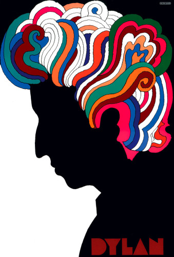
- Milton Glaser, Dylan 1966
-

-

-
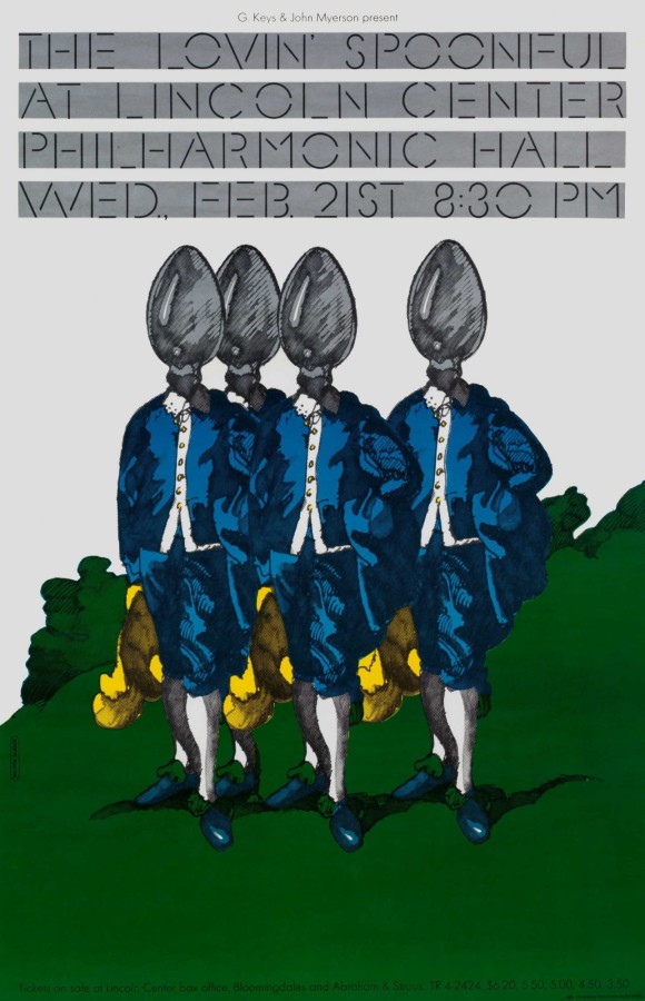
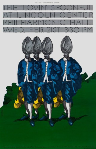
- Milton Glaser, Lovin’ Spoonful 1967
-

-

-

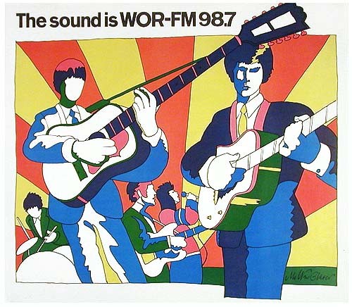
- Milton Glaser, The sound is WOR-FM 98.7 , 1966
-

-
-
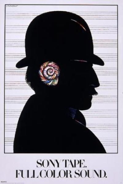
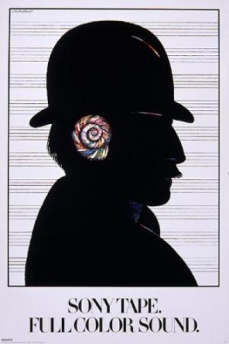
- Milton Glaser, Sony Tape. Full of Sound 1980
-

-
-

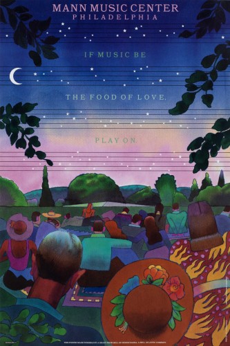
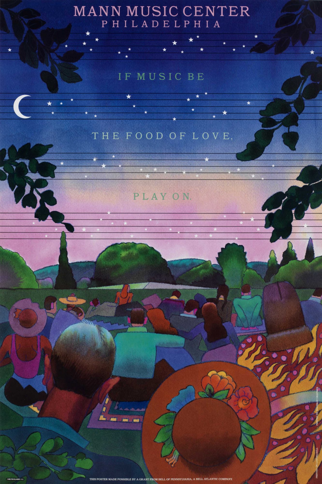
- Milton Glaser, mann music center philadelphia 1988
-

-
-

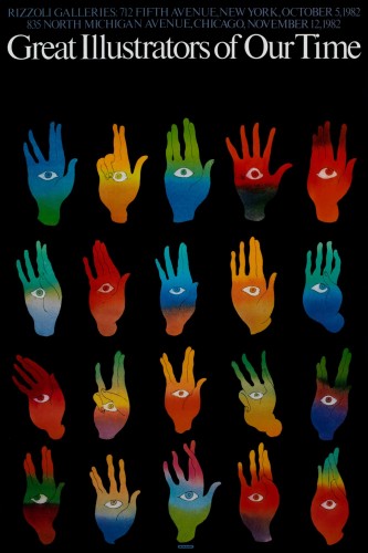
- Milton Glaser, great illustrators of our time 1982
-

-

-

- Milton Glaser, great illustrators of our time 1970
-

-

-
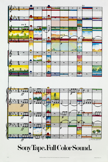
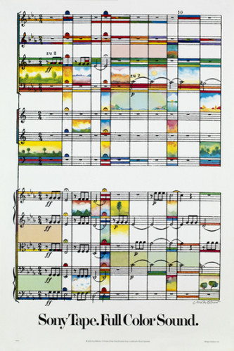
- Milton Glaser, Sony Tape Full Color Sound, 1979
-

-
-

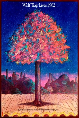
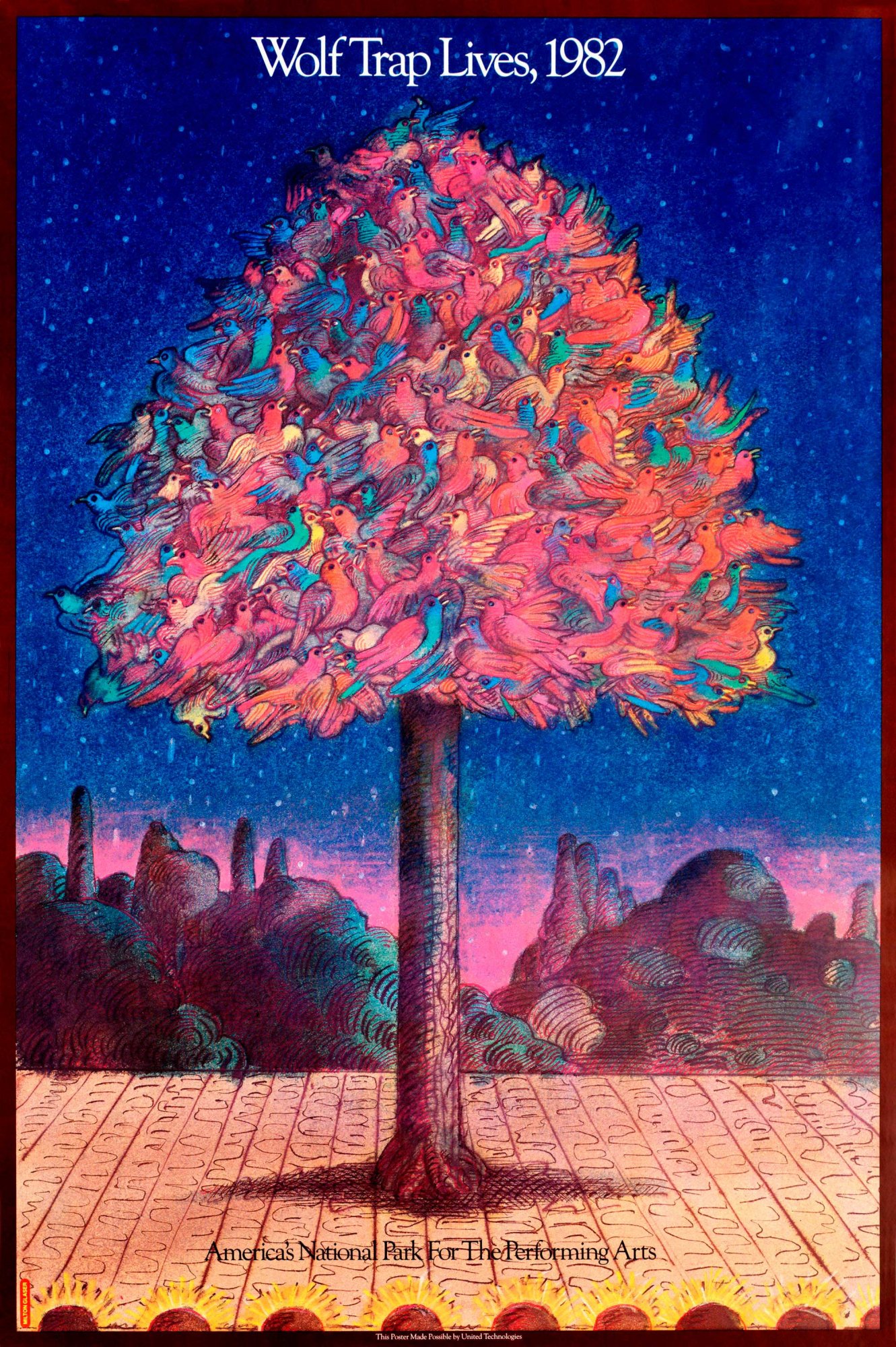
- Milton Glaser, wolf trap revival 1982
-

-
Gallery Paragraph
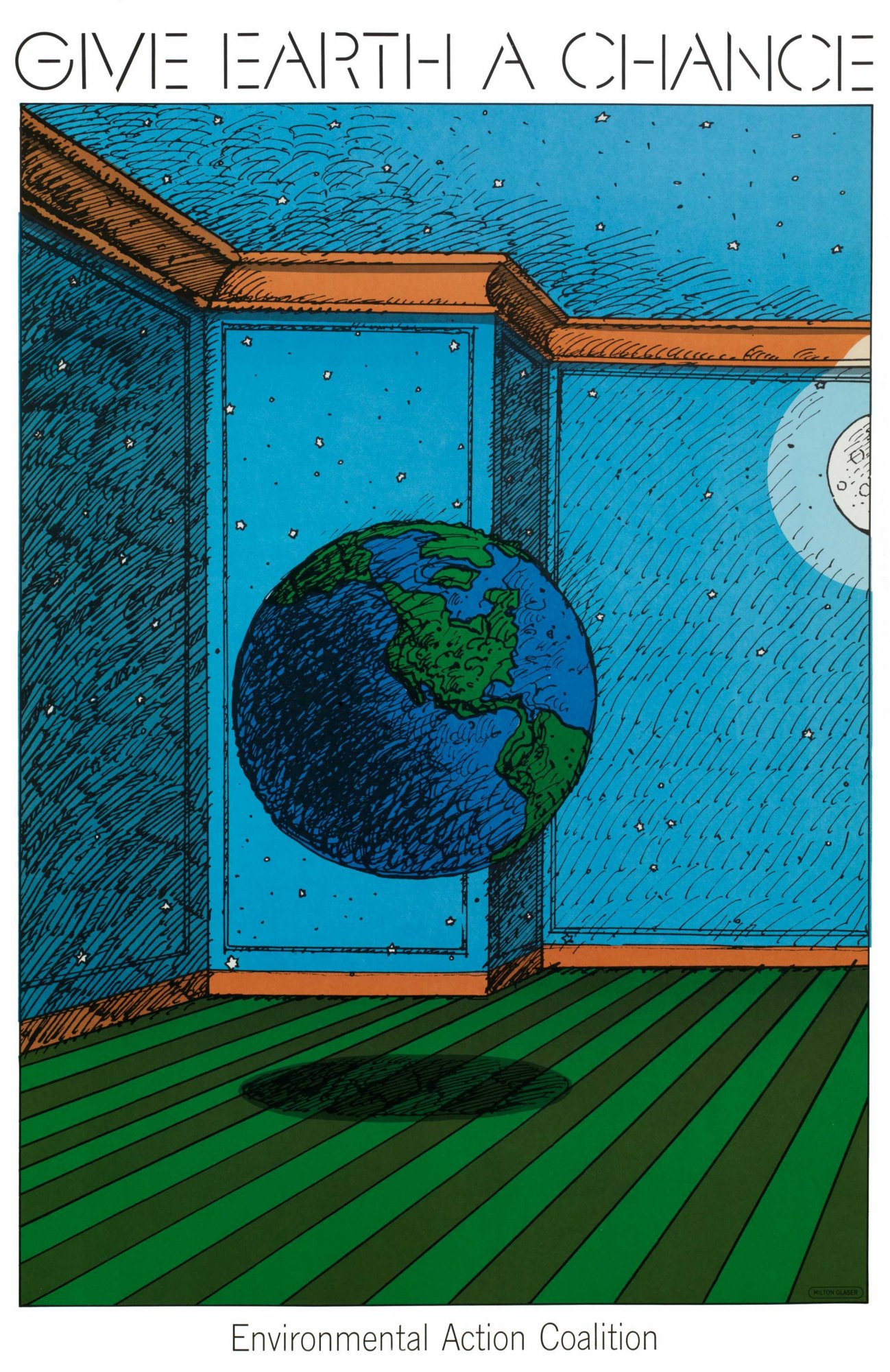
With the pieces that i have chosen for the gallery, I think they go together very well. They’re all posters, most of them being about music. When looking at all of the posters, i was trying to find a common theme. The common theme with these specific ones is that they’re all very vibrant in color. You can very clearly see the choices in color were really thought out in order to get the message across and I love the ones from the late 60’s because the colors just go along with the time period, i believe. These works are also spread across the time span of about 15 years so you can really see his growth in designing and where he’s going next in relation to color and subject matter and whatnot. The pieces from the 60’s are different from the 80’s ones but it reads as almost a timeline, i believe.
Part 1
Milton Glaser was well known for his poster and print designs along with typography later on. Born in 1929, Glaser went to the High School of Music and Art along with an art academy in Italy. Afterwards he co-founded Pushpin Studios in 1954 along with creating New York magazine and established Milton Glaser, Inc. in 1974, as well as teaming with Walter Bernard in 1983 to form the publication design firm WBMG. His iconic work can be found in permanent collections in many museums. His work ranges from famous logos, such as “I (heart) NY”, that are known around the world. He has created so many different things that you see every day and I think it’s kind of crazy. I actually own a shirt that has the “I heart NY” on it. He contributed so much in the design world but also in the education world by writing many essays about graphic design along with speaking about it in interviews. His ways of design and typography have taken over and are seen in packaging, logos, signs etc. His work is very influential to all current graphic designers because you can still see bits and pieces of his ways of working around even when being created by someone different.
Part 2
- He didn’t work in one specific field in graphic design, he has many different styles of visual works.
- Glaser and the Pushpin artists worked on designing things using simplified images that could function as symbols and signs.
- He had a willingness to experiment with many different types of design which lead to some of the most famous designs today.
Sources:
http://www.moma.org/collection/artists/2188?=undefined&page=1
http://www.miltonglaser.com/milton/#1
http://www.britannica.com/biography/Milton-Glaser
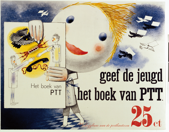
Piet Zwart was a Dutch photographer, typographer, architect, and graphic designer, however he referred to himself as a “typotekt” (typography and architect) because he built pages with type. He first attended The School of Applied Arts in Amsterdam where he was introduced to all of these disciplines but mainly developed himself because teachers were not always present. There was a social revolution after World War 1 which offered Zwart a new direction where he launched his graphic design career in 1919. He became the assistant of the influential Dutch architect HP Berlage and was given assignments such as designing a Christian Science Church and a municipal museum. At the age of 36 he created his first typographic work when asked to design stationary for Jan Wil’s office. Zwart felt strongly attahced to radical ideas which propagated an abstract utopian world, however he did not wish to surrender entirely to the dogmatic ideas of those he was working with and felt his work was too playful to be restricted. He began working with photography and learned how to achieve a balance between texts, photographs, and white space. In 1930 he was approached for the design of “The Book of PTT” which taught young kids how to use the Dutch postal service; Zwart wanted to make them curious and encourage self reliance. Each page was colorful and bright and exciting. He used photography and collages along with drawings and various types of fonts. After the publication of the book, he had been fired from the Rotterdam Academy of Fine Artsin 1933 after being explicit in sharing his thoughts on the redevelopment of Art Education. Piet was known for his indiscretion, he didnt stop working until 3 am, barely took vacations, and rarely left his desk. His work came to and end when he was arrested by German Soldiers in 1942 and held hostage with 800 other prominents. he mainly focused on industrial design after he was released and then died in 1977 at the age of 92. His versatility and influence on present day designers led the Association of Dutch Designers to award him with the title “Designer of the Century” in the year 2000.
“Among the few I have indicated, is there no dynamic man of action, the rebel who will help determine the aspect of the collective expression of tomorrow? Ponder this question and know that to make beautiful creations for the sake of their aesthetic value will have no social significance tomorrow, will be non-sensical self-gratification. Every era contains the conditions for providing a rebel.”
– Piet Zwart
Highlights:
- Worked in many disciplines but is known for his work with Graphic Design
- Made sure he didnt restrict his work to fall under specific categories; stayed true to himself and what he wanted to create
- Although he was a trained architect, he excelled with his work in typography and even more so when he learned how to add photography

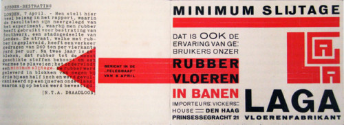
Piet Zwart, LAGA Rubber Flooring, 1923,
-
- Piet Zwart, LAGA Rubber Flooring, 1923,
-

-
-
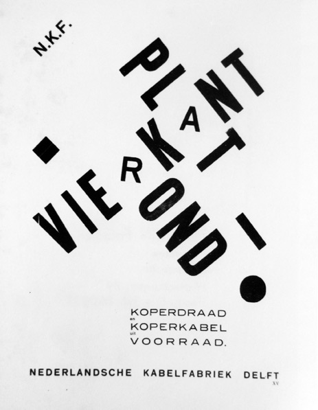
- Piet Zwart, Vierkant Plat Rond, 1926
-

-

-
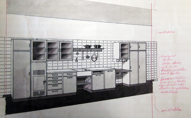
- Piet Zwart, Bruynzeel kitchen, 1937
-

-

-

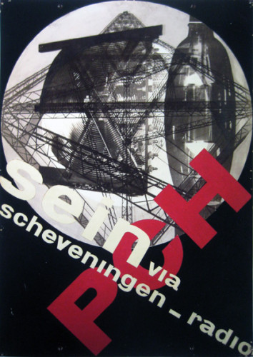
- Piet Zwart,Sein via Scheveningen Radio, 1929
-

-
-

- Piet Zwart, The Book of PTT, 1938
-

-
-
- Piet Zwart, Hot Spots, 1926
-

-
-

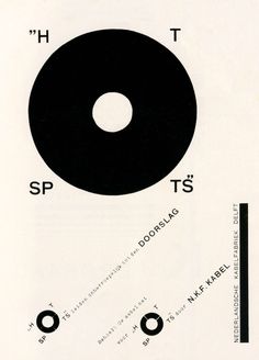
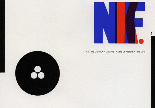
- Piet Zwart, NKF Catalogue, 1927
-

-

-

- Piet Zwart, Trio-Reclameboek, 1931
-

-
-
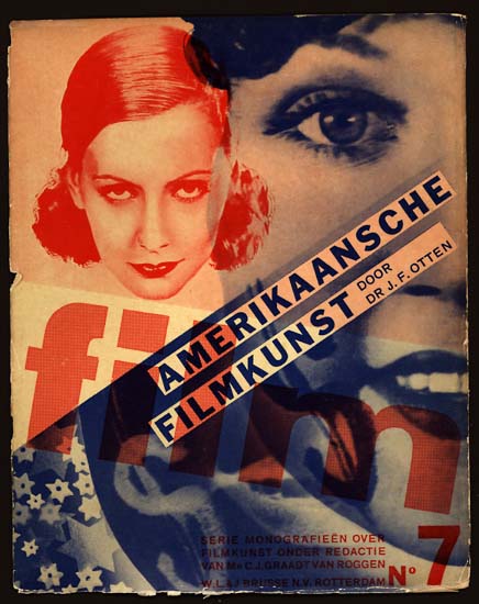
- Piet Zwart, SERIE MONOGRAFIEEN OVER FILMKUNST, 1931
-

-
-
- Piet Zwart, The Book of PTT, 1938
-

-
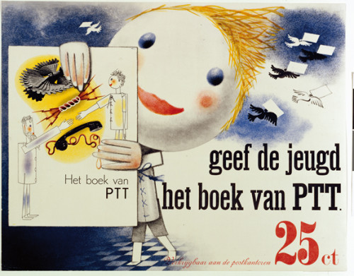
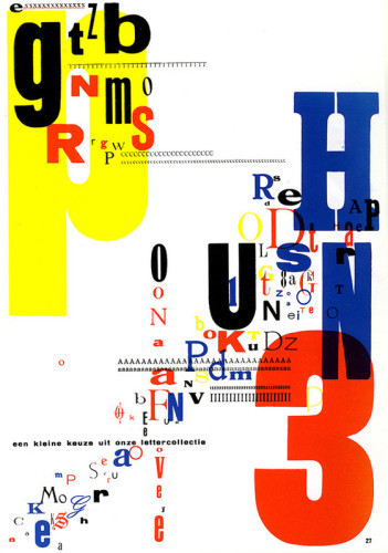
Piet uses mostly Primary colors in all of his works which are evident in all of these pieces. In some, such as The Book of PTT, he strays slightly from the Primary colors but not very far. He also likes to use cream or beige looking backgrounds which perhaps makes the colors pop more. Most of these works are works of typography where he favors block letters and in most cases they are overlapping or at a diagonal.
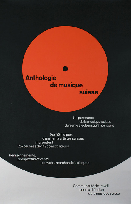
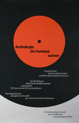
Joseph Müller-Brockmann, Anthologie de Musique Suisse,1965
-
- Joseph Müller-Brockmann, Anthologie de Musique Suisse,1965
-

-
-

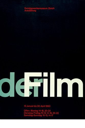
- Josef Müller-Brockmann, Der Film, 1960
-

-

-
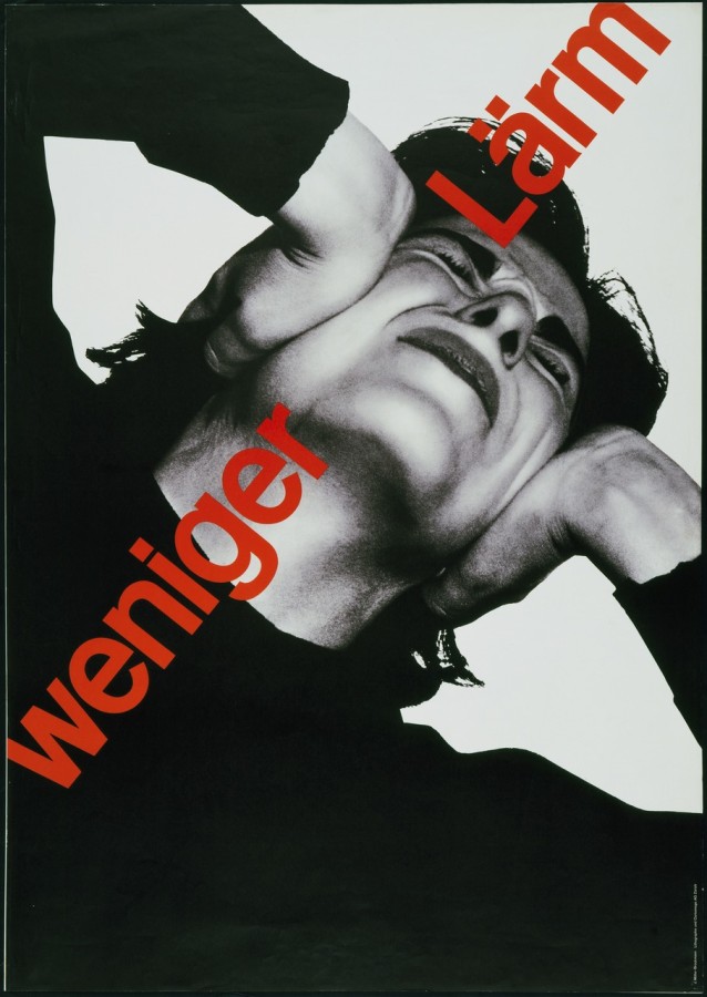
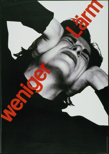
- Josef Müller-Brockmann, Weniger Lärm, poster, 1960
-

-

-
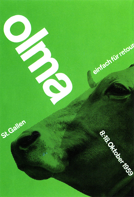
- Joseph Müller-Brockmann, Olma St. Gallan, poster, 1959
-

-

-

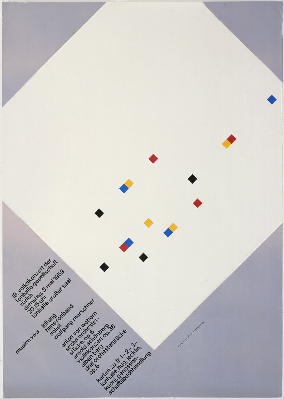
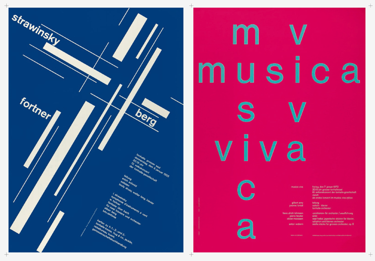
- Joseph Müller-Brockmann, Musica Viva, concert poster, 1958
-

-

-
- Joseph Müller-Brockmann, Musica Viva, concert poster, 1955
-

-

-

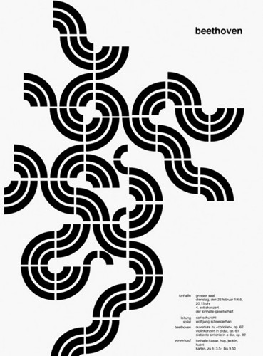
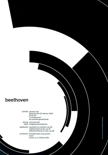
- Joseph Müller-Brockmann, Beethoven Concert poster design, 1955
-

-
-
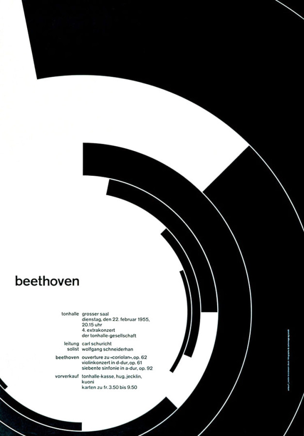
- Beethoven Poster, Josef Müller-Brockmann, 1955 (Zurich town hall poster advertisement), 1955
-

-

-

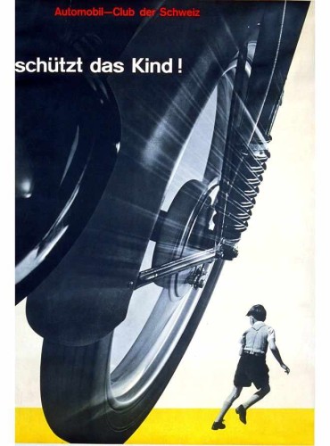
- Josef Müller-Brockmann: Poster for the Auto Club in Switzerland, 1955
-

-
-

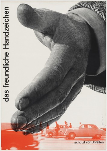
- Josef Müller-Brockmann, Das Freundliche Handzeichen, Schützt vor Unfällen, 1954
-

-

About the Gallery
The works designed by Joseph Muller-Brockmann for the Then Here and Now Exhibition are organized in chronological order based on the year Muller-Brockmann designed them. The collection begins with his earlier works, in which were more graphic than his later more iconic “swiss style” works he became extremely well known for.
About the Designer
Josef Muller-Brockmann was a well-known twentieth century Swiss graphic designer. Besides working as a graphic designer, Muller-Brockmann was a teacher, as well as studied design, architecture, and art history. Muller-Brockmann was born May 9, 1914 in Rapperswill, Switzerland. He studied architecture, art, and design at the University of Zurich and the University of Kunstgewerbeshule. He began his design career with an apprenticeship to a designer and advertising consultant named Walter Diggleman. After his apprenticeship with Diggleman, Muller-Brockmann opened his own studio in Zurich in 1936, in which he specialized in graphics, photography, and exhibition design. Throughout his career as a designer Muller-Brockmann was inspired by the ideas of Constructivism, De Stijl, Suprematism, and the Bauhaus, which eventually led him to his creation of a universal graphic expression that applied a grid based design exclusive of subjective feeling and unnecessary illustration. After two decades of working in his studio, Muller-Brockmann became known as Switzerland’s leading specialist and theorist of “Swiss Style” (a graphic design style developed in Switzerland in the 1950s that emphasizes cleanliness, readability and objectivity.) His work easily connected to the audience of his time period due to his simple designs and neat use of typography. Muller-Brockmann’s work has a unique way of grabbing attention without the use of flashiness or unnecessary imagery. His methodology was simple, he would look at everything he encounters in his designs in a critical light, then at all times he would remain self critical. Today, Muller-Brockmann is seen as one of the most well known Swiss designers of all time.
Signature Points
1.Leading specialist and theorist of Swiss Style (a graphic design style developed in Switzerland in the 1950s that emphasizes cleanliness, readability and objectivity.)
2.Created a universal graphic expression that applied a grid-based design exclusive of subjective feeling and unnecessary illustration.
3.Simple designs and neat use of typography. His work has a unique way of grabbing attention without the use of flashiness or unnecessary imagery.
Links
http://www.famousgraphicdesigners.org/josef-muller-brockmann
http://www.designishistory.com/1940/joseph-mueller-brockmann/http://www.eyemagazine.com/feature/article/reputations-josef-muller-brockmann
Lester Beall

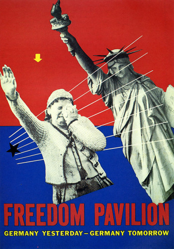
Lester Beall, Unbulit Freedom Pavilion, 1939
-

- Lester Beall, Unbulit Freedom Pavilion, 1939
-

-
-

- Lester Beall, A Better Home, 1947
-

-


-

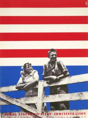
- Lester Beall, Poster for the Rural Electrification Administration,1934
-

-
-

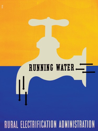
- Lester Beall, Running Water, 1937
-

-

-
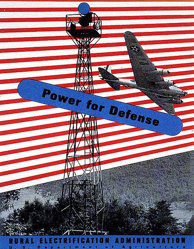
- Lester Beall, Power for Defense, 1937-1941
-

-

-
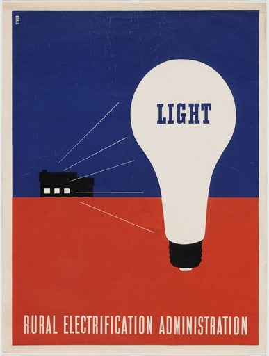
- Lester Beall, Light, 1937
-

-

-

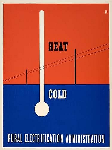
- Lester Beall, Heat-Cold, 1937
-

-
-

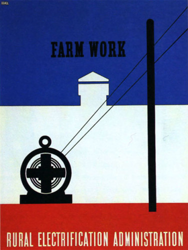
- Lester Beall, Farm Work, 1937
-

-
-

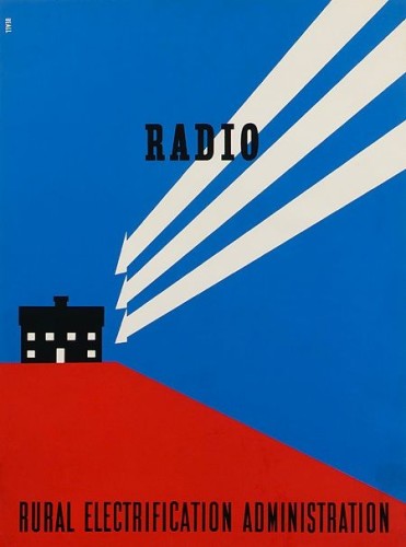
- Lester Beall, Radio, 1937
-

-
-
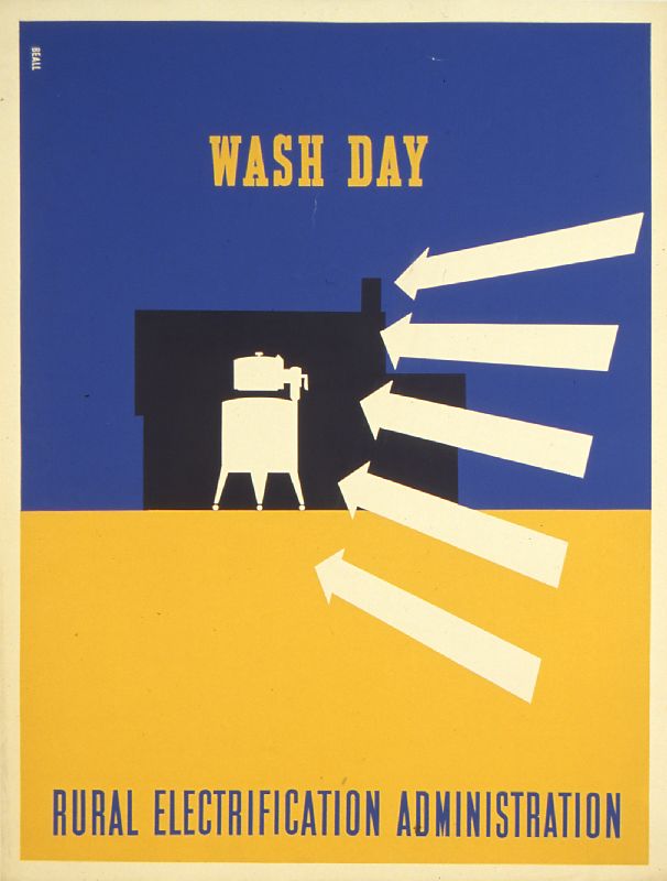
- Lester Beall, Wash Day, 1937
-

-
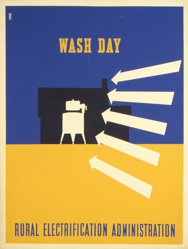
The general relationship between these designs are easily recognizable. Each one is done with primary colors (mostly red and blue). They all contain parallel and diagonal lines to create a well organized design and help the viewer’s eyes flow off the page. They each convey a message about the American life or technology that we use. His typography is very clear and concise and has the title of each print in each design. He worked with the Rural Electrification Administration and the government to help communicate with the American people. It was either good advertisement or to open his viewer’s eyes to see what was really happening in American society.
Part 1:
Lester Beall was born in 1903 in Kansas City, Missouri. He was a notable American Graphic Designer. He was mainly known for his clear precise use of typography, as well as his bold use of primary colors, lines, and arrows. It became such a well known style of his that when someone saw his work, it was easily recognizable. Beall as a young child spent most of his time in St. Louis and Chicago. He graduated the University of Chicago and began his design career in 1927. His work was quickly discovered. Each one of his designs delivered an “arresting message”. He had a thrusting perspective and abstract shapes that made his posters stand out. In 1937 he got his work exhibited in the Museum of Modern Art in New York where he moved to in 1935 and opened his own studio/office. His work demonstrated the rapid change in American culture and society. He wanted to find a way to communicate the expanding world of science, technology, and manufacturing in America and how it has brought rising expectations that called for a new graphic imagery / design. He died in New York in 1969 in his farm where he lived with his family. In my opinion Beall’s work is very simple, but effective. His work showed me that you don’t need complex designs to create a good design. I enjoyed going through his work and seeing how he tried to communicate with his audience.
Part 2:
- Being simple can sometimes be the best form of design
- Every design must convey a message as well as an emotional reaction.
- The way he used lines, arrows, primary colors and abstract shapes gave him his signature style.
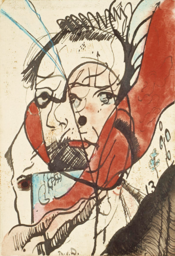
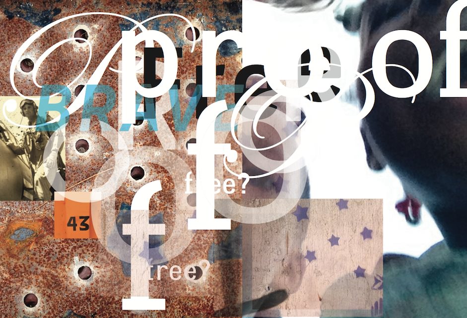
These are the 10 works I chose of David Carson. I selected a range from his portfolio website from 2011-2015. I want to focus on his most recent works and their style. How he focuses on providing the message rather than a readable image.
asian branding logo 2013
asian branding logo 2013
-
- asian branding logo 2013
- asian branding logo 2013
-

-

-
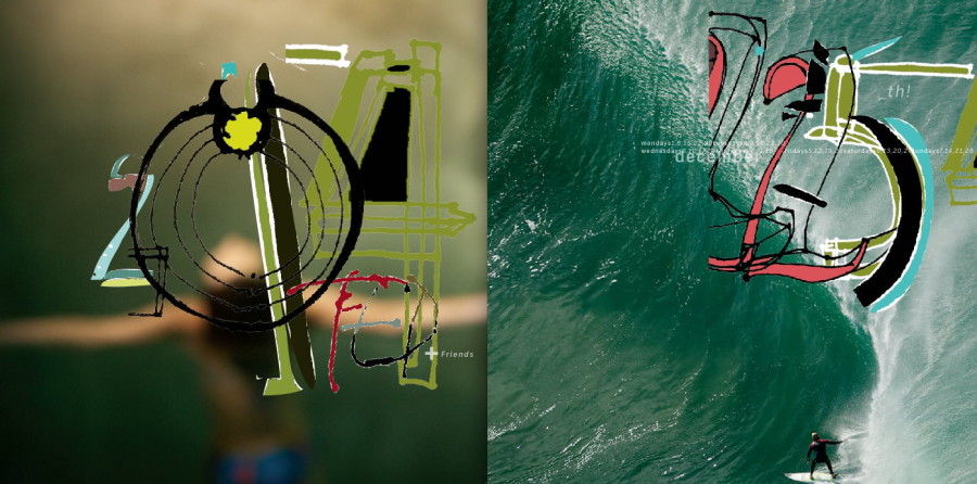
- Page design for a surf photographer 2014
- Page design for a surf photographer
-

-


-

- Smithsonian Commission 2014
- Smithsonian Commission
-

-

-

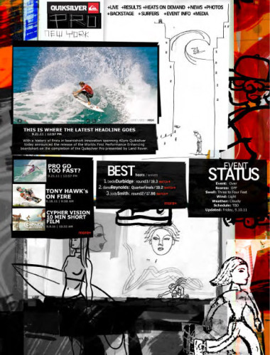
- samsung broadcast
- samsung broadcast
-

-

-

- Dali museum exhibit 2011
- Dali museum exhibit
-

-


-

- A.I.G.A Austin Lecture Poster 2014
- A.I.G.A Austin Lecture Poster
-

-

-
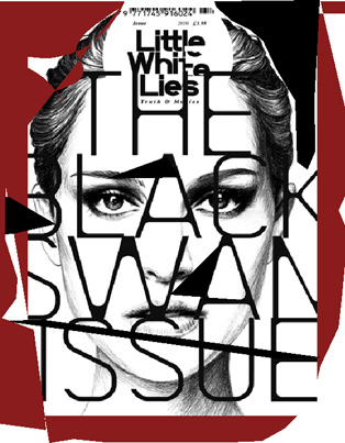
- Cover of “little white lies” 2011
- Cover of “little white lies”
-

-
-

- the creativity 50
- the creativity 50
-

-
-

- japan website 2013
- japan website 2013
-

-
-

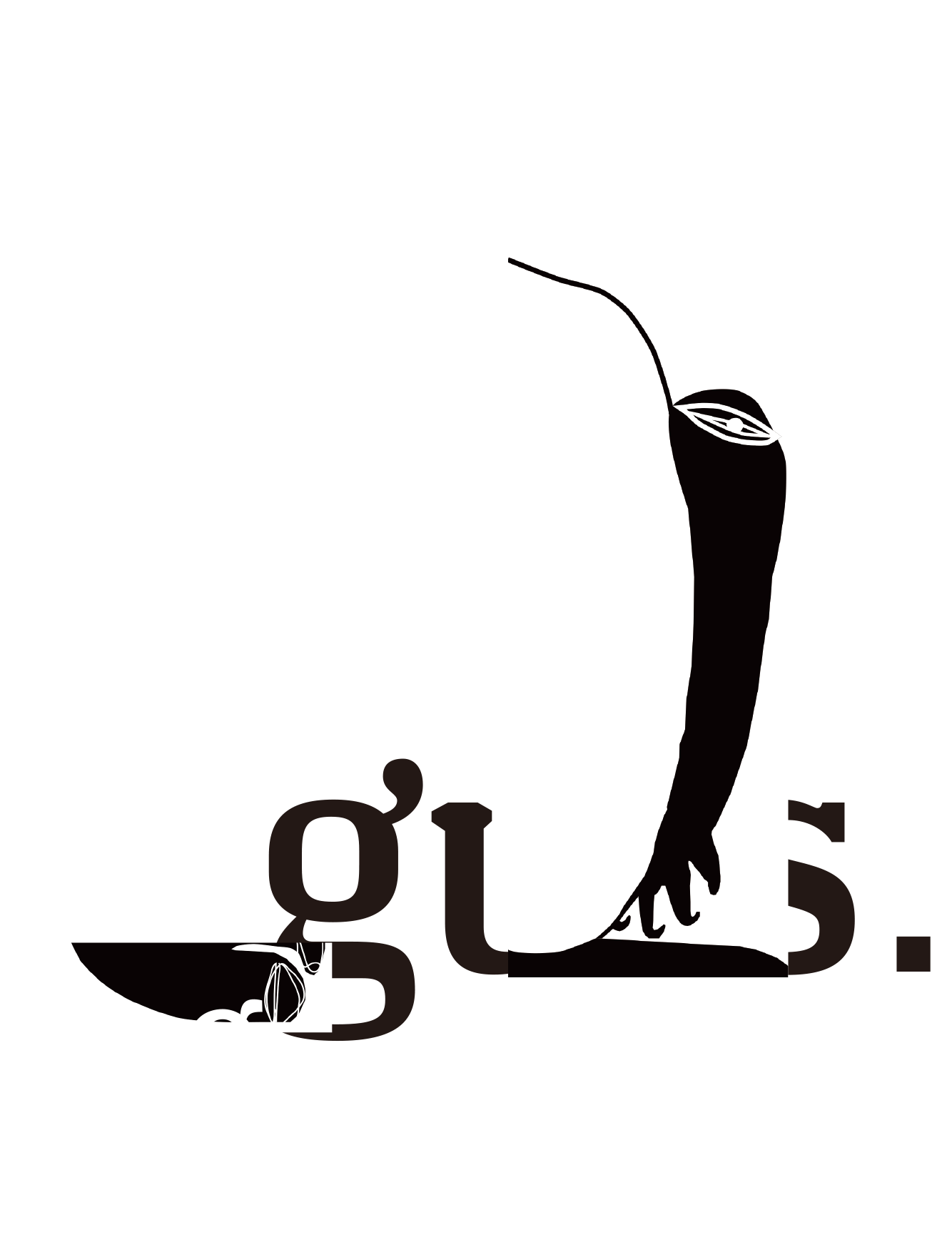
- guts_poster_for_madfest_2015
- guts_poster_for_madfest_2015
-

-

Images source: David Carson’s website
~Todd Gaunt
old below
David Carson is a very influential American graphic designer that works mostly with typography in images to create a stunning picture. Graphic Design was not his first calling however, he was originally educated to be a high school teacher and only after he took a 2-week design class at the age of 26 did he discover his passion. Carson has a unique style that influences many designers that try to make something “pop” or attention grabbing. He often overlaps text and images to pull a viewer in, with some large or clearer text that grabs their attention first. He started his work designing for a small surfing magazine and drew attention from designers and fans with his works. He would use modified typefaces and unique images that mixed together to form a whole composition. This style has been studied and found to appeal to youth for its strong colors and busy design. Although sometimes hard to read, Carson’s style is easy to follow and the text flows elegantly.
Hightlights:
- His work focuses on type and imagery
- His work appeals to youth
- Started graphic design work relatively later in life.
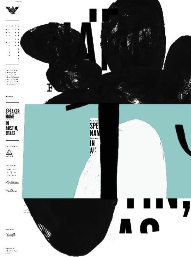
A.I.G.A Austin Lecture Poster
A.I.G.A Austin Lecture Poster 2014
-
- A.I.G.A Austin Lecture Poster 2014
- A.I.G.A Austin Lecture Poster
-
-
-
- Cover of “little white lies” 2011
- Cover of “little white lies”
-
-
-
- Dali museum exhibit 2011
- Dali museum exhibit
-
-
-
- Page design for a surf photographer 2014
- Page design for a surf photographer
-
-
-
- Smithsonian Commission 2014
- Smithsonian Commission
-
-
Information source: http://www.britannica.com/biography/David-Carson
Images source: http://www.davidcarsondesign.com/
~Todd Gaunt
Part 1
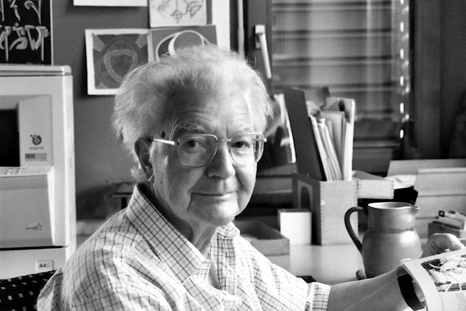
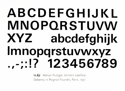
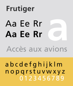
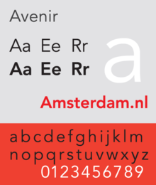
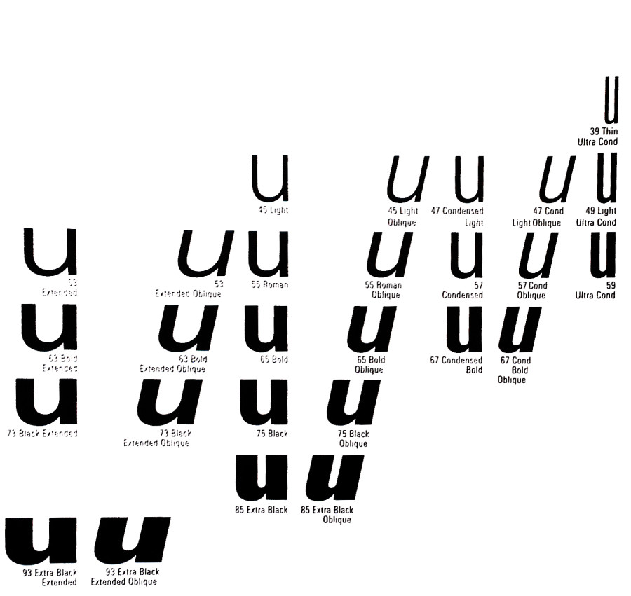
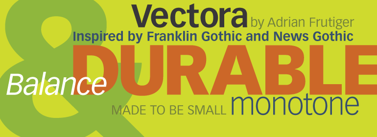
Adrian Frutiger was a Swiss designer of typeface. He was born on May 24, 1928 and died very recently on September 10, 2015 at the age of 87. Frutiger graduated from the School of Applied Arts in Zurich in 1952. After high school, he spent most of his career working for Deberny & Peignot in Paris and became their artistic director. His job was to update and change typefaces through the 20th to the 21st century. He prepared them for photo-typesetting, and created his own typefaces. He designed around 40 typefaces himself. He created Univers, which we have used in class recently on a project, which I thought was pretty interesting. Some of his other well known typefaces are Frutiger, Egyptienne, Serifa and Avenir. It’s wonderful that today we still use his fonts and they are still advertised all over the world. In the 1970’s, he designed a typeface for the Paris Charles de Gaulle airport (Frutiger). He was a professor at the Ecole Estienne for 10 years and spent 8 years at the Ecole Nationale Supérieure des Arts Décoratifs, Paris. His career spanned through three eras, including the hot metal, phototypsetting, and digital typesetting.
Part 2
Frutiger once said, “A letter follows the same canons of beauty as a face: A beautiful letter is in perfect proportion. The bar of a ‘t’ placed too high, the curve of an ‘a’ too low, are as jarring as a long nose or a short chin.” This made me think that although nothing is perfect, there are attractions to each letter as there are a face.
Frutiger paid attention to the inside of letters as well as the letter itself, which is what made each letter a little different, or showed the different of an “O” and a “0” (zero).
One of his most known hallmarks is the square dot over the lowercase “i”, which makes it look different from an “l” or “I”.
Part 3

Frutiger, Univers Typeface, 1957
-

- Frutiger, Univers Typeface, 1957
-

-
-
- Frutiger, Egyptienne, 1956
-

-
-
- Frutiger, Frutiger, 1975
-

-
-
- Frutiger, Avenir, 1988
-

-
-

- Frutiger, Humanist, 1976
-

-
-
- Frutiger, Univers, 1957
-

-


-
- Frutiger, Vectora, 1990
-

-

-
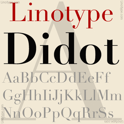
- Frutiger, Linotype Didot, 1991
-

-
-

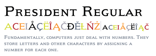
- Frutiger, President, 1954
-

-
-

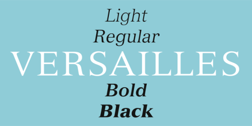
- Frutiger, Versailles, 1982
-

-
Frutiger did not like purely geometric designs. In Frutiger’s work with typeface, he uses weights in the typefaces. For example, with Univers, he uses a weight scale with numbers, rather than names. He used numbers so that the typeface could be translated through the world, as different sizes had different names in different countries. The family of letters would have multiple widths and weights all following a certain form of letter. Frutiger also stated in an interview (on eye magazine) that “my main life’s work was designing sans serif typefaces. It is much more difficult to draw a grotesque than a roman face – much can be covered up with serifs in the latter. The grotesque is like the body of a fish, it is so smooth that no mistake can be allowed to happen!” He really loved using serifs in many of his fonts to make them easier to read.
Sources
-
Classroom
-
-
Recent Posts
Recent Comments
- Danielle Vizard on Thinking with Type — TEXT
- Danielle Vizard on Digging’ It!
- Jenna on Thinking with Type — TEXT
- Jenna on Digging’ It!
- Elizabeth Robinson on Digging’ It!
Archives
- November 2023
- August 2023
- May 2023
- April 2023
- March 2023
- February 2023
- January 2023
- December 2022
- November 2022
- October 2022
- September 2022
- August 2022
- July 2022
- June 2022
- May 2022
- February 2022
- December 2021
- November 2021
- October 2021
- September 2021
- August 2021
- June 2020
- February 2018
- December 2015
- November 2015
- October 2015
- September 2015
- August 2015
Categories
-
About
KSC GRAPHIC DESIGN

Leave a Reply
You must be logged in to post a comment.