- Ê
- Â
5 GD History
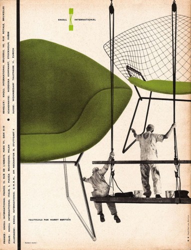
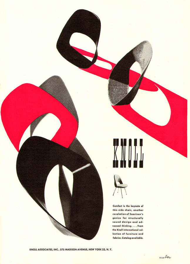
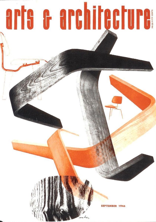
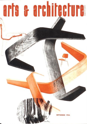
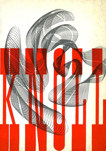
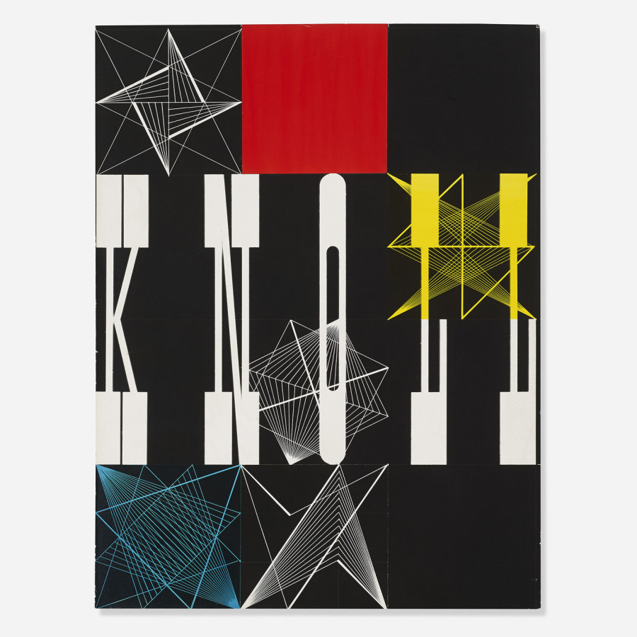
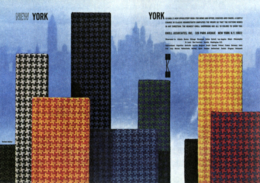
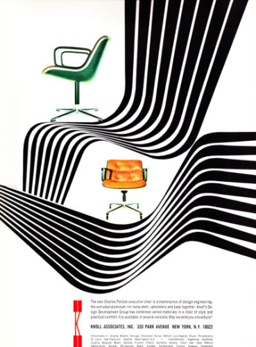
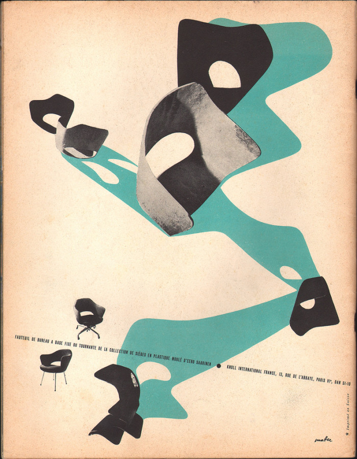
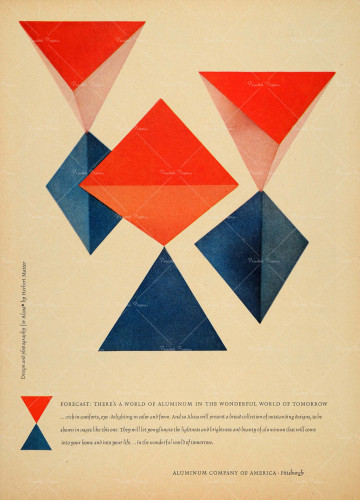
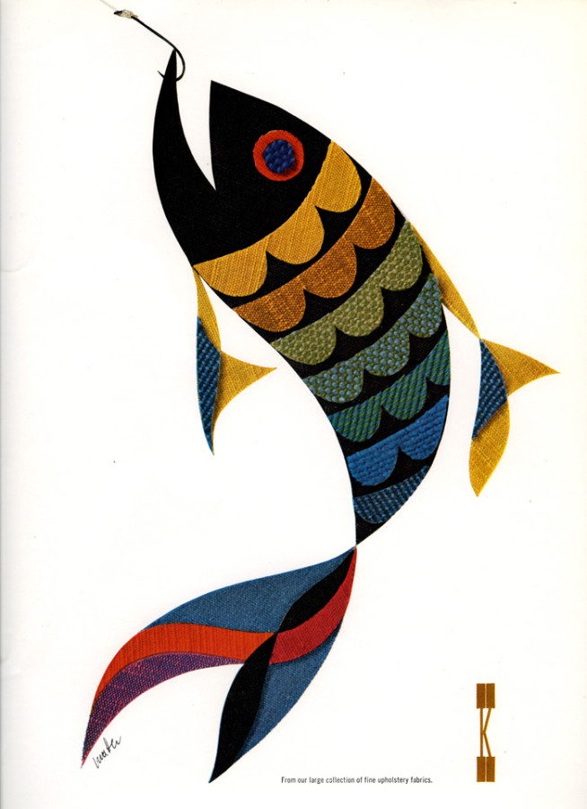
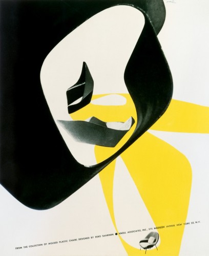
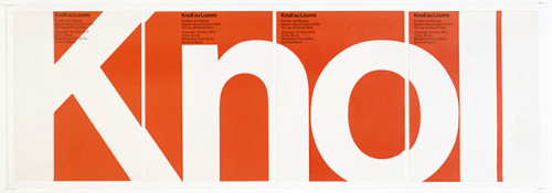
Herbert Matter, Knoll Vintage Ad, 1946
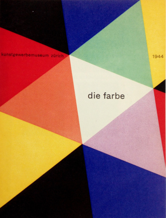
I chose these works by Herbert Matter because these are some of his famous pieces that he did for the company Knoll Associates. He is very well known for these unique works of art. Coming to the US in 1936, 8 years later in 1944, he became the designer and advertiser consultant at Knoll, molding its graphic design identity for 12 years. As Alvin Eisenman, head of the Design Department at Yale and long-time friend, points out: “Herbert had a strong feeling for minute details and this was exemplified by the distinguished typography he did for the Knoll catalogues.” I enjoy looking at these because his color themes always flow and work together really well. What I noticed is that he usually uses the basic complementary colors, yellow, red, blue, green etc… His work makes you feel calm when you look at it.
Old Post
Herbert Matter was a Swiss-born American photographer and graphic designer. He was born in 1907 in Engelberg, Switzerland. In 1925, at the age of 18, he got an education at the École des Beaux-Arts in Geneva studying painting, but after two years he went to Paris to continue his education at the Académie de l’Art Moderne As he wanted to explore his artistic ability more, he became well-known during the 1930s when he made travel posters for the Swiss National Tourist Office in Zürich. These posters were among the earliest effective uses of photomontage, which is the technique of constructing a picture from parts of more than on photograph. He came to America in 1936, and as a skilled photographer he worked for Harper’s Bazaar, Vogue, and many other magazines, and New York ad agencies. During World War II he was commissioned by the US government to design propaganda posters. In 1944, he even became the design consultant at Knoll, molding its graphic identity for 12 years. He even worked with famous designers such as Charles and Ray Eames. Not only did he do all of that and much more, he was also familiar with film as he directed a film for his friend in 1952. As a master at what he did, he began teaching design and photography at Yale University in 1952, and continued to teach until 1976. Herbert Matter passed away in the spring of 1984 in Southampton, New York.
I found this artist to be extremely talented and interesting as he had such a natural ability in almost all aspects of art. Matter had such a keen sense of collage and skillful typesetting that made his work so put-together and nice to look at. His graphic work cleverly fused the severity of Swiss style with American pop culture. He used every method available to accurately achieve his vision of texture, light and form. His color choices and themes were always on point and his style was always fresh and interesting.
- The designer’s innovative and experimental work helped shape the vocabulary of 20th-century graphic design.
- He was a master of using photomontage, color and typography in an expressive manner, transcending the boundaries between art and design.
- His work often involved manipulating negatives or cropping and retouching images in unexpected ways, and his subjects included portraits, nudes, landscapes, and still lives.
- Gallery:
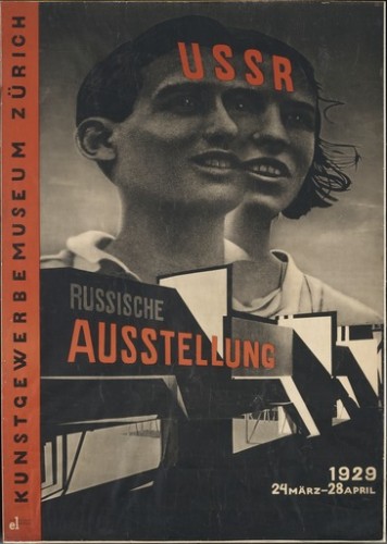
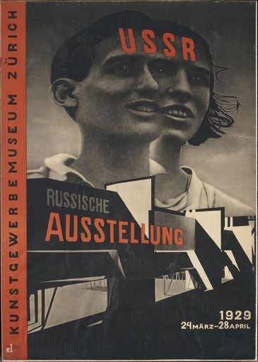
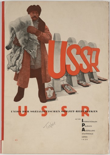
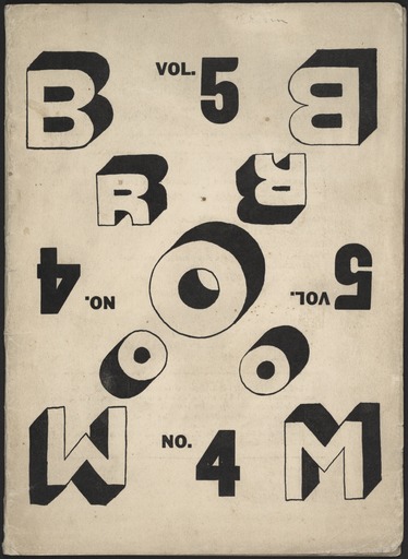
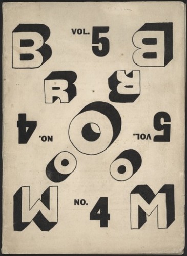
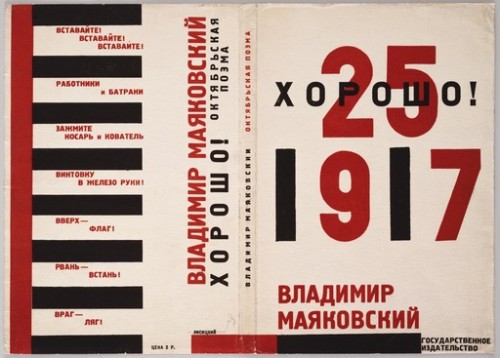
El Lissitzky, Russische Ausstellung, 1929
2. Gallery Paragraph:
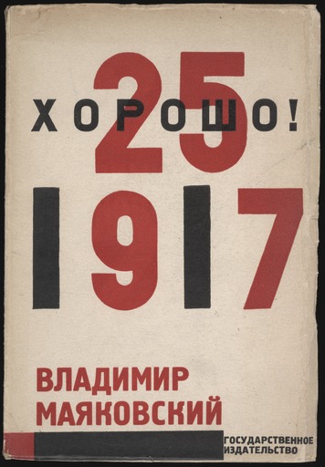
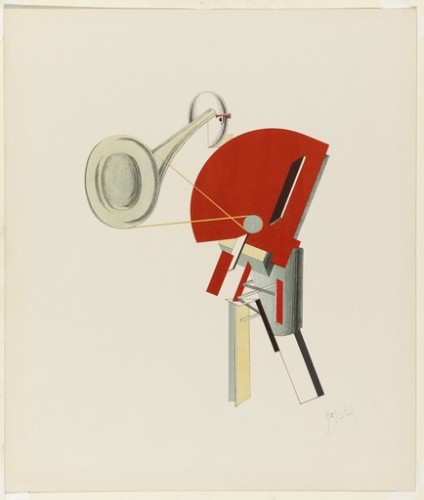
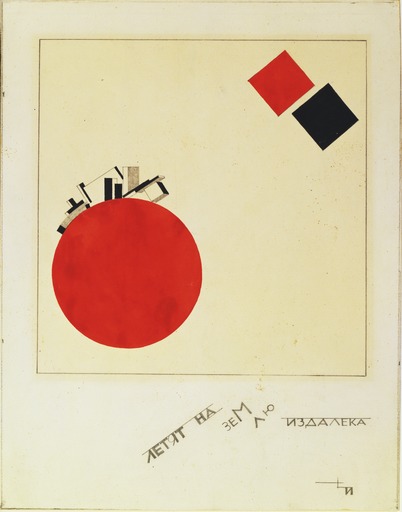
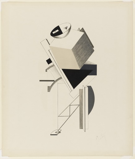
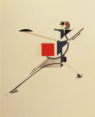
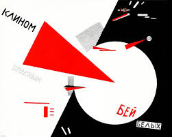
After researching El Lissiskty, I have learned a lot about his style and attributes to society through his work. His base was surrounded by the fundamentals of architecture. Most of his bombing career was during the start of World War I, the Russians used him to create propaganda. He created “prouns”, which majority of his work is titled as. El work is linked through the use of geometric shapes to create objects and or symbolizes a bigger picture.
3. Old Bibliography:
El Lissitzky, a Russian native, architect, typographer, photographer, and painter. In his earlier work was centralized around Jewish themes and culture, but that changed. During this time in history the rise of World War I was approaching. Most of his work was for Soviet propaganda, which was a key contributor to the Soviet Union’s rise of power and brainwashing of it’s own people. That’s why much of his earlier work includes red; red symbolizes communism. One of his approaches would be to use abstract geometric shapes to define the “spatial relationship of his compositions. His approach was to create 3-D environments in which 2-D geometry shapes could co-exists in contrast to that space. Lissitzky’s limited primary color palette, black and white, geometry shapes, and limited typography were foundation work for graphic design. Architect was his favorite expressive art, he liked the structure that he could create, especially the use of “horizontal skyscrapers”. His work always had a bold message, you can see in his work that there is flow, structure, and spaces awareness within his pieces. After researching El Lissitzky I feel that I will personally carry some of his design techniques into my own work!
4. Significant Points:
1. He used 3-D environments with the placement of 2-D objects
2. He called certain pieces of work “prouns”, project for the affirmation of the new in Russian
3. Most of his career was during the period of Russian propaganda
5. Sources:
Gallery
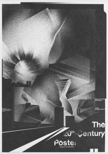
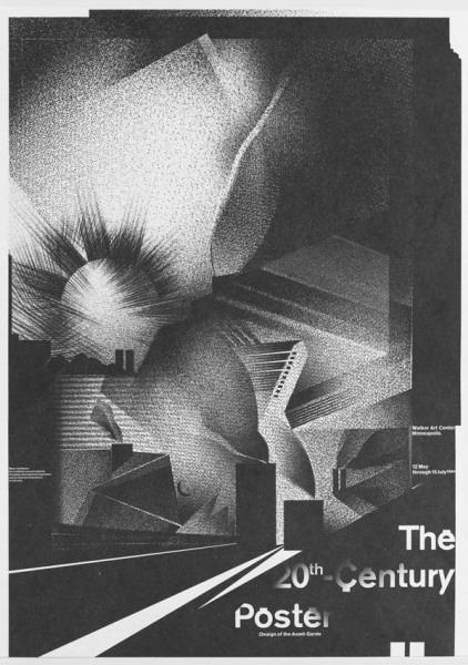
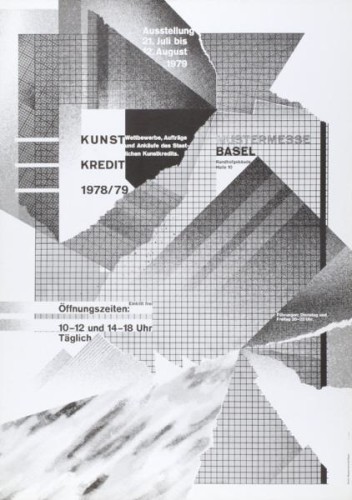
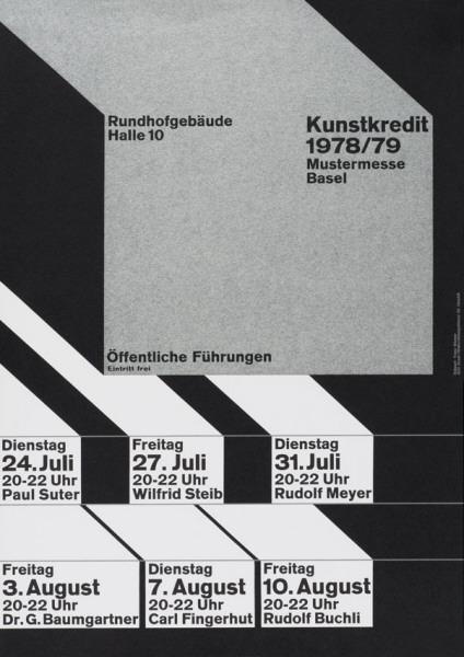
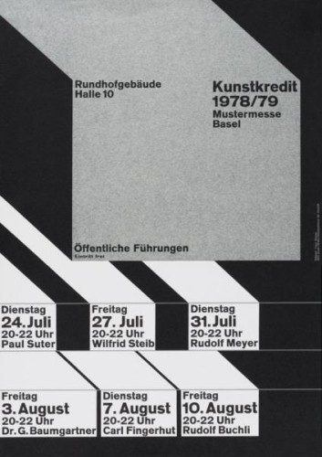
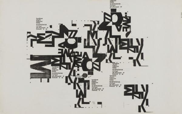
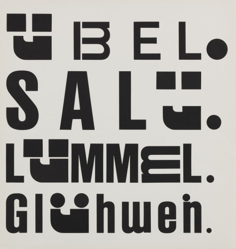
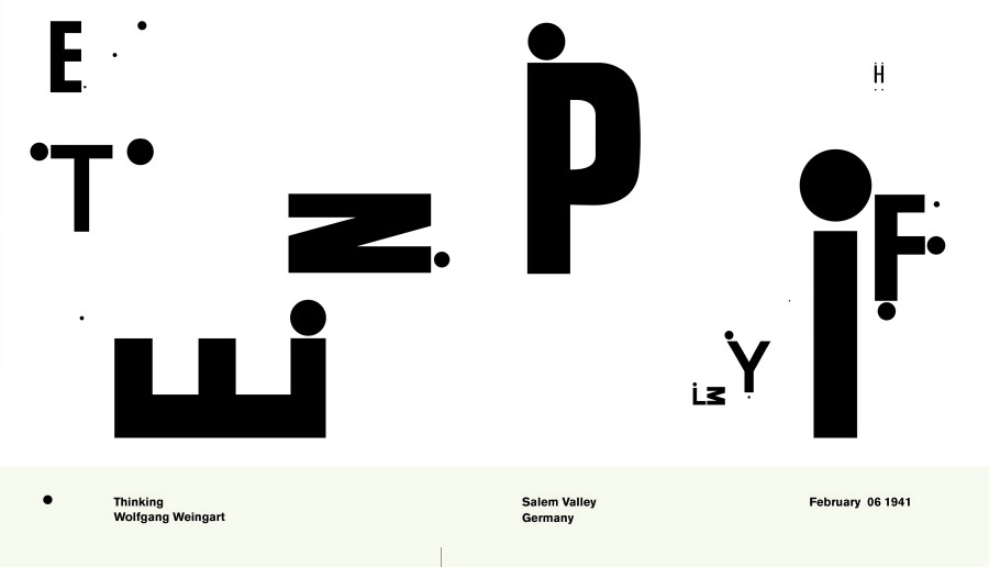
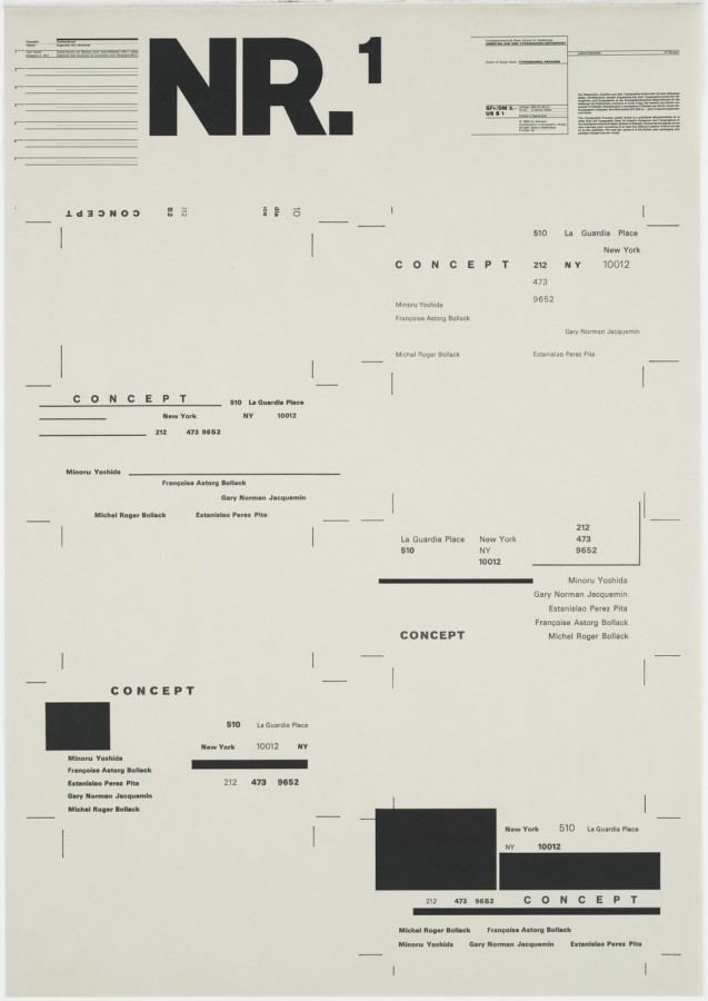
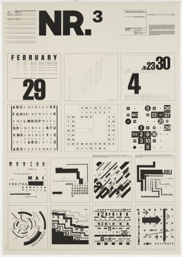
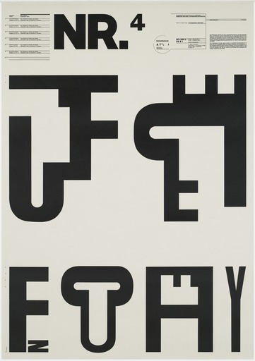
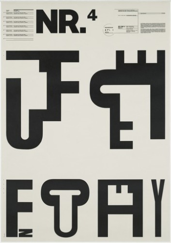
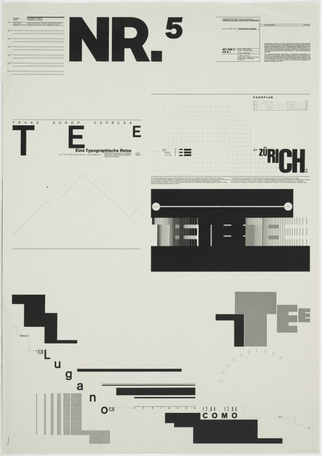
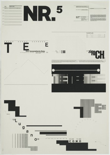
Wolfgang Weingart, The 20th Century Poster, 1984
About the Gallery
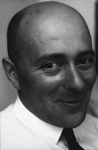
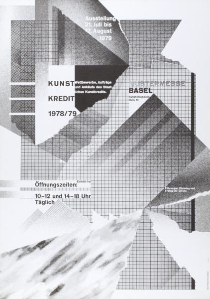
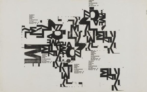
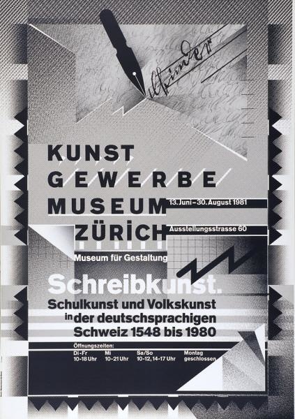
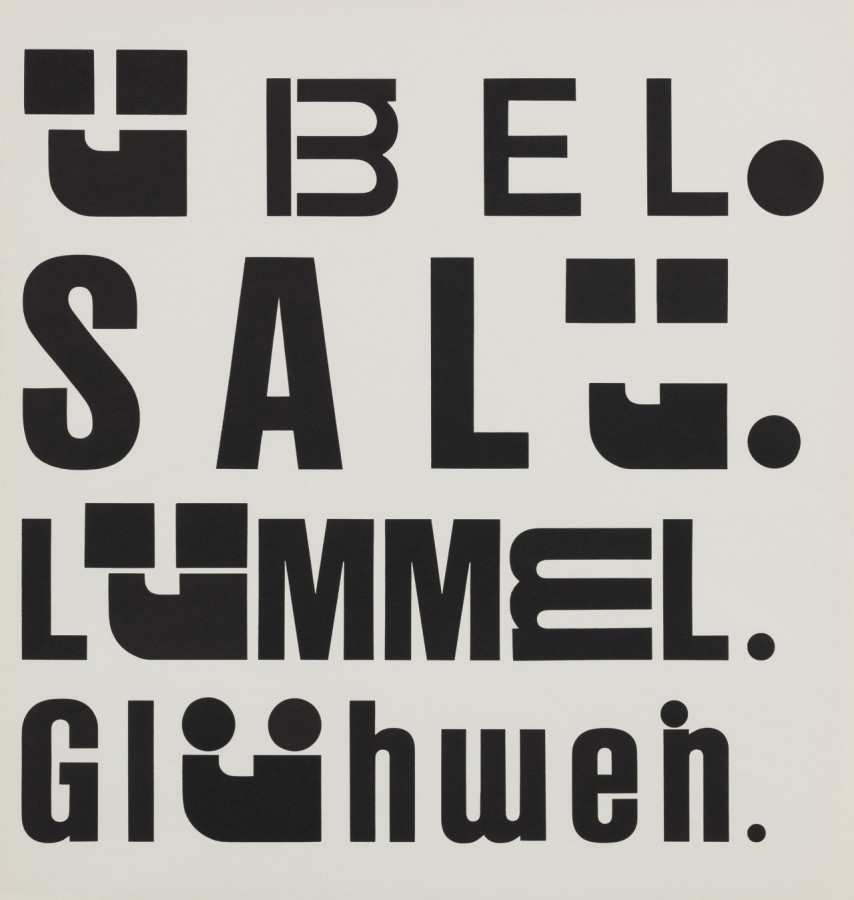
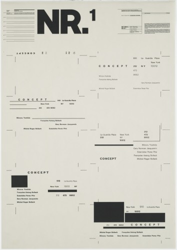
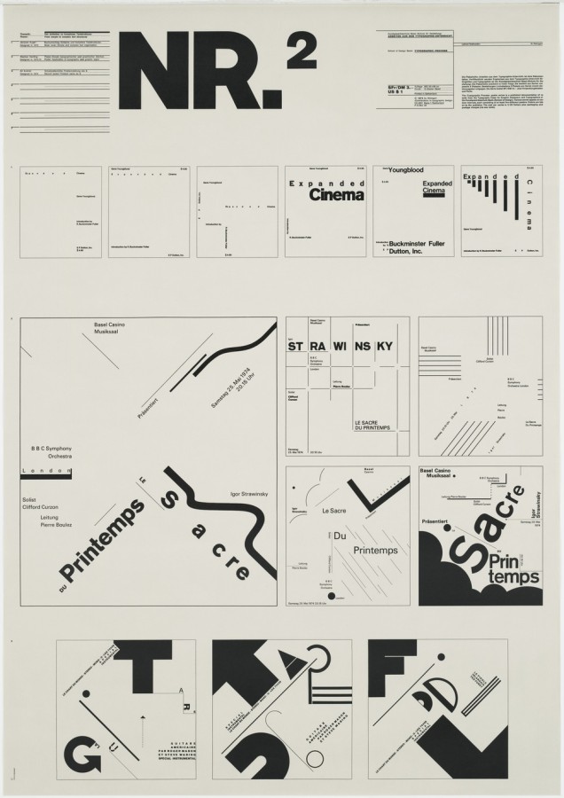
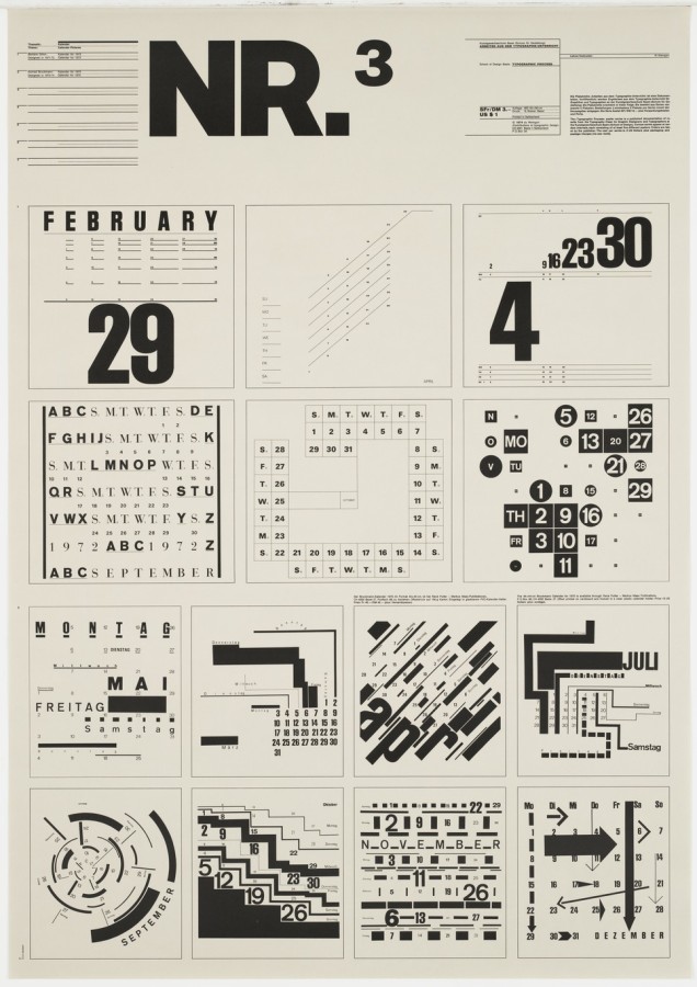
Wolfgang Weingart has found a way to break the rules of traditional Swiss typography and still make it look crisp. Although he uses sans serif fonts like the traditionalists, and works on a grid, he does so in new, dynamic way. His works exemplify disorder yet also have an asymmetrical balance to them. Throughout his works he combines letters in order to create an interesting array of abstract shapes. The strong use of black and white in most of his works lends itself to simplicity and focus. The distraction of color isn’t there to take away from the elegant and remarkable letter combinations. Having an internship as a typesetter allowed Weingart to physically interact with the letters and give him a better understanding of how they could work together.
Biography
Wolfgang Weingart is a graphic designer who is most noted for his exploration of typography. In 2013 he was awarded one of the most prestigious awards in the graphic design field, the AIGIA Medal. Weingart was born in Germany, 1941. At the age of 17 he started school, pursuing design at Merz Academy. After a two year program he took on a three year apprenticeship with Ruwe Printing. There Weingart started to develop his own style. He had a carelessness about his work that was consistent enough to turn into its own sector of Swiss Typography known as, Swiss Punk and New Wave type. After gaining attention for making innovative decisions during the internship, Weingart went on to teach and also practice at the Basel School of Design.
Traditional Swiss Typography was primarily concerned with the legibility of the type but Weingart thought of it much differently. He thought that if the text didn’t catch your eye or have any sort of concern with aesthetics than nobody would read it anyways. Weingarts mission was to create legible text that would be visually captivating. He found that his typesetting internship influenced him to use unconventional methods for printing and creating compositions. He broke the tradition of having perfect 90 degree rules and created what he believed to be more elegant and abstract. While teaching, Weingart even instructed that students work by hand and not on a computer when first exploring ideas. A tactile approach netted a better understanding for the students and even Weingart himself. If a person couldn’t draw and only knew the technical side of design then Weingart believed that they would never be able to completely understand and create a successful design.
Signature Points
- An internship where Weingart had to physically typeset led him to take a more tactile approach which had a profound influence on his methodology.
- Type has to be exciting enough to capture the attention of the audience but also legible enough to have clear meaning.
- Although he had a rebellious style he knew how to handle the problems of typography and could control himself when working for specific clients that needed clean and traditional type.
References
AIGA Medal Article
Keith Tam on Weingart
Weingart Magazine Interview
Poster Index
Type Token Posters
MoMA Gallery
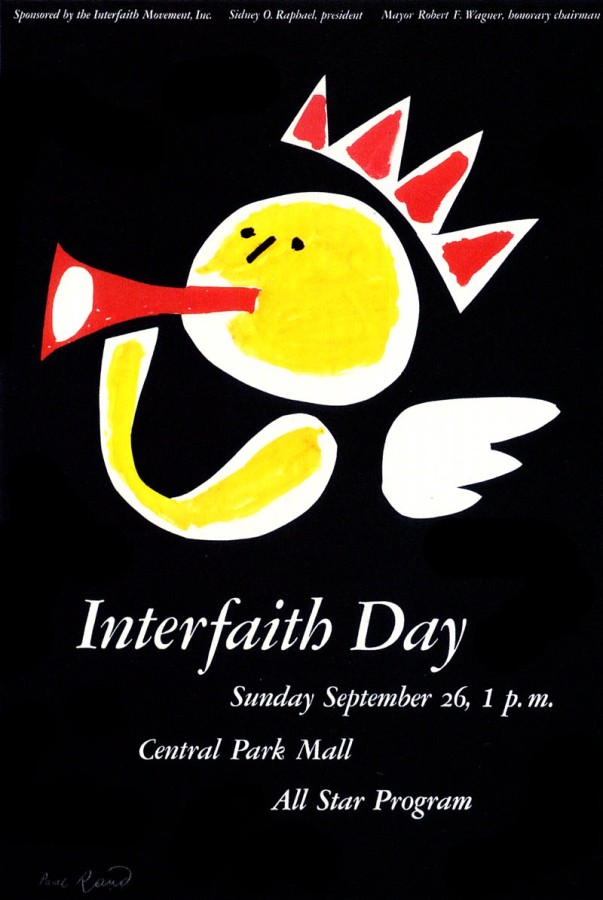
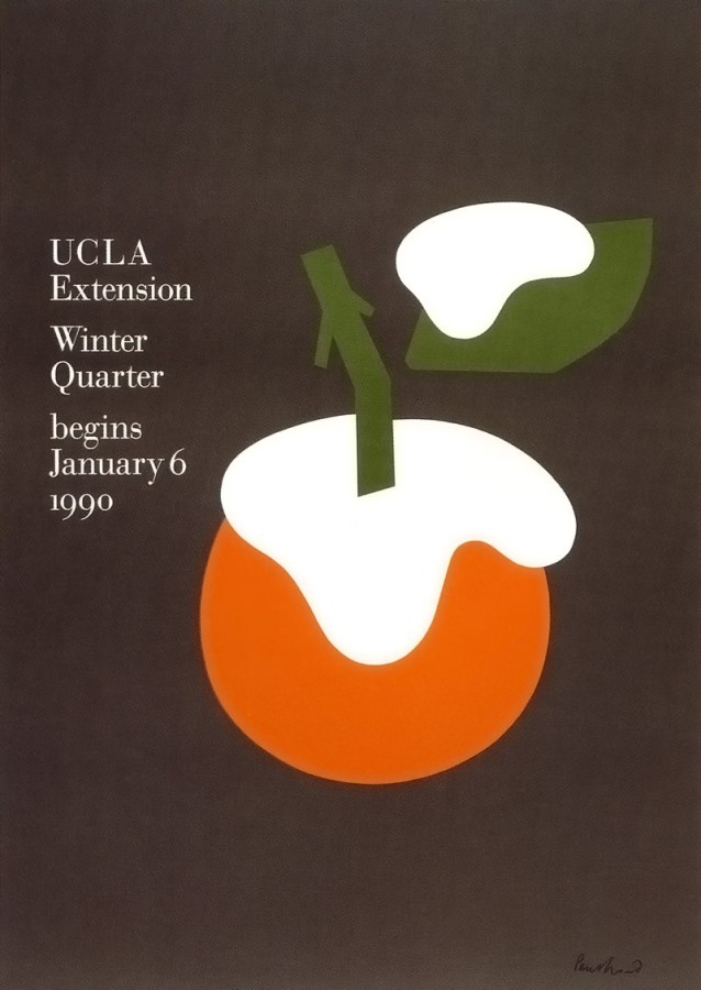
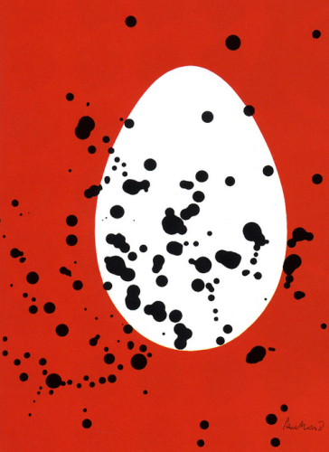
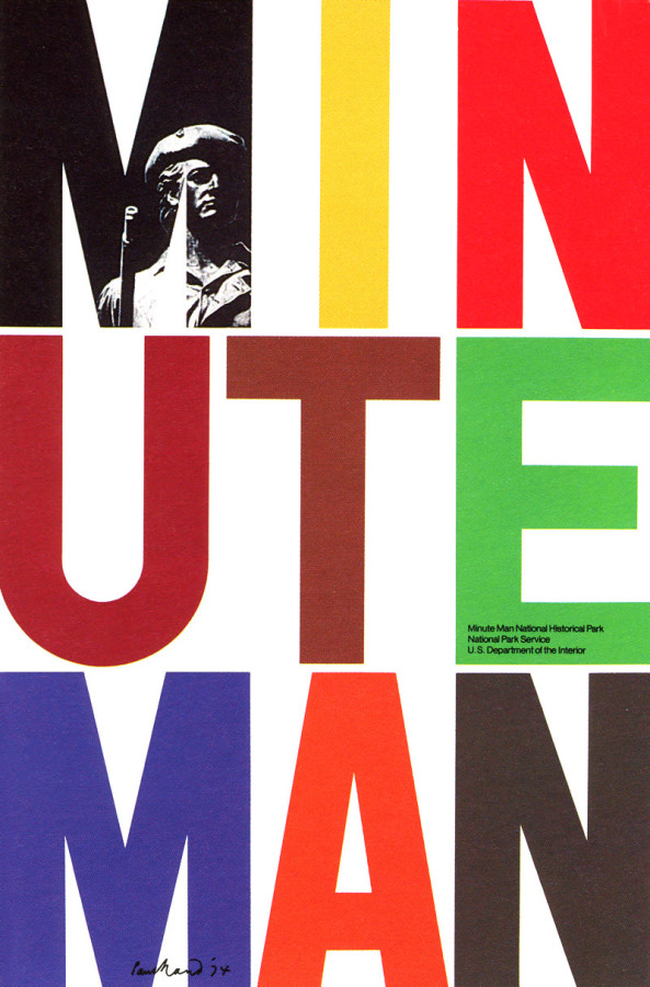
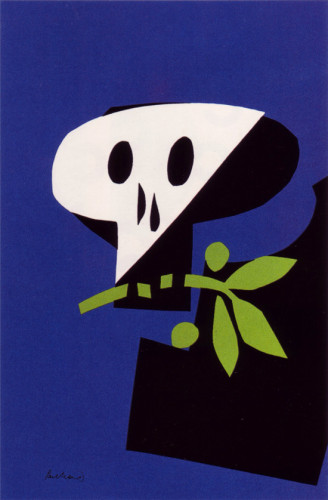
Paul Rand, Interfaith Day, 1954
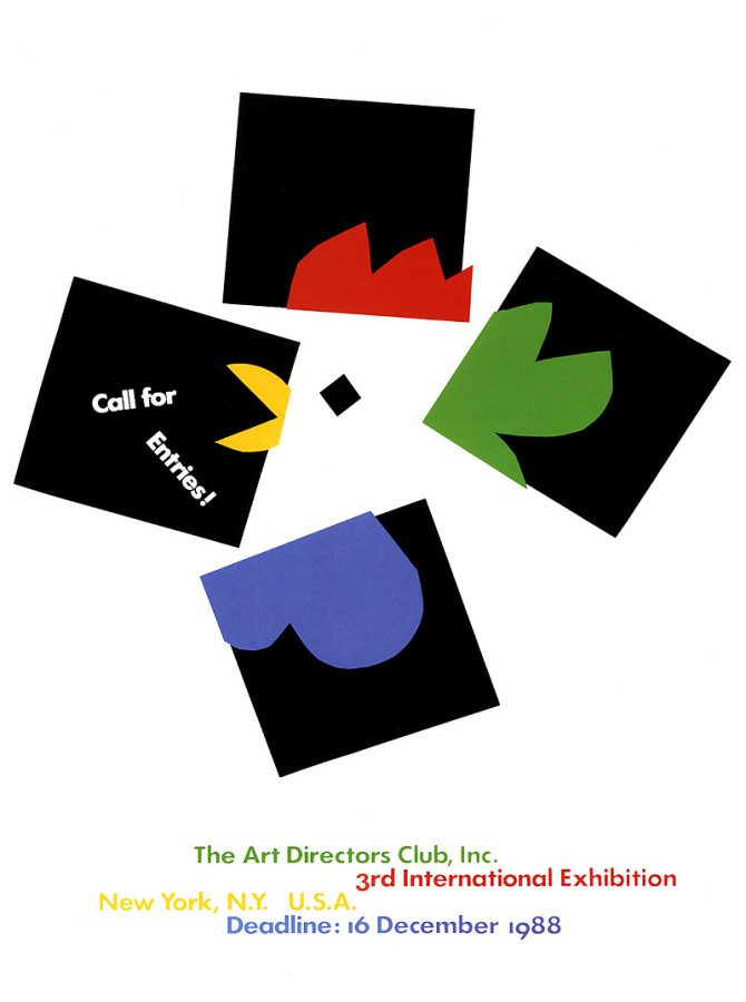
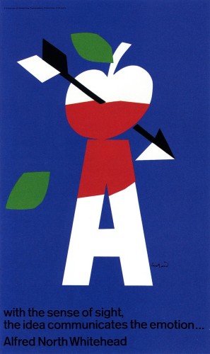
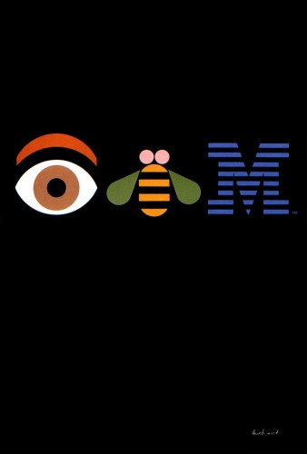
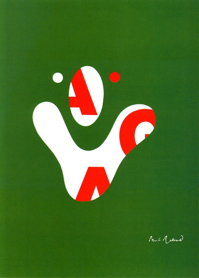
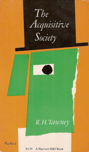
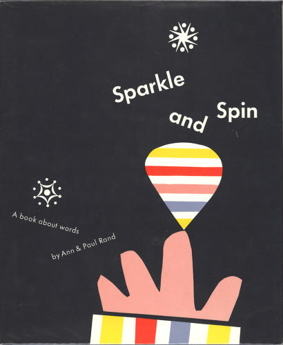
Though Paul Rand lived a long life full of design, in this exhibition we will be focusing more on his more simplistic artwork. The art that shows a lot with only showing very little. You will notice in these pieces, that they are not only simple, but also colorful. It was decided to use some of Paul Rand’s more simple art pieces because that is how he would prefer to work during his life.
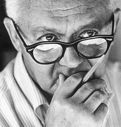
Paul Rand, who was born Peretz Rosenbaum, was born on August 15, 1914 in Brooklyn, New York and later on passed away on November 26, 1996. He was known as one of the world’s most famous graphic designers. He created very many posters and helped business create their logo/identity, such as IBM, UPS and ABC. When Paul Rand would present his designs to clients, he would explain how his designs would meet their needs by presenting them in booklets. Rand was also very patient and clear with his clients who may have not been visual thinkers. This is rather intelligent because when explaining a design to a client it is a good idea to keep it understandable and having a patient attitude that will help make the relationship between client and designer better. In the 40’s, Paul Rand’s work in advertising helped businesses have a different way of approaching branding. He was very clever when it came to ads. Rand knew that an ad was only used to sell a product, but believed that the designer should be artistic to be able to visually convey a message. A philosophy that he followed was the use of symbolism. Rand believed that the relationship between the viewer and the designer should be formed and connected through a symbolic element and by making the abstract forms concrete to help the viewer understand the design. Without Paul Brand’s take on creating ads and logos, the world of advertisement may have been a different place.
Signature points of Paul Brand:
1. He helped art directors gain more power within corporations instead of having the copywriters in charge.
2.”He was very down-to-Earth, and fit into this Brooklyn boys’ world of corporate advertising in New York.”
3. He believes that to a serious problem, humor can serve as an aid.
All About Paul Rand
Graphic Design Legend Paul Rand
Thoughts on Paul Rand’s Design
Paul Rand Identity
Paul Rand Poster
Info about Gallery
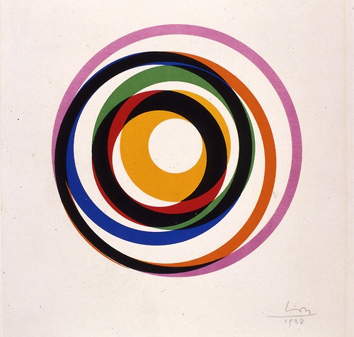
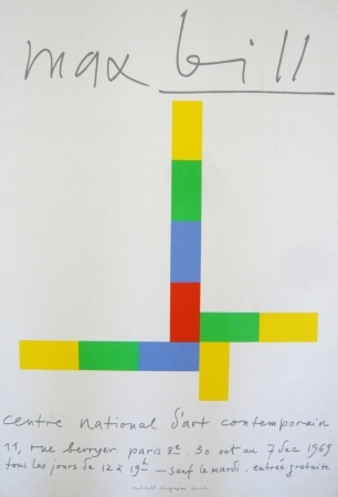
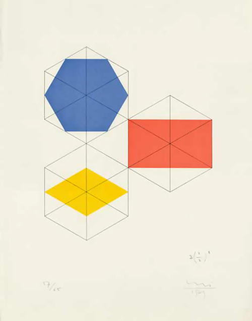
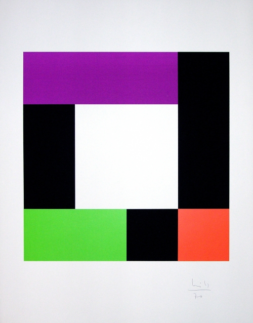
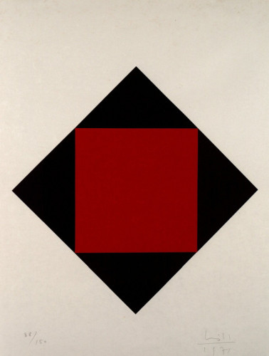
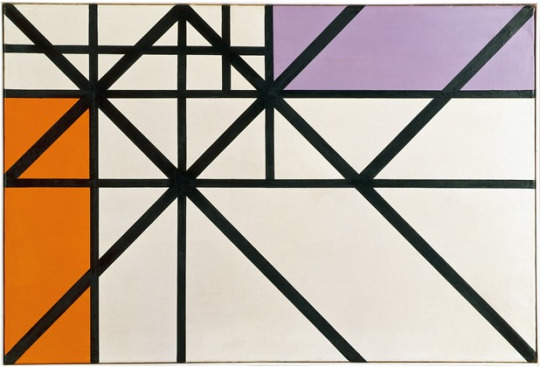
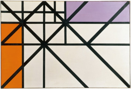
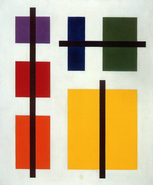
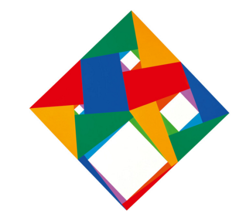
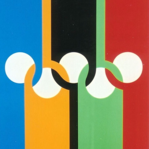
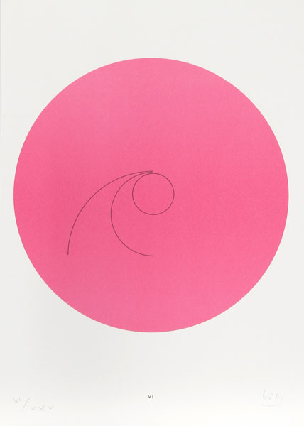
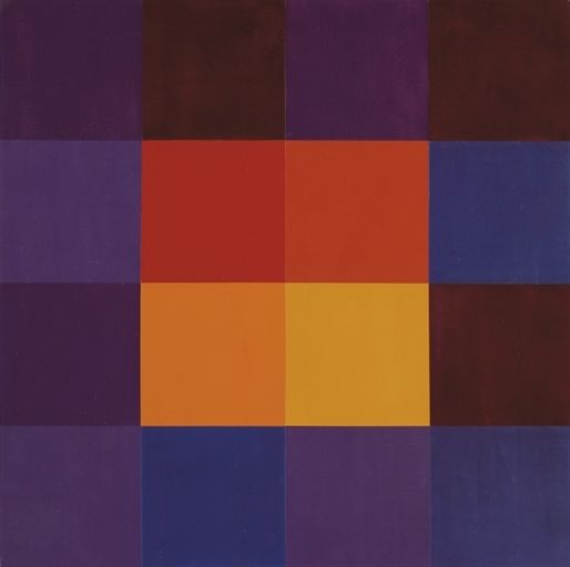
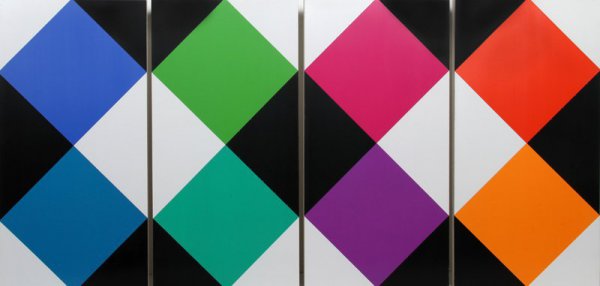
I find Bill’s work very interesting, especially in his Concrete Art. He has simple abstractions with geometric shapes. His use of color is also done in complimentary ways in similar hues. There’s no figurative or natural elements, just pure abstraction. His designs contain clarity and has precision to it. I find his forms to be very masculine and angular. It would create a great contrast in who the panelists are in the exhibition. It would be called Max Bill: Concrete Masculinity, Feminine Color Theory, where the use of color is explored in his masculine forms. This would touch upon his design in his paintings, since I believe they really capture his artistic talents and show a different light to his graphic design.
Old Bio
Max Bill was a Swiss graphic designer, painter, architect, sculptor, and product designer who lived from 1908-1994. He is associated with Concrete Art and Environmental Design. He studied at the Dessau Bauhaus where he was taught by renowned artists like Josef Albers, Wassily Kandinsky, and Paul Klee. He received a well rounded education at the Bauhaus where he learned various mediums of art. His work dominates in the medium of painting where he had begun in landscapes and portraits until in 1931 he began geometric abstraction in his works in Zurich. In the 1930s he was a member of the Parisian artist group known as the “Abstraction-Création”, where he began exhibiting his work. In Paris he befriended artists like Mondrian and Hans Arp.
While creating more abstract works, Bill began formulating the Principles of Concrete Art, where he is known to be one of the founders and great contributor to this genre. Concrete Art is a genre of abstract art which has no figurative or symbolic references, it has to be wholly devoid of natural elements. It is known as the purest form of abstraction. It is evident Bill definitely was able to develop and refine this genre from his education with Kandinsky.
In 1952 Bill was the architect and head of the department for architecture and product form at the Ulm School of Design. He continued the traditions of the Bauhaus at the Ulm School of Design. His forms and teachings were always re-interpreting the Bauhaus theory. The theory basically was form follows function. He studied at other various institutions and continued to lecture and write about his counterparts and artistic theory. His publications turned him into the most “fruitful stimulators of Modern Concrete Art in post-war Europe among the Bauhaus generation of students”.
Bill was an incredibly diverse artist. He designed a series of clocks and watches for a company called Junghans. He also designed various pieces of furniture. He also created various sculptures which were spherical in form and made from stone, metal, wood, and plaster. Many of his sculptures were created for outdoor viewing. One of his most popular sculptures is the “Pavilion Sculpture”. It’s clear lines and structure are simple and abstract.
I really find his work wonderful and fascinating. I’m becoming more and more fascinated in abstract art. I am always drawn to the Bauhaus style and schooling method. I really connect to Max Bill, because I want to be a graphic designer who also works in studio art and other mediums as well.
Old Signature Bullet Points
- He was a major supporter and artist in the genre known as Concrete Art.
- He created forms that could be understood by the senses. It is characterized by its clarity in the design and precise proportions.
- He was an incredibly versatile and well-rounded artist. He was not only a graphic designer, but was a sculptor, silversmith, architect, painter, furniture maker, and more.
Max Bill. Variation 12. 1938
Old Post Links
Meaning of Bill’s “Pavilion Sculpture”
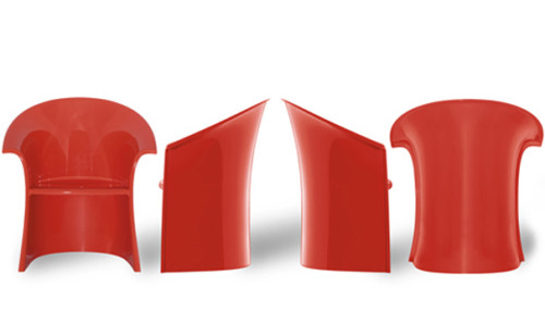
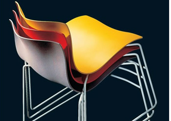
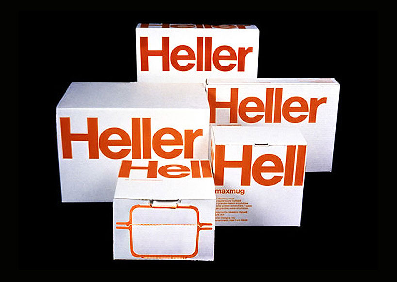
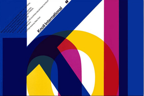
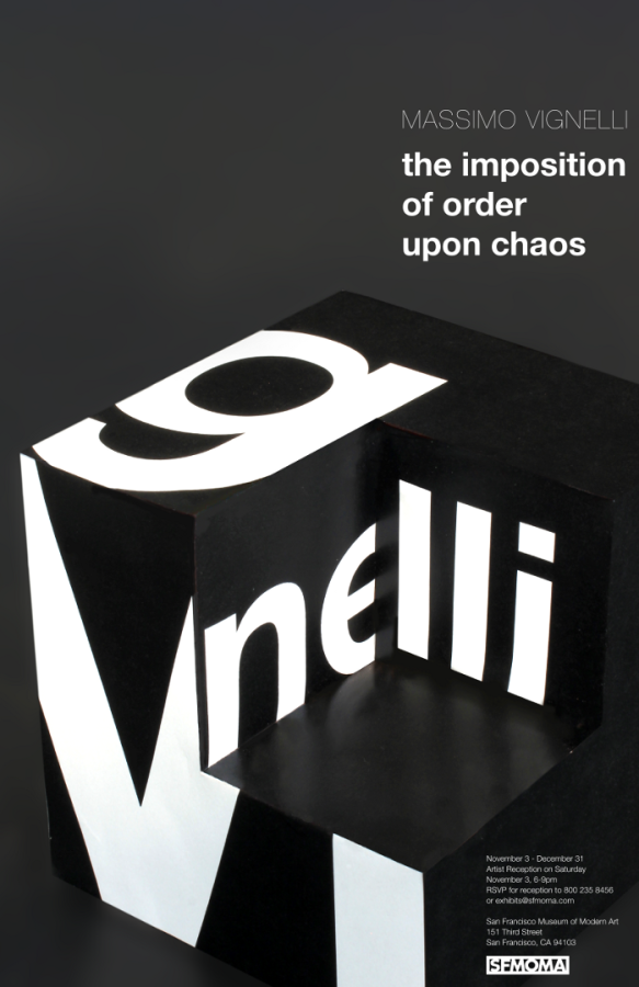
Then, Here, Now : Massimo Vignelli and His Wife
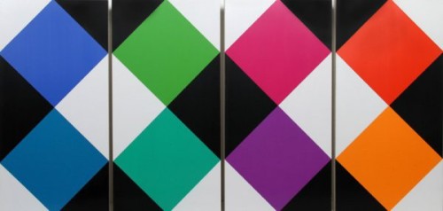
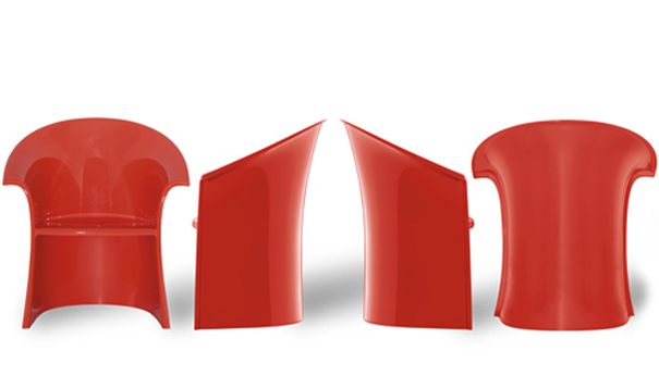
I believe that Massimo Vignelli’s work id best used to show his versatility. He had the architect background and brought that to all aspects of design. He did not only use his skills to make logos or graphic designs but instead he also created home where and furniture. He wanted to bring his simplistic views to all aspects of design to make the world an easier place to live. The exhibit should show his strive for simplicity yet a focus on beautiful design.
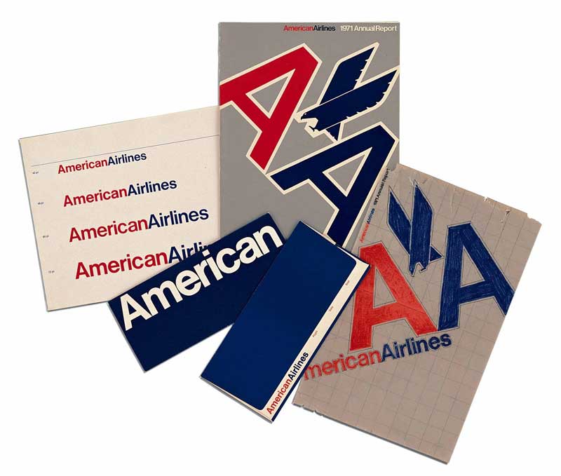
Massimo Vignelli was born in 1931 in Italy. He studied to be an architect during World War II. He used to say that if he was born a generation earlier or later he would not have been a Designer because he would either have had to participate in the war or be involved with the reconstruction after. He met his wife Lella in college and because of there shared interests in architecture and design they got married and became business partners. They both moved to New York to start their own design company Vignelli Associates. He is best known for designing logos for such companies as American Airlines and Bloomingdales as well as reconstructing the New York City subway map. He is also known as the man who brought Helvetica to the US. He had a very modernistic design approach, which could also be considered timeless because his designs are everywhere even today. He believed a good designer looked at the world and tried to make it better. Take away the things that are not needed and make everything much more simple. There is an ease to all of his work that I find comforting and smooth to look at. It takes a truly talented designer to take something so simple yet be able to make it there own and new.
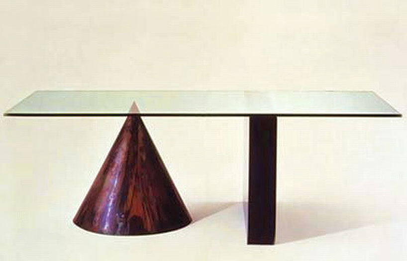
Massimo talked about how the materials that he would use to create the final outcomes for his design helped inspire him. He made a table out of just a sheet of metal and pipes that was so simple yet a beautiful design. He also used the grid and believed it was essential for design. Finally he had a need for his work to be immortal and timeless.
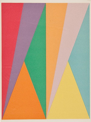
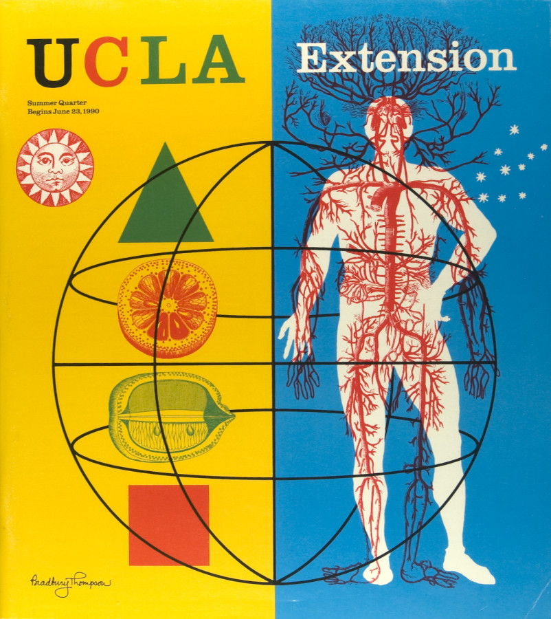
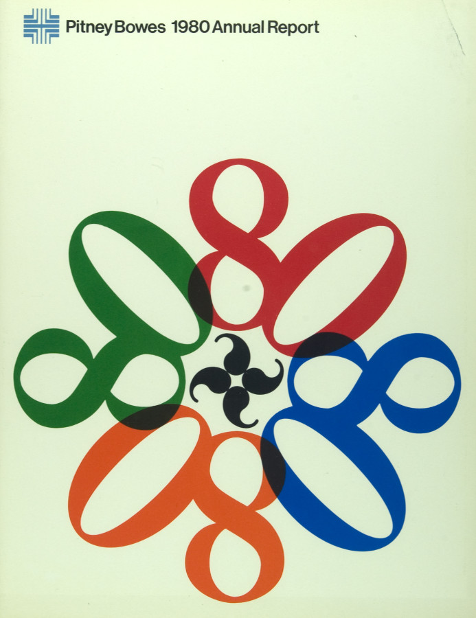
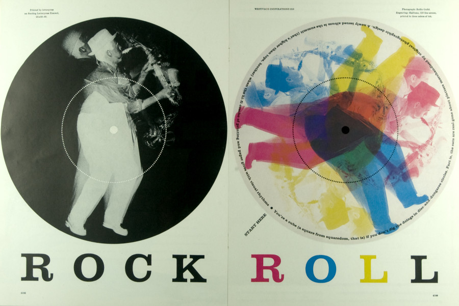
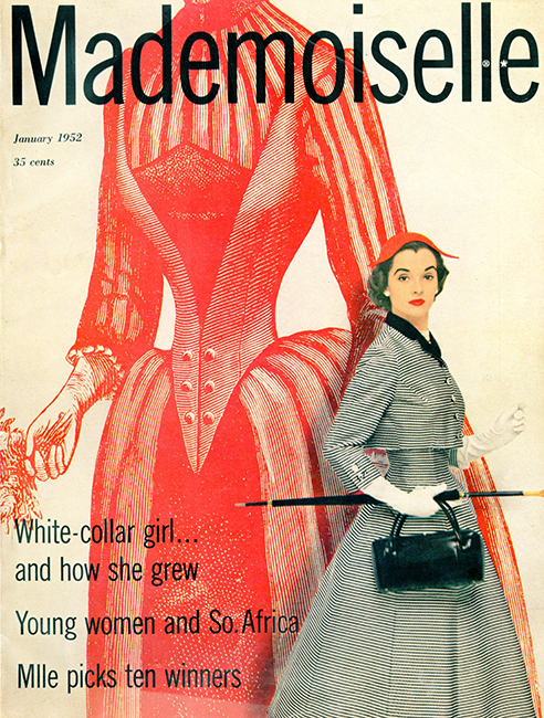
Bradbury Thompson was an influential designer of the twentieth century. His use of pop colors to accentuate certain areas of a design was intriguing to audiences around the world. People loved his work because it was generally vibrant and fun. He used color to add highlights and emphasize certain components of his work, like in his “Rock Roll: 1969-1979” or “Mademoisel: 1952”. Thompson also used shape and form to create his own hierarchy within his design and make certain elements stand out. The color schemes are simple and easy to absorb. Thompson would often work in conjunction with multiple designers over extended periods of time in order to perfect a design; whether it be a magazine cover, a poster, or another medium. Often Thompson makes use of the technique of silhouetting, where he blacks out or whites out one shape in order to make it come forth from the background. Thompson manages to do this with color too, which makes for quite an interesting piece.. Bradbury Thompson is thought to be a powerhouse designer of “pop art”, where color, form, and shape take precedence over the intimate details. Bradbury Thompson’s works connected powerfully with later designers and artists, and inspired them to continue the tradition of pop art into the modern era.
Bradbury Thompson: bibliography, facts, design
Bradbury Thompson: Graphic Design Archive
Three concepts I learned from Bradbury Thompson are:
1. Thompson stressed the importance of Background and Foreground imaging to bring his designs to life and add a 3 dimensional element to them.
2. Thompson made use of color to add highlights instead of shading.
3. Thompson really emphasized Shape and Form over the intimate details of a composition, which seemed to make the piece really pop.
Bradbury Thompson, Yale University Capital, 1968
Tschichold, Transit Typeface, 1931
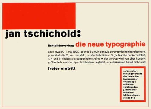
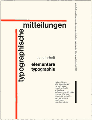
Tschichold, TYPOGRAPHISCHE MITTEILUNGEN, 1925
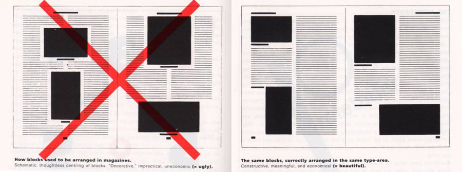
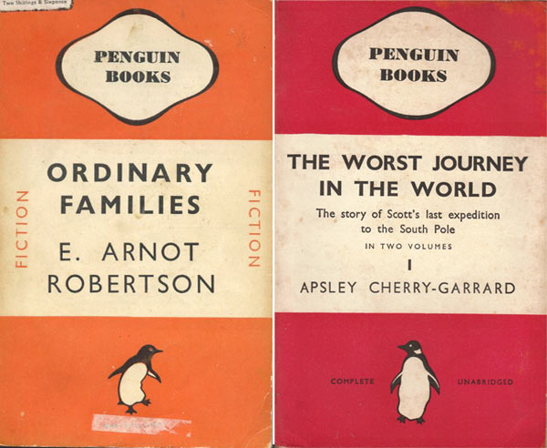
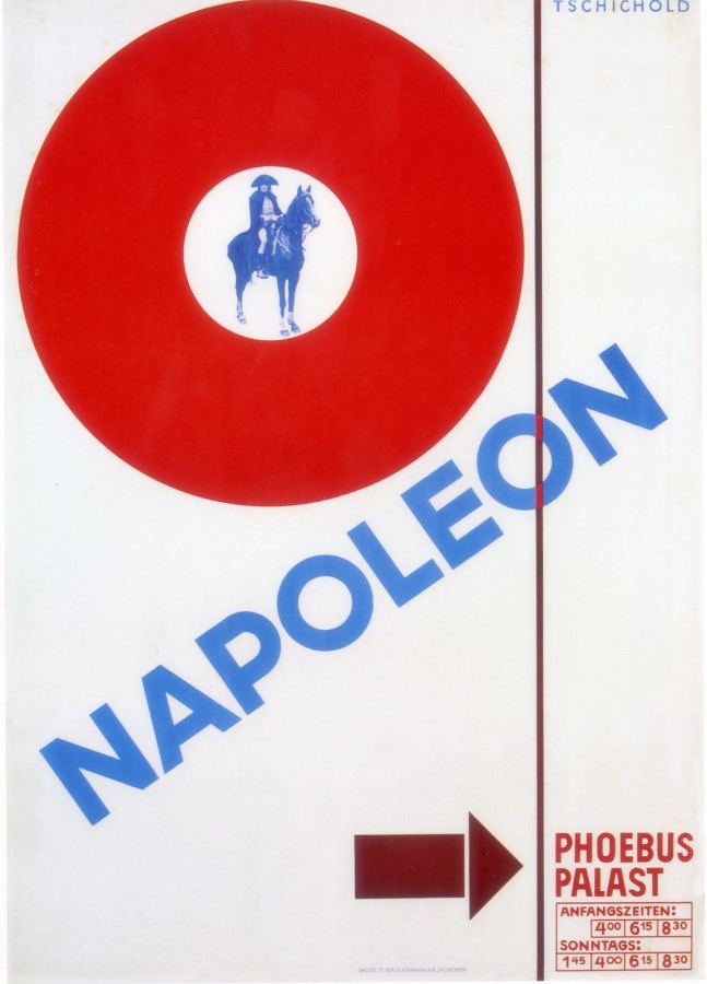
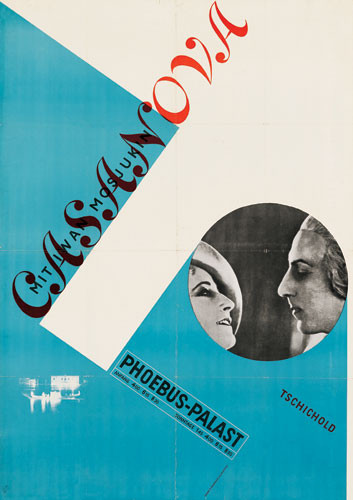
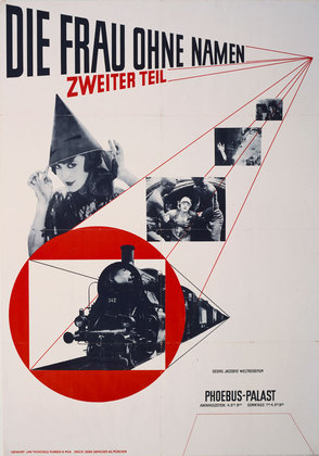
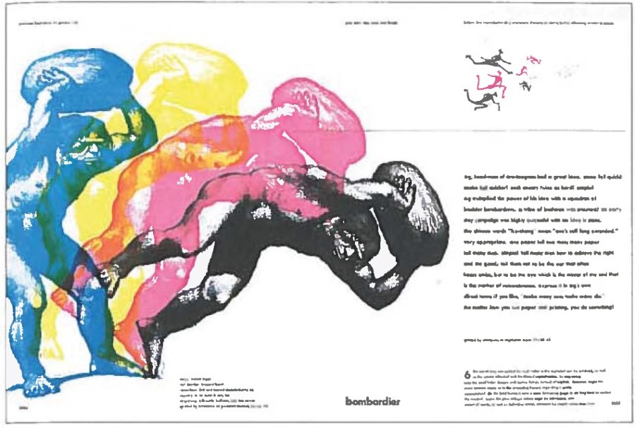
Jan Tschichold was a creative man; a man of many beliefs. In Tschichold early years he had one specific beliefs about typography. He believed that the most powerful and important designs are made with san-serif typefaces. He criticized all other typefaces during this time. In 1928, Tschichold writes a book called, Die Neue Typographie (The New Typography), which introduces his new found philosophy. The book also conveys his opinion on asymmetry layouts. He designs a layout called the Tschichold grid which shows the right and wrong ways to design a layout. He thought that non-centered layouts can only bring more strength to your design, out with the classic and in with the abstract. His early career demonstrates this philosophy. In posters he designs for movies like, Casanova, Napoleon, and The Woman Without a Name, he layers with intense diagonals and contradicting angles. The pieces show his value for modernist design. Tschichold did not stick with modernist designs for much longer in his career. In 1947-49 he designed the Penguin Books, which, compared to his older designs, were extremely different. These books had centered type, simplified designs, and basic formatting. He abandoned all his former beliefs and called the Die Neue Typographie, too extreme. He went as far to say that the modernist design all together was fascist. In 1966/67 he then created a serif font, Sabon, which became a bestseller from then on.
Born in Leipzig, Germany on April 2, 1902, Jan Tschichold started working with typography at a very young age. He fled to Switzerland during the start of the Nazi party. Germany had strict rules against typography and only used Blackletter calligraphy. When Tschichold expanded typography and used san-serif typefaces, which were said to be a threat to the cultural heritage of Germany, the Germans took much of his work before he fled to Switzerland. He would become a writer, teacher, and designer of typefaces. He created the typeface, Sabon, which is still an extremely popular font. He published books like, Penguin Books, Die Neue Typographie, The New Typography and he oversaw the creations of more than 500 books between 1947-49. Tchischold was one of the most powerful influences of 20th century typography. His career has made a huge impact on how we think and use typography today.
I really enjoy looking at his work. Almost all the covers he designs are created with angles, levels, bold, and are distinctively no more than three colors. His work is simple, but rugged at the same time. His words are jumbled together onto one page, but the viewer is able to understand the flow and read it clearly. His work seems to have a modern feel with what people design today.
Research Links: Design is History
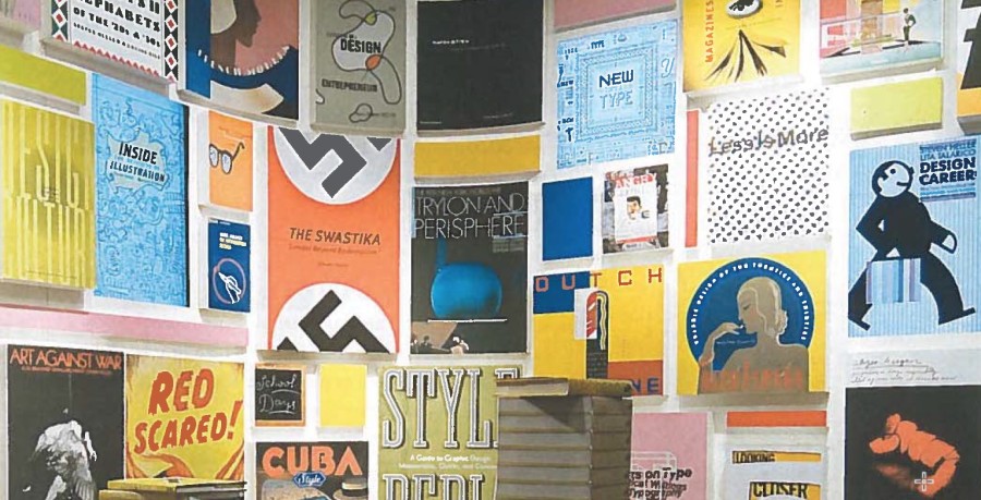
Download and read the following PDF: Graphic Design History / Chapter 2.
Make note of the various visual styles and movements in this history. Which styles do you respond to? How is the world of graphic design today informed by yesterday? What similarities and differences can you identify in the way graphic design functions? What makes a work of graphic design great?
List of Designers from the twentieth century.
You have been assigned one of these designers to explore in an email. Research this designer and their work.
- Peter Behrens
- Lucien Bernhard
- McKnight Kauffer
- A.M. Cassandre
- Kazimir Malevich
- Laslo Moholy-Nagy
- Max Bill
- Alexander Rodchenko
- El Lissitzky
- Theo Van Doesburg
- Herbert Bayer
- Jan Tschichold
- Piet Zwart
- Herbert Matter
- Lester Beall
- Ladislav Sutnar
- Paul Rand
- Alvin Lustig
- Saul Bass
- Adrian Frutiger
- Bradbury Thompson
- Alexey Brodovitch
- Josef Muller-Brockman
- Armin Hoffman
- Wolfgang Weingart
- Milton Glaser
- Ivan Chermayeff
- Shigio Fukada
- Herb Lubalin
- Massimo Vignelli
- Neville Brody
- David Carson
How to make a gallery on the class site
Create a gallery of work by your designer.
Due Sunday, November 16
Part 1
Write a 200 word paragraph about your assigned graphic designer. Reference published material, but bring your personal insight and thoughts into your writing. Pay particular attention to the the designer’s approach or methodology, the context in which they worked. How did the work of this designer connect to the audience of the period?
Please mind the spelling and grammar. Don’t forget to include your primary research links.
Part 2
Highlight three distinctive and signature points that you learned about that person. These are details which gave you insight into the designer and their work as outlined in the first part above. Be succinct.
Part 3
Create a gallery of 5-9 important works by that designer. Identify the following in the caption:
- Name of Designer
- Name of work
- year
- other relevant details
Example gallery below:
Leave a Reply Cancel reply
You must be logged in to post a comment.
-
Classroom
-
Recent Posts
Recent Comments
- Danielle Vizard on Thinking with Type — TEXT
- Danielle Vizard on Digging’ It!
- Jenna on Thinking with Type — TEXT
- Jenna on Digging’ It!
- Elizabeth Robinson on Digging’ It!
Archives
- November 2023
- August 2023
- May 2023
- April 2023
- March 2023
- February 2023
- January 2023
- December 2022
- November 2022
- October 2022
- September 2022
- August 2022
- July 2022
- June 2022
- May 2022
- February 2022
- December 2021
- November 2021
- October 2021
- September 2021
- August 2021
- June 2020
- February 2018
- December 2015
- November 2015
- October 2015
- September 2015
- August 2015
Categories
-
About
KSC GRAPHIC DESIGN



















































































































Leave a Reply
You must be logged in to post a comment.