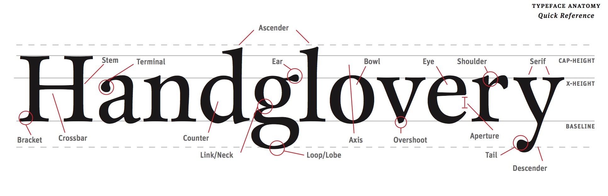
Composition
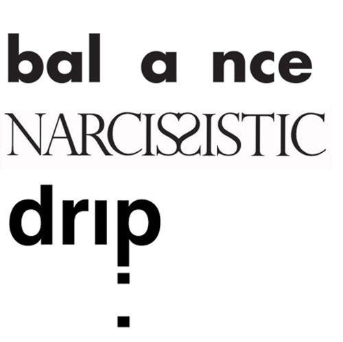
Use the space of the frame dynamically. Create a layer that activates the tension between space and object. This usually means keeping the words smaller unless making them large is essential to the idea.
You are encouraged to place the words in different locations in the square. Where does the word communicate its idea the best? Use a variety of approaches to the designs. Do some words crop off the sides? Do all the letters fit into the space? Do letters want to overlap? Rotate? Flip? You will choose to change the position, scale and rotation of selected letters to express them.
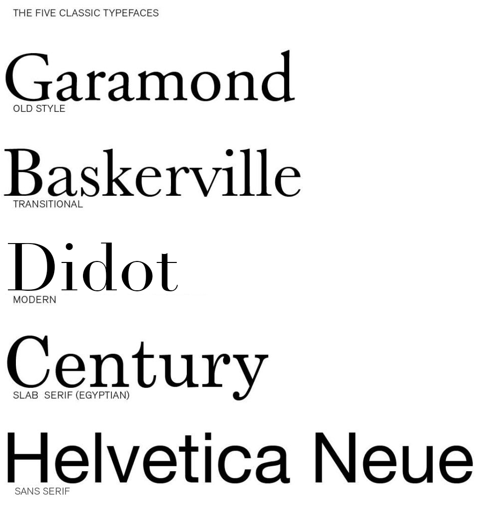
Acceptable Typefaces
You may use any typeface you want for any of your words as long as it is one of the five below. You may use only the regular/book font (not bold for instance).
- Garamond
- Baskerville
- Century Expanded
- Didot
- Helvetica
Be prepared to explain why you chose to do which word in which typeface.
Rules of the game
You may do the following:
- Rotate
- Scale proportionally
- Dont stretch
- Cut or clipping mask
- Extend off the frame
- Repeat letters only when necessary (try not to)
You may not:
- Texture words
- Use other typefaces
- Change the opacity
- use outlines (solid letters only)
Your Words
You will work with 6 words:
- Two from my list on this page — one assigned / one chosen
- Two from mind maps you create
- Two from the Compendium of Lost Words
Create three different concepts (art boards) for each word for a total of 18 designs.
Process
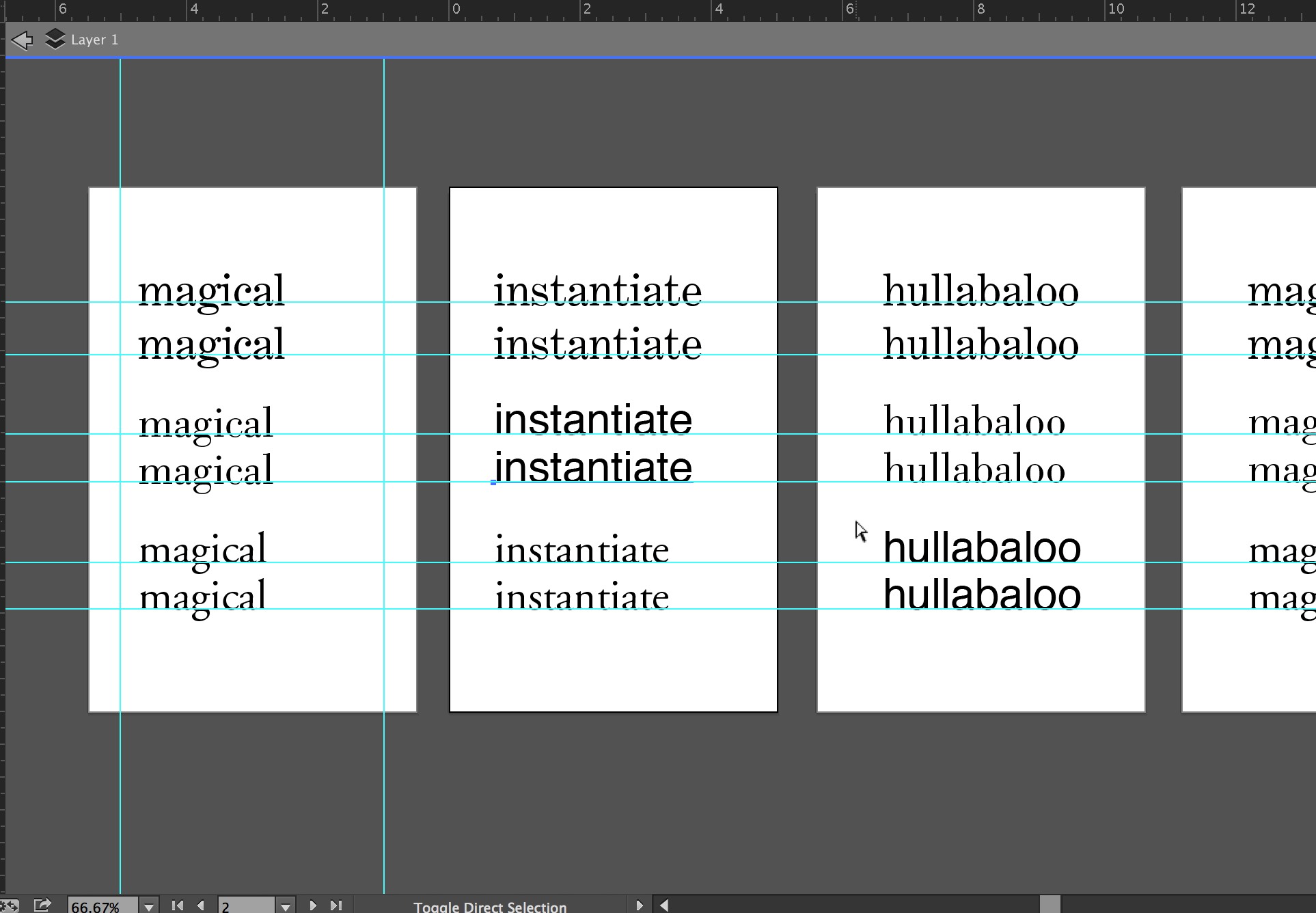
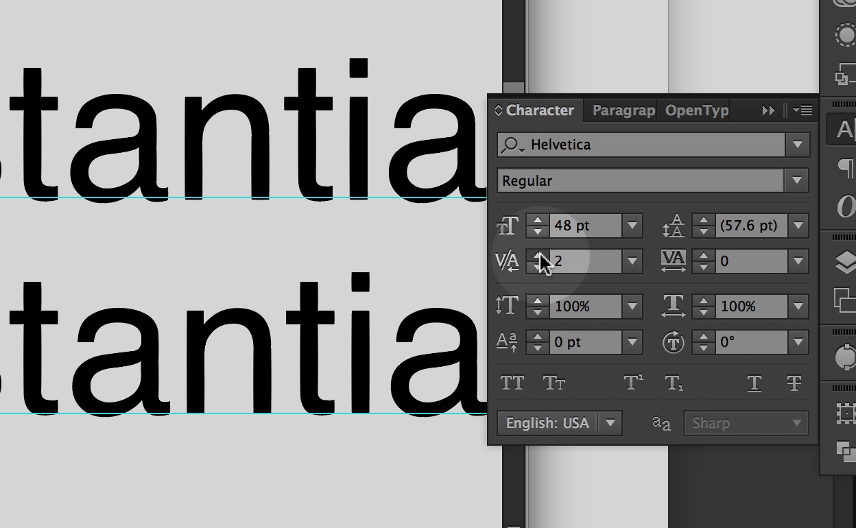
- Using Illustrator make a 6″x6″ file.
- Start your word in a selected typeface at 60 points.
- Place in the right place on the page in the correct typeface.
- Kern it properly.
- Duplicate the artboard 3 times so you have the kerned word + 3 copies.
- Go to the second dartboard for the word.
- Go to the the “Type” menu and select “Create Outlines.”
- Ungroup the letters and begin working with them.
- Start with one change to communicate the word (scale, rotate, position). If you need more then try two changes (scale and rotate, or move two letters). Be conservative in the changes initially. Use only the graphic moves necessary to express the word.
- When you have expressed the word then move to the next dartboard.
- Repeat 7-10 until you have the kerned word + 3 expressive concepts.
1 / My List
One assigned and one chosen
- fright
- animated
- revolve
- impulsive
- isolation
- tension
- energize
- rhythm
- radiant
- sorrow
- malign
- uneasy
- caffeine
- conflict
- scattered
- wander
- clumsy
- cheerful
- alarmed
- whimsical
- haunted
- overjoyed
- magnetic
- clingy
- explosive
- surprised
- discombobulate
- Splash
- Kerplunk
- Sizzle
- Hiccup
- delightful
- Slurp
- Gurgle
- Creak
- rebellious
- disoriented
- intrude
- provoke
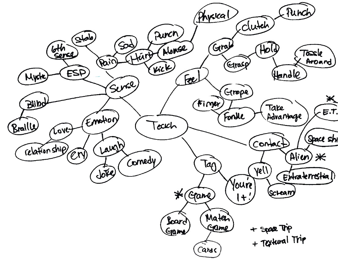
2 / Mind Maps
Do three mind maps with a group of classmates using your assigned words on the list above as the ‘seed.’ Let your minds wander and fill the page with associations. Circle a dozen or so verbs or adjectives that have expressive potential for you. Talk to classmates and select a few words to try. Choose these words carefully. Try not to be too abstract. Is there something about those words that suggest visual solutions? Don’t be obvious such as the word ‘Fall’ (and it is only four letters).
Select two to express.
3 / Lost Words
Choose three ‘Lost Word’ from the Compendium of Lost Words and express its meaning. The class should be able to ascertain a general idea or feeling about the word from your design.
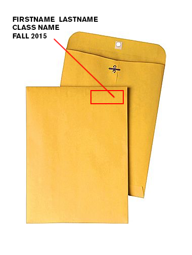
Format
6” x 6” trimmed precisely (you will be graded on the craft of cuts and precise measurement)
Color
Black and White Laser Print
Due Monday September 28
PRINTED: your two best word concepts for each of your 6 words printed and trimmed
DIGITAL: three versions of each of your 6 words — 18 compositions in a single PDF


The creative process is a complicated and personal process that can differ between all creative thinkers. In this reading the author suggests that if a student is given a problem with defined limits the student will be more interested and give a meaningful solution, rather than being given a problem based on freedom and self expression; where as the student will likely be disinterested and provide a meaningless solution. The reason the author thinks this is the best way to arouse one’s curiosity, hold their attention, and engage the students creativity is because limits are what guides a student’s thinking.
The authors ideas about the creative process are very similar to my own. Although I do believe in some situations 100% creative freedom and self expression can lead to a beautiful outcome, I believe being given specific limitations forces one to think harder and dig deeper. Being a creative person, I understand that people with nature talent can create beautiful pieces freely on their own, but i prefer my own creative process to be given limitations. I believe this because when one’s given a small window to work with in rather than complete freedom, and they come out successful.. not only does that show that they are a gifted and creative person but they are also able to be a problem solver.
The creative process needs to be seen through a lens of guidelines. Without limitations, design would be meaningless and boring. Arbitrary designs would have no basis on which to stand and therefore serve no real purpose and as Rand states, “monotonous.” With guidelines there is also a problem to be solved. This really engages a designer and forces one to come up with an innovative finished product.
When it comes to education limitations of a design should hold the students interest far longer than would a free-form design. The students get an opportunity to play with the skills they have and arrange a composition that both solves the problem and is imaginative. For example the tangram forces a student to work within the confines of the shapes provided. As a student I prefer working within guidelines rather than having free expression. It gives me a sense of direction and meaning. When I have free expression I find that it can be hard to find a solid starting point.
This reading by Paul Rand is centralized around the idea that the teaching of art and design can be complicated and perplexing. He states that, though the focal point of a student’s success is his or her natural born talent, a problem still arises in captivating that student and engaging his or her creative potential. Rand feels that the solution to this is defined limits, guidelines and disciplines when it comes to design; that emphasized freedom and self expression in a problem becomes a problem itself, as a student gets lost and creates a meaningless end product.
From a student’s perspective, I personally can attest to Rand’s ideas. I have gone through courses that have provided me with very minimal set guidelines, as well as courses with very strict guidelines. I have found that having barely any limitations, in a way, gives you the opportunity to take the easy way out just to get something done and produced because you have the freedom to do so. Having guidelines, though, forces you to truly get down to the root of the problem and solve it to your greatest capacity.
Overall, I found this reading to be pretty thought-provoking. The sort of “problem-solving” examples he included such as the crossword puzzle, Tangram, the Modulor, etc. were quite interesting to read about. It’s all about finding exciting ways to work with what you have.
In the reading, the author talks about how the creative process is a complicated thing. He states that students are losing interest and becoming bored when it comes to being creative. The problem isn’t limiting the students creative mind, but not giving them guidelines to help them engage it more. Allowing students to have self expression and become limitless, becomes a problem and does not push the student to put their full potential in a final product. Students become lost and hand in a design that had barely any effort put into it. Having defined limits makes the student think, stay curious, and grab their attention. It engages them to solve the problem in a creative way but within boundaries. Every design has limits, and without them they would be useless and have no meaning .
My idea on the creative process compared to the author is very similar. I believe that being able to express yourself is an important concept in being an artist, but everything needs limits to have meaning. I believe having guidelines help push a designer to do their very best, solve problems, and focus on what direction they need to head in. Limits are the foundation of design, and without them we would never know where to start.
The author states how the ultimate success is depended largely on his talents. However from a teaching perspective the teacher wants to arouse his curiosity, focus his attention and to motivate his creative facilities. He also gets the creative juices flowing by having them create a “game” to motivate. Throughout the reading I found it interesting how he incorporated “games” in the child’s creative process. I never thought about my own process as a creative person before. After reading this article I began to think about my childhood in regards to art as well as my personal thoughts about my own creative process. I didn’t have much creative energy surround me expect when I had art but that was only for a short amount of time each week. So mu current creative process is to let your mind explore and be open to new funky ideas!
In the reading by Paul Rand, he discusses the complexity of the creative process. He talks about the problems and solutions to captivating a students creative thinking. As he explains, the best way to “arouse his curiosity, hold his attention. and engage his creative faculties” is to set limitations. By getting his students to get to understand how to work with those limits when they’re given to you will keep them focused and more involved in their creative minds. These guidelines will help them channel their ideas; “‘A mind so disciplined should be both more abstract and more concrete.'” I relate and understand this as a designer, because I have learned that when given a specific task and project I have to work around the rules and limitations and create something that follows the guidelines of the assignment. I feel it’s not only easier to have these rules, but more exciting at the same time. I have work around the limits to come up with a design that I like and viewers like.
In this article written by Paul Rand, he explains that the design process is about limits and knowing them better. He goes into design education, saying that students need to feel that their time is not being wasted, but expanding and becoming more knowledgeable. Students should know the basic disciplines of their work before more rules are set for them to follow, or they will not be able to think of their own ideas as easily. With the creativity process, the limits are endless to what one can think of, however, a limit of an idea is necessary to make a good idea come to life. From reading this article, I do believe what the author is saying about limits to make the creativity of the designer better. There is a main idea which should be followed for a design, but that does not mean that you cannot express the design differently. Limits give the student a guide to follow with their thoughts, rather than a scramble of so many ideas they don’t know where to start. Design is about uniqueness and expression, which cannot be taught but only expanded.
In the reading, the author, Paul Rand, talks about the creative process and how complicated and complex it can really be. He talks about how there needs to be formal limitations otherwise the teacher of design and student tend to bore themselves. He feels that with those limitations given, it could create a better product because it has a purpose and a goal that the student is focusing on. Rand speaks about “play-principle”, a way of problem solving, as well. You make something into a game where you can learn things along the way. I find that very interesting, actually. I like the idea of being able to turn something into a game to almost trick your mind. When Rand talked about the limitations put on designs, I have to agree with how that would help. As a creative person, i feel when given specific limitations, it really helps me take that and create something I think would be attention grabbing. When a student doesn’t have strict guidelines to go by, they can really get lost or even give up on their idea because they feel like they have reached a “goal” because they’ve hit the very minimal guidelines given to them.
I found this reading to be very interesting because I’ve never really thought about the creative process like this and the idea of limitations.
In this reading the author is saying that the creative process is complicated. How the success of a person is mostly based on natural talents, but how to keep them engaged is the problem at hand. He says that if a student is confined in a problem it would keep them more interested while trying to overcome the task. It gives the students motivation to finish what they started and will make them proud of themselves once they have completed the project. The author says that most design education allows students to express themselves any way they feel and are given no expectations or restraints. He suggest that though sometimes it can look really pleasing, other times it’s boring and there is no meaning to it.
His ideas really relate to my understanding of my own process because even though I love to freely express myself, I do prefer constraint. I think having to follow certain guidelines actually helps me more as a creative person, especially in classes. It is really hard when you are given a lot of freedom in art classes because I feel it’s sometimes hard to come up with ideas and make something that will be pleasing to the eye. This can even be said when I am much older and working for clients. I may have more freedom when I am older, but I will still be confined by what the customer is looking for. I may throw out ideas to them, but at the end of the day it will be what they want.
The passage is basically explaining the long stressful procedure that a designer has to go through in order to accomplish their ultimate goal. The author explains how the quality of a design almost always depends on the artists natural talents. he also goes on to say that design should be created with guidelines and create questions that need answering. I agree with both of these statements and feel that a designers work is only as good as they can make it. Each individual piece that is created needs a lot of time and dedication not to mention creativity in which is definitely pushed to the limit when their are guidelines and rules to a design. If I am forced to design a 4 legged animal, I don’t want to make simple animal that you can find on a farm or in the wildlife, I want that animal to be something unique that no one else would have thought to make.
I believe the author is trying to get the point across that art is a creative process so it must be taught in a creative way, however, teaching art and design is an extremely complex task and a lot goes into it opposed to your typical concepts. The teaching of art requires rules but the student needs to have the desire and drive to learn. I agree with this but I also believe that some people are born with the natural talent and eye for design and it can not be completely taught. The basic principals of harmony, order, proportion, symmetry, color, space etc can be taught but that doesnt mean students will know what to do with them to make an appealing design. I really liked the line the author included saying “A mind so disciplined should be both more abstract and more concrete”. It is essential for designers to think abstract and outside of the box but at the same time to have concrete and grounded ideas. The author relates designing to problem solving and how people are drawn to that sort of thing even if it is subconsciously which is why it would make sense for designers to use that kind of technique. I agree with most of the authors points and find myself relating to a lot of the process he talks about such as the problem solving.
The author of this is emphasizing the need of guidelines and boundaries in art. Though according to him, the most important thing in the world of art is over all talent, offering limitations helps to send the talent in the right direction. In education, an important thing to remember is to keep the students interested. If the student is not interested, there’s a good chance that they’re not going to produce a good finished product. Keeping their interest with things like games and rules helps to keep the talent that they have on the right track rather than letting their minds run rampant.
Personally as a designer, I believe that guidelines and limitations are important to my designs. They give me a defined starting point whereas if I was just given a blank piece of paper and told to make something cool, I would have a hard time deciding where to start and what direction to go in. With guidelines, you are given an idea of what a client, teacher, or professor is looking for and can then decide what to put into the design. When you are finished, you can look at your artwork and decide whether it is satisfactory by looking back at the guidelines. Without guidelines, you may not know where to stop, what to incorporate, or really anything for that matter. An artist may have a hard time determining whether the piece is finished and perfect without rules to refer to and base the work on.
I think that this article raises an interesting and valid point. It talks about the importance of bringing fun into learning so that children will be encouraged to stick with their studies. I think this is critical in today’s day and age of education. Children’s attention spans seem to be decreasing every day, possibly because of all of the new technologies that they are exposed to. Because of that, they need a reason to learn. That reason could be the fun, excitement, and thrill that a professor or teacher brings into the learning atmosphere.
Reading this article reminds me of being on a sports team. I would show up every day to practice, truly to learn a new skill, but that was not necessarily my intention. I enjoyed working out with my friends and I enjoyed the atmosphere that came with being on a team. We were all working hard and pursuing a goal together, but we didn’t necessarily realize it at the time. We had the “play” instinct that drove us. Each sports game was like a problem that we were trying to solve; we had to strategize in such a way that we outsmarted our opponent. The play aspect during practice made everything more enjoyable and it also brought the team closer together.
I completely agree with what the author has to say in this article. Having a “play” element distracts the student from the real goal at hand: learning.
“The Design And The Play Instinct” reading talks about a persons creative process. Which process is better; allowing creative freedom or provide basic rules and discipline to challenge and increase a peoples creativity? Providing simple rules increases creativity, new form, and style. If we don’t have these restrictions work would become boring. Some schools make a small attempt to guide the student’s thinking from basic design to applied design. Teaching should alternate between theoretical and practical problems-and between specifically stated rules.
I enjoy creative freedom but, having a good teacher who can set rules for my work allows me to think outside the box. Most of the time, I like staying in my comfort zone and using skills that I learned before. My teachers are the ones who push me to go outside the box and research new ideas. With ought restrictions there is no new knowledge.
The author discusses the different aspects of the creative process and how we should teach it differently. The author also goes into the different creative processes of artists in varying mediums. In design, or any artistic instruction for that matter, The author shows that they want the student to be passionate about what they are creating, as well as learning and expanding as artists. The author talks of creating a balance between rigidity and relaxation in instruction. Braque talks of how limited means can stir up a new form of creativity and how if an assignment is more structured, it can make the student create and conceptualize differently. I can definitely agree to that, an assignment with more expectations and guidelines can be more tedious, but I’ve created some really unique pieces that way. Nonetheless, the goal is ultimately to make sure the student is interested and engaged in their project or assignment, while instilling discipline and motivation.
I can definitely relate to this in many aspects of my life and artwork. I had a photography teacher in high school who drilled us on concepts. She required for us to have a certain number of ideas recorded in a sketchbook along with visuals. This was for an independent study so many thought it was going to be relaxing and an easy A, but it was the opposite. We would usually propose our concepts to her in a private meeting and she would give us her insight and advice, along with certain criticisms. After that, she would let us do what we needed and she would rarely intervene. She created a lovely harmony of discipline and motivation, along with making sure we were passionate about our projects.
I really enjoyed how the author took the reader on a journey through different artists and their creative processes. All of them had an idea to execute it and went above and beyond to achieve it. I feel like many people I encounter are afraid to leave their comfort zone and try something different. Designers are constantly having to go out of their comfort zones in hopes of creating something innovative and well done. They always have to solve problems and prevent others from arising. One can get easily tripped up, but the important thing is how you get back up from it and I think that’s something that should definitely be taught in all aspects of education, every experience is an opportunity to learn.
After reading the design and the play instinct, I noticed that the author talked a lot about simplicity and playfulness. With every design, there’s a starting point and it starts off simplified. Every type of design, architects, painters, drawings, mathematical systems, starts off with a plan. A geometric layout is used to design a plan, and after this there is plenty of room to use creativity and playfulness in the design. I think this is a good process because it gives the student a starting point, and then allows them to think abstractly.
In the reading “The Design and the Play”, the author Paul Rand compares the creative process to a game. You need to know the basic rules and understandings to play the game of Design. The reading states a problem with defined limits, implied or stated, and is conducted to the instinct of play could grab someones attention with a meaningful solution. Renaissance teachers used this play-principle, teaching children about difficult subjects while creating fun games for the children to enjoy. Without that play-principle, the children way back when would end up getting bored not learning a thing in class. Rand compares the play-method to design by saying being creative is just like playing a game, however you need to know the rules before you play. With this method you can define the rules which then could forward the designer into playing their own “game” or creating a smart design.
Rand believes that the problem with design education is that there is a lot of freedom of expression however no rules. Without the rules of the game there is no game at all. Students should learn the basics of design in school and learn how to set the rules for their own creative game. After learning the basics, the student shall apply that knowledge and have fun while playing around with designs to create a product which is meaningful and useful.
It’s funny how Rand compares designing to games. In middle school when I had trouble with my classes my father had told me that school is just like a game. You need to figure out the rules of the game and then play until you win. However with Design, I now understand this connection of making the rules to my own game. My creative process is super unorganized with thoughts running through my head without categorizing them. I would honestly just design what I thought would look best on the computer and be done. With this game theory I can take what I know from past classes and create rules for the next design (or game) that comes my way.
The general theme of this article is that limitations can aid creative thinking. It makes sense because if you given restrictions, such as trying to creating a image out of triangles, then you will naturally try to figure out the many ways you can fit the triangles together. The well defined problem of working with triangles gives the a designer tight space with which they will want to explore what’s possible. Whereas if they are given a massive collection of tools such as Photoshop and are told to just make something with it, they’re going to spend a lot of time just planning what to do. As much as people desire freedom, without restraint it’s easy to feel lost or overburdened. For another example, as people get older they gain more power over their life, but along with that power comes all the worries of the adult world people have to deal with. There’s a sweet spot between total freedom and restraint that gives a person an empowering sense of control over whatever it is that they are doing.
I imagine the author thinks that design education should involve students being given explicitly defined problems to solve allowing them to apply understood design principles without worrying too much about what the limitations actually are.
His theory of turning problems into games by defining them better meshes pretty well with my creative processes. I get pretty frustrated when teachers give out vague assignments, what is supposedly “assumed knowledge” easily becomes pretty esoteric for me. Having restrictions being set in stones makes doing work a lot more enjoyable for me and allows my thought process to feel more fluid and unrestrained.
Through reading this article, it is made clear that the process in which professors of design must go through to teach their students in a well and effective way is; both highly complex and difficult. The complex nature of this career field is that in order to succeed the student must need space to explore his or her own imagination and talents to develop the skills and techniques through practice. However this is where the complexity comes in, because its is extremely difficult to allow students complete freedom and still expect them to learn and create meaningful pieces, and to the contrary its also impossible to set bold boundaries and rules by which they must follow because students become quickly bored and unfocused with such problems.
These ideals are greatly similar to mine, there is a quote in the passage which states; “they have got to be made to feel they are studying something, and are not merely executing intellectual minuets”. This quote sums up how I feel about design education, in order to effectively learn, I believe a student needs the room to explore his or her own creativity and techniques, the ability to see progress in their works, and the ability to solve problems which require the employment of certain techniques, but do so in a fun and challenging manner.
Paul Rand, the author of this reading, is concerned about the modern students ability to think in a creative way. Rand believes that if a student in today’s world were to be given a problem to find a solution for, instead of giving a solution that involves any sort of creative or personal thinking, the student will more often than not give the “logical” answer. I order for a student to be successful they need to be given complete freedom of creativity to explore, the problem is that in a classroom environment this can prove to be difficult solely because there needs to be some sort of guidelines in a classroom. When setting any guidlines in creativity, one would feel limited no matter what has been set in place.
I agree with Rand on this matter. Students in today’s era are limited in what they can accomplish creatively. This is due to the innate nature of the classroom however and there isn’t really much of a way to change the way schooling works. There always needs to be some order in the classroom and no matter how unfortunte it may be, it really leaves little room for personal expression.
Our author found that without certain factors at play, the creative process was meaningless and monotonous. He describes two in particular when facing a problem; subject that is studies and the method of doing so. He argues and supports the idea a certain process following three key stages. These stages are motivation, test of skill and ultimate reward. He argues without challenging possibilities and an element of play, both the teacher and the pupil will inevitably be bored. There is a balance that must be appreciated however, one with discipline creates a more abstract and concrete solution to their problem.
I agree with our author and specifically so on the topic of discipline and the balance of it. I personally have found balancing discipline within my work to be a challenge. The authors mentions a lack of discipline leaving the subject to what i interpret as chaotic and unboundaried freedom. This has its time and place but certain rules grant access to much more creative and thought provoking outcomes. This is how I aspire each day to think.
After reading the article I feel like the author is trying to tell us that everyone can be creative and that due to the way we have been taught some people are limited to what they are capable of. He relates this to design education, sometimes simplicity is key if it gets your point across, it might be strange but if you feel confident with it then you should feel self reward because it shows yourself your skills. You will have to work so be motivated and everyone learns different so they should be creative with the way students are being taught.
I like to think of myself as a creative person and sometimes I like the idea of rules so my idea can be more put together, but I also feel that rules limit creativity if they are too rigorous. I feel like we should change teaching styles so students can dig deep and be as creative as they can be and not feel limited.
You are playing with what you’re working with during the creative process, rather than to follow strict guidelines and rule in a formulaic structure. Unless the rules are bent, or “play” isn’t allowed with the project, it will be difficult to have a creative workflow. To teach this it differs from student to student, but to educate students in art, one must teach to reinforce strengths by making resources scarce and projects contrained while teaching through something active, like a game. Not to teach formulas and methods, but instead give guidelines, show examples of good work, show examples of bad work.
My ideas of the creative process and teaching it are very similar. I always try to narrow my scope and to stick to certain guidelines/ reference work I created beforehand, and projects that have constraints or limited resources have always been my most successful. Overall, I agree with Rand on his ideas of teaching and being creative.
In the reading, by Paul Rand, he discusses how the design process is complicated. That freedom and self interest are important for the creative process but guidelines and discipline are critical. Without guidelines and discipline students become bored and unmotivated. The solution to having students engage in their creative potential is guidelines and discipline. This way a student won’t get lost in their own thoughts and ideas which will result in a solution with more meaning and purpose to it. I would agree with Rand, guiding student’s thinking is going to grab and hold their attention more than letting them do it themselves. I have personally had a teacher that had little to no guidelines with their teaching and it was very difficult to find the solution they were looking for when I did not even know what the problem was to begin with. I believe that it is easier to focus all your thoughts and ideas surrounding one problem/topic than just letting your mind wander not completely knowing what you are looking to do/solve. Guidelines help put ideas into a structure that is needed for even greater ideas to be born.
In this reading by Paul Rand he tries to explain how students need freedom and need to learn to be creative. Rand talks about how if a student wants to be successful in not just graphic design but really any pursue in art, they need their own room to be creative and to explore their own talents that lay within them, yet as professor there needs to be a balance in being free to create, and also learning and expanding your knowledge at the same time.
I think back to my high school, I took graphic design for three years and I had the same teacher for all of them. I felt as though she didn’t exactly teach me much it was more of her handing out papers that gave us step by step how to do a project she wanted us to do and then we would never work on that skill again. With the combination that she didn’t know how to control my class and teach us in a way that would help us expand.
Paul Rand states in “Design and the Play Instinct” that in order to be successful, you must be disciplined and look at the factors of what goes into a problem. If you don’t have any motivation, a goal, or any sort of interest, you’re not going to fulfill the task at hand. While creating, it’s a necessity to have rules and disciplines, the outcome is not going to be what you’re looking for. Perception, judgement, concentration and improvisation are just a few things that are necessary for becoming successful. If you are to follow these easy guidelines/rules, success will come with whatever you do. Although we need all of these guidelines to become successful, he agrees that it’s also important to be creative while creating anything.
I have to agree with mostly everything he says in the article. If you don’t have any sort of goal, you’re not going to get the outcome that you’re looking for. It’s also important to not forget to be creative in the process of doing so. I took three years of graphic design in high school, and even though our main goals in the class were to get our work done and hope that our designs were good enough to be used, whether it was on a poster, logo, or t-shirt design, we made sure to be set goals for ourselves while being creative throughout the entire process.
In this reading by Paul Rand he discusses his idea of the best method to engage students in their creative process. Teaching a class that is based on creativity can sometimes be difficult but Rand explains his theory on the best way to accomplish this. He believes that giving students guidelines and order, will surprisingly result in more creativity rather than if the student is given complete creative freedom. This is pretty controversial to what one would usually think but I can definitely attest to his theory. I like the way he explains his ideas by comparing this way to teaching to a game. What fun is a game if theres no rules or structure or motivation? Learning creatively is the same way. In my years of schooling I’ve taken many artistic classes and I have had many different teachers with different styles. I have found that all of my best skills in art, I’ve learned from my teachers that give strict guidelines to the projects. Although I do agree with Rand’s ideas, I also have to say that teachers who give total creative freedom is not bad. In these classes, however, I don’t seem to learn as much. Without guidelines, I tend to stay in my comfort zone, and as much as I enjoy it, the end result is that I haven’t learned anything new. I see qualities in both methods of teaching but Rand has definitely opened my mind to the world of strictness in a creative world.
There must be interest in order to learn. As “The best Renaissance teachers, instead of beating their pupils, spurred them on by a number of appeals to the play-principle.” They suggested that with some order a student can create great things. With too much structure, the student is limited and with too little structure they can be overwhelmed.
I find that this is true for me. When I’m creating something on my own I often have difficulty coming up with ideas. My mind gets overwhelmed with all the possibilities and I can’t focus. With too much structure, everything ends up looking the same, and my creativity is wasted. By providing some structure without limiting me too much, I can create things easier.
In order to learn more and create, one must be curious, and with curiosity, one will find more perspective to feed their creativity. Sure some may think that creativity will be boundless. What Paul Rand brings forth is the idea of purpose and use when you use your imagination. It may sound counter intuitive to someone at first however, it does make sense. I remember sometimes myself, I might not come up with something to draw because I have no motive. But when I bring up an issue or theme for instance, I might come up with a general cartoon idea to draw along with that situation as my guideline to create something relevant to it. Like writing a paper, you may wish to follow a specific side or bias, in order to get somewhere and find a thesis.
Like an art class, having these guidelines create a goal of discipline in your work to create a piece that is strong and meaningful. When we look at architecture, what purpose does the building have? We would ask what appliances would be required to solidify its purpose and to meet its demands. So if an architect wishes to create something promising, the first thing they will look at is the square space they are given for the location, fit the most convenient appliances, then work from the ground up. This process requires your own perspective and what you are given to work with. You would have to have knowledge about electrical situations, as well as many OSHA regulations and so on.
I know that my artistic ability improved through last year as a freshman in Keene, because the classes were demanding and forced their students to focus on a subject, work with certain materials, with simple rules.