- Ê
- Â
fJamie has 6 post(s)
Lester Beall
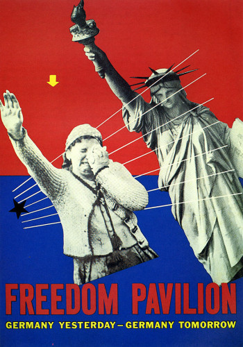
Lester Beall, Unbulit Freedom Pavilion, 1939
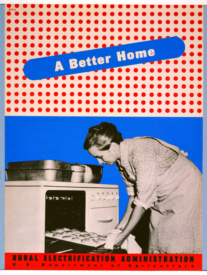
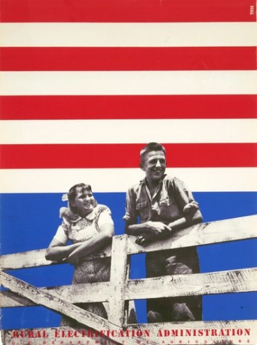
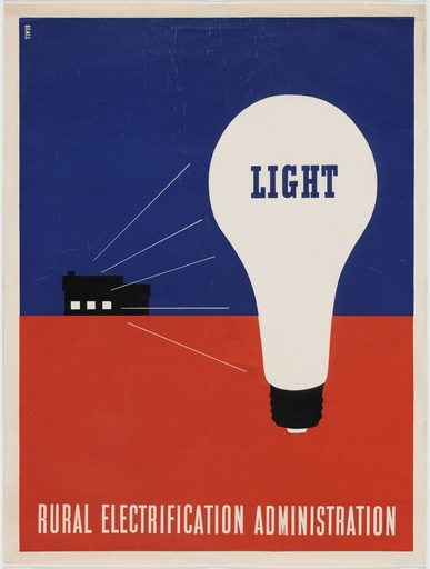
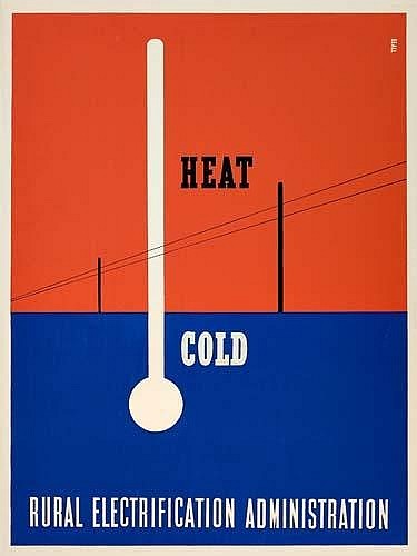
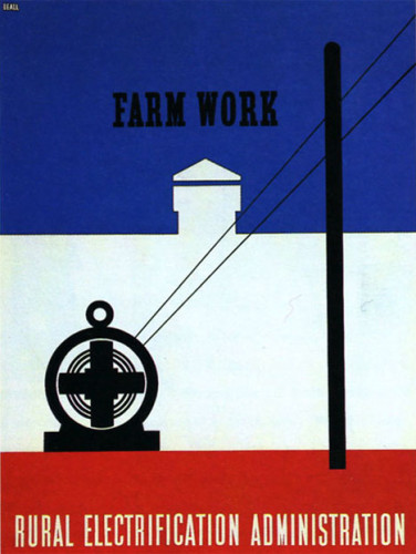
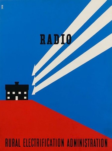
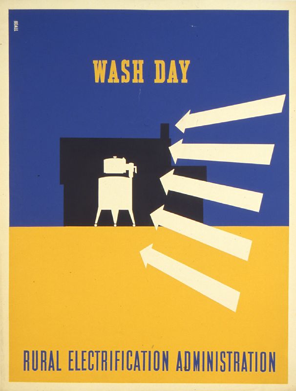
The general relationship between these designs are easily recognizable. Each one is done with primary colors (mostly red and blue). They all contain parallel and diagonal lines to create a well organized design and help the viewer’s eyes flow off the page. They each convey a message about the American life or technology that we use. His typography is very clear and concise and has the title of each print in each design. He worked with the Rural Electrification Administration and the government to help communicate with the American people. It was either good advertisement or to open his viewer’s eyes to see what was really happening in American society.
Part 1:
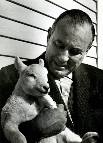
Lester Beall was born in 1903 in Kansas City, Missouri. He was a notable American Graphic Designer. He was mainly known for his clear precise use of typography, as well as his bold use of primary colors, lines, and arrows. It became such a well known style of his that when someone saw his work, it was easily recognizable. Beall as a young child spent most of his time in St. Louis and Chicago. He graduated the University of Chicago and began his design career in 1927. His work was quickly discovered. Each one of his designs delivered an “arresting message”. He had a thrusting perspective and abstract shapes that made his posters stand out. In 1937 he got his work exhibited in the Museum of Modern Art in New York where he moved to in 1935 and opened his own studio/office. His work demonstrated the rapid change in American culture and society. He wanted to find a way to communicate the expanding world of science, technology, and manufacturing in America and how it has brought rising expectations that called for a new graphic imagery / design. He died in New York in 1969 in his farm where he lived with his family. In my opinion Beall’s work is very simple, but effective. His work showed me that you don’t need complex designs to create a good design. I enjoyed going through his work and seeing how he tried to communicate with his audience.
Part 2:
- Being simple can sometimes be the best form of design
- Every design must convey a message as well as an emotional reaction.
- The way he used lines, arrows, primary colors and abstract shapes gave him his signature style.
-
-
Classroom
-
Recent Posts
Recent Comments
- Danielle Vizard on Thinking with Type — TEXT
- Danielle Vizard on Digging’ It!
- Jenna on Thinking with Type — TEXT
- Jenna on Digging’ It!
- Elizabeth Robinson on Digging’ It!
Archives
- November 2023
- August 2023
- May 2023
- April 2023
- March 2023
- February 2023
- January 2023
- December 2022
- November 2022
- October 2022
- September 2022
- August 2022
- July 2022
- June 2022
- May 2022
- February 2022
- December 2021
- November 2021
- October 2021
- September 2021
- August 2021
- June 2020
- February 2018
- December 2015
- November 2015
- October 2015
- September 2015
- August 2015
Categories
-
About
KSC GRAPHIC DESIGN


















Leave a Reply
You must be logged in to post a comment.