- Ê
- Â
fJulie has 6 post(s)

Part 1
Alexey Brodovitch was born in Russia in 1898 and died in France in 1971. He is remembered today as the art director of Harper’s Bazaar for nearly a quarter of a century. Brodovitch played a crucial role in introducing a radically simplified form of modern graphic design to the United States. He used photography as a backbone of modern magazine design. He is seen as virtually the model for the modern magazine art director. Brodovitch’s impact on the editorial of Harper’s Bazaar was so great that he achieved celebrity status. He came to the United States in 1930 to start a department of advertising (later known as the Philadelphia College of Art). There he trained students in the fundamentals of European design, while also taking on freelance illustration assignments in Philadelphia and New York. Brodovitch’s legacy as a publications designer also includes the short-lived but influential magazine Portfolio, three issues of which were published in 1949 and 1950. Portfolio was a flashy, innovative quarterly aimed at the design profession. Throughout his career, he continued to teach his “Design Laboratory,” which focused variously on illustration, graphic design, and photography. Brodovitch did not formulate a theory of design. Despite his unbending manner and lack of explicit critical standards, many students under his tutelage discovered untapped creative reserves.
Part 2
1. While politically he was sympathetic with czarist russia, his artistic work shared the ideas of the avant-garde.
2. Bodovitch was one of the pioneers to bring modernist ideas to America.
3. At the Philadelphia college of Art Brodovitch taught by using examples of european graphic design, questioning his students about the placing of the elements and the decisions made by the designers
Part 3
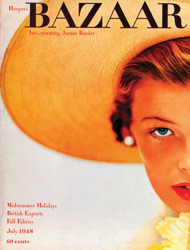
Alexey Brodovitch, Harper's Bazaar, July 1948, Photograph by Richard Alvedon
-
- Alexey Brodovitch, Harper’s Bazaar, July 1948, Photograph by Richard Alvedon
-

-

-

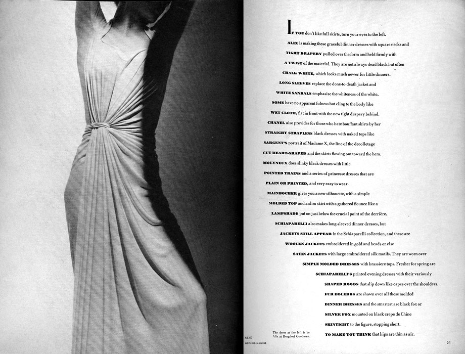
- Alexey Brodovitch, If you don’t like full skirts…, March 1938, Photographs by George Hoyningen-Huene
-

-

-
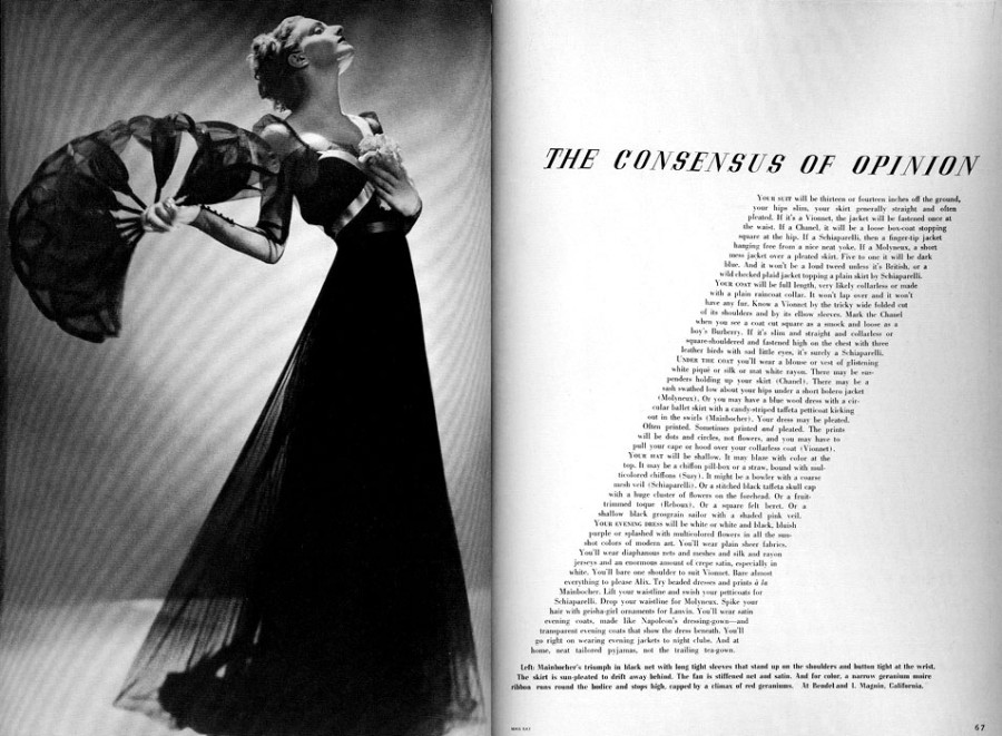
- Alexey Brodovitch, The Consensus of Opinion, March 1936, Photograph by Man Ray
-

-


-
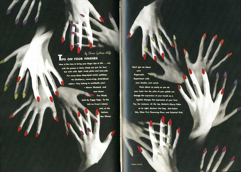
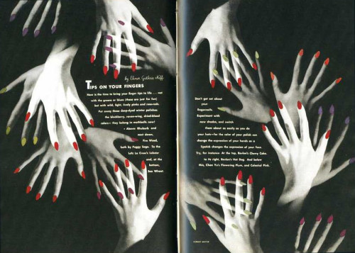
- Alexey Brodovitch, Tips in Your Fingers, April 1941, Photographs by Herbert Matter
-

-
-
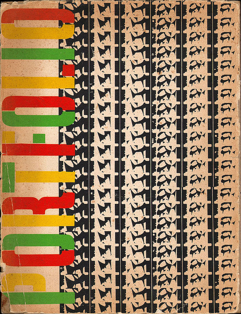
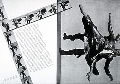
- Alexey Brodovitch, Portfolio, 1950, film strips by Charles and Ray Eames
-

-

-
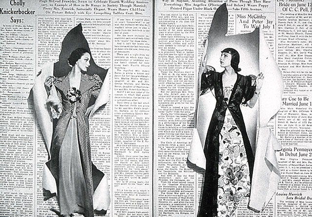
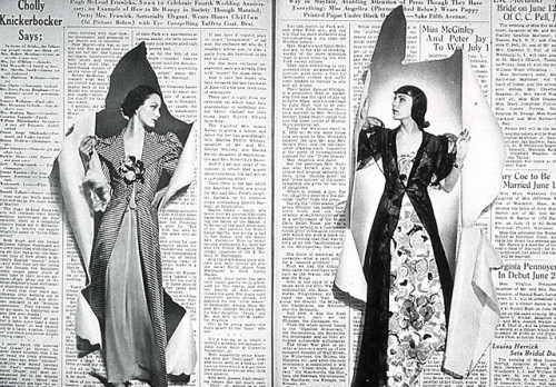
- Alexey Brodovitch, spread from issue of Bazaar, June 1938
-

-
-
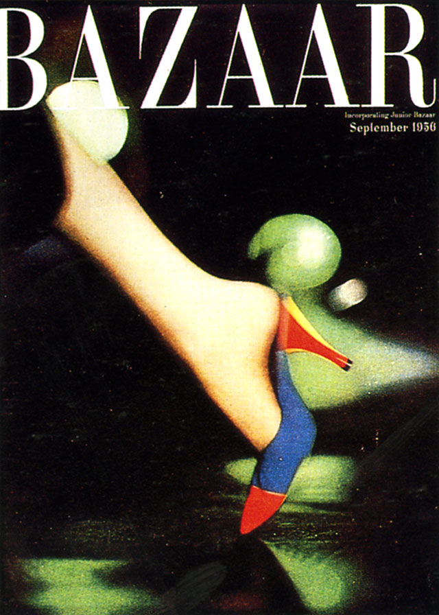
- Alexey Brodovitch, Cover Of Bazaar, September 1956
-

-

-
- Alexey Brodovitch, Ramon & Renita, 1935, Harper’s Bazaar
-

-
-
- Alexey Brodovitch, Harper’s Bazaar Cover, July 1968
-

-
These works are related in their use of photographs with the exception of Portfolio which uses film strips and creates a unique visual texture. In the page spreads, the text and photographs work harmoniously as the shapes presented in the photographs are either mimicked by the text or wrapped tightly within or around it. In the case of the cover pages, there is a limited use of text and an emphasis on the female figure photographed. The space that is present is activated by the interjecting shapes and oversized photos of the parts of the female body or face that is shown. Each work has a sense of balance .
-
-
Classroom
-
-
Recent Posts
Recent Comments
- Danielle Vizard on Thinking with Type — TEXT
- Danielle Vizard on Digging’ It!
- Jenna on Thinking with Type — TEXT
- Jenna on Digging’ It!
- Elizabeth Robinson on Digging’ It!
Archives
- November 2023
- August 2023
- May 2023
- April 2023
- March 2023
- February 2023
- January 2023
- December 2022
- November 2022
- October 2022
- September 2022
- August 2022
- July 2022
- June 2022
- May 2022
- February 2022
- December 2021
- November 2021
- October 2021
- September 2021
- August 2021
- June 2020
- February 2018
- December 2015
- November 2015
- October 2015
- September 2015
- August 2015
Categories
-
About
KSC GRAPHIC DESIGN

Leave a Reply
You must be logged in to post a comment.