- Ê
- Â
fDylan has 7 post(s)
Gallery

Herbert Bayer, Kandinsky zum 60. Geburtstag, 1926
-
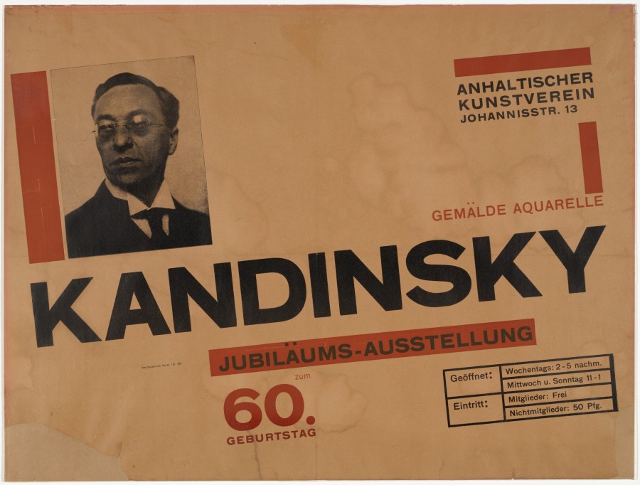
- Herbert Bayer, Kandinsky zum 60. Geburtstag, 1926
-

-

-

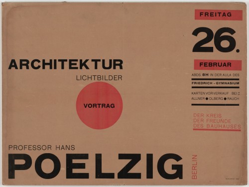
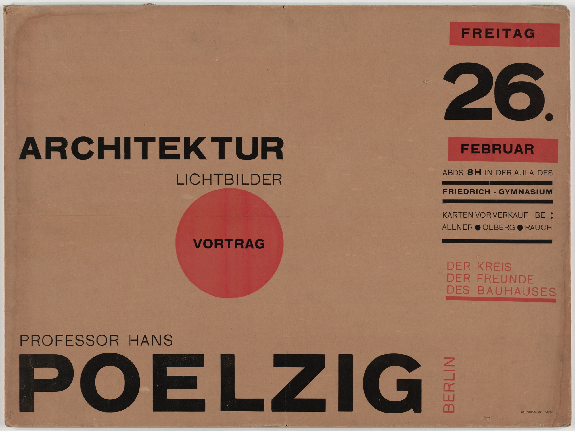
- Herbert Bayer, Architektur Lichtbilder Vortrag Professor Hans Poelzig, 1926
-

-
-
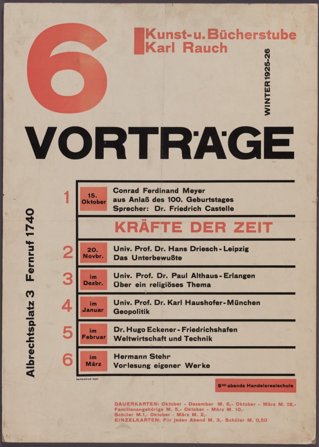
- Herbert Bayer, 6 Vorträge, 1925
-

-


-
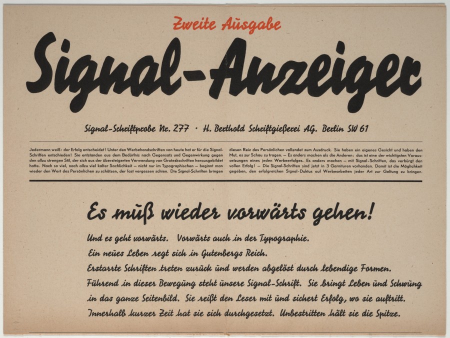
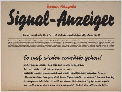
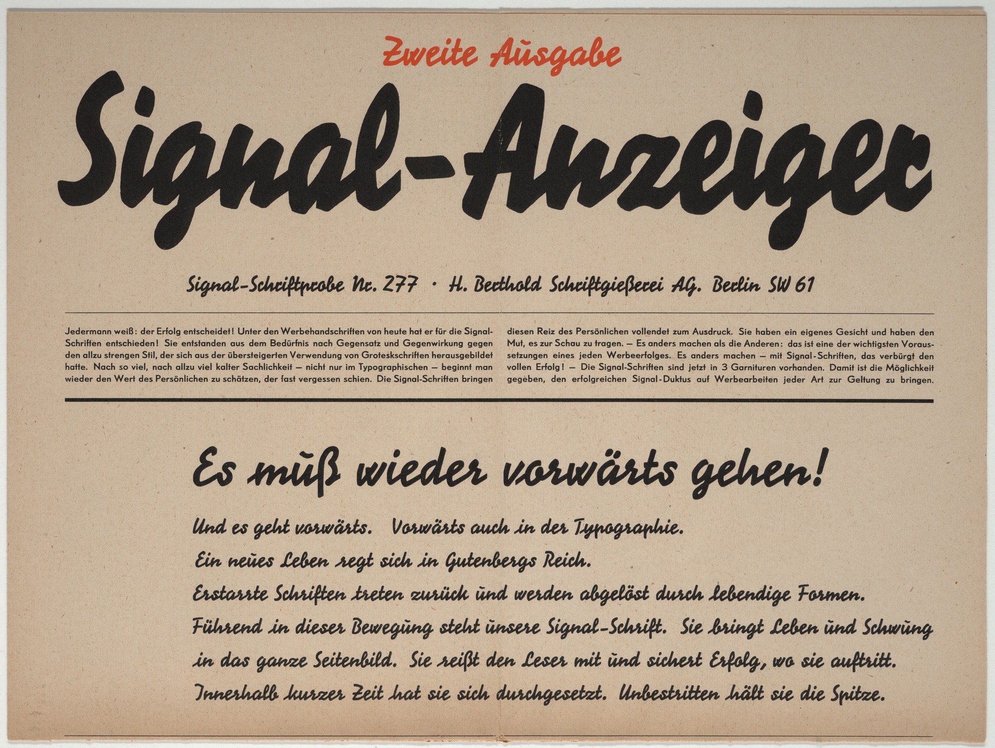
- Herbert Bayer, Signal-Anzeiger, Signal-Schriftprobe No. 277, 1929
-

-
-
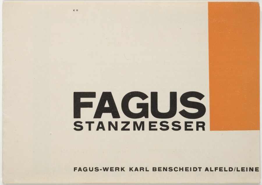
- Herbert Bayer, Fagus Stanzmesser, 1923
-

-


-

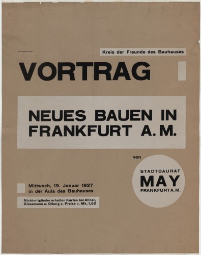
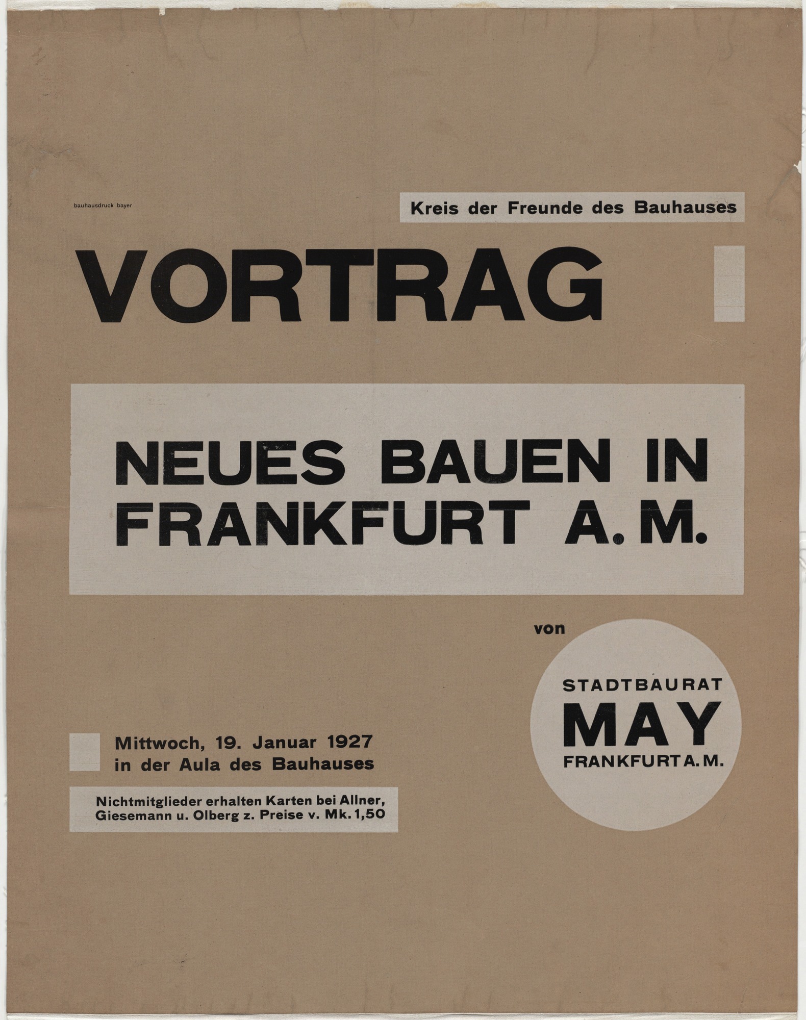
- Herbert Bayer, Neues Bauen in Frankfurt a.M , 1927
-

-
-

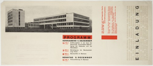
- Herbert Bayer, Einladung Bauhaus Dessau, 1926
-

-

-
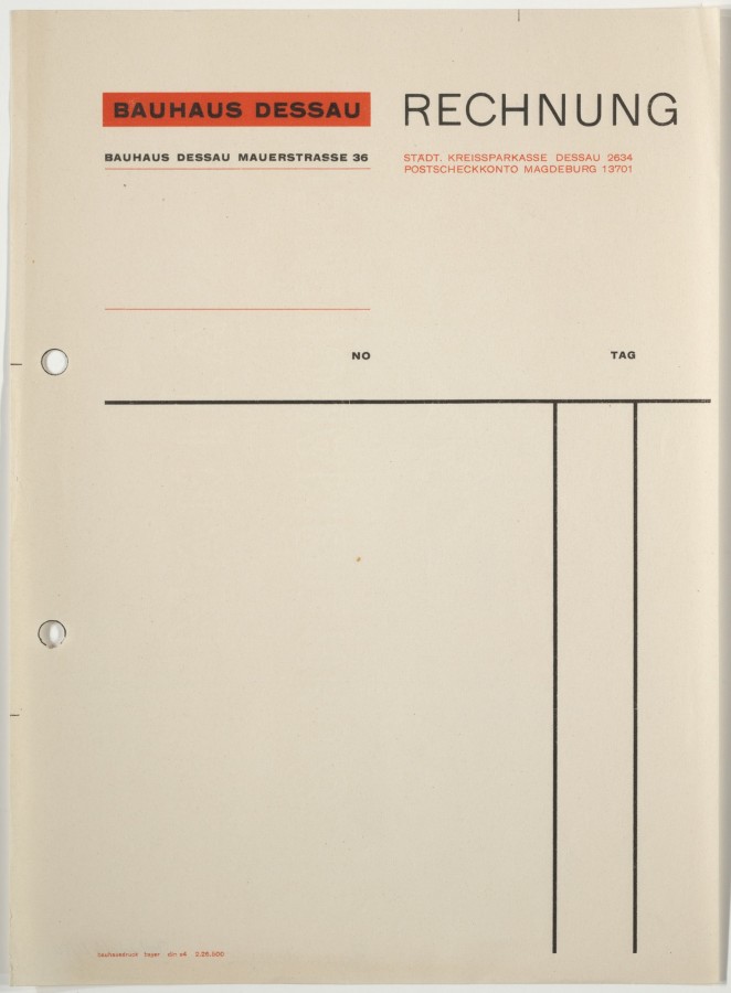
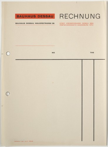
- Herbert Bayer, Bauhaus Dessau Rechnung, 1926
-

-

-

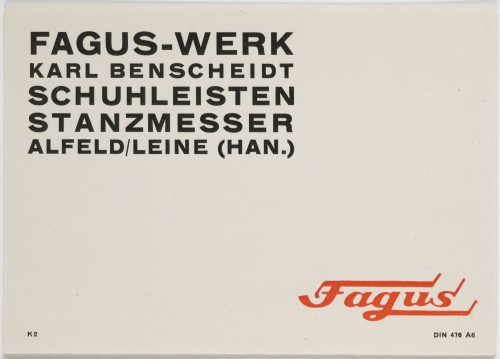
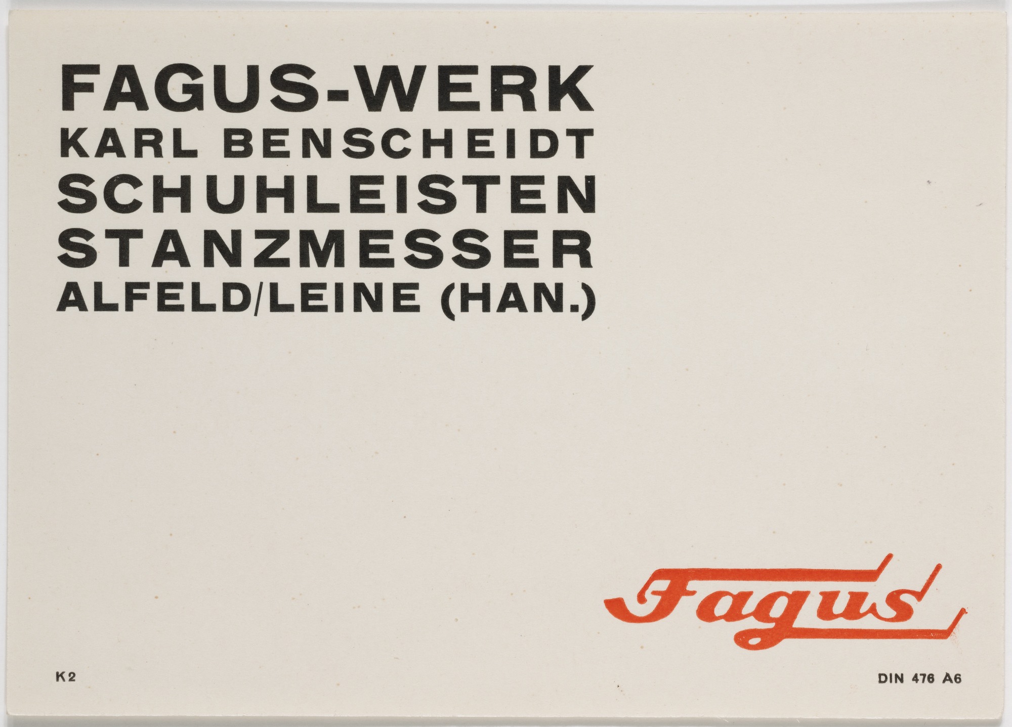
- Herbert Bayer, Fagus-Werk, Schuhleisten, Stanzmesser, 1926
-

-
-
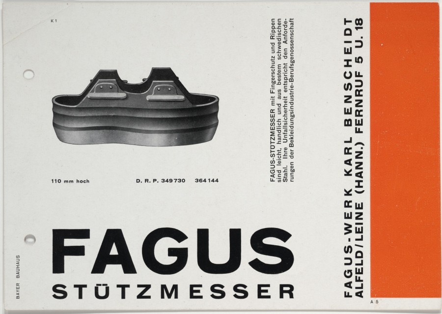
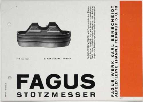
- Herbert Bayer, Fagus Stützmesser, 1926
-

-

-
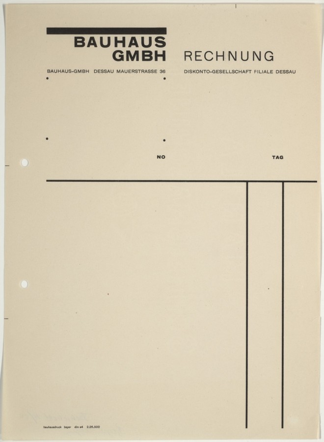
- Herbert Bayer, Bauhaus GmbH Rechnung, 1925-26
-

-


-

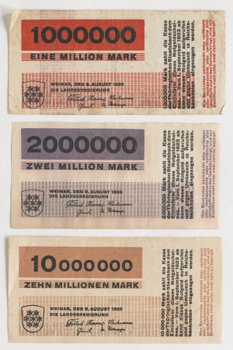
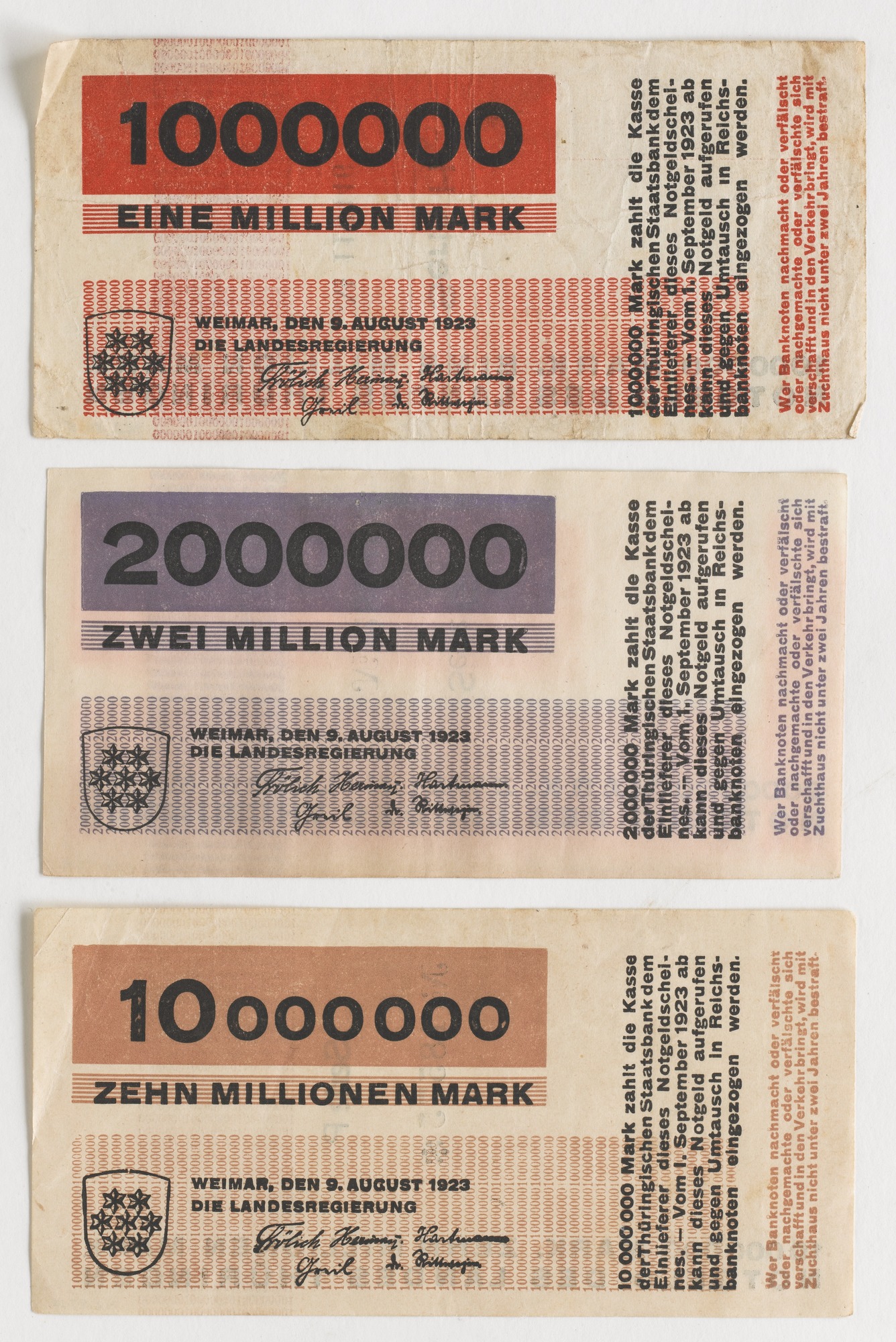
- Herbert Bayer, 10 Banknotes, designed for the State Bank of Thuringia, 1923
-

-
Gallery Info
The works selected for this gallery were picked from Herbert Bayer’s simpler, more bare-bones designs. The contents of the gallery involve almost entirely text-based designs(typically sans-seriff) with limited used of abstract shapes and sometimes photo. For the sake of avoiding complications, such as overwhelming viewers, Bayer keeps his colors monochromatic. All of these typographic works have a strong architectural structure to them. Each composition is rigidly put together with no dangling ends or floating text. While there is a great disparity between text sizes there always appears to be a counterbalance holding the shapes together. These radical differences in text sizes allow Herbert to give a fantastic amount of emphasis on certain key words. Herbert also shows a preference for taking words an places them inside of containers, whether it be within circles, squares, or grids, it has the noteworthy effect of isolating text from the rest of the page. Much of Herbert’s work seems to convey a sense of expressive restraint, he tries to keep things concise only showing what’s necessary. That being said, his minimalist typography still shows a fair deal of personality, giving off a bold, powerful impression.
BIO
Herbert Bayer is a graphic designer from Haag, Austria. He was accepted into Germany’s famous Bauhaus design school in 1921. Though an accomplished painter and photographer, Bayer was most known for his accomplishments in the typography and graphic design fields. He created a very geometry, sans-seriff typeface he called “Universal” which decided to drop uppercase letters entirely. Qualities of the type are how they have a very bold and round look to them. One detail that particularly appeals to me about the typeface, is the way that in some letters like “d” are just perfect circles with descenders and ascenders added on to them.
Herbert did a number of posters for Bauhaus. He usually sticks to flat colors to emphasize shapes in his designs. One of my favorite works of his would be his poster for architect, Hans Poelzig. It is a very sans-seriff type heavy poster with a few orange abstract shapes on a brown background. The left side of the poster is a fairly spacious with large bold text sandwiching smaller light text and a bold text containing circle. The top and bottom halves of texts have opposite allignments making the text forms appear to hook over one another. The orange circle in the middles hangs below the top half of text creating a perfect right angle. The right side of the page contrasts with left’s spacious by having a fairly dense sidebar of information. Two of words at the top are highlighted in orange blocks containing a number explaining the date of an event. As for the rest of the text, Bayer has created a neat internal logic by bolding, underling, and coloring words. Herbert Bayer has great talent for taking text and and turning them into really interesting structures.
OTHER INSIGHTS
1. Before his acceptance into Bauhaus, he apprenticed for an architect Josef Emanuel Margold in Linz, Germany.
2. He has a wide range of skill including Photography, Landscape architecture, and painting.
3. One of his reasonings for developing a lower case only typeface was to counter the fact that the German language capitalizes all nouns.
Sources
After reading this article, i feel like i have a much a better understanding of what visual hierarchy is all about. Hierarchy is focused on how a layout can control our attention by emphasizing and organizing aspects in the visual space. Hierarchy can separate lines of text into groups or make everything clump together into a big homogeneous blurb. An example in the text that stuck out was the table of contents page that tried one to many methods of separating texts and ended up looking like a complete mess. Also the page that showed a series of similar hierarchies with slight permutation was useful in showing how different types of changes can affect a hierarchy.
Isolated Snow Showers
38°F
Humidity 57%
Barometer 30.10 in
Wind Speed NA
Dewpoint 24°F
Visibility NA
89701
-
-
Classroom
-
-
Recent Posts
Recent Comments
- Danielle Vizard on Thinking with Type — TEXT
- Danielle Vizard on Digging’ It!
- Jenna on Thinking with Type — TEXT
- Jenna on Digging’ It!
- Elizabeth Robinson on Digging’ It!
Archives
- November 2023
- August 2023
- May 2023
- April 2023
- March 2023
- February 2023
- January 2023
- December 2022
- November 2022
- October 2022
- September 2022
- August 2022
- July 2022
- June 2022
- May 2022
- February 2022
- December 2021
- November 2021
- October 2021
- September 2021
- August 2021
- June 2020
- February 2018
- December 2015
- November 2015
- October 2015
- September 2015
- August 2015
Categories
-
About
KSC GRAPHIC DESIGN

Leave a Reply
You must be logged in to post a comment.