- Ê
- Â
fChristian has 6 post(s)
Gallery

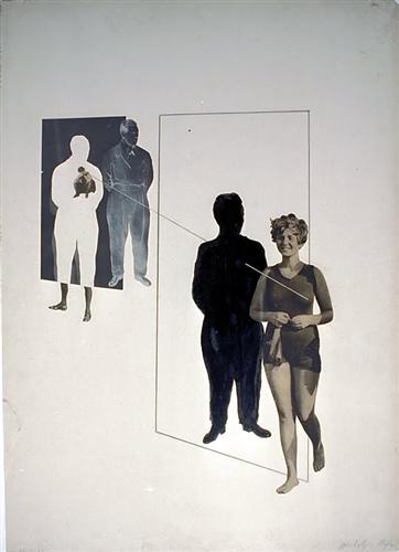
László Moholy-Nagy, Love Your Neighbor; Murder on the RailwayLove Your Neighbor; Murder on the Railway, 1925
-
- László Moholy-Nagy, Love Your Neighbor; Murder on the RailwayLove Your Neighbor; Murder on the Railway, 1925
-

-

-
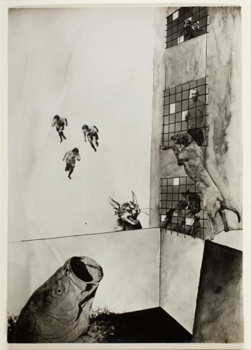
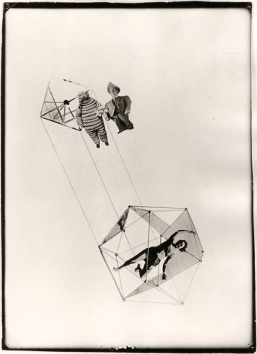
- László Moholy-Nagy, Human Mechanics, 1925
-

-

-
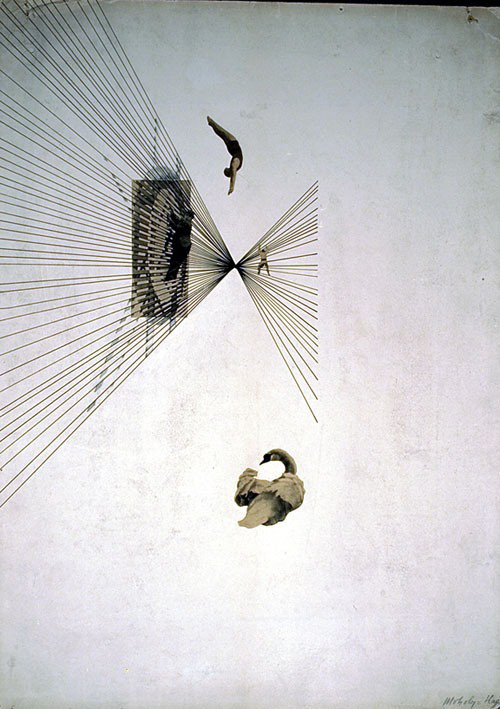
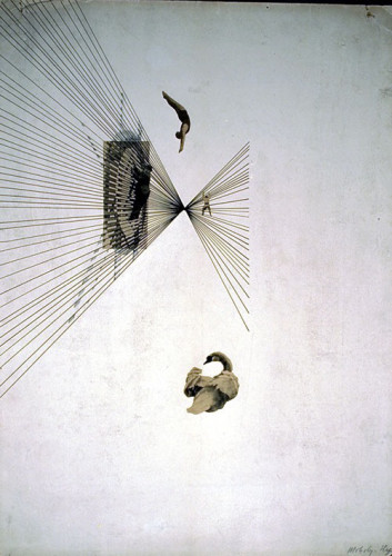
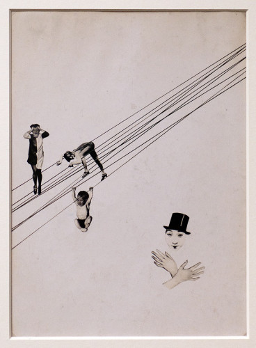
- László Moholy-Nagy, Leda and the Swan, 1925
-

-
-

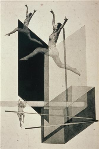
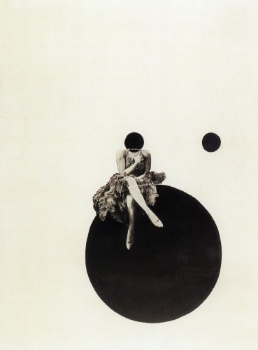
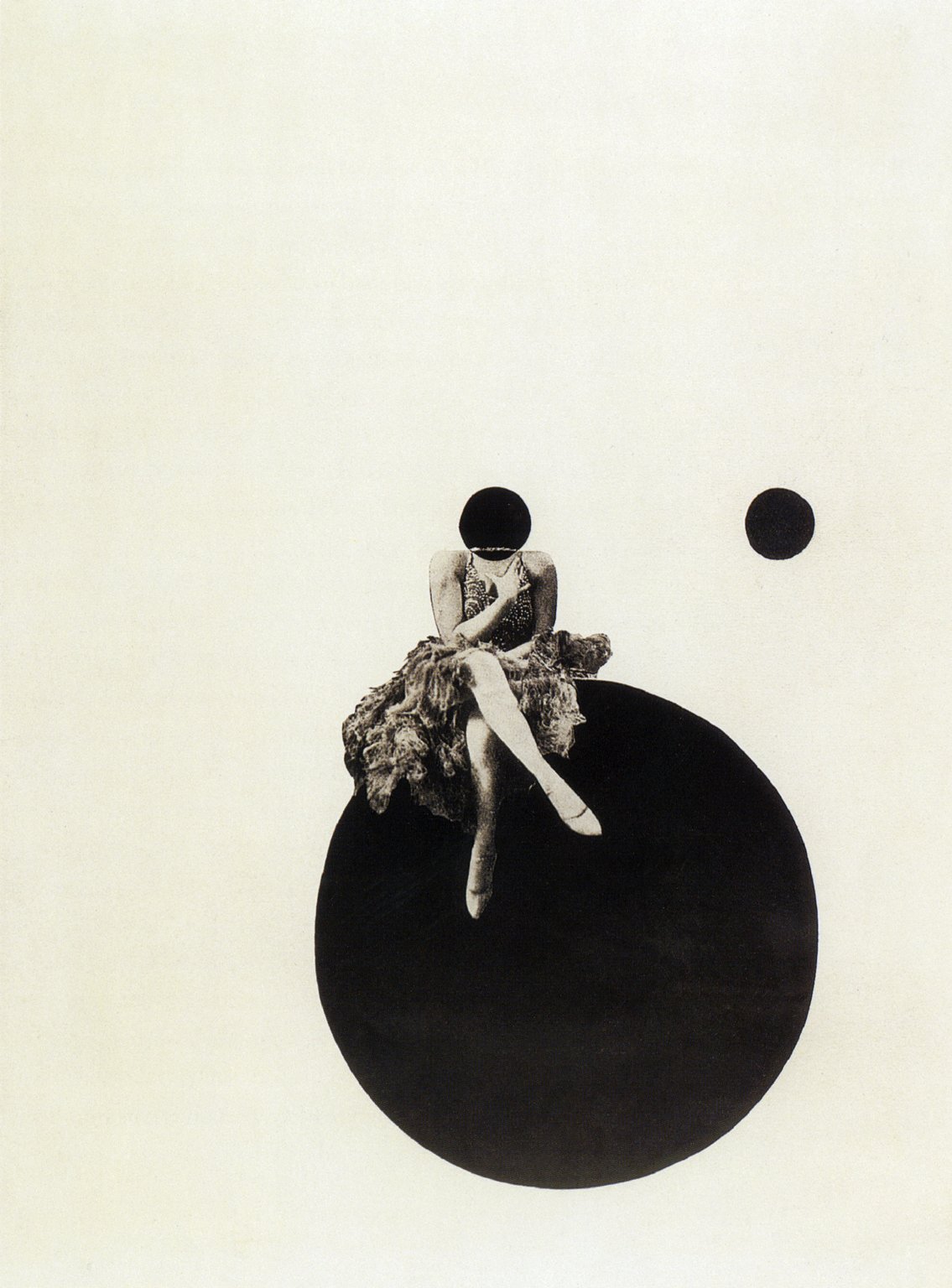
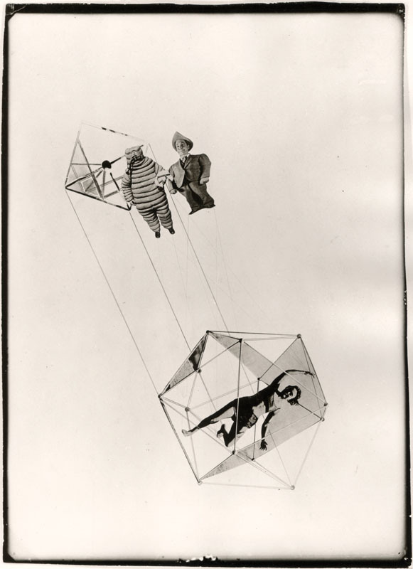
- László Moholy-Nagy, The Olly and Dolly Sisters, 1925
-

-
-
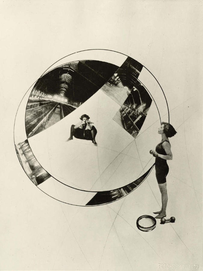
- László Moholy-Nagy, How Do I Stay Young and Beautiful, 1925
-

-

-

- László Moholy-Nagy, City Lights, 1926
-

-
-
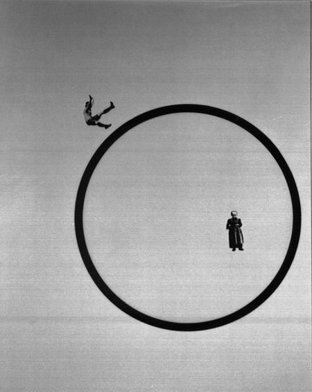
- László Moholy-Nagy, Jealousy, 1927
-

-

-

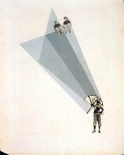
- László Moholy-Nagy, The Mavericks II, 1927
-

-
-

- László Moholy-Nagy, My Name is Bunny Rabbit, I Know Nothing, 1927
-

-

-
- László Moholy-Nagy, Die Korsettstange, 1925-27
-

-
-
- László Moholy-Nagy, Die Zerruttete Ehe, 1925-27
-

-

Relationships Within His Work
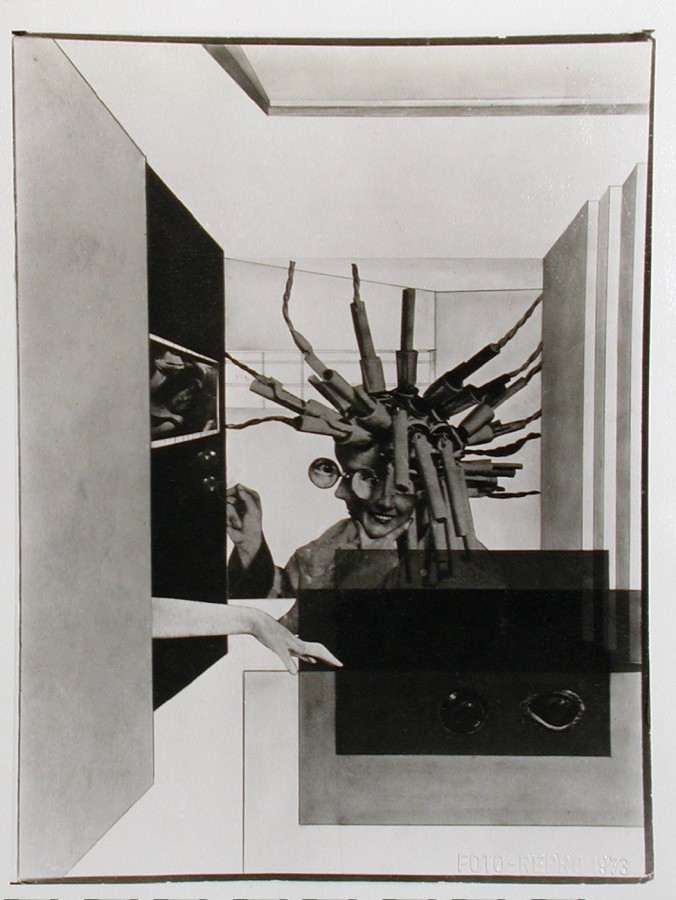
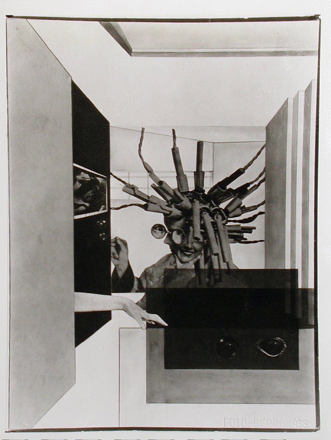
The specific area of Moholy-Nagy’s work that I have chosen to focus on is his photomontage, which is seen within the gallery above. Photomontage in the wake of WWI was an attempt for artists and designers to help re-shape society by conveying how a gendered experience of modernity could be envisioned. There are two unifying characteristics of almost all of his montage work that specifically stood out to me: the first, being his use of women as subjects and the second being the inclusion of line and geometric shape. As an artist, he utilized a constructivist approach in placing the photographic elements to create dynamic relationships within his pieces.
About the Artist
Born in Borsod, Austria-Hungary in 1895, László Moholy-Nagy had picked up an interest in literature at a young age. His first ambition was to become a writer, but he was persuaded to study law in Budapest after graduation. His studies came to a halt when World War I began, and in 1915 he enlisted in the Austro-Hungarian army as an officer. Though he had begun to pick up drawing before joining the army, he turned this hobby into a more serious one during his hours in artillery observation posts where he would produce sketches on the backs of military-issue postcards. At the age of 23, he officially began his career as an artist. He became fascinated by the expressive power of lines and the effects of color on composition. His work was highly influenced by Russian Constructivism, and he strove to eliminate “personal touch” from his paintings. In addition to painting, he focused a lot of his time on creating collages on paper and dabbling into photography. He spent five pivotal years as a professor at the Bauhaus school, where his paintings continued to evolve. He then began work as a free-lance designer, creating book jackets, posters and exhibitions. In 1935, he set up a design studio with György Kepes. In 1939, he opened his own school, The School of Design in Chicago, and though it absorbed much of his time and energy, he still continued to lecture, paint, photograph and publish his works. He is noted to be one of the greatest influences on post-war art education in the United States.
Signature Points
- He worked predominantly with light as a photographer and painter.
- His time in the army played a fundamental role in not only his art but his teaching.
- He was an advocate of the integration of technology and industry into the arts.
Research Links
The reading on Hierarchy was pretty interesting to me. Hierarchy within design is something that I have been noticing and looking out for fairly frequently and it is, just like many other things, a factor that can make or break a design. It’s what gives a design it’s flow and readability. If someone was to look at a design, they would most likely want to look at something that clearly conveyed what parts of the design are most important and what parts of the design are not as important. For example, think about an event flyer. An event flyer is normally filled with a good amount of text, and that text needs to be broken up somehow or else nobody will even bother reading it. People passing by that flyer want to know what the event is and when it takes place at first glance. If that information draws them in, then they’ll care enough to look further and find the other details. Creating a hierarchy within a design can be pretty difficult, though. You really have to take the time to think and make decisions about what is TRULY the most significant in your case. I, myself, am hoping to better myself at it.
Fog/Mist
45°F
| Humidity | 97% |
| Wind Speed | NW 12 mph |
| Barometer | 29.73 in (1007.3 mb) |
| Dewpoint | 44°F (7°C) |
| Visibility | 2.50 mi |
| Wind Chill | 39°F (4°C) |
| Last update | 4 Nov 12:53 pm CST |
57501


Mind Map
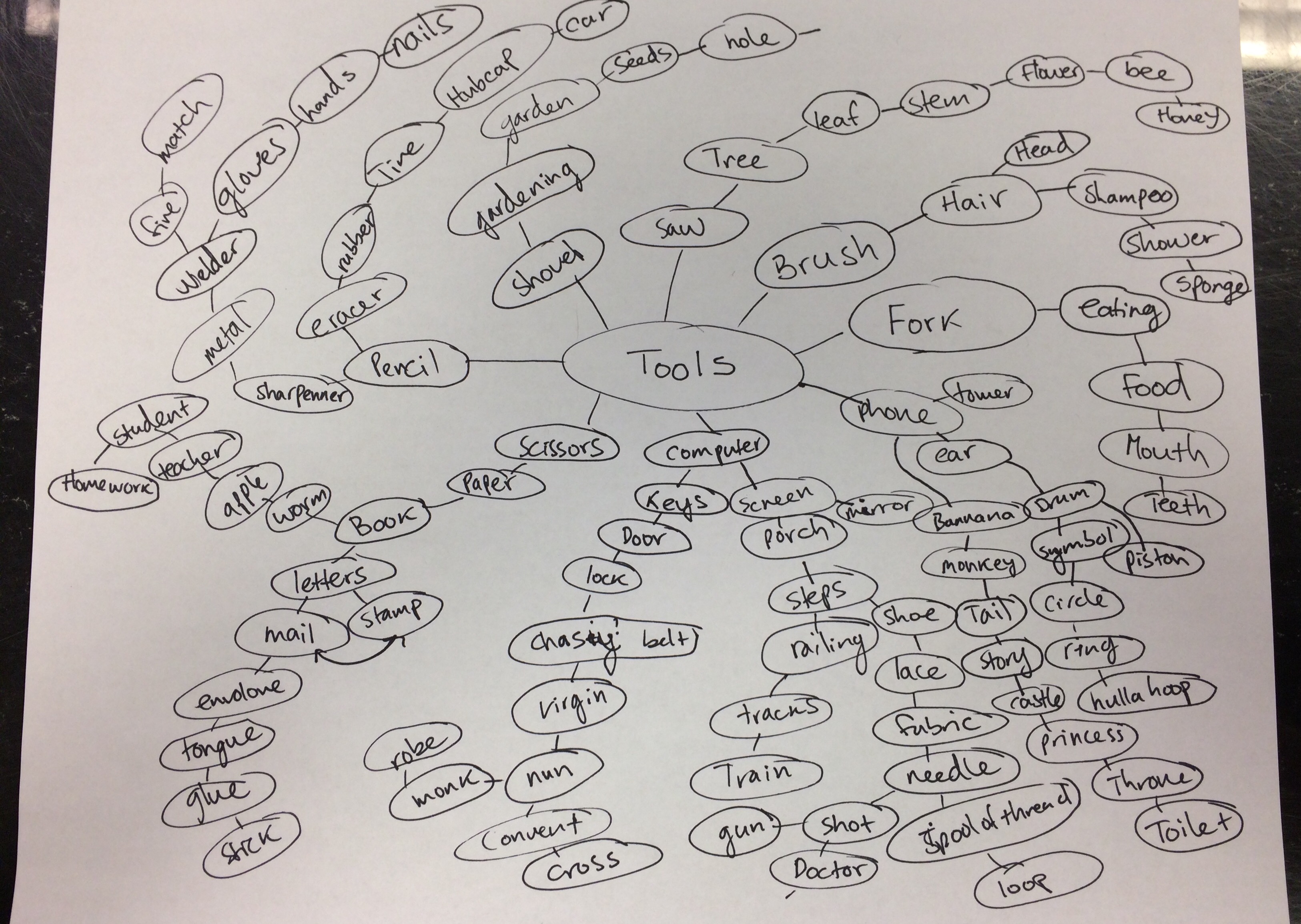
This is one of the three mind maps that my group of four came up with. Mind mapping is actually a new concept to me, and I think they’re pretty cool so far. It’s interesting to see how far you can run with a thought and what those thoughts can develop into, especially in a group of people who all think differently. Having the ability to bounce ideas off of each other was definitely helpful.
My 25 Original Pairings
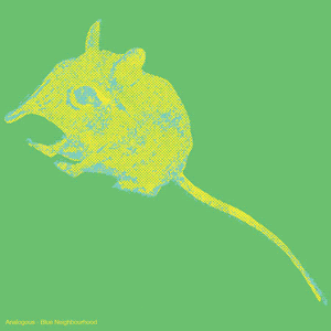
1. Saw + Teeth
2. Elephant + Megaphone
3. Trampoline + Drum
4. Snake + Stapler
5. Drill + Noodle
6. Brush + Puzzle
7. Phone + Shovel
8. Spatula + Lamp
9. Keys + Ponytail
10. Shoe + Rocket
11. Suitcase + Computer
12. Scissors + Hook
13. Mittens + Cheese
14. Dish + Boat
15. Match + Bug
16. Sword + Fan
17. Nun + Clown
18. Pencil + Whip
19. Fork + Worm
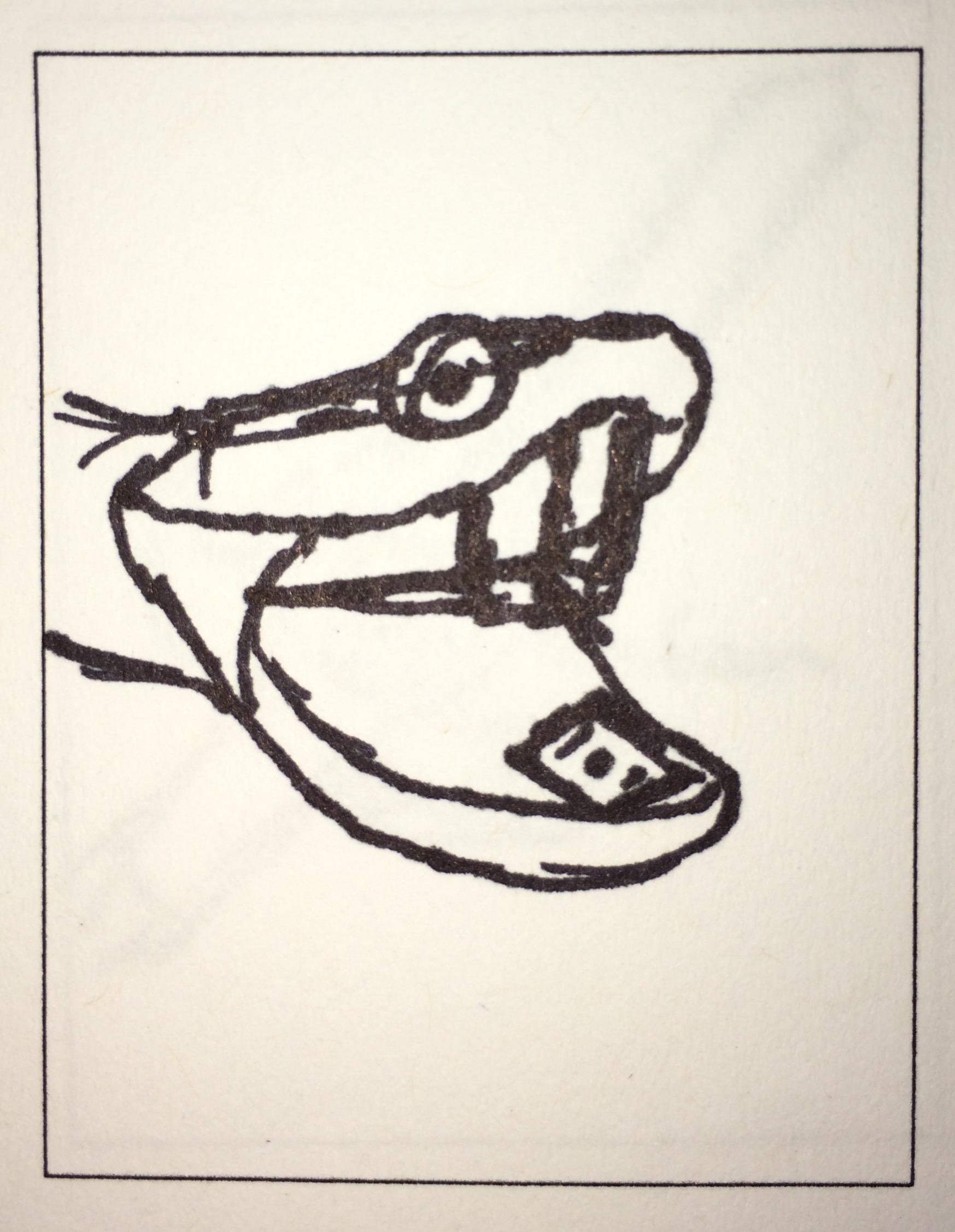
20. Gun + Cup
21. Telescope + Cannon
22. Car + Hula Hoop
23. Meat + Tree
24. Bottle + Glasses
25. Chain + Tail
My 10 Choices
1. Saw + Teeth
I automatically thought of the “teeth” on a saw, and thought it’d be comical to have them look like actual human teeth. I doubt that would actually help in cutting anything down though… unless you brushed and flossed every day, of course.
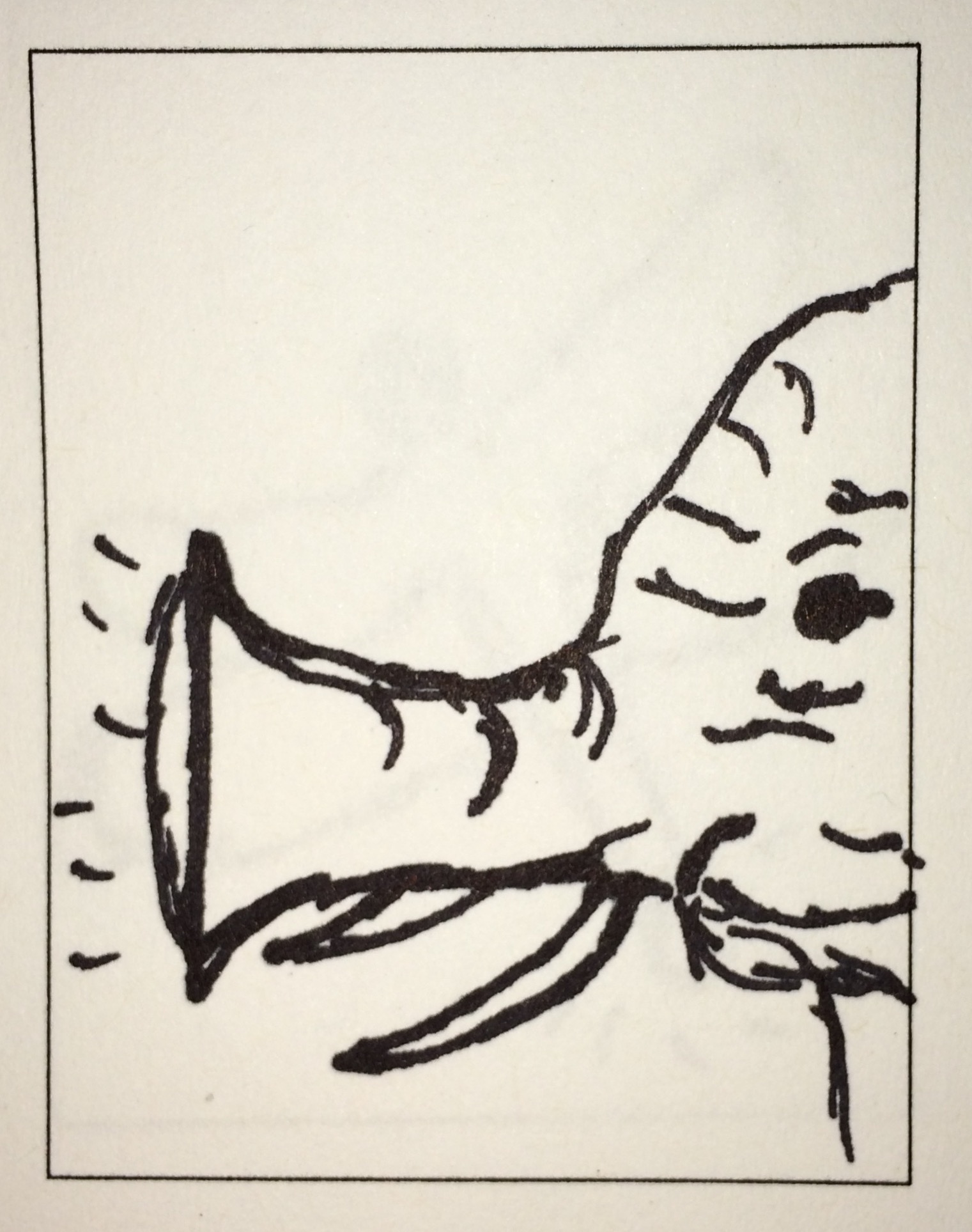
2. Megaphone + Elephant
A megaphone is slightly similar to an elephant’s trunk appearance-wise, so why not switch them up and maximize the volume of their breathing, am i right?!
3. Snake + Stapler
This probably would have worked better if the snake was paired with a staple remover, because of the resemblance between that and a snake’s fangs, but this was the next best thing in my opinion. All you have to do is bop the (hopefully dead) snake on the head and voilà, you have a stapled set of papers and you looked cool (and brave) doing it.
4. Drill + Noodle
This idea popped into my head while thinking of drill bits and the similarities in appearance between them and certain pasta noodles, so I thought it would be fun to see where the combination could go.
5. Phone + Shovel
I have ABSOLUTELY no idea as to why or how this combination popped into my head so fast, but I automatically thought of the slide-out keyboard cellphones we used to have in middle school. For some odd reason, I thought it would be a fantastic idea to replace the slide-out keyboard with a shovel… y’know, just in case you need to go digging and you forget your actual shovel at home.
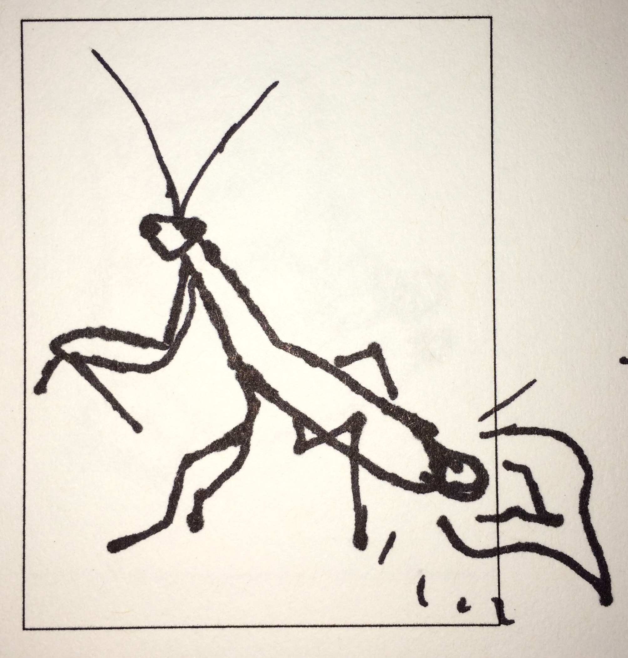
6. Match + Bug
For this combination, I kept coming back to the idea of the way certain bugs’ bodies are, and how thin and similar to a match some of them look (praying mantis, dragon fly, stick bug, etc.), so I thought of replacing the actual body with one.
7. Sword + Fan
I had a feeling that, in medieval times, fans would have been made out of the same blades swords were made out of as a sort of torture device (or just to circulate some air). I also thought of how nice it would’ve been for knights to have a fan built IN to their swords, especially with all of the heavy armor they had to wear. Refreshment on the go.
8. Fork + Worm
For this one, I thought it would be funny (and gross) to shape worms into the shape of a fork and/or wrap the worms around a regular fork to make them look like spaghetti.
9. Car + Hula Hoop
I had a few different ideas when it came to this pairing. The first two were to make the wheels on a car and the steering wheel inside a car into hula hoops, and the third was to make a person look like they were hula hooping a limousine (because of how long they are, which I thought was fitting).
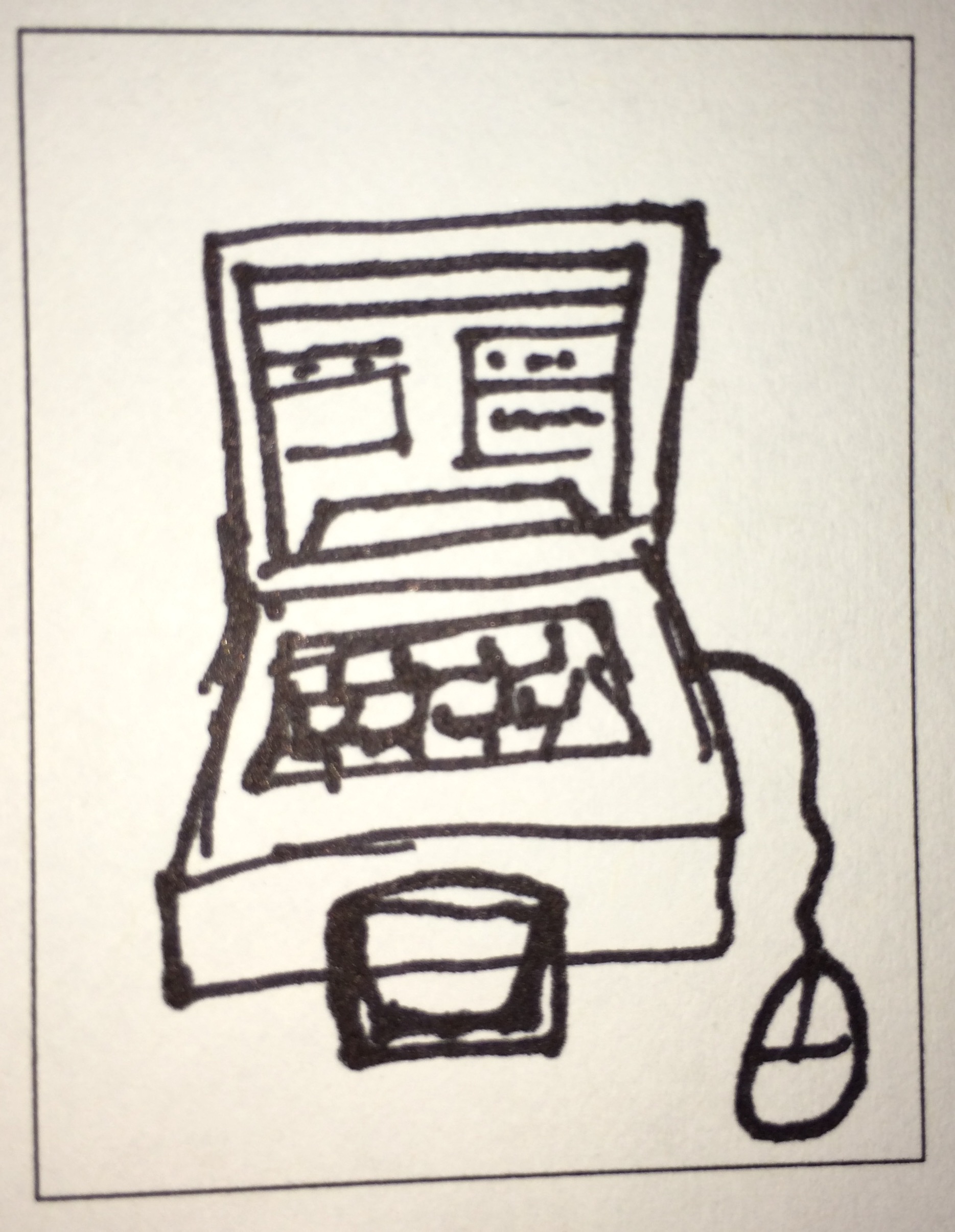
10. Suitcase + Computer
I call this one “The TRAVEL Computer”, which makes no sense at this point in time because that’s why laptops were invented. I thought that the way a suit case un-hinges and the way a laptop opens was pretty similar, so I went with it. I wouldn’t recommend buying it, though, because I can guarantee you won’t have too much space left to use to pack clothes.
Thumbnails
Overall
I thought this assignment was very interesting. Like I had said earlier, it’s something I had never done before and It was cool to branch out (even literally too, in the mind maps). It truly showed me how much thought goes into the early stages of design work, and how helpful it is to have a plethora of different ideas to grab from.
How Design Sparked My Interest
Since I was about twelve years old I’ve had a love for graphic design, even though I hadn’t truly realized it at that point. I had always taken an interest in the process behind my favorite album covers and movie posters and wondered what it’d be like to do something like that myself. As I started to grow up, I became active in blogs and forums online and noticed that some people used those places as their outlets for their own fan-made designs for their favorite singers and bands. It was cool to see a fan’s vision of an album cover I had known and loved, as well as the feedback other people would give them, so I figured I would try. I started out on Microsoft paint (which was obviously a tragedy), eventually grew up to a program called GIMP, and then discovered Photoshop. During a talk with my guidance counselor my freshman year of high school, I mentioned my passion for design when she asked about what I was thinking about doing after getting out of high school (I know, a weird question to ask so early). From there, she recommended that I join a vocational program where I would take design classes for 3 hours a day, and my regular academics the other half of the day. I partook in that program from sophomore to senior year and it was probably the best decision I’ve made in my life so far. The class expose me to so many new things and techniques. It was an eye-opener for me at first, because the whole first year was all the basics (drawing, painting, etc.) and no computer whatsoever which I wasn’t used to. Through the class, I entered and won various state-wide competitions and designed the yearbook cover for my school my senior year. All of these things really helped me grow not only as a designer, but as a person as well. I was taught to not take things to heart because not everybody is going to love everything you do, and that criticism is only there to help you, not to bring you down. On the other side of that, though, It truly does feel fantastic to get recognition for doing something that you love. Overall, the class really reinforced my passion for the field, and also helped me confirm that it was definitely what I wanted to pursue in college.
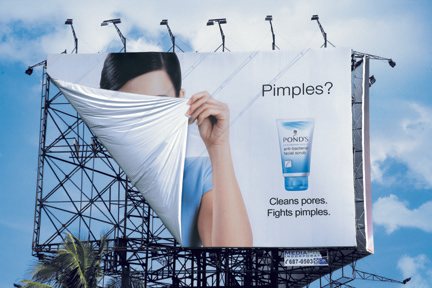
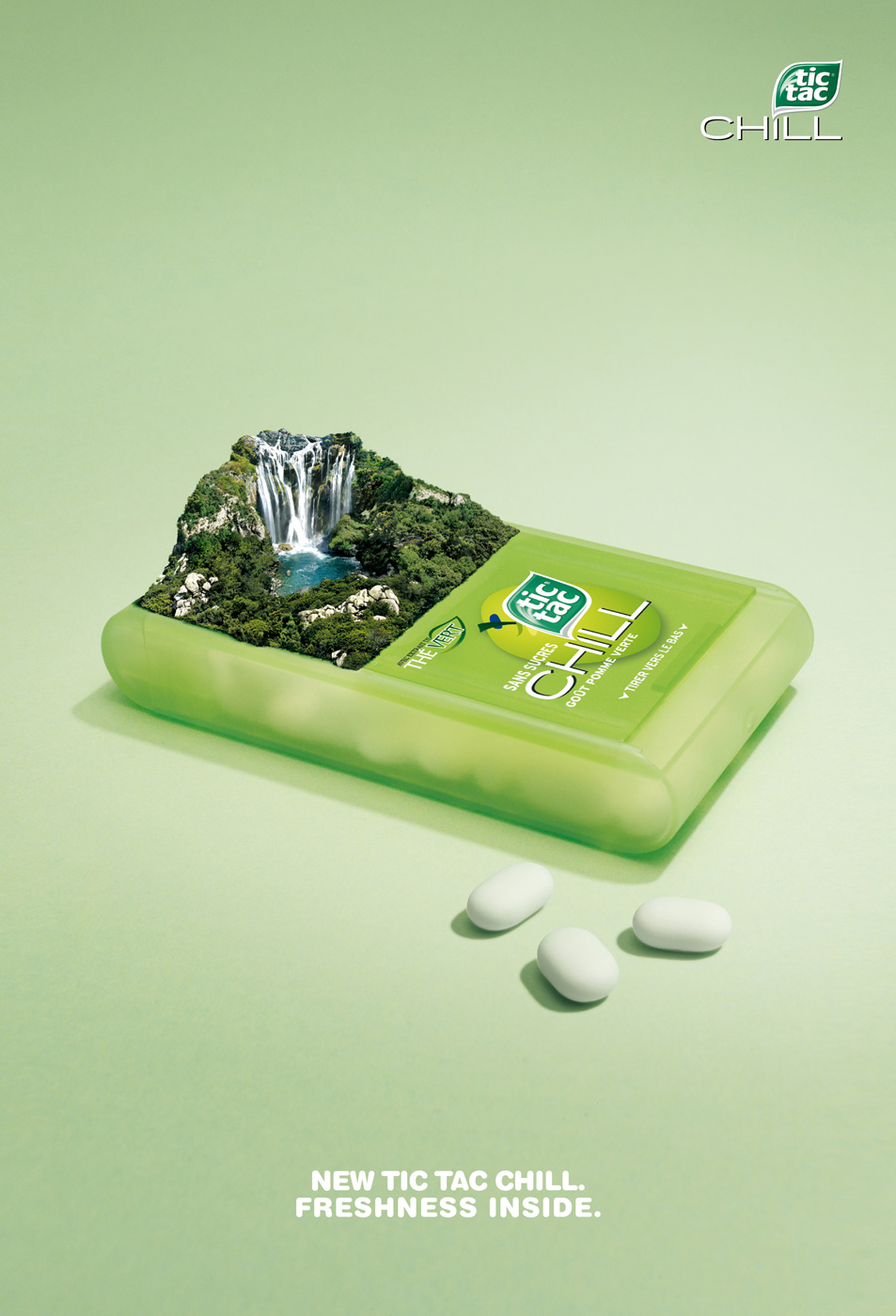
Advertising Design
The field of design that I’m most interested in is advertising design, mostly because that’s what I’ve had the most experience in. Advertising Design is the integration of type and image to strengthen a concept and portray a message. We see examples of this everywhere we look, whether it’s in stores, on a billboard, on a poster in the student center, etc. I like this field because I think it’s cool to see the various ways artists portray their messages to the public, and I would love to get some of my own out there one day.
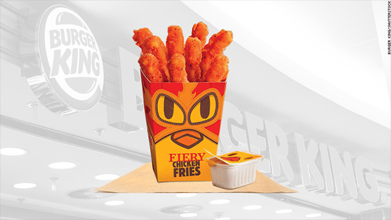
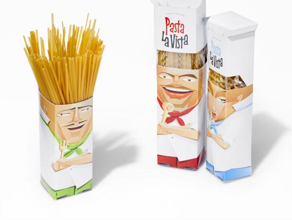
Package Design
Another field I’ve taken an interest in is package design. I was able to touch upon this field in my high school design class, where I was given a random item that I had to design a package for. My item was a bulldog clip, and I decided I wanted it to look like the roughest, toughest bulldog clip around (because of the name), so my packaging portrayed a cage with danger signs around it promoting it’s “toughness”. I thought it was pretty nifty at the time. That’s the thing about package design that I like – if you want to sell a product, the design surrounding it needs to be “nifty” or have a sort of “wow factor” to grab the consumer’s attention. That in itself comes as a fun challenge to me.
-
-
Classroom
-
-
Recent Posts
Recent Comments
- Danielle Vizard on Thinking with Type — TEXT
- Danielle Vizard on Digging’ It!
- Jenna on Thinking with Type — TEXT
- Jenna on Digging’ It!
- Elizabeth Robinson on Digging’ It!
Archives
- November 2023
- August 2023
- May 2023
- April 2023
- March 2023
- February 2023
- January 2023
- December 2022
- November 2022
- October 2022
- September 2022
- August 2022
- July 2022
- June 2022
- May 2022
- February 2022
- December 2021
- November 2021
- October 2021
- September 2021
- August 2021
- June 2020
- February 2018
- December 2015
- November 2015
- October 2015
- September 2015
- August 2015
Categories
-
About
KSC GRAPHIC DESIGN

Leave a Reply
You must be logged in to post a comment.