- Ê
- Â
fCourtney has 6 post(s)
- Gallery:
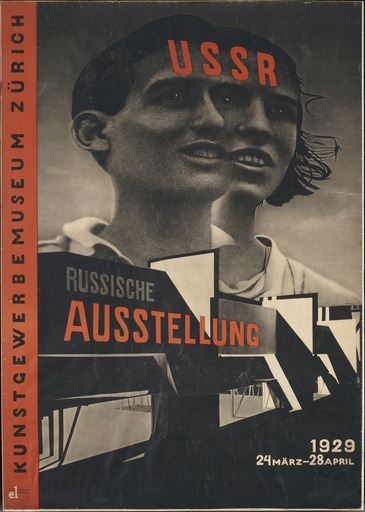
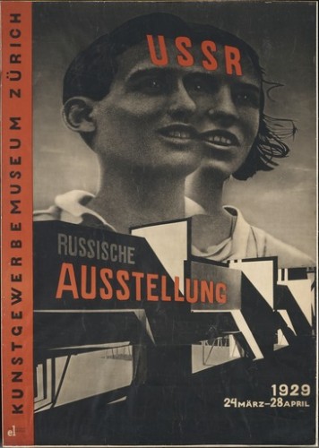
El Lissitzky, Russische Ausstellung, 1929
-
- El Lissitzky, Russische Ausstellung, 1929
-

-
-

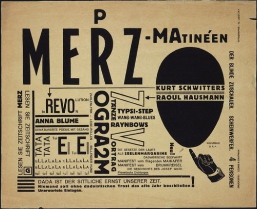
- El Lissitzky, Merz-Matineen, 1923
-

-
-
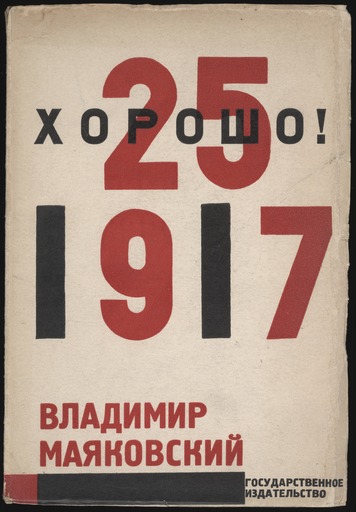
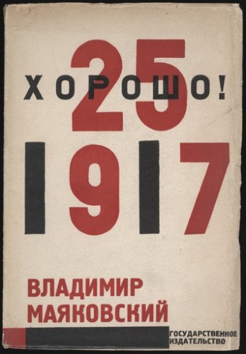
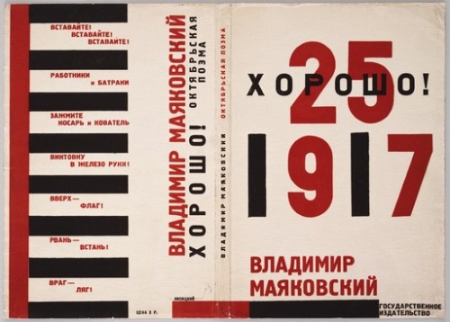
- El Lissitzky, Khorosho! Oktiabr’skaia poema, 1923
-

-
-

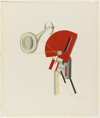
- El Lissitzky, Announcer, 1923
-

-
-
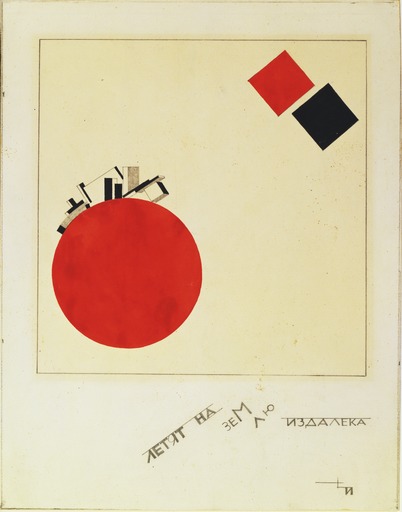
- El Lissitzky, Of Two Squares: A Suprematist Tale in Six Constructions, 1920
-

-

-
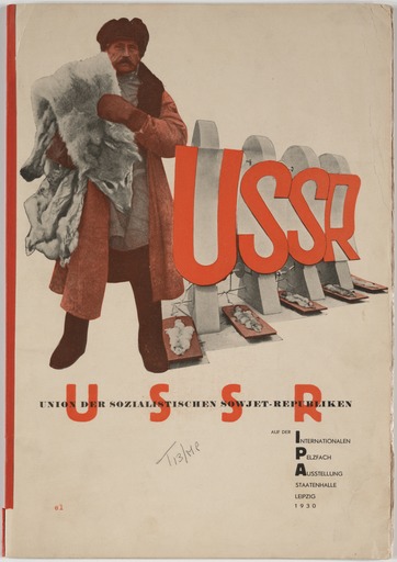
- El Lissitzky, USSR, 1923
-

-

-
- El Lissitzky ,Sentry, 1923
-

-
-

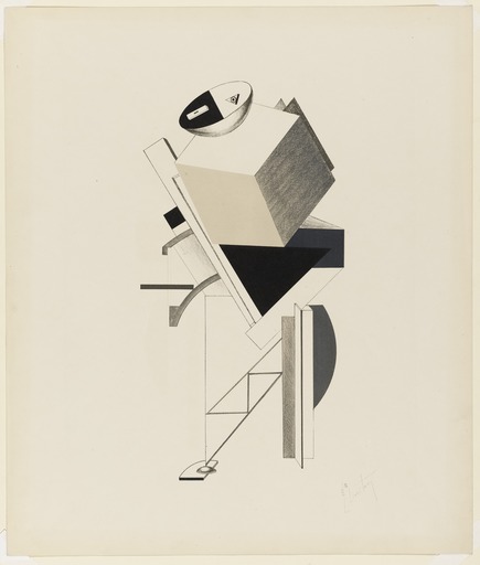
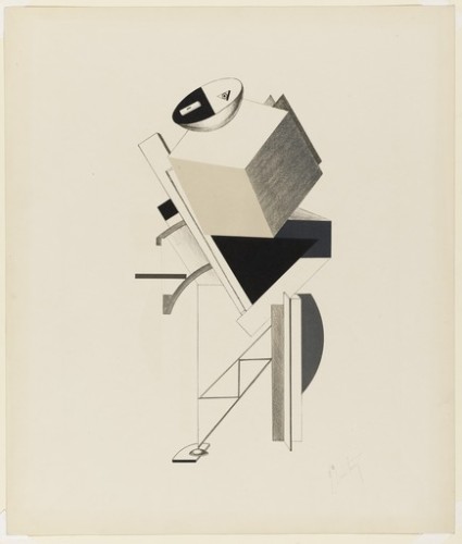
- El Lissitzky, The New Man, 1923
-

-
-
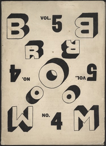
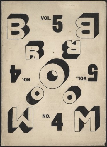
- El Lissitzky, Broom, 1923
-

-
-

- El Lissitzky, Khorosho! Oktyabrskaya poema, 1927
-

-
-
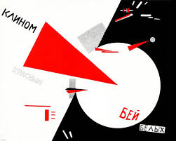
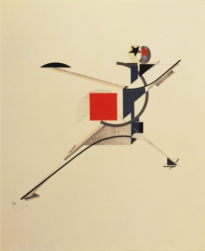
- El Lissitzky, Beat the Whites with the Red Wedge, 1920
-

-
2. Gallery Paragraph:
After researching El Lissiskty, I have learned a lot about his style and attributes to society through his work. His base was surrounded by the fundamentals of architecture. Most of his bombing career was during the start of World War I, the Russians used him to create propaganda. He created “prouns”, which majority of his work is titled as. El work is linked through the use of geometric shapes to create objects and or symbolizes a bigger picture.
3. Old Bibliography:
El Lissitzky, a Russian native, architect, typographer, photographer, and painter. In his earlier work was centralized around Jewish themes and culture, but that changed. During this time in history the rise of World War I was approaching. Most of his work was for Soviet propaganda, which was a key contributor to the Soviet Union’s rise of power and brainwashing of it’s own people. That’s why much of his earlier work includes red; red symbolizes communism. One of his approaches would be to use abstract geometric shapes to define the “spatial relationship of his compositions. His approach was to create 3-D environments in which 2-D geometry shapes could co-exists in contrast to that space. Lissitzky’s limited primary color palette, black and white, geometry shapes, and limited typography were foundation work for graphic design. Architect was his favorite expressive art, he liked the structure that he could create, especially the use of “horizontal skyscrapers”. His work always had a bold message, you can see in his work that there is flow, structure, and spaces awareness within his pieces. After researching El Lissitzky I feel that I will personally carry some of his design techniques into my own work!
4. Significant Points:
1. He used 3-D environments with the placement of 2-D objects
2. He called certain pieces of work “prouns”, project for the affirmation of the new in Russian
3. Most of his career was during the period of Russian propaganda
5. Sources:
After reading through this article it showed how designers have so much authority within the process of their work. For example, how and where to place images/text; if they want to use weights, italic/bold/underlined; just to get a certain message through to their clients and viewer. Each client and viewer has different taste, opinion, and their own vision. The designer’s job is to make all of that compliment each other through their own work. When one thinks of hierarchy they think of a class system society, having the elites being on top and the peasants towards the bottom. Well in design that is also somewhat of the case. Certain words or pictures are going to be emphasized more than others, just like the class system. The client and viewer will be drawn to the larger, bolder, flexible texts rather than the smaller text. The designer holds the power or in American historian would call it holding the big stick!
Dover, DE
19901
Fair
67°F 19°C
Humidity 57%
Wind Speed NE 6 mph
Barometer 30.32 in (1027.0 mb)
Dewpoint 51°F (11°C)
Visibility 10.00 mi
Last update 4 Nov 9:58 am

My response to this project would be that it was time consuming however very therapeutic. Once I got focused I was in the zone, nothing could stop me! This project challenged my artist and creative abilities. My 10 choices were difficult to choose as I felt that all my possible 25 combinations could have been chosen as they were all strange and unique. I notice that I took all my objects and combined them literally; instead of doing that I need to not take it as literally and be more creative.
Mind Map:
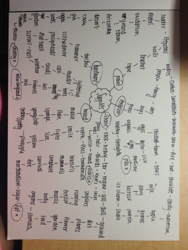
Possible Combinations:
- lightening + cows
- Pills +hammer
- Plants +stomach
- Ladder+ thumb
- Crabby Patty+ muscles
- Apple + sponge
- Sneakers + tape
- Sun + marshmallows
- Eggs + screws
- Cell phone + bowl
- Keys + sun
- Tree + lightbulb
- Kids + toothbrush
- World+ scissors
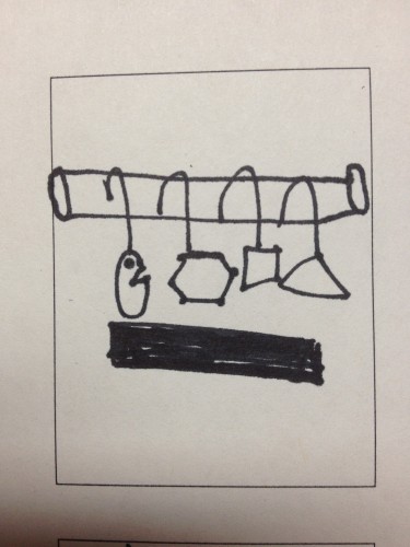
- Hangers+ shapes
- Water + nails
- Coat + sink
- spoon+ rope
- tv + toilet paper
- Pots + keyboard
- Antenna + buttons
- Letters + mouse
- Shelf + needles
- Film + brick
- Piano +baseball
My 10 Choices:
Lightening+ Cows: Lightening and Cows don’t overlap at all the fun part about this combination is that lightening is a shocking event and a cow is just our producers hanging out in a field.
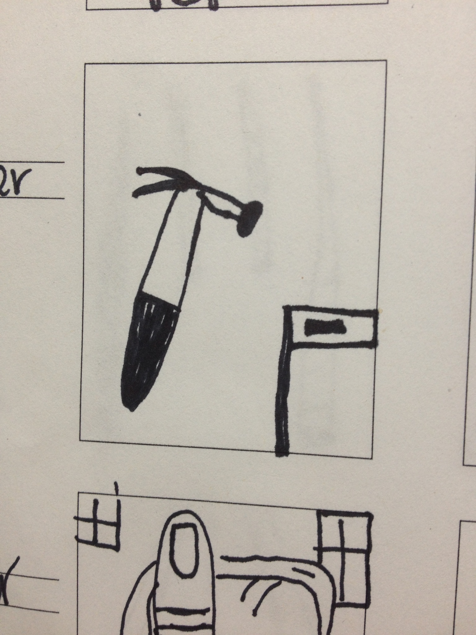
Pills + Hammer: Pills and a hammer, one object you digest and the other object you use, so this is a funny thumbnail to draw.
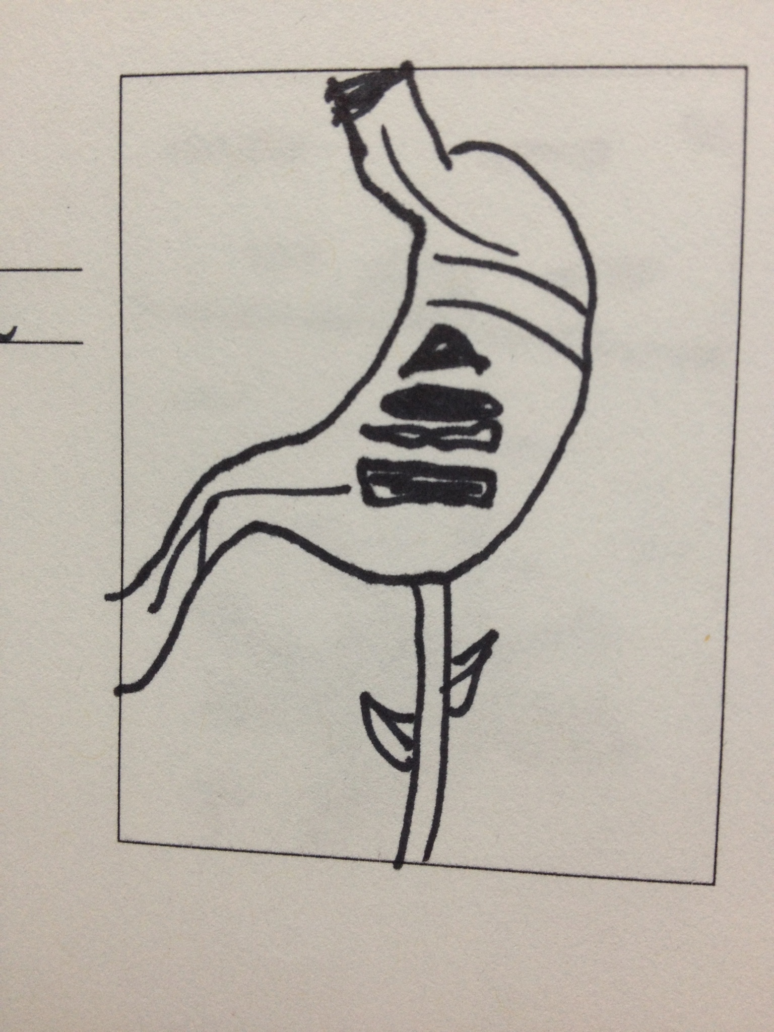
Plants + Stomach: Plants and stomach, plants have the ability to grow and change and a stomach is weird looking and it breaks down foods.
Ladder + Thumb: A ladder and a thumb is fun to draw because thumbs are weird and a ladder is basic. The idea of how I could combine these two is going to be interesting.
Apple + Sponge: An apple is a fruit and a sponge absorbs liquids, you can eat an apple however you can’t eat a sponge, so it was strange to draw
World + Scissor: The world give you the ability to draw it in many different ways and the scissor is a basic tool.
Coat + Sink: A coat keeps you warm and a sink cleans your dishes, so something you wear and something that you use.
Letters + Mouse : Many letters are in the alphabet and a mouse could be a computer mouse or an actually mouse, so that gives me more range within this thumbnail
Hanger + Shapes: A hanger holds close and a shape can be an irregular object of a regular shaped object, should be fun to see how those to connect
Shelf + Needles: A shelf holds things and a needle is sharp and can hurt, both are completely opposite from each other.
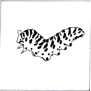
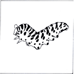
A few of my favorite Thumbnails:
Introduction:
Going into this class knowing absolutely nothing about graphic design; thinking that it only entailed drawing shapes. Once I finished reading this article I feel that I have a much better understanding for what the field of graphic design truly demands!
Publication Graphic Design:
After reading through a few other graphic design categories, publication design captured my attention. In this category you seem to be constantly having the challenge of coming up with new ideas that require you to meet the standards of books, newspapers, and magazines. Within this particular category you will defiantly not be bored at work, which would be ideal for someone who can get bored easily! This category will have you constantly doing something to meet the needs of your ideas. The whole idea of publication is to draw the consumer in, The Cosmopolitan Magazine does just that, by attracting females. Being exposed to new forms of communications through publications would be something that interests me!
Advertising Graphic Design:
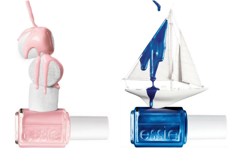
Continuing through the article I fell upon advertising design, and how advertising designers have to market to consumers. Theses, adverting designers have a different perspective that they need to incorporate into their design to meet demands of their customers. I never even thought about how the designers are trying to make their product appeal to us. This category caught my attention because the customers wants are constantly changing, requiring the designer to continue to improve and change their designs based on their customers. As I try and think of an advertisting design that interests me would have to be Essie Nail Polish, it is the second link at the bottom of the page. This appealed to me because looking to major in management and could possibly have a job that would require me to have a mindset of a graphic designer!
Cosmopolitan Magazine: The colors on the page are bright however they seem to really compliment each other and drag the eyes all over the page.

Essie Advertisement: I find that all Essie designs are complex, the transparency of the white background and the white objects are interesting to look at.
-
-
Classroom
-
-
Recent Posts
Recent Comments
- Danielle Vizard on Thinking with Type — TEXT
- Danielle Vizard on Digging’ It!
- Jenna on Thinking with Type — TEXT
- Jenna on Digging’ It!
- Elizabeth Robinson on Digging’ It!
Archives
- November 2023
- August 2023
- May 2023
- April 2023
- March 2023
- February 2023
- January 2023
- December 2022
- November 2022
- October 2022
- September 2022
- August 2022
- July 2022
- June 2022
- May 2022
- February 2022
- December 2021
- November 2021
- October 2021
- September 2021
- August 2021
- June 2020
- February 2018
- December 2015
- November 2015
- October 2015
- September 2015
- August 2015
Categories
-
About
KSC GRAPHIC DESIGN

Leave a Reply
You must be logged in to post a comment.