• Ê
  • Â

fJuliap has 13 post(s)

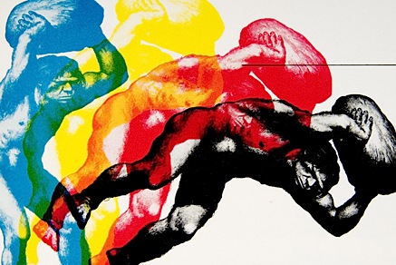
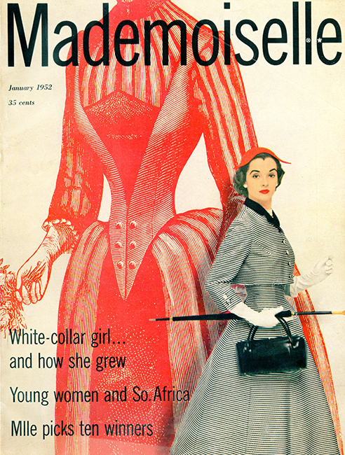
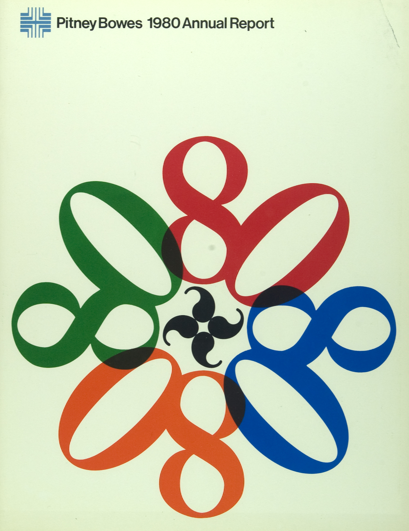
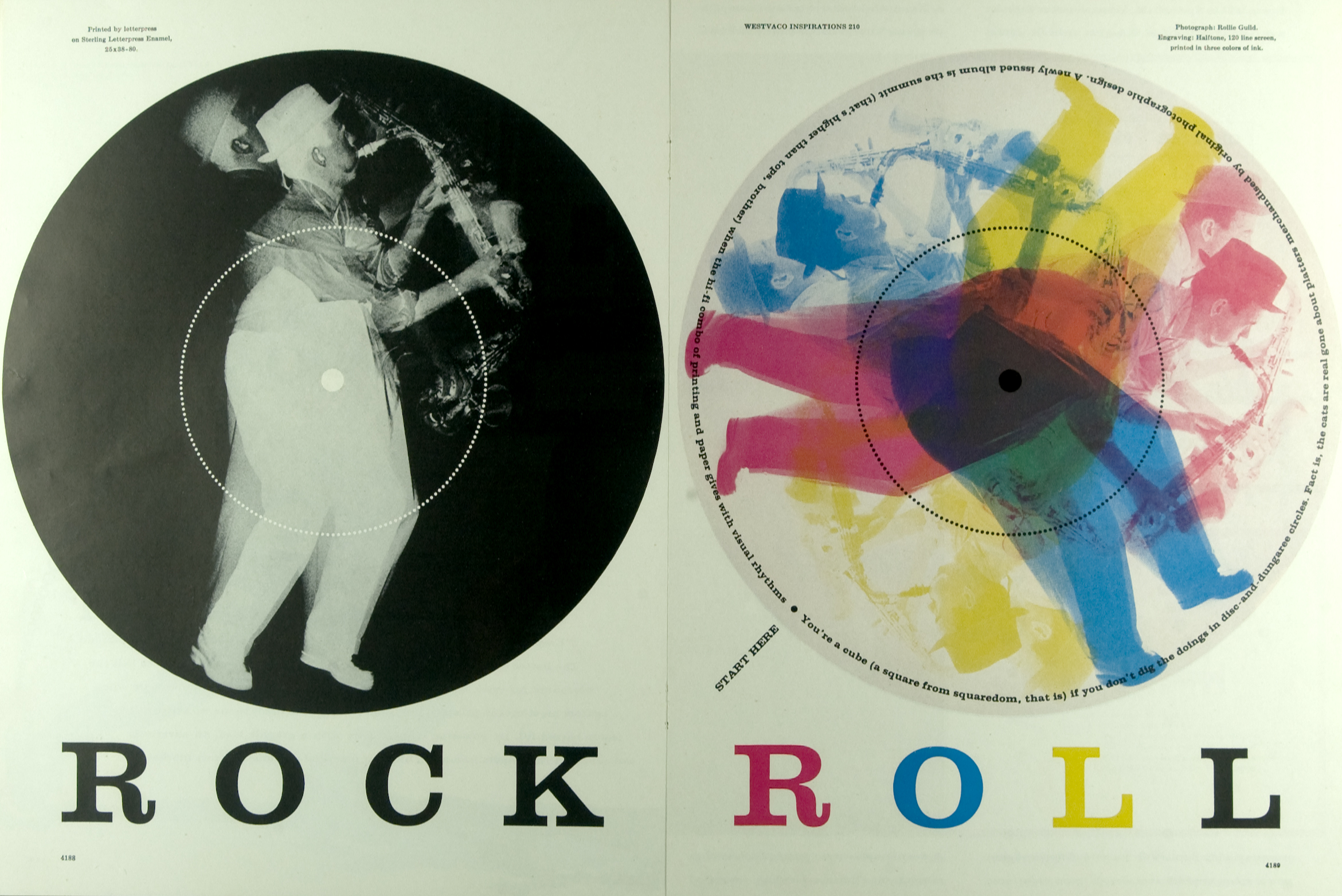
Bradbury Thompson was an influential designer of the twentieth century. His use of pop colors to accentuate certain areas of a design was intriguing to audiences around the world. People loved his work because it was generally vibrant and fun. He used color to add highlights and emphasize certain components of his work, like in his “Rock Roll: 1969-1979” or “Mademoisel: 1952”. Thompson also used shape and form to create his own hierarchy within his design and make certain elements stand out. The color schemes are simple and easy to absorb. Thompson would often work in conjunction with multiple designers over extended periods of time in order to perfect a design; whether it be a magazine cover, a poster, or another medium. Often Thompson makes use of the technique of silhouetting, where he blacks out or whites out one shape in order to make it come forth from the background. Thompson manages to do this with color too, which makes for quite an interesting piece.. Bradbury Thompson is thought to be a powerhouse designer of “pop art”, where color, form, and shape take precedence over the intimate details. Bradbury Thompson’s works connected powerfully with later designers and artists, and inspired them to continue the tradition of pop art into the modern era.

Bradbury Thompson: bibliography, facts, design
Bradbury Thompson: Graphic Design Archive

Three concepts I learned from Bradbury Thompson are:
1. Thompson stressed the importance of Background and Foreground imaging to bring his designs to life and add a 3 dimensional element to them.
2. Thompson made use of color to add highlights instead of shading.
3. Thompson really emphasized Shape and Form over the intimate details of a composition, which seemed to make the piece really pop.

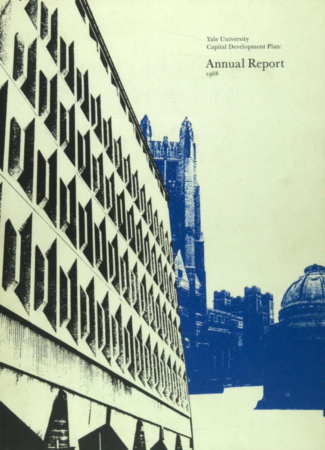
Bradbury Thompson, Yale University Capital, 1968
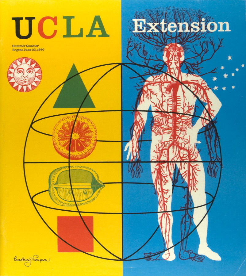
4 GD History   b Add comment

Leave a Reply

I thought this reading was very interesting. Hierarchy never really became consciously aware to me until we started talking about it in this class. I’ve always noticed it in design work before or in drawings of my own, but I never really noticed that I was doing it or that I was classifying one object with a higher importance than another. Hierarchy is extremely important because it establishes to the viewer, the audience, the client, or whoever is examining the design the order of importance of the information in the design. I’m beginning to notice more and more throughout the course of this class that design work is not necessarily so much about the actual artistry and the beauty of a piece, but more about the clarity of the image. There is more to say about simplicity because there is more readability, and that’s something the reading touches upon. Scale and style of the fonts are extremely important because they determine whether or not the design can get the point across to the viewer. This being said, I’ve also realized through this project just how difficult it can be to achieve simplicity and readability within a design. They will make or break the design, but they can also make or break the designer depending on how much time and effort the design requires.

4 09: Hierarchy   b Add comment

Leave a Reply

Springfield, IL
62701
Fog
57°F
14°C

Humidity: 96%
Wind Speed: S 5 mph
Barometer: 30.16 in (1021.4 mb)
Dewpoint: 56°F (13°C)
Visibility: 0.25 mi
Last update: 4 Nov 8:52 am CST

4 weather report   b Add comment

Leave a Reply

Peet_Julia_Lion_Animation

4 animation   b Add comment

Leave a Reply