- Ê
- Â
fJulia has 6 post(s)
Part 1
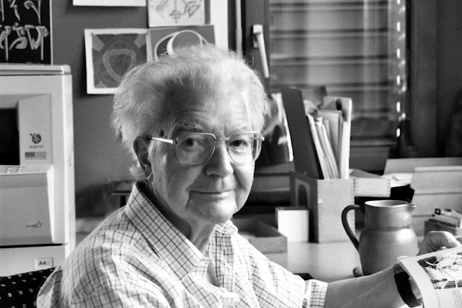
Adrian Frutiger was a Swiss designer of typeface. He was born on May 24, 1928 and died very recently on September 10, 2015 at the age of 87. Frutiger graduated from the School of Applied Arts in Zurich in 1952. After high school, he spent most of his career working for Deberny & Peignot in Paris and became their artistic director. His job was to update and change typefaces through the 20th to the 21st century. He prepared them for photo-typesetting, and created his own typefaces. He designed around 40 typefaces himself. He created Univers, which we have used in class recently on a project, which I thought was pretty interesting. Some of his other well known typefaces are Frutiger, Egyptienne, Serifa and Avenir. It’s wonderful that today we still use his fonts and they are still advertised all over the world. In the 1970’s, he designed a typeface for the Paris Charles de Gaulle airport (Frutiger). He was a professor at the Ecole Estienne for 10 years and spent 8 years at the Ecole Nationale Supérieure des Arts Décoratifs, Paris. His career spanned through three eras, including the hot metal, phototypsetting, and digital typesetting.
Part 2
Frutiger once said, “A letter follows the same canons of beauty as a face: A beautiful letter is in perfect proportion. The bar of a ‘t’ placed too high, the curve of an ‘a’ too low, are as jarring as a long nose or a short chin.” This made me think that although nothing is perfect, there are attractions to each letter as there are a face.
Frutiger paid attention to the inside of letters as well as the letter itself, which is what made each letter a little different, or showed the different of an “O” and a “0” (zero).
One of his most known hallmarks is the square dot over the lowercase “i”, which makes it look different from an “l” or “I”.
Part 3

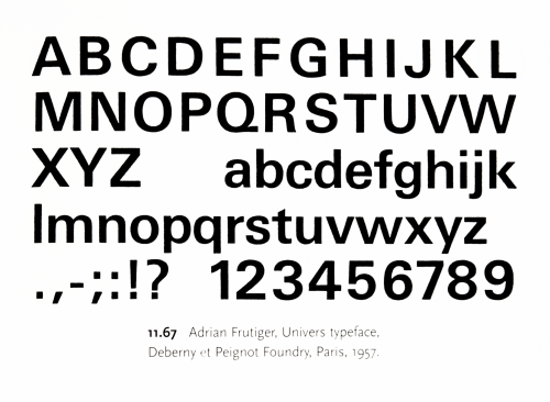
Frutiger, Univers Typeface, 1957
-

- Frutiger, Univers Typeface, 1957
-

-
-
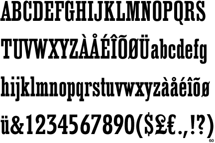
- Frutiger, Egyptienne, 1956
-

-
-
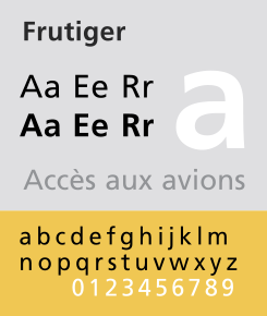
- Frutiger, Frutiger, 1975
-

-
-
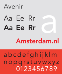
- Frutiger, Avenir, 1988
-

-
-

- Frutiger, Humanist, 1976
-

-
-
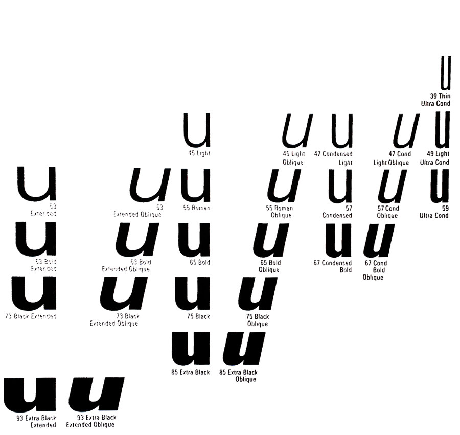
- Frutiger, Univers, 1957
-

-


-
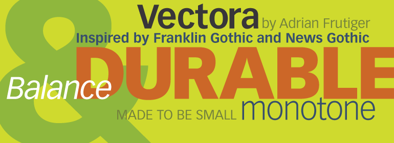
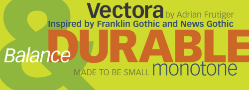
- Frutiger, Vectora, 1990
-

-
-
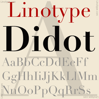
- Frutiger, Linotype Didot, 1991
-

-
-

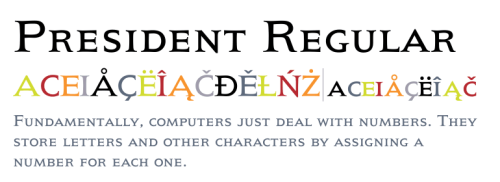
- Frutiger, President, 1954
-

-
-

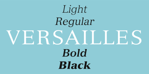
- Frutiger, Versailles, 1982
-

-
Frutiger did not like purely geometric designs. In Frutiger’s work with typeface, he uses weights in the typefaces. For example, with Univers, he uses a weight scale with numbers, rather than names. He used numbers so that the typeface could be translated through the world, as different sizes had different names in different countries. The family of letters would have multiple widths and weights all following a certain form of letter. Frutiger also stated in an interview (on eye magazine) that “my main life’s work was designing sans serif typefaces. It is much more difficult to draw a grotesque than a roman face – much can be covered up with serifs in the latter. The grotesque is like the body of a fish, it is so smooth that no mistake can be allowed to happen!” He really loved using serifs in many of his fonts to make them easier to read.
Sources
I always knew there had to be an order to doing things in graphic design. If there was no order, the projects would be a mess and would not look as amazing as most do. Every little detail is important in making the project better the best it could be. Thought has to go into every project- what size lettering? Should this be tilted? What colors go best here? What’s the best font to use? There is a lot of idea that goes into even simple things- like a table of context. Changing the fonts or editing the landscapes adds character to the page and makes it unique. I also thought about the dimensional hierarchy and how everything in the picture has to be set up so the eye follows the design in a dimensional form to make a connection with the picture. If the viewer feels a connection, the designer has done their job well.
Seattle, Washington, 98501
Fog
34°F / 1°C
| Humidity | 96% |
| Wind Speed | S 3 MPH |
| Barometer | 30.18 in (1022.4 mb) |
| Dewpoint | 33°F (1°C) |
| Visibility | 0.25 mi |
| Last update | 04 Nov 6:54 am PST |


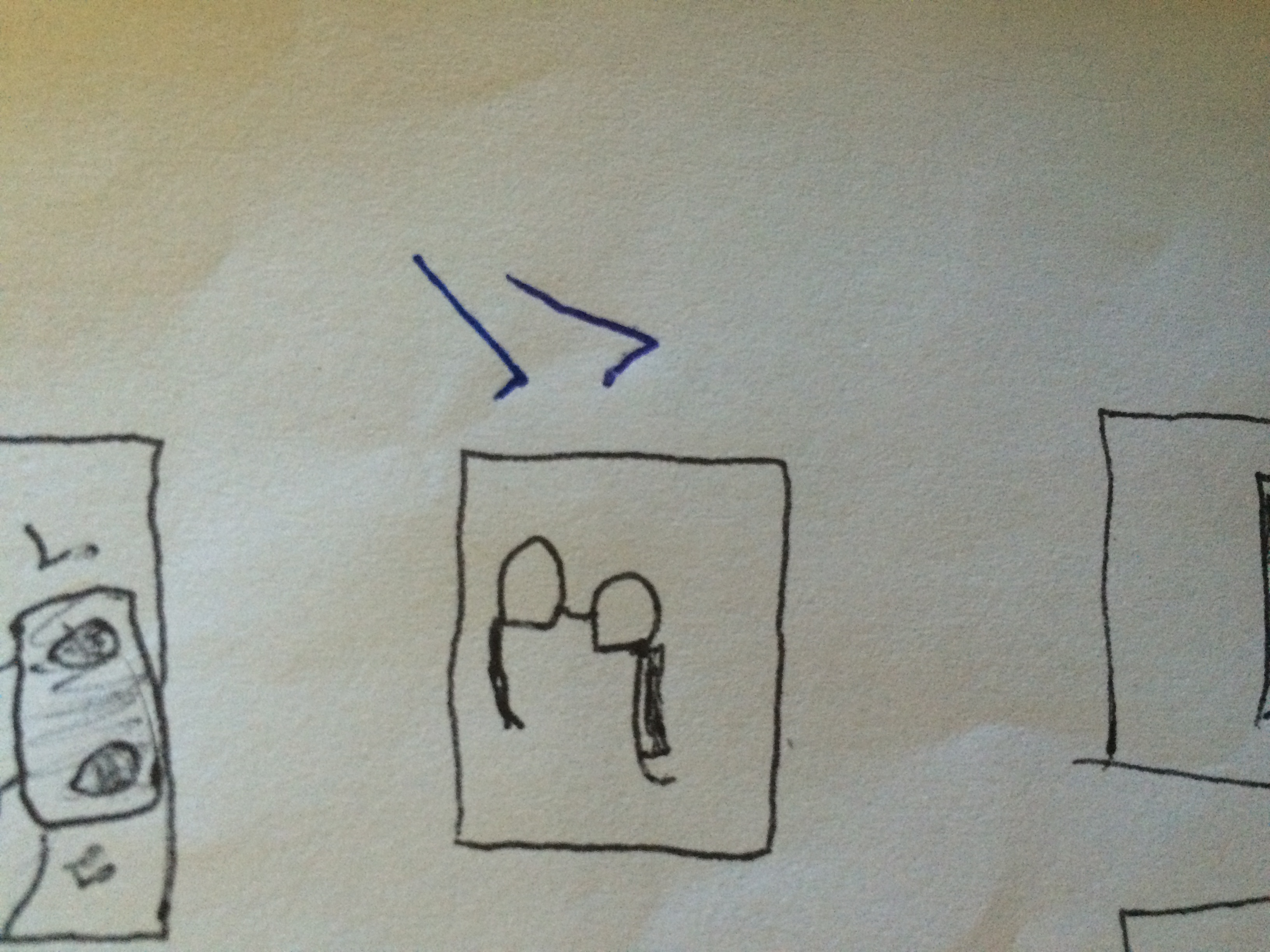
This project was a little overwhelming to me because I had never done thumbnails, mindmapping, or used photoshop at the end of the project. However, this project did help me to become more creative and help myself to do something I would not usually do. Below are the 3 mind maps my partner and I did together.
Mind Map


25 Possible Pairings
- Music Box+Blender
- Glasses+Pen Holder
- Flannel+Shorts
- Stereo+Garage
- Desk+Pen Holder
- Dog+Glasses
- Desk+Printer
- Light+Espresso Maker
- Hammer+Gun
- Glue+Glove
- Scissors+Saw
- Saw+Lawn Mower
- Cooler+Ice Machine
- Keyboard+Mouse
- Car+Plane
- Hair Brush+Scissors
- Shower+Stool
- Blow Torch+Hose
- Dog+Glasses
- Bomb+Hammer
- Electric Wrench
- Heater+Bowl
- Key+Screw
- Heater+Coat
- Book+Movie
10 Choices
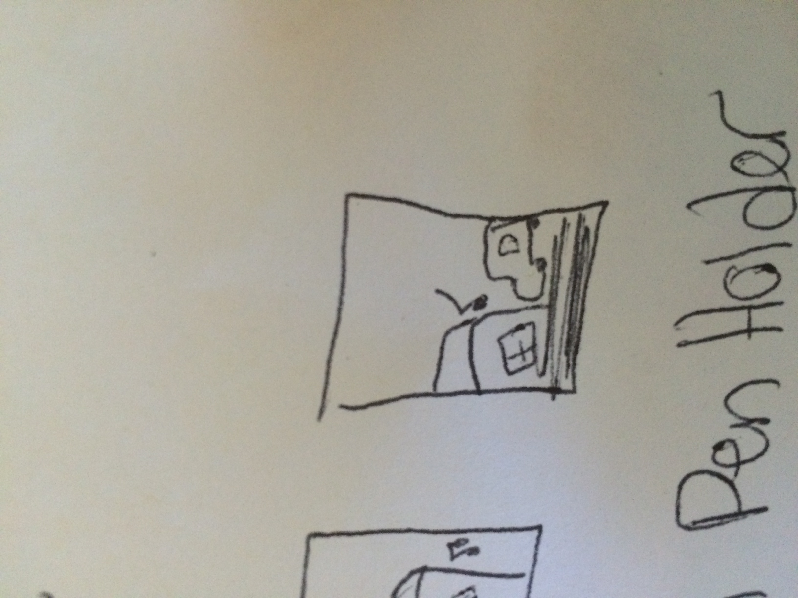
- Glasses+Pen Holder I thought a pen holder would be a great idea to put on a pair of glasses, you would never lose your pen or glasses!
- Flannel+Shorts These are a classic. Warm, stylish, and yet you still don’t have to wear pants.
- Music Box+Blender Blenders are loud and obnoxious. If music played while you were blending your smoothie together, the whole process would be much more enjoyable.
- Desk+Pen Holder This would be very useful and would save room on the desk so it does not seem so crowded and unorganized.
- Scissors+Saw This would be terrifying, but extra sharp and long to really get the job done. It also may make it easier to cut things like trees!
- Book+Movie If the book came with the movie, or vice versa, readers would be more likely to see the movie, while movie watchers would be more likely to read the book. It would bring a better understanding to both parties of the story.
- Dog+Glasses Some dogs cannot see well for various reasons. If they had glasses, not only would they be much cuter, but also be able to see better and have a more clear perception of the world.
- Stereo+Garage How cool would it be for your garage to play music each time you opened it? Very!
- Heater+Coat Coats help to keep us warm in winter, but if you live in New England, you know a coat can only do so much before the cold wiggles its way through to your skin. With the Heated Coat, you would be warm and stay warm!
- Refrigerator Desk Anyone would love to have a fridge right at their desk, it would save time from going to the kitchen and is easy access.
Thumbnails
Glasses+Pen Holder
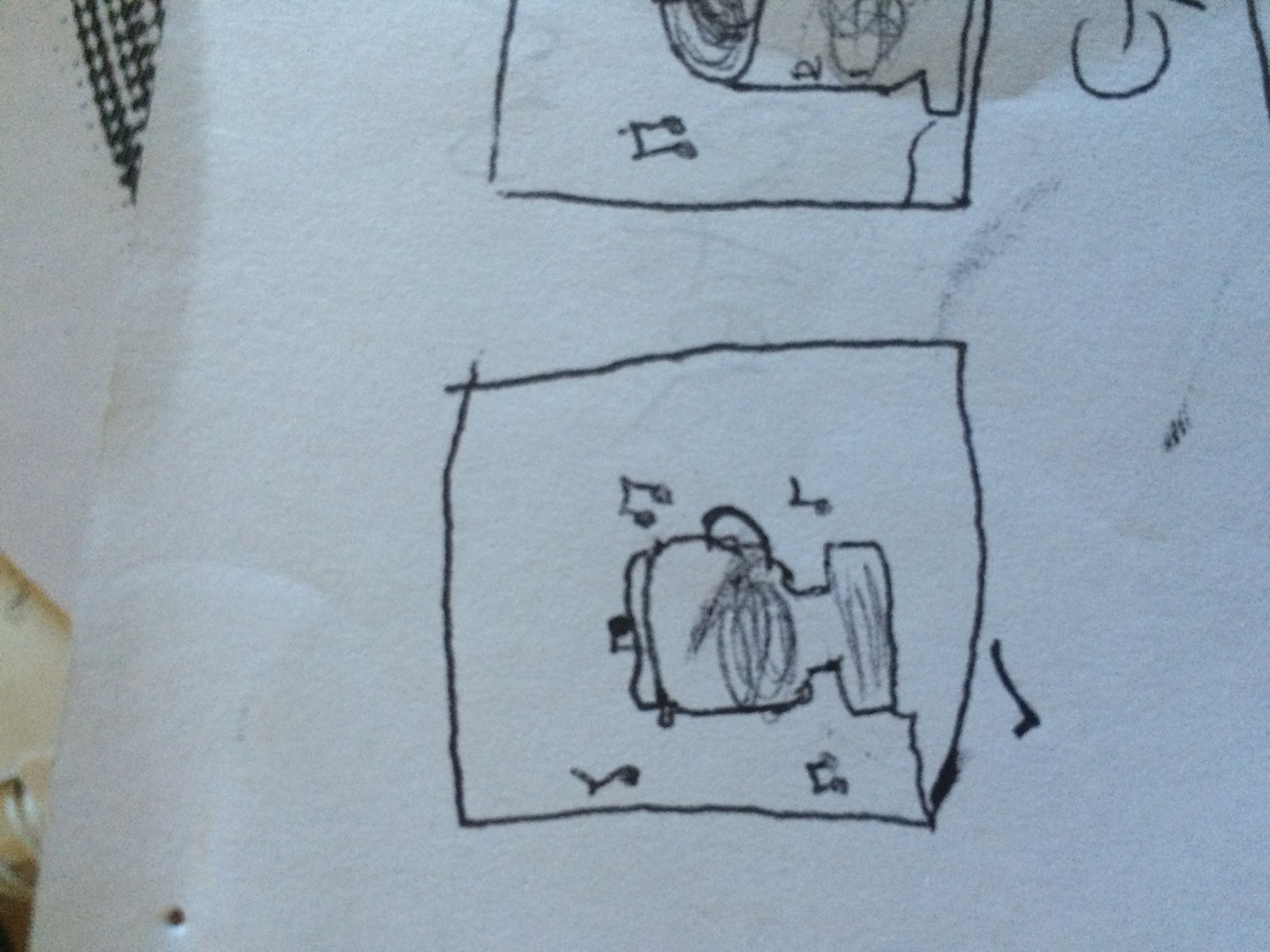
Music Box+Blender
Stereo+Garage
The reason I am taking graphic design is for another passion. I wish to become better at communicating. I want to learn to communicate and express my ideas and thoughts more clearly to those around me, which can be used in any field or major. I am a nursing major, which does not really have much to do with graphic design. However, being expressive and well at communicating is greatly important in this field, and by learning the ability to express my ideas, I will be better equipped for my major. I also have always had a desire to be more artistic, but have never followed up on it. So, this class will also be helping me with increasing my artistic abilities.
Motion Design
I thought motion design was interesting. It is not only deciding how a picture should be designed, but adding sound and movement to the picture to tell a story. As an example of why motion design is interesting to me- I often think the trailer to a movie is more interesting than the actual movie, which shows how motion design advertises the movie well. This video, in the link below, shows how many different ways motion design can be used, and how long motion design has been used for (I thought that using it in a 3-D way was the best one). I have always wanted to create a short film from animation, so this was very interesting to me!
https://www.youtube.com/watch?v=fzGXSpmNHzc
Type Design
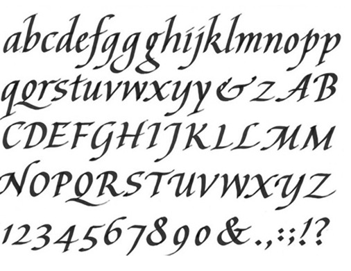
I also thought that type design was very interesting. I thought so because I had never thought of fonts and typeface as graphic design. Fonts are always needed for anything and everything on a computer, and would be incorporated with basically every type of graphic design that has any word or number involved with it. I was interested to know how the designer would think of a font and write it out, so I searched for it. This is what I found: http://www.fastcompany.com/3028881/most-creative-people/what-its-like-to-design-a-font-from-scratch
This article explains one man who designed famous fonts, such as Times New Roman and Ariel. In the pictures on the side, it shows how they write out each letter, scan it, and get as close to the outline of the letter as possible. My aunt actually does calligraphy, which is another reason I thought this was interesting! My handwriting can be really nice (when I try…), so this would be a good design for me to work on.
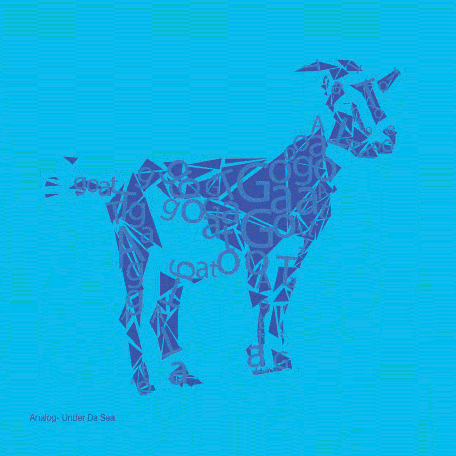
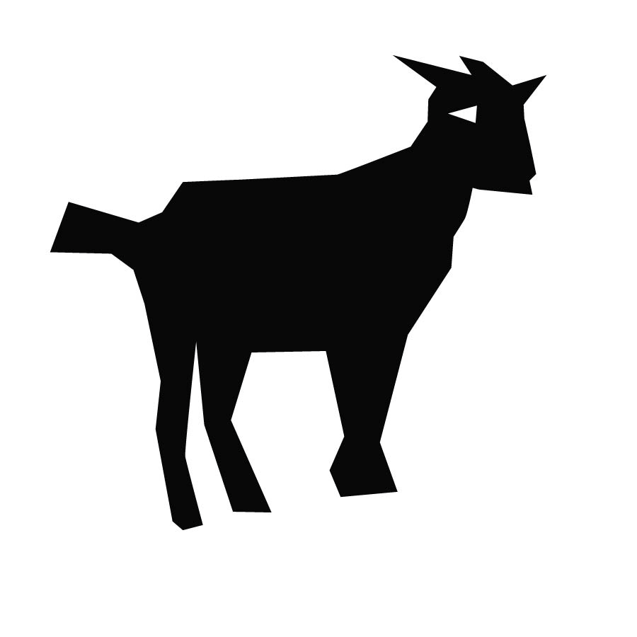
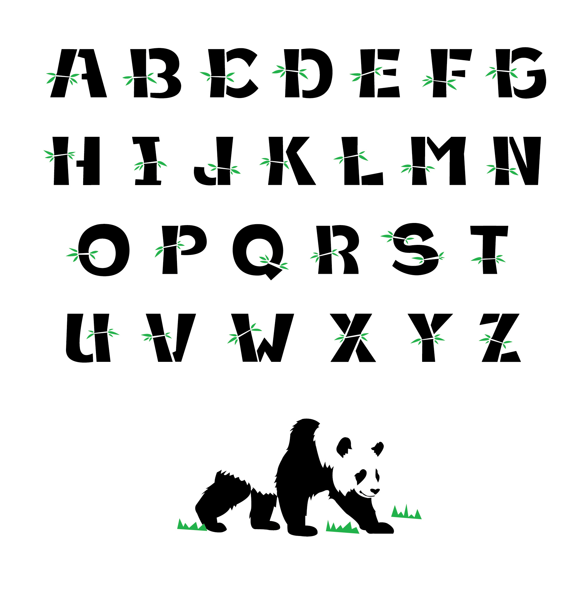
I also found a few typeface design that I thought looked cool.

-
-
Classroom
-
-
Recent Posts
Recent Comments
- Danielle Vizard on Thinking with Type — TEXT
- Danielle Vizard on Digging’ It!
- Jenna on Thinking with Type — TEXT
- Jenna on Digging’ It!
- Elizabeth Robinson on Digging’ It!
Archives
- November 2023
- August 2023
- May 2023
- April 2023
- March 2023
- February 2023
- January 2023
- December 2022
- November 2022
- October 2022
- September 2022
- August 2022
- July 2022
- June 2022
- May 2022
- February 2022
- December 2021
- November 2021
- October 2021
- September 2021
- August 2021
- June 2020
- February 2018
- December 2015
- November 2015
- October 2015
- September 2015
- August 2015
Categories
-
About
KSC GRAPHIC DESIGN

Leave a Reply
You must be logged in to post a comment.