Part 1:
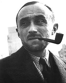
Adolphe Mouron Cassandre was a well known graphic artist who specialized in commercial posters, creating typefaces, and painting. He was born January 21,1901 in Kharkov, Ukraine and studied at École des Beaux-Arts in Paris, France. After he finished school, A.M. Started up his own art studio in Paris, France in which he then started referring to himself with the pseudonym “Cassandre” when he created his first commercial piece, Au Bûcheron in 1925. The piece was made for a cabinet marker and would eventually get a lot of attention and awards in which really put A.M. onto the bigger scene. All of his work was very inspired by by cubism and surrealism because of the place he grew up and the scenery around him. His commercial projects really pushed the line between fine art and commercial art in which was not a familiar thing during this time period. All of his commercial works are very unique and almost none of them share any of the same characteristics other than personal style and creativeness. After time went by and A.M. was moving from company to company, he spent some time teaching at schools such as Ecole Nationale des Arts Décoratifs and later at Rue Férou in Paris. During this time A.M. was experimenting with creating typefaces and ended up creating the European renowned typeface, “Peignot”. The font was a big hit in Europe and landed it’s way into 1937 World’s Fair in Paris, France.
Part 2:
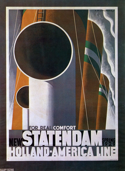
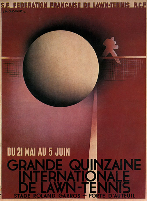
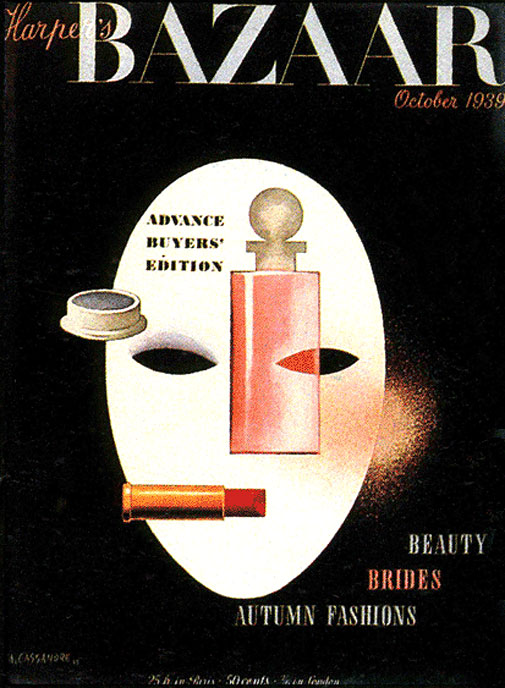
A.M.’s success was based mostly off of his poster designs, magazine designs, advertisements, logos and typefaces.
A.M. and several other partners formed the advertising agency Alliance Graphiqe, which worked for a broad client base throughout the 1930’s.
The Musée des Arts Décoratifs held a large public exhibition featuring A.M.’s diverse works in the graphic and plastic arts.
This article was very interesting to me because it compared hierarchy in the mid-evil days to hierarchy in graphic design. It explained how hierarchy back then described a basic ranking system in which a king was the highest and the peasants were the lowest and hierarchy in graphic design separates the more important text from the least important. This example really helped me grasp the concept of hierarchy in graphic design and now I am definitely going to look at the layout of text differently when thinking about that.
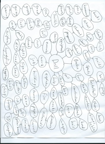
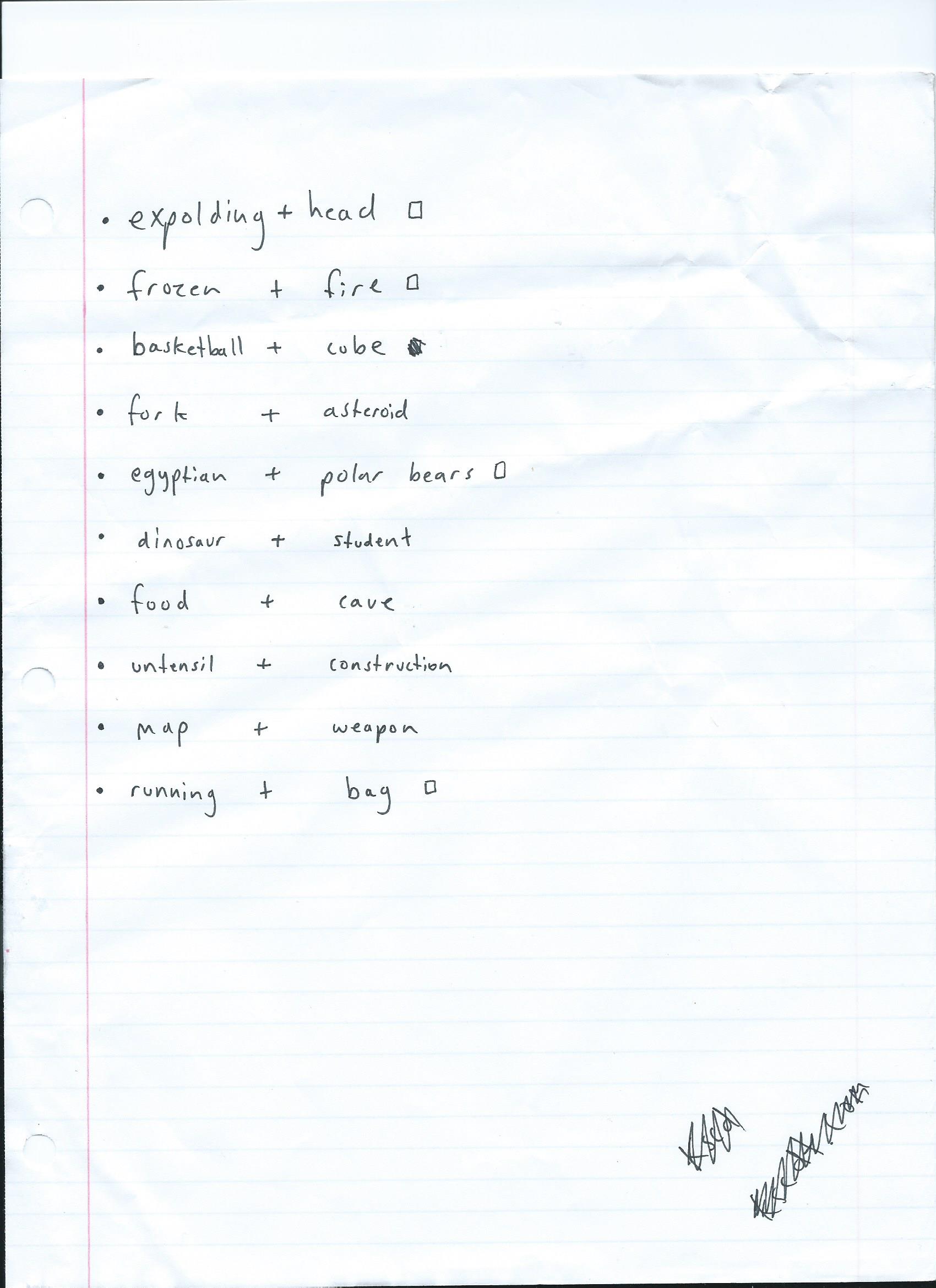
This project was very interesting and the mine map was a new exciting way to brain storm ideas that are original and different. There was no extreme difficulty in this project either in which made it a lot easier to understand and complete. I also liked creating the multiple thumbnail designs for each tool because its helps bring more ideas in for a final image.
Graphic Design has also been a huge part of my life since I was in middle school. I always looked at the world differently knowing the extenuating process people go through to make what seemed like the simplest things. Two particular types of design that I enjoy are printing/packaging design and advertising.
In high school I took a graphic design & printing class that really got me into wanting to know more about the different types of printing such as, screen printing, offset printing, digital printing, letterpress printing, and many more. We printed almost everything in that class and it was a great experience and also a really fun time. Our teacher would also bring in examples of packaging or prints that helped show the different printing styles in action. The example below is a picture a butterfly that is broken down into 4 color processes or cmyk, cyan, magenta, yellow, and black that are used when running an offset printing press.
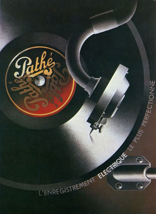
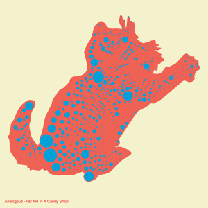
Advertising on the other hand is a huge interest to me because an advertisement helps show the creative ability of a company while also promoting themselves inside that design. Advertisements take a lot of brain storming and different creative minds in order to create something original that appeals to target audiences. A lot of hard work and thought has to go into each advertisement to help keep it relevant to the company or product while also helping it pop or stand out. The example below is an awesome advertisement that I believe stands out very well and helps get the message out.


Leave a Reply
You must be logged in to post a comment.