- Â
B Reading
B Digging’ It!
Read an comment on the reading. How does the reading speak to what you have been taught about using typefaces and arranging words? Pick three points in the text that were eye opening or intriguing to you about typography.
B Thinking with Type — TEXT
Read an comment on the reading. How does the reading speak to what you have been taught about using typefaces and arranging words? Pick three points in the text that were eye opening or intriguing to you about typography.
Thinking_With_Type_TEXT_excerpts
26 responses to “Thinking with Type — TEXT”
-
> Jamie Halloran says:
The reading talks about kerning, line spacing, alignment, hierarchy, tracking, paragraph, and word alignment. Everything in the reading relates to what we have been learning in class, especially for our final project. It shows how to make text more interesting, readable, and relatable. Three things that were intriguing in the reading were the flush left and flush right alignment, tracking, and stacked letters. I never thought much about how the sentences aligned from left or the right would affect the reader’s flow in reading it. Having it flush left makes the text lose its organic flow and gives it an illusion of randomness. Flush right pulls away from the familiar way people usually read text. It can be difficult to add a punctuation to the end of lines and weaken the hard right edge. Tracking can give the text and sentences space and fill the space around it better. I never tracked any of my designs until I learned about it in class. Lastly, what I found to be intriguing is the vertical stacking of letters. Stacking capital letters helps even out the width of the column, as well as giving it a stable look to it. Stacking lower case letters gives the text an awkward look to it, as well as give it an uneven look to the columns. This reading made me think more about typography and how I should think about it more when I work with words in my designs.
-
Kelsey Rogers says:
The reading talked about elements of type that we have learned and even used, such as kerning and hierarchy, but it also discussed things I had not really focused on such as tracking, alignment, and paragraph set up. This reading was really resourceful for our current project and influenced some of the decisions I plan on making for my use of text and type in the assignment. Some of the things I found interesting in the text was when it was talking about paragraph alignment such as flush right alignment, which personally I did not like. Even though flush right alignment is difficult for the reader to read I understand its purpose, when its used as a side caption paragraph. I also found the section that went over line spacing very interesting and how you can really manipulate text to be read the way you intend. I like how they link line spacing to how a paragraph can be set up as well. I like the idea that how you set up text influences the way your audience reads it and how they perceive the information. The reading definitely shows that every detail matters, not just pictures but type as well.
-
Kate Jones says:
This reading touches on the most crucial points and things to focus on when arranging text. Thinking with Text elaborates on kerning and tracking, line spacing, and hierarchy, all things we have briefly gone over throughout the semester. Before taking Graphic Design and Typography, I wasn’t even aware kerning and tracking existed. Kerning is the spacing between individual characters in a piece of text. Tracking is the overall letter spacing between all the characters in a piece of text. When letters in a typeface are not spaced properly they create a pattern that doesn’t look uniform enough, which is why proper kerning and tracking are important. Line spacing (leading) is the distance from the baseline of one line of type to another. This is important because as line spacing becomes more extreme, the block of text begins to read as separate lines rather than a group of text. Hierarchy is an important part of typography we’ve been focusing on a lot lately in Graphic Design. Hierarchy expresses an organizational system for type that emphasizes important information, while diminishing the less important. Hierarchy is extremely important because it helps readers scan through a text by guiding their eyes from important to least important.
-
Jess Caldwell says:
This article touched upon all sorts of techniques used to create a successful text layout. Over the past semester we have talked and worked on aligning, kerning and leading. I have learned about alignment, leading, tracking and kerning before in one of my previous Graphic Arts courses before entering in this class. I find it fascinating how a simple kern of a letter or a tracking of a word can make a complete difference. This text was so interesting to me because of all the different names there are for things. Before reading this article I had never heard of the word “rag” or “bad rag” and never knew that there was name for when a soft edge looses its organic look to it. I also found it interesting that when stacking letters on top of one another it is preferred not to stack lowercase’s because the way their ascendants and descendants work it makes them look uneven and weird. I myself really don’t prefer to stack letters all together, but I can see how in some cases they are appropriate. I enjoyed the part of the article when they talked about Hierarchy and how to put emphasis on running text. I agree with the text, when it says using one type of emphasis can get the job done and that adding too many is bad.
-
Christian Alejandre says:
I found the reading on Thinking with Type to be pretty interesting because it truly proved how much goes into creating a flowing set of text, which is something that many people take for granted. When a person (who isn’t a designer) picks up a book of some sort, I don’t think they focus on the amount of work and effort that has gone into text alignment or orientation (unless it’s hard to read, of course). Kerning, line spacing, hierarchy and alignment are all crucial elements that contribute to the readability of a piece of text, and getting those elements correct isn’t always a simple task. Something that I had never heard of prior to reading this article were the terms “ragged right” and “ragged left”. I like how self explanatory their names are. I also enjoyed the little “Type Crime” sections they had on the pages, especially the one they had for the stacked lower case letters. Stacked lower case letters are pretty nasty and awkward, which is something I’ve learned through previous classes as well. Attempting to do it just does not work no matter how hard you try. The section about vertical baselines also stood out to me a bit, due to what we had just worked on within the Weather Report assignment. It’s all about guiding your viewer’s eyes.
-
Courtney Sheehy says:
This reading discusses some of the topics that we have been learning in class with regards to typefaces. Kerning is a major part of this whole process, as it can corrupt the word flow if it is not dealt with in the appropriate manner. There is a difference between lower-case letters and upper-case letters kerning. Tracking is another term mentioned in this reading, it relates to kerning. This process allows the designer to create a more airier feel. Another process mentioned in this reading is line spacing. This effect has the ability to make lines of text become independent rather than an overall texture. This reading really speaks to me as a young immature uneducated designer. It breaks up all the elements that are needed to get typographer to have flow, structure, and ambiance. One point that sticks out to me is the debate of vertical alignment, or vertical baseline. The reading says to move the baseline of the word to a vertical standpoint as it preserves the natural affinity among the letters. Another new term mentioned was flush/right. This concept was intriguing because certain forms of flush/right are welcomed and also “evil”, giving certain points to when it is acceptable and when it isn’t okay to have flush/right. Creating emphasis with running text also popped out to me because there is a lot of text in our final project. They explain how the use of italics, boldface, small caps, and changing the color of the font changes the whole dynamic of the text.
-
Meaghan Casey says:
When reading this, I read about familiar topic but then not so familiar topics. The things we have focused on the most, hierarchy and kerning, went into a bit more detail and gave helpful examples. Kerning is interesting to me that you can’t fully tell how bad the spacing between the letters are until you increase the text. With line spacing, the right amount of spacing is very important. If the lines are sitting right on top of each other, it creates a different feel than if they are spaced apart. When spaced, the lines become their own “elements” rather than part of an entire paragraph, as stated in the reading and when it’s put like that, it makes a lot of sense to me. Alignment is also something very important when it comes to graphic design. The way you decide to align text can really make the difference. If you center the text, will definitely give off a different feel if on a poster because centered text is usually seen on invitations and title pages. Reading this is really going to help me with future projects because now i know how certain alignment and spacing can really make the difference. Also, knowing the importance of hierarchy in text helps with flow of text from important content to not so important.
-
Gabrielle Holveck says:
This reading referred to very basic ideas in typography such as kerning and tracking that make a huge difference in a typographic work and if forgotten can make the work look sloppy. This was a mistake that I had been making not even noticing what the adjustment was at first. It then talked about alignment which is something we discuss often in class and its actually harder than it comes across as being. Most people would just assume that it can be aligned in the middle, left, or right, when really there a tons of different options and each one makes a huge difference. I enjoyed all of the visual examples included in this reading as well because it really shows how everything works different across the page and what looks best. This went into further detail on topics we’ve gone over in class and will definitely be helpful during this project along with the other reading.
-
Brendan Belzil says:
The reading really breaks down and explains each section of type while giving great examples within the text on the pages. It also helped show how they incorporate into the world of text and when they are fitting and when they are not. I thought it was interesting how the reading said that as line spacing gets more extreme it reads as multiple blocks of texts rather than shades of grey, it was interesting because rather than saying a more contrasted paragraph of text they explain it as shades of grey. Another interesting point was when they explain ugly gaps as when the line lengths are too short or too long while creating the image in that same paragraph because it showed how ugly they really look. Lastly I thought it very interesting how they said paragraph indentation wasn’t mandatory until the 17th century.
-
Antonina Robinson says:
This reading talks about how typography is effected by kerning, tracking, stacking and hierarchy. Kerning specifies to the space adjustment between two characters while tracking focuses on the overall space between letters. When the letter size is increased the space between characters becomes greater as well and kerning becomes especially important. When stacking letter is necessary, capitals make a more pleasing visual statement rather than lower case letters. The lower case lettering makes stacking look more awkward. The next important part of typography is hierarchy. It helps distinguish more important content from the rest of the text. Hierarchy can be defined through Bolding the text, changing color, placement within space, and placing text in caps. Each component of typography is important and if one is ignored the rest might look awkward and unpleasing.
-
Matt deWolf says:
This reading reinforces the notions of kerning practices as well as the idea of hierarchy. Kerning is still something I think is a critical concept of good design. It becomes so obvious when something is poorly kerned, it turns into an eye sore. Eye sore can also occur in hierarchy. I love the idea of restraint and simplicity. It only takes a minor change in order to create an effective signal of hierarchy. There is no need for an overdone signal. The text also focused on the use of different alignments. I had never thought about how the rag looked prior to this reading. Like kerning however it becomes apparent when the rag is poorly done and well done. Along with standard alignment is vertical alignment. I thought it was clever to have text running in two different directions while retaining a vertical alignment. It can be an effective tool when trying to manipulate the view of the audience. The text examples towards the end of the reading proved to be another interesting and valuable way to influence the way a body of text is seen. Also the rag of this text is ruined by the apparent wedge that has been created..
-
Christina Lyons says:
This article was really helpful when it came to the technical aspects of typography. It really is helping me with my project. It went over some basic terms we have learned and have worked with, like kearning and text hierarchy. It also explains why these aspects of type are called what they are. For example, I learned that leading received its name from the metal stripes used to separate lines of text. The reading also gave wonderful tips on using type in different ways. I learned that centered text is very formal and classic, so it should be used sparingly since it can create static flow. If you do not, it can “look like a gravestone”. Which I very much agree with. The advice in the reading makes me more conscientious about my type. I also saw to take heed when stacking lowercase letters. It makes the text look uneven due to the stacked ascenders and descenders. I definitely will be saving this reading to refer back to while I’m working not only on the final projects but future projects including type.
-
Cat Avery says:
The reading talks about techniques we have been learning in class and focuses on creating the right flow and adjustments needed with text. Gaps between letters gets more noticeable when the word is enlarged. This is where kerning and tracking comes in and can make the word flow more and become more appealing to the eye. Using line breaks and space in a paragraph allows the viewer to focus or order the information given to them. This is important because how the information is displayed affects how the viewer will interpret it. Hierarchy is another topic that affects how the viewer or reader interprets the information. This concept uses organization and order to display information, while showing greater importance in information using larger text or bold text, and so on. These topics are very useful to think about when designing anything and it’s interesting to think about how these techniques can manipulate how the viewer or reader interprets the information.
-
Todd Gaunt says:
Three points in this text that I payed attention to the most were Kerning, text-alignment, and hierarchy. The examples and lessons in the reading about these elements are reinforcing these points similarly to we’ve been getting taught in class. Some new topics I picked up on were text flushing, and some more verbose explanations of vertical alignment and justification, and how those can be used to create hierarchy of information without even touching the actual text, with a right flushed block of text used for small notes or annotations while a left flushed block of text is used for the main body.
Another interesting thing the reading had to say were some important points about kerning. I didn’t really realize how bad kerning could get on large type. It really emphasizes how important it is to always pay attention to the kerning of letters, as even though it may look good at certain size, if you change its size at all it could end up looking bad.
-
Julia Hannan says:
This reading talks a lot about what we have learned through the semester. Talking about kerning again, I’m realizing how truly important it is. Poorly kerned letters and words become much more noticeable than they ever had been to me. I thought the section on normal, positive and negative tracking was cute. It talked about how letters love each other, but how some work and others do not, especially “V” and “L”. This article also talks about line spacing. This effect can make lines of text become independent and strong rather than being a texture overall. This reading will help me with this next project to make the typography look even better, especially because my artist is a typographer. Kerning, tracking and line spacing will all assist me in creating a better project and making the letters look cleaner and more put together.
-
Julie Elwell says:
This reading talks about all the things that we’ve learned about typography, but puts it into context and shows how different arrangements and ways of displaying type can affect the image you create. In particular, I found it interesting that when using all capital letters, more tracking is required because of the more square form that capitals take on. These shapes want space between them whereas with lowercase letters, the characters want to almost blend together and flow as a continuous thought. I also found it interesting how tight leading versus more loose leading creates totally different images with the text. When the leading is tight, the text itself overall creates its own texture and is seen as a single entity whereas with loose leading, lines are seen separately and break up the flow and texture of the text. Lastly, it is interesting how there are so many different ways to show typographical hierarchy. All of the ways are affective, but in certain contexts, some fit better than others. It all really depends on what you’re designing and who will be viewing it.
-
Mikayla Doggett says:
The text showed me that there are more aspects to typography than I previously thought. It went into Kerning and text Hierarchy, which is something we already explored in class. I found the section on text alignment interesting. I always used the align left option, not even thinking that sometimes it can benefit the design to use the other options. I didn’t realize that different alignments can work better for different designs. I also found the section on vertical alignment interesting. Although I normally don’t vertically align my text, I didn’t realize until after reading that putting lowercase letters up and down doesn’t look as grounded as capital letters. Finally, I found it interesting that there are different ways to indicate a paragraph. There are so many more ways than I originally thought. This can allow me to have more variation in my text.
-
Sean Kiziltan says:
The text introduces and explains the essential elements of typography and shows the importance of how you place text on a page and with purpose. Of course, this reading reminds us of kerning, font size and the variations of typefaces and their typical thicknesses (like medium, bold, and thin, etc). Another major practice is the usage of hierarchy that we’ve been acquainted with. I’ve read the same thing as what I was taught in class, that hierarchy is used to move the eyes in a more purposeful way. Ordering the level of importance to each line of text like the example the reading gave. Think of the lineup of the clergy or biblical symbols and characters.
We are told in more detail how flow matters with words and how they are presented with which typeface we use. Not only is kerning a concern, this tells us of leading, left and right flush, centered, or paragraph styles. I started to see more how letters are being treated more as organic objects that have more character to them than what I would have perceived before. When I start thinking of tracking and leading, I start to see how a whole paragraph might turn from a random look, to a refined block of text. Do the starting points of each line jump too much and distract your eyes from reading? Does the right end of the text lose its edge when placed this way throughout the pages? I never even thought of the difference between vertically stacking capital letters — and lowercase letters. Thinking of the book which took on a poem style format with gray bars framing the text, made me question the creative discretion behind the way they printed it. So whether you are designing a book cover like I did last year, or a brochure — everything is placed with purpose and follows a certain discipline/guideline, as well as your own style and design methods.
-
Dylan Cobelli says:
This reading felt like mostly a retread of things we already learning but there were some things that stood out to me. It was interesting to see what paragraphing looked before line-breaks were a thing, breaking up text with chunks of repeated letters instead. Something that took me by surprise was the fact clean edges on a flushed alignment is considered a type sin. I could think of a couple times recently when i might have made such an alignment and it never struck me as off, it might just be situational though. I really liked the text exercises at the end showing the creative ways people play alignments. The one with randomly spaced words breaking out of the justified block was my personal favorite.
-
Joseph Sullivan says:
Kerning has been a prominent topic throughout the semester and this reading reinforces it’s importance. It is truly interesting to see what the simple spacing of letters can do when applied in certain contexts. Paragraph breaks are also an interesting topic that this reading touched upon, and I also believe thta how they are used are crucial when working with text. Text hierarchy is on of the most important aspects of working with type I believe because the purpose of a piece of design can totally change depending on which letters become an area of focus.
-
Athena Nathan says:
Kerning helps the writers work look more attractive; without a little adjustment on words, the work would appear uneven and unfinished. It would make it look sloppy and makes the artist look careless. One needs to kern to make the work look more uniform with the spacing between the letters, giving it a nice flow. The bigger the letters get, the more likely kerning will have to involved. Smaller letters speak more freely amongst another and conjoin naturally. There for, it is important to know how to kern the proper way.
-
Hailey Carlson says:
I found this reading to be really interesting because it talks about the importance of many things such as kerning, tracking, line spacing, hierarchy, and so much more! Everything that I read in this article is everything that we have discussed and learned in class this year. This text reinforces the importance of typography and everything that comes along with it. It is especially very helpful for the project that we are currently working on. It shows how to make text more appealing and makes you want to read and look at it! I found a lot interesting but one thing that really stood out to me was tracking because this is simply the adjusting the overall space between the letters so make it look more appealing to the eye. There are also different kinds of tracking such as normal tracking, positive tracking, and negative tracking. I also found line spacing to be interesting because this is also important when it comes to making your text look good. This is the distance from the baseline of one line of type to another. I also found vertical alignment interesting because this talks about how to do it the right way when it comes to different kinds of text such as stacked capitals, stacked lowercase, and vertical baselines. All of these readings are extremely helpful for becoming a designer.
-
Patrick Regan says:
One aspect that I fond interesting was the vertical alignment section. There is something about stacked letters that I found off putting. It does seem like an easily yet not effective way to make a word stand out. It is difficult to read and for me personally every time I see that I think an acronym is soon to follow. Another thing I had never thought about is the idea that the paragraphs are just a form of design. Design is there to make the world easier to understand and that is exactly what paragraphs do. They do not occur in nature it is a design construct and that really just shows the power of design. Alignment is also a huge part of this idea of design because it is used to make the text easier to read. It is really kind of nuts to think about how every paper I have ever written had design aspects built into it. It is typography but for the masses.
-
Elizabeth Robinson says:
This article talks about all the different ways to use text in your layout. It informs the readers about the importance of kerning, tracking, line spacing, alignment and more. These techniques will help the designer create a successful layout with text. It explains the pros and cons of many of these typographic resources. Loose tracking and normal tracking are two completely different uses and can be used for specific layouts depending on your design. Another is line spacing, which is the space between each line of text, which has a big impact on how you read the text. All these are going to help us with our project we are beginning.
-
Jenna says:
I think that this article was much more interesting and informative than the last one. It has a lot of things to pay attention to, but I like the way they set this up by saying the “type crime” (aka basically what not to do when working with type). I think the most interesting parts to read though, were the kerning and the hierarchy section. I thought the kerning was interesting because it showed you exactly what happens when you make a font bigger and shows the relationship between letters as you increase the size. The hierarchy part was also interesting because it helped me think of new ideas for the text in the exhibit book that we’re currently working on in class. I learned a lot when reading about the different ways to emphasis something instead of making it italicized.
-
Danielle Vizard says:
This reading has a lot of information to take in as well did the last reading, the first thing that I found intriguing in this reading was the flush left, flush right. This is a subject I have never heard of before, I found it interesting how flush left makes the reading keep an organic flow to the type and right flush pulls away from how people normally read text and its best place for use is as captions or as sidebars. Another thing that I thought was interesting was the section on stacking, how it’s better to use capital letters when stacking because it forms more of a stable stack than lower case. Lastly I found the section on Hierarchy to be fairly interesting, since we got to get a glimpse of working with hierarchy I found this section to be relatable. This section gave me a brief overview and refresher of what hierarchy actually does. It is important where things are placed on a page, it helps readers be able to scan the text and still know where to start and where to end.
Leave a Reply
You must be logged in to post a comment.
B Frame/Grid Reading
Read about Framing and comment to this page.
What is your perspective on the idea of the frame influencing how something is seen? Can you compare this idea to your personal experience? How does language ‘frame’ things? How about window and doors — both metaphoric and the literal?
Graphic Design: The New Basics — Framing & Grids
27 responses to “Frame/Grid Reading”
-
My perspective on the idea of the frame influencing how something is seen is that I completely agree with what the book says. Framing gives a picture, words, a website, or even a statement the support it needs to stay together and gives it it’s own personality. It can help complete a picture or just tell a different story depending on how it’s framed. From my experience, putting frames on pictures keeps them neat and contains them in a compartment, as well as gives them space. When I don’t add frames to my artwork, it feels like the picture should continue and be never ending. It doesn’t look professional or make a true statement.
Language “frames” things by giving it’s culture meaning and organizes communication between individuals. It brings people together, like a frame brings a picture together. Windows and doors “frame” things literally and metaphorically. Windows and doors frame a house or a building by giving it entrances and fresh air. Metaphorically, it opens up new opportunities and “frames” a path or someone’s future, whether it’s good (through a new door) or bad (out the window). -
Framing is one of the most important aspects of a photograph or design due to the fact that the frame is what gives an object it’s story – the best examples of this can be seen within our most recent assignment, as well as on the page about cropping within the reading. It gives an identity to the subject. What I find to be interesting about cropping, specifically is the idea that it opens doors (metaphorically) to finding new images. The single photograph used on page 119 had been cropped into two different parts, and each part looks like it’s own separate photograph. I would’ve never guessed that both crops had sourced from the same single picture if the original wasn’t alongside it. It makes for various interesting compositions. This is something that I personally dealt with in my Photo 1 class last semester.
The art of framing itself is a means of securing or organizing something into a set piece. It “creates the conditions for understanding an image or object” (p. 117), which is also the case when it comes to language – a mutual relationship, an agreement.P.S. – the picture used in the post + on the first page of the reading has been stressing me out since I first saw it. I HATE IT.
-
As someone who is interested in photography the frame has always been something thats important. The frame can dictate what is the truth or in other cases hide the truth. Making the choice to include something or exclude it conceals or conveys lots of information and can sway a viewers opinion on something. Language can do the same thing. Politicians frame what they say in order to impose their views on an audience better. The same thing happens with images. A caption or text within an image can offer a different context than it would have otherwise. Doors are a mystery. They have the power to keep someone out but also let someone in. The grid also caught my attention. It serves as a very useful tool in typography and hand lettering. Using the grid is definitely something I want to be able to take from paper and use in illustrator. Further than that it is a way to not get caught up in trying to fill the whole page and usually can end up creating some interesting design layouts as seen in our current framing project. Its nice knowing that the page doesn’t have to be full. However knowing the whole image won’t necessarily be shown makes the decision difficult as well.
-
When I think of framing, my first thought is a picture. Simply taking a picture and putting it in the frame in which you purchased. After reading through this book my whole outlook of “framing” has changed! Never really thought about how words, websites, and posters were even framed. Framing allows the words or the object(s) to be the focus, us as designers hold that power to get the people to receive a certain message. The whole idea of framing gives the piece of work that finishing touch! Once I hit the pictures of this book, I really took note of the different images and how each one is giving a different message. This is the language of the frames. As the person looking at the images from the customer side I felt different emotions with different pictures. Windows and doors have the ability to frame literally and metaphorically throughout a house, building, and many other structures. Windows create reflection of someone, and give the people perspective of looking into the future. The door saying, once one door closes another one opens; Meaning an opportunity can come to an end however a new beginning will follow!
-
I think framing does lead someones eyes to what is framed or as a border. It makes your eyes focus on what is within the frame and could make you look at the photo in a different perspective if there were more to the image. I have done artwork in the past that involves frames. I have also done pieces that involve cropping an image to give it an abstract look and a different way of looking at a normal object. Language can frame things by focusing on certain topic instead of the general one. Language can also frame things by giving off different moods and making people feel certain emotions because of it. Doors and windows in a literal term open and let air, sunlight and generally people walk in and out. In a metaphoric term doors generally mean opportunities for an individual, whether one closes or another one opens. Windows can be seen through and show opportunities waiting for us. They also can show a reflection and reflect who someone is on the inside.
-
This reading really opened my mind to the idea of framing images by explaining the history of framing and showing it’s role in the world today. Framing helps construct an image by placing all of the subject matter in correct placement to better explain it and make it easier to understand. Framing can also give added effect to a dull image that has too much empty space or help simplify an image with overactive subject material. Language can be framed to help get a point across faster like a revised paragraph summarizing all of the Harry Potter series by just telling very vague descriptions of his adventures and problems to help paint a picture without too much detail to bore the audience. Windows and doors need frames to help keep them in place just like in design should.
-
I did not realize how important framing is to the structure of a magazine, photograph, painting, website, sculpture and so on. I was really amazed by how much the frame can give the viewer a better understanding of the piece. A frame can create the difference between the background and the object. There is framing throughout the world in everything you look at and the examples the article gives you blows my mind. Examples like, the saucer and the tea cup, fences with the property line, buttons on a TV…etc. Even when cropping a photograph the frame allows you to see new things in the photo. This article was very informative to the new project we are staring.
-
This article really opened my eyes to how many different types of framing there are. Before reading this, when I heard the word frame I would just think of a simple bored or picture frame but now I realize framing is much more than that. I thought it was interesting that we can actually frame with text and putting words over another image inside a picture is almost like inverse framing and makes you focus somewhere else that maybe you wouldnt originally have focussed on. I’m also now realizing that framing is literally everywhere, just by typing on my laptop right now, the screen is framed, the website is framed, and even this text box is framed. Framing is extremely important when it comes to where you want your audience to focus on when it comes to a photograph or drawing or design etc. Even choosing not to include a small detail by cropping it out is an important decision
-
Nick St. Amour says:
Frames are everywhere, on our computers, glasses, cars, ect. Framing is cool because you can apply framing to different areas in graphics, and outside of graphics too. One idea that uses the frame is photography. You always need to have a firm grasp of framing when taking a photo so the rule of thirds is there to help. The rule of thirds is basically a frame which helps create guide lines with intersecting points so that the image can flow better. If people started using the rule of third on their smart phone, then anyone can start taking nice photos. Another area I found interesting in the reading was when they talked about text and framing. If a photo doesn’t have any words to it, then the picture is open to ideas. However if you add text to your photo then you create this frame which helps people interpret the meaning just by what the text says and where the text is located typographically.
-
There is framing all around us and we do not tend to think about it in great detail. Yet framing is something that we see everyday from the tv to actual picture frames. The point of the frames are to draw your attention which I find very important if you want a message to get across. Even just a family photo in a frame is to draw your attention and recall the memory or even just the people in the photo. Framing also makes things look clean and gives things a purpose or a place. An example could be a website, it could have text boxes framed so your eyes stay focused and don’t wonder looking for the message the designer is trying to get across. Frames enclose an object such as a window, door, picture, a screen, and many more.
-
Framing is extemely important, something I believed both before and after this article. I have seen this idea of framing ideas and events with the right context, but haven’t releated it to graphic design before. This article makes this relationship apparent with many things, as it says from interfaces to captions beneath pictures, which I kept thinking about whenever a picture in the reading had one. Emphasizing certain elements with contrast and borders is very important in web design, especially when you want to convery a certain Idea with the website. This is how framing is important to me, and its important that it does not take up too much space to be cumbersome on a screen, but present enough to allow someone to differentiate between different elements of an interface, and to see what is important. Framing is even important when programming, as when writing code formatting consistently and making sparing use of comments throughout the code is extremely important for when you want to share your project and have it be easily understood. Coding inconsistenly without a proper structure and leaving out critical comments is like have a poorly done frame that destroys half of the image. This is a perfect example of framing within a language, using the language itself. Doors and windows, well those frame what people can see. A door that leads into your personal room shouldn’t expose the whole room if it can avoid it, while a doorway into a living room should try to frame as much of the living room as possible to invite people into it.
-
Everyone has experienced framing at least once in their life; whether it was in that kindergarten class you had and the art teacher made you frame your master piece of pasta glued onto paper. Or when your filtering a picture on Instagram. As an art student, it was mandatory to learn how to frame my drawings because a piece looks prettier when it is framed. The reason behind this is that a piece of work looks cleaner from the taintless straight edges the frame expresses towards the drawing. However, less and less pictures are becoming framed online because apposed to studio art, photos look better when the colors are bleeding off the page. Likewise for occasional GD work. But think about what is framed in the world! a dresser is a frame for your draws, a window is framed, the whole interior of your house is framed. It is such an important structure used in everyday life; such as in magazines where white space always shapes a photo or design, taking the role as a frame.
-
Framing gives focus to work and it also brings out details that an artist wants to the viewer to see. The meaning of an image changes depending on how a piece is bordered or framed. It can also control where the viewer’s eye travels within a piece. A border is a method to show a firm difference between inside and outside, creating the edges of work. People use framing everywhere. We can use them to frame text, logos, images and much more. If an artist is having difficulty figuring out the layout of their work, they can use the grid (network of lines) as an aid to generate form. I use framing a lot in my painting to draw the viewer’s eye around my work and to focus on specific details.
-
Julia Peet says:
I think that framing can create a narrative in a story. It can take one image and make that image tell a different story depending on how it is framed. The image could have a very dramatic story if it is close up and you do not not get every bit of information about what is in the picture. Or the image could be more calm and laid back if it appear zoomed out and the viewer can see more of what is in the actual picture. I think that framing is an interesting way to tell a story with images. In my experience with this project and framing, I began to notice things about the pictures that I had not seen when I had taken them. For example, I noticed aspects and objects in the background that I was not really aware were present. There was one picture where my friend was in the air in the half pipe, and I noticed that there was spray paint on the other side wall. I focused on the words and framed them even though they were profanity because I thought they captured the free spirited nature of the skate park. Framing gives pictures and images a new light, but it also gives the viewer a new perspective. I noticed that when I was looking at these pictures, I started to focus on the bike itself and not so much at my friend. I thought that the bike was more interesting than my friend, which is not at all what I was looking at when I was taking the pictures initially. Framing can call attention to certain details that people would not otherwise notice when looking at an image which I think is so interesting and important. Many of these pictures have so much information, and it is impossible to take them all in at once. This is why framing is so important. It allows the viewer to focus on one aspect at a time.
-
After learning more about framing, I noticed how much of an impact it has on our designs. Using framing to manipulate the information we are displaying is interesting to think about, and influences our audience. Using techniques like cropping and using margins and bleeds can enhance your design and give it a whole new perspective and meaning. Comparing the idea of the grid technique we used in class, I found that the grid allows the design or picture to have a focal point or perspective, allowing the viewer to interpret it in a different way and to get more meaning out of the design. The grid also makes it more interesting, instead of just placing the picture in the middle of the page. Language has the ability to frame the image or design by giving the viewer an insight on what the picture displays, or to shape the idea into their mind giving them a better understanding. Windows and doors give someone a view of what’s in the distance and shows just a piece of the whole outside. Metaphorically speaking, windows and doors symbolize opportunity and an opening to another world or place for that person to go. The possibilities are endless when you think about what’s behind a closed door or window.
-
Austin Drouin says:
I found the elements that incorporate framing, in design are often the ones that are the most underappreciated, while in fact, being one of the most important elements in any object. This reading has opened a new understanding of the way our natural world interacts with both natural and synthetic objects we see everyday. It also gives me a greater appreciation for the designers and architects that are able to use the natural environment as well as other synthetic materials to frame around the focus object, as theyre able to use them in different ways to manipulate the way we view an object so that we would see what the designer has intended.
As a learning photographer, I had always found the importance of engaging the edges of the image to create a more lively and interesting view, but I had never really thought about how the things surrounding my subject and the actual borders the camera lens create, could effect it as well. Mostly this reading made me realize how important and common the technique of framing is in our modernized world. From the grid like structures of our skyscrapers to the products we see on the shelves in our local supermarkets, various objects are organized and placed in certain relation to others to emphasize or diminish certain qualities of surrounding objects.
It is mind-blowing to understand the amount of work and design had to have gone into everything that surrounds us today. -
How a photo is framed is how you figure out what the photo is actually saying. When a single photo is framed in various different ways, it can make a person realize the many different things the photo really means. The frame is created to draw the viewer into a specific spot in the image. After reading this article I decided to take a look around my room and notice all the things that have been framed without me realizing it before. When I took graphic design in high school, we focused on photography and filming, one of the first thing she taught us was the rule of thirds, how it is important that you know why you’re taking the picture in the frame that you are. Text and framing is very interesting because putting text into a frame is kind of like giving away the answer, making it easier for the viewer to see exactly what you want them to see. Without text it becomes a mystery and you leave it up to the viewer to figure it out.
-
When a frame is made, whether it is a picture frame around a piece of artwork, a cropped photo, or a window it controls everything that the viewer will see and how they will see it. What is inside the frame is what the viewer sees and can interpret, but the way that the frame interacts with the work helps to determine how the viewer will interpret whatever they are seeing. The way that a designer creates a frame, whether it’s an obvious one or one that’s more subtle, depends solely on what message you want to get across to your audience. The frame adds power to a piece in that everything that you want to be seen is within that frame. This power can be manipulated in making propaganda posters, for example, focusing in on a small dark area while leaving out the rest of the bright and cheery picture.
In my own personal experience, adding a frame to a work of art adds a level of completeness and makes it feel like it is ready to be displayed. When finishing calligraphy projects, I would always put a colored matte border around the work with anywhere from 1/2″ to 3″ margins depending on the project.
Whenever language is used, whether spoken or written, it creates a frame. Each word that is used carries its own connotation and feeling with it along with it’s formal definition. The context in which they are used will determine how a person chooses their diction and syntax to create the image that they want in the reader’s mind. If someone was writing a narrative paper on their journey through a rainforest, they would use vivid descriptive words that made the reader feel like they were there with the author. The connotations that certain words carry are utilized based on what context they are being used in and what feeling you want the audience to have when reading or listening. -
I didn’t realize before reading the article how many things are framed. I never thought of a photo being a frame in itself, framing the landscape around it, or how a window frames the outdoors. Before reading this, I just didn’t realize that these common objects are actually frames. Anything that limits your eyesight can be considered a frame. When I take photographs, I subconsciously frame things. I angle the camera to cut certain things out. If I don’t want any people in a nature shot, I would angle the camera up to avoid the people, or zoom in close. This frames out what I don’t want in the finished product. When drawing, I sometimes use a frame to go piece by piece so I’m not overwhelmed by the whole piece. This is also considered a frame and allows me to see all the different images that can be made from one picture, which is another use of framing. Although you don’t really “frame” things in an actual picture frame, you are still framing the image. You are limiting the viewer’s eyesight. Sometimes there is a frame around the image. This is usually in the form of a white, or other solid color, boarder. The image can be framed without the use of a boarder. Windows and doors frame the image of the outdoors, while still actually being frames.
-
By reading this, I’ve learned that framing isn’t just putting a rectangle around a picture and calling it a day. Framing is a setting, an interpretation or just plain cropping. The way something is framed can really add or take away from a photo or object. Without even realizing it, frames help us every day. Most are essential to our understanding; how a product looks or what a picture is supposed to mean etc. When you use cropping, you can really change an image. There could be a picture of a large field with one flower in it and if you crop it down to just having the flower, the image itself now has a different meaning, i think. When you frame things, you are basically taking something and saying “this is what you should focus on”. I feel like adding boarders can really tie a piece together. I also like framing with image and text.You can show as much or as little of a picture as you want when adding text because whatever the image is missing, the text can add so that the viewer can still get the same amount of information.
-
Bailey Rose says:
Prior to reading this article, I would have told you that framing is simply putting a picture in a frame and maybe tweaking it a bit by cropping it so it “looks good.” But after reading this article I understand that framing isn’t only about what looks goos but more bout what message you are trying to portray or what element of this photo should be the min focus. Framing gives a photo or design meaning and purpose. Without a frame, the image just kind of floats in space and has no real elements to it. Its as if the viewer is lost without a frame and once the frame is on, it tells them exactly where to look, and in some cases, how to feel about the image. Comparing the same image with two different frames really shows you how important frames are because you can see the way your eye reacts the two pieces so differently only based on the frame. Framing is just another way to control what the viewer sees/reacts/feels/does based on your design which is why is such a important skill to have and understand.
-
Framing is a huge part of design and photography. Frames are part of the fundamental architecture of Graphic design because they are what creates the conditions for understanding the object or image that is being shown. Designers use framing everyday to control the way we view things. Framing and the use of grids are similar techniques used to show organization and clean lines. Framing controls everything about the way a viewer sees things. It has the ability to send our eyes in a specific direction controlled by the one who created the frame. Framing can be a cropping, a setting, borders, margins, bleeds and more. The grid is also extremely important. Grids have been used throughout history to generate form in design and modern art. Grids allow for one to construct clean compositions, layouts and patterns by dividing space into fields. Overall, framing and grids not only allow for a viewer to take in an image in a specific way controlled by the designer, but they also allow for a clean aesthetically appealing composition.
-
Framing is very much important in art! Framing can affect a composition in positive and negative ways. As a photographer framing plays a huge role in my work. There’s first the portion where framing is used in the composition. Then there is the framing of the actual piece. During the matting process it’s important how thick or thin the mat is and what color it is. If you have a spectacular piece of work and an awful frame, it could ruin your work. There has to be a harmony. The reading talks about how in modern society we are not using many frames, we like to include full bleeds in photos on magazines. I see that changing. The use of margins and framing in social media apps like Instagram are now a huge trend, which popped up in a spontaneous way. Even designers like Prada in the September 2015 issue of Vogue used head white margins on their photos going against that full bleed effect. I really enjoyed the article because quite frankly I used to overlook it, now I want to make sure it gets the same attention the other portions of my work receives.
-
As someone growing up into a family of many artists and photographers I have (literally) been surrounded by frames my whole life. My father and grandmother go crazy when it comes to framing their art work and have rooms piled with just frames. What I realized is that framing is almost just as important as the work you created itself. A frame can emphasize a certain aspect of your work, allows you to see what the artist wants you to see, and shows you the final piece in the best way it can be, putting it all together. After reading this article, I realized there is a lot more to framing than just simply putting a frame around a photograph or a piece of artwork, but there are different types of framing and certain things you need to know to express a certain meaning and focus. You need to put a lot of thought into how you are framing your work. This article showed me how different your work can look and the different meaning it can give off when you arrange it in different ways. The project we just did also taught me a lot with all the crop marks in different areas to alter the look of the photograph. I thought it was a lot of fun. Windows and doors need frames as well to keep them in place and to look good. The way a door looks can either make you want to step inside or walk right away. Framing does many things and they are everywhere!!
-
Reading this article while simultaneously working on the framing project was an interesting combination, particularly the section about the cropping. That section talked about how there are new shapes that can be found when cropping and I could not agree more. At face value my pictures are nothing special but when you look into them you can see a bunch of fun shapes and color combinations that where created. I also was into the focus that can be put on an image. That is something I find difficult to juggle in graphic design because I usually have one image to present and it is hard to decide what should be the focus. It was nice to have all of the options of this project so that I move the focus from page to page.
-
It’s no question that frames influence how things can be seen. Everything has some kind of frame that gives it a certain personal bias . Without a frame, an image would be endless and there would be no sense to be made of it because it isn’t trying to convey anything in particular, unless the goal is to convey nothing in particular. Language for example frames things by breaking down large concepts through use of labels. Sometimes different labels are used to express a single concept, we pick which labels to use by how people react to them, taking into consideration the associations people make. A memorable experience i had with framing is the screen door my uncle has at his porch. The door uses a metal screen with wiring that is barely visible. On a few occasions where my extended family has had dinner on the porch, i ran my foot through the screen on the way to get hotdogs. The reason this happens isn’t just because of the faint screen itself but also because the door frame blends into the corners of the frame. Had my uncle been a graphic designer, he would have known to get a door with either a more visible screen or a more noticeable frame. This shows how a good understanding of framing is important and can save a graphic designer or any other person a lot of money in the long run.
-
Like using color, language and its various functions can apply a focal point on an image or a specified meaning, it can narrow down to an area of interpretation. First off, when we think of framing, we should think about the compartmentalizing purposes and how framing also is used to give a fixed position for an image. And right off from the beginning of the reading, I could not agree more with the quote – that the frame, no matter how significant or invisible it may be , can be there and not (seamlessly). The frame is there to emphasize the image.
When I think back to the beginning of our framing assignment, I caught onto the general purpose of the project. After working on a few slides and getting more experimental, I started to see how you kind of create this narrative on something generic or quite symbolic. I took the snapshots into the file and started to see that focusing on the apple and orienting it differently, later added up in this sequence. You could start to take on different focal points on the item and perhaps make a montage for a page or two on each particular area of the snapshots.
When we use language, perhaps quotes, words, or phrases: They start to solidify the image to something more relevant. Maybe take my apple photos and decide to put some word in it. The image might become more than an organic photo, so to say – it could be something directed to you more personally, to challenge you, to find a larger meaning. It’s there to make a statement and act as a frame, because it allows the contained image to take on a discoverable meaning rather than open interpretation.
Leave a Reply
You must be logged in to post a comment.
B Color Readings
Read these texts and comment about the information to this page. What can you say about the way you use color now? How will this change the way you think about color?
Graphic Design: The New Basics by Ellen Lupton
Guide to Graphic Design: Color
Comment below…
28 responses to “Color Readings”
-
This reading assignment was a cool read on how to buff up designs into modern 21st century designs. Starting with color, it was awesome to find more information on the differences between RGB and CYMK. RGB is cool because we see these colors on our displays of cell phones and computers everyday while CYMK is great for printing those displays well. It made me think halfway through that if I ever wanted to print some of my photography that I should convert colors to CYMK to print out awesome images to frame or $ell. The reading stated that when you choose color, you don’t just go with your favorite choice. Color has a whole bunch of meanings like red could mean love, the color of our hearts, or can mix with green and can create Christmas colors. Another concept I hadn’t put too much thought into with design was depth, and whats great about all this information is that I’m learning most of this in my drawing 101 course too. To show different perspectives in a 2D space you can use overlapping, foreshortening, perspective, and so on, but what amazes me is that perspective on a 3D space is based around past experiences, cultural roots, inner emotions, and the senses. Just using what we know as humans and inserting it with design can truly make graphics pop out. The image 6.24 is a great example because of how everything is super personable to the designer. It said that the designer use to work at a flee market however the artist used knowledge of selling clothes (I’m assuming) to add his own twist. Not only does the color of that old leather shoe pop out, but the hand written words shaped in the form of a tie just adds so much that it creates this experience of being in this artists shoes gazing at the cool gothic type design.
-
“Nobody cares what your favorite color is.” This line really made me think about how a favorite color is irrelevant in the design world. Having a favorite color is fun and all but in the grand scheme of things won’t make a design better because you personally think its awesome. Color is more of a tool than something that is arbitrarily added. Color has much more powerful meanings than just something to look at. After reading about how important color is I’d like to make a point of being more conscious about my selection and how its impacting the overall effect the design has on the viewer. Its important to be intentional and have a purpose behind what colors you use. This awareness can make the difference of a successful design or unsuccessful design. Prior to reading these articles I was always a fan of using complimentary colors. Something about their vibrance really drew me to them but now I find that the subtlety of analogous and compound colors is much more fascinating.
-
The colors you use in your design are extremely important to the outcome and success of your design. I have never really understood why color is so essential to the success of your design, but after reading these articles I was blown away by how color can really make or brake your design. I learned color can identify the space, mood, dimension, form, and content of your design. That is so true! Picking the perfect colors can be difficult, but knowing what each color means can really help. Yellow comes forward while blue recedes. Yellow and red are colors many would use in a food design, because they not only attract people really well but additionally make people hungry. In contrast, I have learned that blue is the type on color to use if you are on a diet. For example, eating off a blue plate can allow you to eat less because the color is unappealing while eating. Color means so much and knowing which colors to use make a successful design.
-
The way I use color is based on how I am feeling. If I am in a good mood, I tend to use brighter warmer colors. When I am feeling down, I use cooler colors and black. Most of the time I don’t like to use a lot of colors (especially in my clothing) because I’ve always preferred neutral colors. I never thought about the way I’ve used color, I would just use whatever I thought looked good. After reading the two articles, it made me think more about how I should use it, especially on projects and designs. I should start thinking about what color schemes would leave the impression I want on the viewer. Color is so important and effects how we feel when we see it. It can change a person’s mood and the way they think of things in a heartbeat. Learning how to use color the right way can help me become a better designer.
-
I believe that color is often taken for granted, and these readings really pushed the idea that it shouldn’t be. Color, whether you like it or not, is one of (if not THE) most essential aspects of a design. I look at it as the glue that holds a design together; something that can either make it or break it. I think the most important part of this reading, for me, was the paragraph that talked about how color should be part of the original design concept and not an afterthought. If you have an incredible design, but the color scheme throughout it is god awful, your design will most likely come across as god awful no matter the content which is something nobody wants. As designers, we have to train ourselves to think in color as we progress which is not a very easy thing to do, but doing so proves to be quite rewarding. Color emits feelings and can provoke thoughts (for example: red is associated with passion and aggression while yellow has a strong association with warmth, sunlight and growth), which is why choosing the perfect scheme and having a balance is so important. Color shouldn’t be overlooked or taken for granted because of how crucial and relevant it is in the world. Just imagine taking a look outside and seeing all of the fall foliage stripped of their gorgeous red, orange, yellow, green and brown colors. How gross would that be?!
-
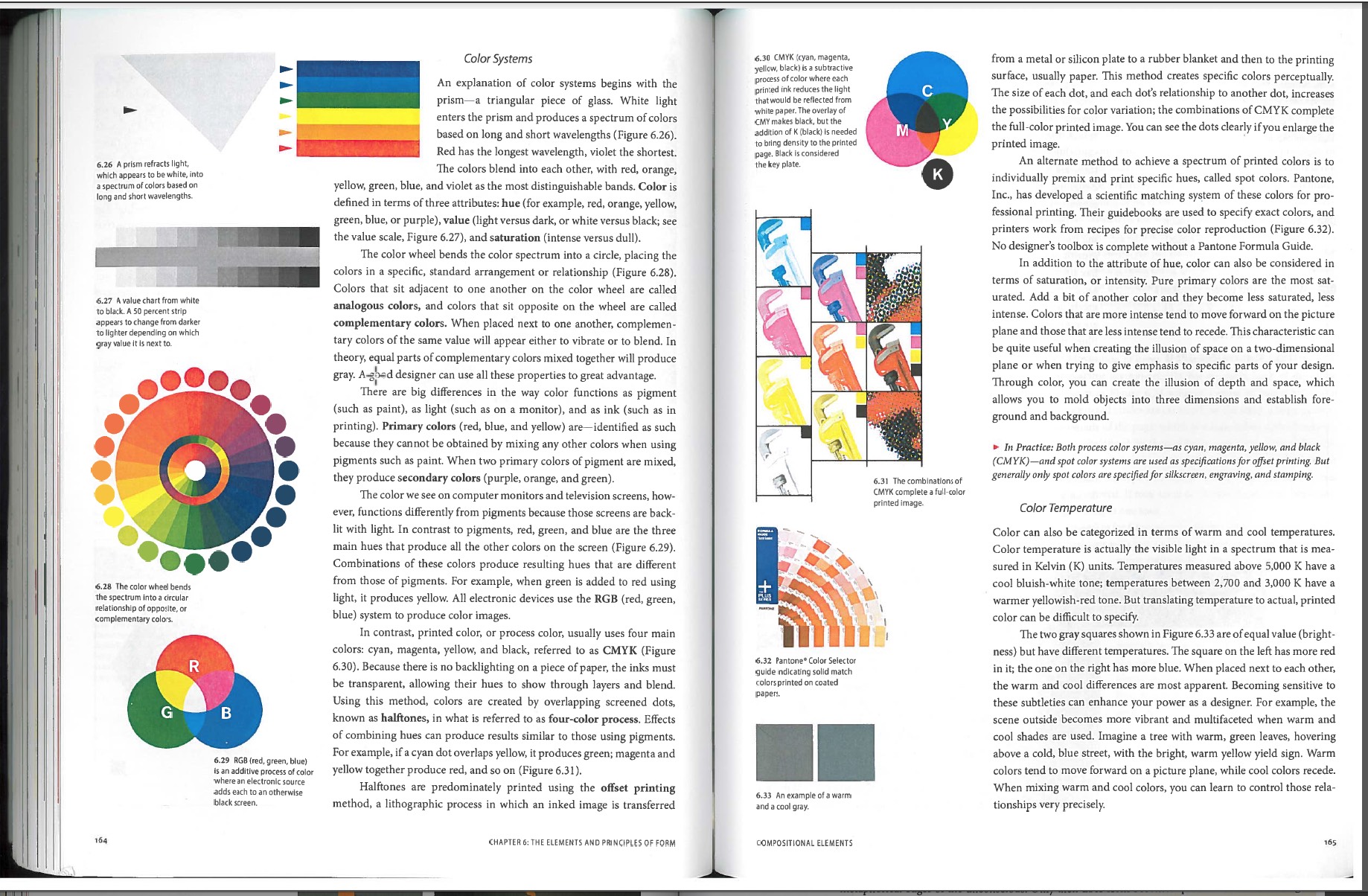
I thought this reading was very interesting. It incorporated many scientific explanations and definitions of color into design. One such element it discussed was the color spectrum. I liked how it then transitioned into the color wheel and how it was applicable to the concepts we have discussed and practiced in class.
I was never aware of the different ways in which color manifested itself on different mediums like paint, computer screens, and ink. I think it is so interesting that we would need to create different color systems for different mediums. When I look at quickly at color on a computer screen and then at the same color on a printed piece of paper, I don’t necessarily notice a different between them. I think I’ve just never really paid any attention to it before. What I was familiar with prior to this reading was the concept of primary and secondary colors, and warm and cool colors. But I was never really aware of how they were applicable to the real world other than in painting or drawing. This is why I enjoyed this reading; it was really informative in an applicable way. -
These articles really showed how important color can be to design and how big of a difference it can make. It’s crazy to think that different colors can make people feel different ways and they can totally change the way a person perceives a design or advertisement. Different colors attract different kinds of people and color alone can be used to target certain groups while advertising. Colors alone can also create depths and shapes and different perspective without even outlining specific shapes or objects. Color can be used with personal preference, to make something look pretty, or it can be used strategically which would be the act of a good designer. This might even include a lack of color and just keeping things simple with black and white and maybe just an accent color. After reading these articles I’ll definitely be looking at color differently and using it more strategically.
-
These two text gave a real insight as to what color is all about. How it isn’t simply just putting colors together that we like, but more that there is a science to it. I have learned it before, but I still find it interesting how certain colors and color combinations can effect a persons emotions to make them feel something they may have not been feeling before hand. Sometimes when I do graphic design projects I choose colors that are appealing to me and are normally simplified colors with not a whole lot of variation between them. Sometimes though I do mix it up and go with colors I would not normally choose. I do want to start using color in a more unique and professional way, in which I am using Analogous, Monochrome, Complimentary, etc. I am actually working with color right now in my web design class. We are creating our own websites and we have to come up with a color scheme that will work together and be appropriate for the the type of website we are creating.
-
I think that these readings were pretty interesting. It really shows that the trick behind good design relies heavily on color selection. It’s true how it doesn’t matter what your favorite color is. It isn’t about what you like to look at, it’s about what message you really want to get across to the audience. In reading these texts, it made me realize how much in past designs I created, I almost arbitrarily used a lot of complementary and analogous colors that I thought just looked good together. Now when deciding on colors now, I will take into consideration the overall feel of the color, for example warm and cool colors and what effect different hues and saturations of colors have on the overall feel of the composition. These readings really emphasize the importance of color in visual communication.
-
When I think about color, I immediately think how colors affect my moods. As the color reading says, each one has warm and cool shades. Warmer shades make me feel more positive while cooler shades make me feel down. However, when it comes to my favorite color schemes I prefer triad colors. These color have a larger contrast and make my work feel more dramatic and visually energetic. As a designer it is very important to know how color interacts with their work and systematically test variations of their ideas.
-
I never noticed how color effected me before I read the readings. I always used colors when I thought they looked good. If the poster looked good with greens and blues, I would use greens and blues, never thinking that those colors could change someone’s mood. After reading the articles, I am more likely to use color more cautiously. I will no longer use a red tone when trying to portray a calm message. It is important in design to use color in a way that matches the message you are trying to say. It is a way to add to the message without making the image busy and complicated. I will now be able to use colors in a way that benefits whatever I’m creating, rather than clashing with the message I’m trying to show.
-
It was nice to address color theory and it’s importance in design. As I expand more in my art classes, the more important color theory has become. As a photographer, color theory has helped me do color correction and of course when I style my models in their clothing. I use color theory when I’m doing makeup on my models as well. It has so much importance in the art world and real world. Color has different meanings to different people and the meanings that color can communicate are so important as a designer when working with it for a client or simply for an artistic audience. If you want to make the viewer feel a certain way about the piece, change the tone of the color. Of course Graphic Design started as a mainly black and white medium, but that all changed with photography. The readings mentioned two artists who I’ve studied and greatly admire. First was Josef Albers who really nailed color theory and taught at the Bauhaus School and Yale. Marc Rothko was also mentioned, his work really needs to be seen in person with the way how he beautifully interprets color theory and texture in his work. I really want to be more aware in the way I use color and to make it more appealing in my work and use it as a communication tool. Color is super useful in design and really should be taken seriously and appreciated.
-
Generally speaking, I only use colors that I find attractive to my own eyes. I am fairly close minded to colors that I don’t look appealing to me and that is a choice that may seem very close minded. Upon reading this, I have discovered that there is more to color than just what the eye sees, there is much more of a science behind it. Certain colors may be associated with moods and if you use the wrong color to portray a message, the whole meaning could be lost. Color is important in this aspect of design because if color is does not properly communicate the message of the design or if the color does not fit the final product, the message may be entirely lost. Color is much more important than I originally imagined and that information in itself should help me better myself as an artist.
-
Colors give a feeling of unity, perspective, emotion, expression, and balance in a design. Using color in a design can be complicated, in order to give the audience the right feel or emotions being portrayed. Before reading this text, I would pick the colors that looked most appealing and that went well with each other. After reading, I now know how powerful color can be when expressing an idea in a design. By using hues, values, and different colors on the color wheel correctly, you can set the tone of the design. Another consideration when choosing colors is balance. Balance provides equality and creates a relationship in the design. Colors can also symbolize something, for example red is used as a symbol for blood or death. This text has opened my eyes further in dealing the concept of color being used in design. Creating emotion and unity in a design is heavily expressed through the colors that are chosen.
-
When reading this, it really opened my eyes on the different perspectives people have on color. Color can be used as many things such as emotions. When you see a specific color, you automatically relate it with something for example, seeing the color red. I personally think of warnings. But seeing blue is a more calming color. Adding color to design is very important because it brings your concept to life. Before reading this i never really thought of how colors give off a certain emotion to people. I personally have always loved contrasting colors because they make each other pop and stand out on their own but also work together at the same time. I also find it interesting how much something can change if the shade or hue of a color is altered.
-
For the future of using color in projects I will take into account all the factors that I have just newly learned about. Such as each color uses different aspects within that specific color choice, value, intensity, and others that were stated in the article. The color wheel will play a bigger role into my color schemes and choosing colors. I will also have to listen to what I am trying to achieve through my work, if I need to be suttle then I will use colors in the same family just different ascpets of that one color! This changes the way I think about color because there is so much more thought that I have to put in to create something great!
-
Color is a wonderful gift that many, but not all, can perceive. Often times, we take it for granted. I do not usually think about the color of my clothes or appreciate the leaves in the fall. I have become so distracted by my life that I do not just stop and look or think about the simplicity in colors. These readings opened my eyes to not only be aware of the colors in my designs and what mood I want to set for the art with it, but to be aware of the colors surrounding me always. By seeing the color wheel again, as I have not in a very long time, I will have a better understanding of what colors will and will not work together. My art will hopefully be even better than before with color and colors that help the picture to come to life in even more ways than it had in black and white.
-
Color is an important tool used everyday by designers to intensify and mold their design. Color has the power to convey emotion, describe reality, or even codify information. Being a graphic design student, I make decisions involving color almost everyday. I use color to make certain points of focus stand out more than others, and other times I use color to make objects disappear/ blend in. Color is a balancing act, we use it to add contrast or connect, and to highlight and to hide. And if one is not smart about the way they use color it can completely destroy an image/design. This is why it is important to be educated on the color wheel and the relationships among the colors. For example, a designer must know the difference between complementary colors (colors that sit opposite of each other on the color wheel), for example red and green, and analogous colors (colors that sit near each other on the spectrum) for example red and purple. This changes the way I think about color because after reading both readings, and tying the information together, color can give so much more than just emotion. One can actually use color and line to give visual perspective, an effective way of creating illusion of depth. After learning about color I also learned in the second reading that depth and perspective can be manipulated to make space more active, ultimately making a design more appealing. These two readings have given me a much stronger understanding of color and how it should be used, so from now on when I work on projects involving color, they will look even better than before.
-
One thing this reading pointed out that made me think a bit differently about color was the flexibility when picking colors for a color scheme. Usually, i get the idea that colors must be perfectly harmonious with exact complementary colors, or triadic colors, or whatever other types of schemes. But in the reading, they seemed to be suggested use of near colors such as a red paired with a tertiary green as opposed to the usual secondary green. I imagine there is good reason to stray from what would typically be considered perfect color harmony and there are statements to be made with use of colors that don’t go by the book.
-
I thoroughly enjoyed reading these articles and I learned a lot! It also showed me the main things you need to think about and focus on to succeed as a graphic designer. There is so much more to color than what you see. Color is what brings something unique and distinct to your work. Graphic designers choose their color schemes very carefully to create a certain mood or atmosphere to make you feel something or express emotion. Color is a significant part of any design, but if you make a bad choice of colors your design can say something different than what you are aiming for. What I realized, As a graphic design major, it is very essential to know when to use RGB and CMYK. When I change the ink cartridges in my printer I always think to myself how those 4 colors work together CMYK (cyan, magenta, yellow, and black) but when you print an image and look closely you can see that they are just a bunch of tiny little dots that appear like the colors that we want. RGB stands for the colors red, green, and blue and are known as the primary colors. It is crazy that we can blend these colors together in certain ways to get a ton of different shades. RGB is what you see when you are watching TV or looking at your computer or cell phone. What I found most interesting is how color has different meanings to different people all around the world in different cultures. How people perceive colors has a lot to do with the culture that that person was born into. In the article by Ellen Lupton, she says “White signals virginity and purity in the West, but is the color of death in Eastern cultures.” That’s a big difference in color meaning! What colors you think looks good, may look like a piece of crap to someone else, so you have to think about what kind of meaning and emotion it has behind it!
-
I found this reading to be pretty cool. I kind of fell in love with the idea of digital color vs paint. digital color is light being reflected and paint does not have as shape of a reflection giving different colors when combining colors. Also when it came to printing how the black has to be added because the darkest color CYMK can make is not strong enough to be black. There are tones and hues to all colors and to think that they can be crated with for the most part three colors that are not the primary colors is kind of life altering. I mean why did I even learn that blue and red make purple.
-
Color is very interesting because to many it seems to be a simple concept in which you use to help decorate a room or help stylize an object that is appealing to their eye. However it has so much more meaning than that because color actually has the power to evoke emotion and create a universal language that helps reach out to all types of communities. Color can help turn a boring grey village into a bright green environment that helps give a happy life to the image and everyone can enjoy their own lives. Color is a very powerful tool and it is crazy to think that there are billions of colors and all of them can really help create a different emotion when applied to something.
-
Life is full of colors that are unbelievably beautiful. Could you imagine living in black and white like in the movie “Pleasantville”, that would be terrible! Not being able to experience colors and how colors react towards you.
The thought of knowing that a color that I see can be viewed differently by another person; such as, color blinded people, who mix up their greens and reds and etc. How does society know that we are right and the “color blind” people are wrong? Maybe we are the ones actually color blind. Maybe they colors that we can’t even see. Just like other species can. The mantis shrimp carries 16 types of color receptive cones which gives the crustacean the ability to recognize colors that are unimaginable towards the eye of a human or by other species. Just think about how big their color wheel is and what if there are more than 3 primary colors in the world! -
Color is an enhancement to everyday life and even design . I didn’t realize how much color is used to persuade your subconscious, such as why fast food restaurants logos are usually a red or yellow color to catch your eye. Also how blue is used for businesses like BMW, Intel, and Walmart due to the professional look of the color. Color is used to evoke feelings like red for anger or passion and a world with out color would be a black and white movie but with only words and actions to help you express yourself. Now I feel like I appreciate color much more and have sympathy for the people that cant experience color to the fullest such as the blind or the color blind.
-
Christy McGraw says:
I really like how the first reading starts out with the quote, “All colors are the friends of their neighbors and the lovers of their opposites.” I like how Marc Chagell puts color into perspective that we can relate to as humans, while still suggesting that he was actually just talking about analogous and complimentary colors in a friendlier way. When you’re younger you just throw a bunch of paint on the paper and pray that it’s an attractive outcome. Now that we have been learning about RGB and CMYK, it really makes you step back and realize that we are seeing no different than how a printer is printing. Our eyes are the printers of our own perspectives of the world. If we were color blind, it would just be 50 shades of gray. Haha.
Understanding color and how two or three colors communicate with one another is honestly the first step to design. Color is what catches your eye and makes two identical shirts either be your favorite shirt or the one that you never take the tags off of. Yes, some people may have a favorite color, as mine is baby blue, but in the end it really doesn’t matter to anyone else, but you. Your client will never care what color you paint your room. They only want to see what matters to them and their ideas. They want to see what looks good in their eyes, not yours. After reading these articles I feel that I have a better understanding of color that can benefit myself as being an artist and a designer. I understand how different colors bounce off each other where others are more comfortable sitting in the background next to each other. I never realized how complex it was to think about color, but I definitely have a better understanding and appreciation for the people who took the chance to lay it out and explain the visual differences through out colors. -
Neula Ha says:
We take advantage of color every single day. For an example, I am at the exact moment, looking at a white screen with red text. What if it was red text against a red screen? We’re lucky that two colors can either blend very well together or not at all to the point where we can make sense of everything that is going on. We see color every day so we don’t think about how much it affects us. While I read these two documents it made me think about how I read an article on logos and branding. Blue is used when you want your company to look loyal, green is used to look fresh and resourceful, yellow is used to look happy, and so on and so far. We don’t think about these kinds of things but in our minds we automatically connect it to emotions and feelings. Every single second of your life, colors make you feel a certain way, make you perceive things you don’t even realize.
-
I’ve always known that color was an extremely important aspect of design, but I like the way this article proved that scientifically. The way color actually affects your mind and your emotions is so cool to me. I believe learning and understanding the way color effects the human mind is essential to being a designer of any sort. This arctic made me think of all those well known ads, commercials, or products and reconsider why exactly each color or color scheme was chosen. This article also made me think back to some drawing I did, and how back then, color was just a matter of complimenting and picking what “looks good.” But after learning so much about the real reasons behind color choice, I may have made some different decisions about my color use based on what kind of emotion I was trying to portray in the drawing. So much about design is about what the viewer will think/see/do/react to your piece and having this knowledge of color will give us a new perspective on those concepts and move us along in the design world.
-
Definitely after transitioning from our expressive designs to our color translations, I began to recognize more profoundly, the purpose of color and its versatile use. How we simply go off of the color rules and create themes with their names – I started to catch on to more of how we simulated a sort of purpose to the design we originally created. In response to the reading, I agree that color is implemented in our lives culturally and routinely. Good points made across in regards to the color red. Think of black and white as well. Remember the stop sign, the yellow caution sign. Okay, when you use one or more colors, it alters the meaning drastically, your eyes begin to make sense out of the values. It’s a matter of how you want to stir your audience. Do you want to make the bull angry and flash red upon his face? Do you want to catch the compulsive buyer? Depending on what you’re trying to get across, you already have a spectrum of colors that are best suited for your intent.
You look into how a printer prints or how paint mixes, you begin to see how colors turn out brighter or darker than what you’d first expect. The reading not only gives technicality to how colors work, I do love that it puts a humanizing perspective to it. You can connect with the person next to you by using color. It’s influencing to the designer and the viewer. I think there is definitely a social factor in using color.
Leave a Reply
You must be logged in to post a comment.
B The Design and the Play
Read The Design and the Play Instinct and respond to the reading as a comment to this page. What is the author saying about the creative process? About design education? How do his ideas compare to your understanding of your own process as a creative person?
29 responses to “The Design and the Play”
-
The creative process is a complicated and personal process that can differ between all creative thinkers. In this reading the author suggests that if a student is given a problem with defined limits the student will be more interested and give a meaningful solution, rather than being given a problem based on freedom and self expression; where as the student will likely be disinterested and provide a meaningless solution. The reason the author thinks this is the best way to arouse one’s curiosity, hold their attention, and engage the students creativity is because limits are what guides a student’s thinking.
The authors ideas about the creative process are very similar to my own. Although I do believe in some situations 100% creative freedom and self expression can lead to a beautiful outcome, I believe being given specific limitations forces one to think harder and dig deeper. Being a creative person, I understand that people with nature talent can create beautiful pieces freely on their own, but i prefer my own creative process to be given limitations. I believe this because when one’s given a small window to work with in rather than complete freedom, and they come out successful.. not only does that show that they are a gifted and creative person but they are also able to be a problem solver. -
The creative process needs to be seen through a lens of guidelines. Without limitations, design would be meaningless and boring. Arbitrary designs would have no basis on which to stand and therefore serve no real purpose and as Rand states, “monotonous.” With guidelines there is also a problem to be solved. This really engages a designer and forces one to come up with an innovative finished product.
When it comes to education limitations of a design should hold the students interest far longer than would a free-form design. The students get an opportunity to play with the skills they have and arrange a composition that both solves the problem and is imaginative. For example the tangram forces a student to work within the confines of the shapes provided. As a student I prefer working within guidelines rather than having free expression. It gives me a sense of direction and meaning. When I have free expression I find that it can be hard to find a solid starting point. -
This reading by Paul Rand is centralized around the idea that the teaching of art and design can be complicated and perplexing. He states that, though the focal point of a student’s success is his or her natural born talent, a problem still arises in captivating that student and engaging his or her creative potential. Rand feels that the solution to this is defined limits, guidelines and disciplines when it comes to design; that emphasized freedom and self expression in a problem becomes a problem itself, as a student gets lost and creates a meaningless end product.
From a student’s perspective, I personally can attest to Rand’s ideas. I have gone through courses that have provided me with very minimal set guidelines, as well as courses with very strict guidelines. I have found that having barely any limitations, in a way, gives you the opportunity to take the easy way out just to get something done and produced because you have the freedom to do so. Having guidelines, though, forces you to truly get down to the root of the problem and solve it to your greatest capacity.
Overall, I found this reading to be pretty thought-provoking. The sort of “problem-solving” examples he included such as the crossword puzzle, Tangram, the Modulor, etc. were quite interesting to read about. It’s all about finding exciting ways to work with what you have. -
In the reading, the author talks about how the creative process is a complicated thing. He states that students are losing interest and becoming bored when it comes to being creative. The problem isn’t limiting the students creative mind, but not giving them guidelines to help them engage it more. Allowing students to have self expression and become limitless, becomes a problem and does not push the student to put their full potential in a final product. Students become lost and hand in a design that had barely any effort put into it. Having defined limits makes the student think, stay curious, and grab their attention. It engages them to solve the problem in a creative way but within boundaries. Every design has limits, and without them they would be useless and have no meaning .
My idea on the creative process compared to the author is very similar. I believe that being able to express yourself is an important concept in being an artist, but everything needs limits to have meaning. I believe having guidelines help push a designer to do their very best, solve problems, and focus on what direction they need to head in. Limits are the foundation of design, and without them we would never know where to start. -
The author states how the ultimate success is depended largely on his talents. However from a teaching perspective the teacher wants to arouse his curiosity, focus his attention and to motivate his creative facilities. He also gets the creative juices flowing by having them create a “game” to motivate. Throughout the reading I found it interesting how he incorporated “games” in the child’s creative process. I never thought about my own process as a creative person before. After reading this article I began to think about my childhood in regards to art as well as my personal thoughts about my own creative process. I didn’t have much creative energy surround me expect when I had art but that was only for a short amount of time each week. So mu current creative process is to let your mind explore and be open to new funky ideas!
-
In the reading by Paul Rand, he discusses the complexity of the creative process. He talks about the problems and solutions to captivating a students creative thinking. As he explains, the best way to “arouse his curiosity, hold his attention. and engage his creative faculties” is to set limitations. By getting his students to get to understand how to work with those limits when they’re given to you will keep them focused and more involved in their creative minds. These guidelines will help them channel their ideas; “‘A mind so disciplined should be both more abstract and more concrete.'” I relate and understand this as a designer, because I have learned that when given a specific task and project I have to work around the rules and limitations and create something that follows the guidelines of the assignment. I feel it’s not only easier to have these rules, but more exciting at the same time. I have work around the limits to come up with a design that I like and viewers like.
-
In this article written by Paul Rand, he explains that the design process is about limits and knowing them better. He goes into design education, saying that students need to feel that their time is not being wasted, but expanding and becoming more knowledgeable. Students should know the basic disciplines of their work before more rules are set for them to follow, or they will not be able to think of their own ideas as easily. With the creativity process, the limits are endless to what one can think of, however, a limit of an idea is necessary to make a good idea come to life. From reading this article, I do believe what the author is saying about limits to make the creativity of the designer better. There is a main idea which should be followed for a design, but that does not mean that you cannot express the design differently. Limits give the student a guide to follow with their thoughts, rather than a scramble of so many ideas they don’t know where to start. Design is about uniqueness and expression, which cannot be taught but only expanded.
-
In the reading, the author, Paul Rand, talks about the creative process and how complicated and complex it can really be. He talks about how there needs to be formal limitations otherwise the teacher of design and student tend to bore themselves. He feels that with those limitations given, it could create a better product because it has a purpose and a goal that the student is focusing on. Rand speaks about “play-principle”, a way of problem solving, as well. You make something into a game where you can learn things along the way. I find that very interesting, actually. I like the idea of being able to turn something into a game to almost trick your mind. When Rand talked about the limitations put on designs, I have to agree with how that would help. As a creative person, i feel when given specific limitations, it really helps me take that and create something I think would be attention grabbing. When a student doesn’t have strict guidelines to go by, they can really get lost or even give up on their idea because they feel like they have reached a “goal” because they’ve hit the very minimal guidelines given to them.
I found this reading to be very interesting because I’ve never really thought about the creative process like this and the idea of limitations. -
In this reading the author is saying that the creative process is complicated. How the success of a person is mostly based on natural talents, but how to keep them engaged is the problem at hand. He says that if a student is confined in a problem it would keep them more interested while trying to overcome the task. It gives the students motivation to finish what they started and will make them proud of themselves once they have completed the project. The author says that most design education allows students to express themselves any way they feel and are given no expectations or restraints. He suggest that though sometimes it can look really pleasing, other times it’s boring and there is no meaning to it.
His ideas really relate to my understanding of my own process because even though I love to freely express myself, I do prefer constraint. I think having to follow certain guidelines actually helps me more as a creative person, especially in classes. It is really hard when you are given a lot of freedom in art classes because I feel it’s sometimes hard to come up with ideas and make something that will be pleasing to the eye. This can even be said when I am much older and working for clients. I may have more freedom when I am older, but I will still be confined by what the customer is looking for. I may throw out ideas to them, but at the end of the day it will be what they want. -
The passage is basically explaining the long stressful procedure that a designer has to go through in order to accomplish their ultimate goal. The author explains how the quality of a design almost always depends on the artists natural talents. he also goes on to say that design should be created with guidelines and create questions that need answering. I agree with both of these statements and feel that a designers work is only as good as they can make it. Each individual piece that is created needs a lot of time and dedication not to mention creativity in which is definitely pushed to the limit when their are guidelines and rules to a design. If I am forced to design a 4 legged animal, I don’t want to make simple animal that you can find on a farm or in the wildlife, I want that animal to be something unique that no one else would have thought to make.
-
I believe the author is trying to get the point across that art is a creative process so it must be taught in a creative way, however, teaching art and design is an extremely complex task and a lot goes into it opposed to your typical concepts. The teaching of art requires rules but the student needs to have the desire and drive to learn. I agree with this but I also believe that some people are born with the natural talent and eye for design and it can not be completely taught. The basic principals of harmony, order, proportion, symmetry, color, space etc can be taught but that doesnt mean students will know what to do with them to make an appealing design. I really liked the line the author included saying “A mind so disciplined should be both more abstract and more concrete”. It is essential for designers to think abstract and outside of the box but at the same time to have concrete and grounded ideas. The author relates designing to problem solving and how people are drawn to that sort of thing even if it is subconsciously which is why it would make sense for designers to use that kind of technique. I agree with most of the authors points and find myself relating to a lot of the process he talks about such as the problem solving.
-
The author of this is emphasizing the need of guidelines and boundaries in art. Though according to him, the most important thing in the world of art is over all talent, offering limitations helps to send the talent in the right direction. In education, an important thing to remember is to keep the students interested. If the student is not interested, there’s a good chance that they’re not going to produce a good finished product. Keeping their interest with things like games and rules helps to keep the talent that they have on the right track rather than letting their minds run rampant.
Personally as a designer, I believe that guidelines and limitations are important to my designs. They give me a defined starting point whereas if I was just given a blank piece of paper and told to make something cool, I would have a hard time deciding where to start and what direction to go in. With guidelines, you are given an idea of what a client, teacher, or professor is looking for and can then decide what to put into the design. When you are finished, you can look at your artwork and decide whether it is satisfactory by looking back at the guidelines. Without guidelines, you may not know where to stop, what to incorporate, or really anything for that matter. An artist may have a hard time determining whether the piece is finished and perfect without rules to refer to and base the work on. -
I think that this article raises an interesting and valid point. It talks about the importance of bringing fun into learning so that children will be encouraged to stick with their studies. I think this is critical in today’s day and age of education. Children’s attention spans seem to be decreasing every day, possibly because of all of the new technologies that they are exposed to. Because of that, they need a reason to learn. That reason could be the fun, excitement, and thrill that a professor or teacher brings into the learning atmosphere.
Reading this article reminds me of being on a sports team. I would show up every day to practice, truly to learn a new skill, but that was not necessarily my intention. I enjoyed working out with my friends and I enjoyed the atmosphere that came with being on a team. We were all working hard and pursuing a goal together, but we didn’t necessarily realize it at the time. We had the “play” instinct that drove us. Each sports game was like a problem that we were trying to solve; we had to strategize in such a way that we outsmarted our opponent. The play aspect during practice made everything more enjoyable and it also brought the team closer together.
I completely agree with what the author has to say in this article. Having a “play” element distracts the student from the real goal at hand: learning.
-
“The Design And The Play Instinct” reading talks about a persons creative process. Which process is better; allowing creative freedom or provide basic rules and discipline to challenge and increase a peoples creativity? Providing simple rules increases creativity, new form, and style. If we don’t have these restrictions work would become boring. Some schools make a small attempt to guide the student’s thinking from basic design to applied design. Teaching should alternate between theoretical and practical problems-and between specifically stated rules.
I enjoy creative freedom but, having a good teacher who can set rules for my work allows me to think outside the box. Most of the time, I like staying in my comfort zone and using skills that I learned before. My teachers are the ones who push me to go outside the box and research new ideas. With ought restrictions there is no new knowledge. -
The author discusses the different aspects of the creative process and how we should teach it differently. The author also goes into the different creative processes of artists in varying mediums. In design, or any artistic instruction for that matter, The author shows that they want the student to be passionate about what they are creating, as well as learning and expanding as artists. The author talks of creating a balance between rigidity and relaxation in instruction. Braque talks of how limited means can stir up a new form of creativity and how if an assignment is more structured, it can make the student create and conceptualize differently. I can definitely agree to that, an assignment with more expectations and guidelines can be more tedious, but I’ve created some really unique pieces that way. Nonetheless, the goal is ultimately to make sure the student is interested and engaged in their project or assignment, while instilling discipline and motivation.
I can definitely relate to this in many aspects of my life and artwork. I had a photography teacher in high school who drilled us on concepts. She required for us to have a certain number of ideas recorded in a sketchbook along with visuals. This was for an independent study so many thought it was going to be relaxing and an easy A, but it was the opposite. We would usually propose our concepts to her in a private meeting and she would give us her insight and advice, along with certain criticisms. After that, she would let us do what we needed and she would rarely intervene. She created a lovely harmony of discipline and motivation, along with making sure we were passionate about our projects.
I really enjoyed how the author took the reader on a journey through different artists and their creative processes. All of them had an idea to execute it and went above and beyond to achieve it. I feel like many people I encounter are afraid to leave their comfort zone and try something different. Designers are constantly having to go out of their comfort zones in hopes of creating something innovative and well done. They always have to solve problems and prevent others from arising. One can get easily tripped up, but the important thing is how you get back up from it and I think that’s something that should definitely be taught in all aspects of education, every experience is an opportunity to learn.
-
After reading the design and the play instinct, I noticed that the author talked a lot about simplicity and playfulness. With every design, there’s a starting point and it starts off simplified. Every type of design, architects, painters, drawings, mathematical systems, starts off with a plan. A geometric layout is used to design a plan, and after this there is plenty of room to use creativity and playfulness in the design. I think this is a good process because it gives the student a starting point, and then allows them to think abstractly.
-
In the reading “The Design and the Play”, the author Paul Rand compares the creative process to a game. You need to know the basic rules and understandings to play the game of Design. The reading states a problem with defined limits, implied or stated, and is conducted to the instinct of play could grab someones attention with a meaningful solution. Renaissance teachers used this play-principle, teaching children about difficult subjects while creating fun games for the children to enjoy. Without that play-principle, the children way back when would end up getting bored not learning a thing in class. Rand compares the play-method to design by saying being creative is just like playing a game, however you need to know the rules before you play. With this method you can define the rules which then could forward the designer into playing their own “game” or creating a smart design.
Rand believes that the problem with design education is that there is a lot of freedom of expression however no rules. Without the rules of the game there is no game at all. Students should learn the basics of design in school and learn how to set the rules for their own creative game. After learning the basics, the student shall apply that knowledge and have fun while playing around with designs to create a product which is meaningful and useful.
It’s funny how Rand compares designing to games. In middle school when I had trouble with my classes my father had told me that school is just like a game. You need to figure out the rules of the game and then play until you win. However with Design, I now understand this connection of making the rules to my own game. My creative process is super unorganized with thoughts running through my head without categorizing them. I would honestly just design what I thought would look best on the computer and be done. With this game theory I can take what I know from past classes and create rules for the next design (or game) that comes my way.
-
The general theme of this article is that limitations can aid creative thinking. It makes sense because if you given restrictions, such as trying to creating a image out of triangles, then you will naturally try to figure out the many ways you can fit the triangles together. The well defined problem of working with triangles gives the a designer tight space with which they will want to explore what’s possible. Whereas if they are given a massive collection of tools such as Photoshop and are told to just make something with it, they’re going to spend a lot of time just planning what to do. As much as people desire freedom, without restraint it’s easy to feel lost or overburdened. For another example, as people get older they gain more power over their life, but along with that power comes all the worries of the adult world people have to deal with. There’s a sweet spot between total freedom and restraint that gives a person an empowering sense of control over whatever it is that they are doing.
I imagine the author thinks that design education should involve students being given explicitly defined problems to solve allowing them to apply understood design principles without worrying too much about what the limitations actually are.
His theory of turning problems into games by defining them better meshes pretty well with my creative processes. I get pretty frustrated when teachers give out vague assignments, what is supposedly “assumed knowledge” easily becomes pretty esoteric for me. Having restrictions being set in stones makes doing work a lot more enjoyable for me and allows my thought process to feel more fluid and unrestrained.
-
Through reading this article, it is made clear that the process in which professors of design must go through to teach their students in a well and effective way is; both highly complex and difficult. The complex nature of this career field is that in order to succeed the student must need space to explore his or her own imagination and talents to develop the skills and techniques through practice. However this is where the complexity comes in, because its is extremely difficult to allow students complete freedom and still expect them to learn and create meaningful pieces, and to the contrary its also impossible to set bold boundaries and rules by which they must follow because students become quickly bored and unfocused with such problems.
These ideals are greatly similar to mine, there is a quote in the passage which states; “they have got to be made to feel they are studying something, and are not merely executing intellectual minuets”. This quote sums up how I feel about design education, in order to effectively learn, I believe a student needs the room to explore his or her own creativity and techniques, the ability to see progress in their works, and the ability to solve problems which require the employment of certain techniques, but do so in a fun and challenging manner. -
Paul Rand, the author of this reading, is concerned about the modern students ability to think in a creative way. Rand believes that if a student in today’s world were to be given a problem to find a solution for, instead of giving a solution that involves any sort of creative or personal thinking, the student will more often than not give the “logical” answer. I order for a student to be successful they need to be given complete freedom of creativity to explore, the problem is that in a classroom environment this can prove to be difficult solely because there needs to be some sort of guidelines in a classroom. When setting any guidlines in creativity, one would feel limited no matter what has been set in place.
I agree with Rand on this matter. Students in today’s era are limited in what they can accomplish creatively. This is due to the innate nature of the classroom however and there isn’t really much of a way to change the way schooling works. There always needs to be some order in the classroom and no matter how unfortunte it may be, it really leaves little room for personal expression.
-
Joseph Miffitt says:
Our author found that without certain factors at play, the creative process was meaningless and monotonous. He describes two in particular when facing a problem; subject that is studies and the method of doing so. He argues and supports the idea a certain process following three key stages. These stages are motivation, test of skill and ultimate reward. He argues without challenging possibilities and an element of play, both the teacher and the pupil will inevitably be bored. There is a balance that must be appreciated however, one with discipline creates a more abstract and concrete solution to their problem.
I agree with our author and specifically so on the topic of discipline and the balance of it. I personally have found balancing discipline within my work to be a challenge. The authors mentions a lack of discipline leaving the subject to what i interpret as chaotic and unboundaried freedom. This has its time and place but certain rules grant access to much more creative and thought provoking outcomes. This is how I aspire each day to think.
-
After reading the article I feel like the author is trying to tell us that everyone can be creative and that due to the way we have been taught some people are limited to what they are capable of. He relates this to design education, sometimes simplicity is key if it gets your point across, it might be strange but if you feel confident with it then you should feel self reward because it shows yourself your skills. You will have to work so be motivated and everyone learns different so they should be creative with the way students are being taught.
I like to think of myself as a creative person and sometimes I like the idea of rules so my idea can be more put together, but I also feel that rules limit creativity if they are too rigorous. I feel like we should change teaching styles so students can dig deep and be as creative as they can be and not feel limited. -
You are playing with what you’re working with during the creative process, rather than to follow strict guidelines and rule in a formulaic structure. Unless the rules are bent, or “play” isn’t allowed with the project, it will be difficult to have a creative workflow. To teach this it differs from student to student, but to educate students in art, one must teach to reinforce strengths by making resources scarce and projects contrained while teaching through something active, like a game. Not to teach formulas and methods, but instead give guidelines, show examples of good work, show examples of bad work.
My ideas of the creative process and teaching it are very similar. I always try to narrow my scope and to stick to certain guidelines/ reference work I created beforehand, and projects that have constraints or limited resources have always been my most successful. Overall, I agree with Rand on his ideas of teaching and being creative.
-
Natalie Cartier says:
In the reading, by Paul Rand, he discusses how the design process is complicated. That freedom and self interest are important for the creative process but guidelines and discipline are critical. Without guidelines and discipline students become bored and unmotivated. The solution to having students engage in their creative potential is guidelines and discipline. This way a student won’t get lost in their own thoughts and ideas which will result in a solution with more meaning and purpose to it. I would agree with Rand, guiding student’s thinking is going to grab and hold their attention more than letting them do it themselves. I have personally had a teacher that had little to no guidelines with their teaching and it was very difficult to find the solution they were looking for when I did not even know what the problem was to begin with. I believe that it is easier to focus all your thoughts and ideas surrounding one problem/topic than just letting your mind wander not completely knowing what you are looking to do/solve. Guidelines help put ideas into a structure that is needed for even greater ideas to be born.
-
In this reading by Paul Rand he tries to explain how students need freedom and need to learn to be creative. Rand talks about how if a student wants to be successful in not just graphic design but really any pursue in art, they need their own room to be creative and to explore their own talents that lay within them, yet as professor there needs to be a balance in being free to create, and also learning and expanding your knowledge at the same time.
I think back to my high school, I took graphic design for three years and I had the same teacher for all of them. I felt as though she didn’t exactly teach me much it was more of her handing out papers that gave us step by step how to do a project she wanted us to do and then we would never work on that skill again. With the combination that she didn’t know how to control my class and teach us in a way that would help us expand. -
Paul Rand states in “Design and the Play Instinct” that in order to be successful, you must be disciplined and look at the factors of what goes into a problem. If you don’t have any motivation, a goal, or any sort of interest, you’re not going to fulfill the task at hand. While creating, it’s a necessity to have rules and disciplines, the outcome is not going to be what you’re looking for. Perception, judgement, concentration and improvisation are just a few things that are necessary for becoming successful. If you are to follow these easy guidelines/rules, success will come with whatever you do. Although we need all of these guidelines to become successful, he agrees that it’s also important to be creative while creating anything.
I have to agree with mostly everything he says in the article. If you don’t have any sort of goal, you’re not going to get the outcome that you’re looking for. It’s also important to not forget to be creative in the process of doing so. I took three years of graphic design in high school, and even though our main goals in the class were to get our work done and hope that our designs were good enough to be used, whether it was on a poster, logo, or t-shirt design, we made sure to be set goals for ourselves while being creative throughout the entire process. -
In this reading by Paul Rand he discusses his idea of the best method to engage students in their creative process. Teaching a class that is based on creativity can sometimes be difficult but Rand explains his theory on the best way to accomplish this. He believes that giving students guidelines and order, will surprisingly result in more creativity rather than if the student is given complete creative freedom. This is pretty controversial to what one would usually think but I can definitely attest to his theory. I like the way he explains his ideas by comparing this way to teaching to a game. What fun is a game if theres no rules or structure or motivation? Learning creatively is the same way. In my years of schooling I’ve taken many artistic classes and I have had many different teachers with different styles. I have found that all of my best skills in art, I’ve learned from my teachers that give strict guidelines to the projects. Although I do agree with Rand’s ideas, I also have to say that teachers who give total creative freedom is not bad. In these classes, however, I don’t seem to learn as much. Without guidelines, I tend to stay in my comfort zone, and as much as I enjoy it, the end result is that I haven’t learned anything new. I see qualities in both methods of teaching but Rand has definitely opened my mind to the world of strictness in a creative world.
-
There must be interest in order to learn. As “The best Renaissance teachers, instead of beating their pupils, spurred them on by a number of appeals to the play-principle.” They suggested that with some order a student can create great things. With too much structure, the student is limited and with too little structure they can be overwhelmed.
I find that this is true for me. When I’m creating something on my own I often have difficulty coming up with ideas. My mind gets overwhelmed with all the possibilities and I can’t focus. With too much structure, everything ends up looking the same, and my creativity is wasted. By providing some structure without limiting me too much, I can create things easier. -
In order to learn more and create, one must be curious, and with curiosity, one will find more perspective to feed their creativity. Sure some may think that creativity will be boundless. What Paul Rand brings forth is the idea of purpose and use when you use your imagination. It may sound counter intuitive to someone at first however, it does make sense. I remember sometimes myself, I might not come up with something to draw because I have no motive. But when I bring up an issue or theme for instance, I might come up with a general cartoon idea to draw along with that situation as my guideline to create something relevant to it. Like writing a paper, you may wish to follow a specific side or bias, in order to get somewhere and find a thesis.
Like an art class, having these guidelines create a goal of discipline in your work to create a piece that is strong and meaningful. When we look at architecture, what purpose does the building have? We would ask what appliances would be required to solidify its purpose and to meet its demands. So if an architect wishes to create something promising, the first thing they will look at is the square space they are given for the location, fit the most convenient appliances, then work from the ground up. This process requires your own perspective and what you are given to work with. You would have to have knowledge about electrical situations, as well as many OSHA regulations and so on.
I know that my artistic ability improved through last year as a freshman in Keene, because the classes were demanding and forced their students to focus on a subject, work with certain materials, with simple rules.
Leave a Reply
You must be logged in to post a comment.
B Anatomy of the Letter
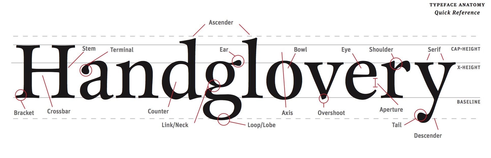
Read
Read this guide about identifying the parts of letter forms.
Study
Download and fill out this sheet. You will be quizzed on it.
B The Five Classic Typefaces
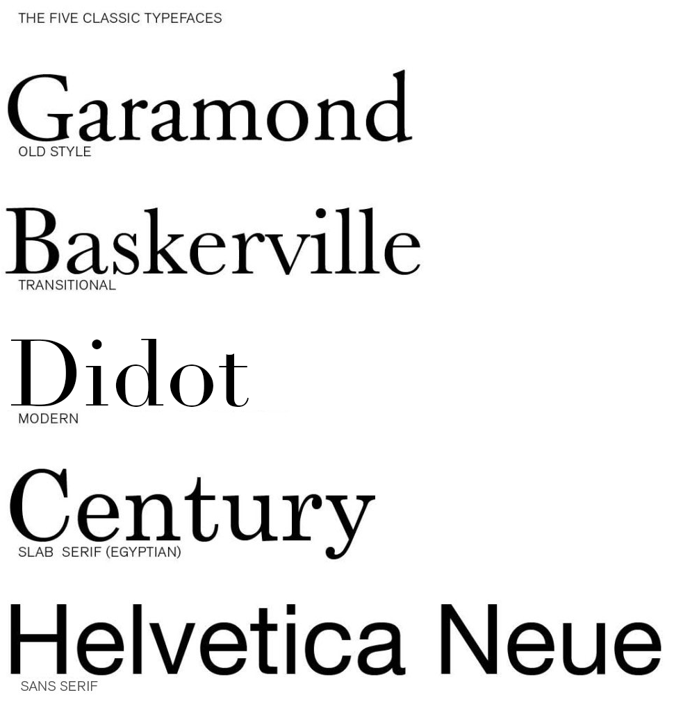
Download the Five Classic Typefaces Here…Five_Classic_Typefaces
Read
Explore these Links.
Designing with Type 5: Identifying Typefaces
The Five Classic Typefaces | Steve Bowden: Endicott SP13
A Simple Overview of the 5 Classic Typefaces
Read them and respond as a comment to this post.
Tell compare two of the typefaces: one you like and one you like less. Explain why they are different and what informs your opinion. It is not good enough to say “I just like it”. Be specific about the type attributes.
28 responses to “The Five Classic Typefaces”
-
The two typefaces I’m comparing are Helvetica and Century. Out of the two, I prefer Century over Helvetica. Century has a more curvier, thinner style, as well as a better flow to it. Helvetica on the other hand is more blockier, bulkier, and bolder. It stands out of the crowd and shouts “look at me”! I chose Century because it has a very dainty feel to it compared to the other fonts. It reminds me of my own hand writing and something you would find on an important document. I didn’t like Helvetica that much because to me it seemed very plain. It just reminded me of any bold title you would see on every package at the grocery store (which is not a bad thing). I prefer interesting fonts that have a curvier sense to them. It gives them more “life”, like a person is writing it.
-
Century and Baskerville seem to be my favorites out of these classic typefaces. I say this because the look of century is so classic in itself, perhaps it’s called “century” since the roots of this type can be traced back for centuries! It’s a very unimposing font, as it’s easy on the eyes and the reader should have no problem focusing on each word. Baskerville is a bit different in this way as the font is more condensed. The letters seem to be much closer together and while I believe that this font looks very clean, I feel as though it is also possible that the smaller the font goes the more difficult it may be for some to focus on the letters. Overall however, this font does look very nice when utilized correctly.
-
My favorite of these fonts is Garamond. I like how the letters are all rounded and wispy, but they all have tails to them. I also like Century. I like the old style lettering because it looks like something you would find on an old newspaper clipping. They have an almost medieval appeal to them. I think it is because of the way the letters all have tails that are sharp and jagged. I don’t really like the Helvetia font because it is too bold and plain. There is too much simplicity to it that does not appeal to the eye. The Century font is soft and easy flowing while the Garamond is thinner and sharper.
-
I like the century font. It reminds me of a typewriter. It has character, but is still elegant. It seems like a font that can be used for multiple problems. This font seems sophisticated. I love the serif fonts. The letters seem to flow together well, creating a balanced composition. I did not like Helvetica. This font is overused. It is too main stream. The letters, unlike century, have very little character, which is probably why people are inclined to use it more often. When looking at Helvetica, it doesn’t catch the eye and is therefore less memorable. It isn’t an awful font. It’s modern and sleek, but I prefer the serif fonts. They seem older and more vintage.
-
I personally liked navigating through the designing with type website. I found that it was very user friendly and quite easy to get through all of the different tabs. The tabs also contained a lot of information that was easy to understand. Nothing was too technical or hard to navigate.
Baskerville is the font that I like best out of the bunch. It has a professional but relaxed look to it. I think this is attributed to the fact that it is a serif font that is thinner than Garamond. Helvetica is my least favorite font. It is too plain and over used. Although it is an easy font to read it has no surprise factor any more and elicits no emotion.
-
The two typefaces I chose to compare are Didot and Helvetica. Didot I chose as my favorite typeface. I actually used Didot quite a bit in my other classes. I really enjoy this typeface, because it has a modern, sleek look to it but also has a classic feel to it. Didot has a very stylish look to it with the varying thick and thinness in the letters. I love the top part of the lowercase “t” in Didot with that nice little curve on the top. Aesthetically, I find DIdot pleasing to my eye. My least favorite is Helvetica in this comparison of typefaces.
Personally, I think Helvetica just is so different compared to the other typefaces listed. It’s a very bold and simple look. Helvetica was used for functional purposes and to be put on signs. It was created in 1957 where typography was becoming more experimental. The other typefaces listed above are classic and were created in the 1500s and even 1800s. I just don’t like the look of Helvetica compared to these other typefaces, it’s a sans seriff fonts and all the others contain seriffs. It looks very jarring and harsh when set next to the other typefaces and stands out in an unpleasing way.
-
My favorite font is Garamond. It is very old fashioned and I like the style. It is very elegant looking along with simple at the same time. It looks like something you would see in a newspaper a long time ago or an old book! I love how the letters look, something about it is just satisfying to my eye.
I am nit a huge fan of the Helvetica font. It doesn’t do much for me. It is almost too simple and there isn’t much to it. It looks like you could take a sharpie and copy this font without even trying. One thing that is good about it, is how simple and practical it is. It is very clear and readable and I’m sure a lot of people like that. I prefer fonts that have more spunk to them and look like they have personality in each letter. Helvetica is too plain and bulky.
-
The two fonts that I find appealing are Transitional and Slab Serif (Egyptian). The Transitional lettering has more curvature and smoother flow that I find very attractive. However, the Slab Serif(Egyptian) has less curves and the text is more blunt and has more angles. It reminds me of texts that I see in magazines and books. The two fonts seem similar but have opposing differences.
-
The two fonts I like are Helvetica and Didot. I am a huge fan of Helvetica (especially after watching the documentary Helvetica). Helvetica is a swiss Sans serif typeface that was made in 1957. Im attracted to it’s slightly condensed letters and clean design because not only is it very readable, but to me it gets straight to the point. I like Didot as well but it’s not nearly as universal as Helvetica. Helvetica has the ability to be used to say so many different things. Didot, a modern typeface made in 1788 has a strong contrast between it’s thicks and thins, as well as a strong vertical stress. It was the first modern typeface among the older faces known as Old Style. What draws me to Didot is it’s bold expression that comes from it’s contrasting thick and thin lines.
-
The two fonts I have chose to compare are Helvetica and Century. I prefer Helvetica of the two because personally I enjoy more modern looking sans serif fonts that help broadcast futuristic looking media. All sans serif fonts are typically very smooth and simple while serif fonts are very contour and complex. Century would probably be my favorite out of the serif fonts if I wanted to reach more of a vintage or classic look. I would use both of these fonts in the future it just depends on the design and which direction it is going towards, modern or classic.
-
Didot and Baskerville are two very different fonts. Both are used for personal or design use, but I would prefer Didot over Garamond. Didot has such a bold and interesting look to it, it draws your attention to it. The thick and thin lines combine to create this effect, and I think it does a good job in grabbing my attention. On the other hand, Baskerville is a little harsh for me, and doesn’t seem to flow, like Didot does. I don’t think this font fits together well, It seems choppy and awkward to me. It doesn’t catch my eye as much as Didot or other fonts do. Both these fonts will get the job done, but I love the characteristic and feeling Didot creates.
-
Helvetica Neue and Garamond are the fonts most seperated by age, and it shows. As time passed, printing went from looking similar to pen and ink writing, to impossibly perfect lettering. I like Helvetica more than garamond because it’s a very common font and I prefer simple and easy to read fonts because I work on a computer programming so much. I really dislike garamond as a computer font, however I think it looks nice for books or as a decorative font, but its just less readable than helvetica. Garamond is a better font for real paper, while helvetica is a winner on the computer.
-
The font i took a strong liking to was Didot, while Century on the otherhand i didn’t like so much. I really like Didot’s heavy contrast between the thick and thins, it gives it a very fragile look. I also like how spaced out each of Didot’s letters appear, it makes it look like each letter stands out on its while still maintaining the cohesiveness needed for a flexible typeface. Century isn’t such a bad typefaces, there’s just a few little things about it that i personally don’t care for. I don’t like Century’s slab seriffs, it’s too distracting for me. Also i feel like the curves aren’t quite as interesting or varied as some of the other typefaces such as Garamond or Baskerville. Century probably has it’s uses, but i’d rather stick with Didot.
-
My favorite out of them is definitely Garamond because of it’s elegance compared to the rest of the types. I prefer the open and round letter forms because they make it seem like a friendly happier type rather than the other dull ones but it’s not too casual at the same time. My least favorite is Helvetica because it’s just boring straight letters with no elegance or excitement or anything. Garamond has the rounded edges whereas Helvetica is just cut straight and it may seem like a small detail but that small flair is much more appealing to me personally.
-
My favorite font out of these five type faces is Century because of its thick serifs and the over all curvy look of some of the letters, like the tail on the lower case ‘y’ for example, or the shoulder on the letter ‘r’. I like the natural boldness of the font along with its uppercase letters. It also is very legible.
My least favorite font out of these five is Didot because of its extreme thicks and thins of the horizontal and vertical lines. I think it would work well as a short heading, but as body text I think that the reader would get distracted by the extreme variation of the font itself.
-
Century and Baskerville fronts seem to be my favorite as of now because I like how fluent the letters are corresponding with one another. The terminals on the letters gives the font more of a dramatic and playful look. It is not as serious as Helvetica, which is very straight forward and cutting edge. Didot is probably my least favorite because I do not like how skinny the legs are and it looks too old modern fashion for me. I feel like it is a font that the elderly would enjoy using.
-
The two fonts I’ll be comparing are Didot and Garamound. Didot is the font I like the most, something about the symmetrical letters appeals to my eyes. Didot is a Rational Serif which contain super thin looking serifs with no curvy brackets. Garamound is the font I don’t enjoy out of the 5 different fonts. It’s a humanist serif which has humanistic brackets and mimics the looks of hand writing. This is nothing special because we see our own hand writing everyday. Didot just looks fancy which I can imagine seeing this font on a cover of a fashion magazine rather than Garmound which looks like the boring typeface cousin of the Harry Potter logo.
-
Helvetica Neue and Didot are very different fonts, but have a professional look to them in their own way. I believe Helvetica Neue could be used for just about any company, while Didot has that specific look that would be for a fashion company. I prefer Helvetica Neue because I like the simplicity of it and I believe you could use it as the title or the body of a page and it would be easy to read. Didot has more of a pen like quality that makes for a great title, but I believe it would not be legible if shrunken down as a body text.
-
My favorite typeface is Baskerville over Helvetica. Baskerville is much classier and feels more sophisticated to me than Helvetica, which seems very modern and unoriginal. I love Baskerville’s style and how it looks as if it is from the Roman times. It is not as hard as Helvetica, but is not soft and vulnerable. Helvetica is large and in charge with how its letters are designed. Helvetica is overrated to me because it is used so often for billboards and other company logos that it is seen everywhere. I believe Baskerville should be used more in expensive and classier brands, because it feels more exquisite.
-
Out of the five typefaces we use, Didot happens to be my favorite font. I enjoy looking at the cleaned lines of the sperifs. It gives off a clean lined look which i am attracted too. It gives off a neat and deliberate feeling when you look at this specific type face. Helvetica Neue falls just short of Didot for my personally preference. Helvetica is also a clean lined look. The letters are organized neatly; Also they look like “block” letters. Block letters remind me of posters that one would make for a car washes, garage sales, as well as sport posters, which brings back memories!
-
My two favorite fonts have to be Didot and Baskerville. They just really capture my attention, especially Didot with its thin flat serifs and how professional and classy Baskerville looks. They look like fonts you would use on like invitations or things you want to look clean and simple. I would have to say that Helvetica is my least favorite font, due to the reason that it looks elementary and boring with its bold, thick block lettering. Helvetica looks like the font you would use if you want to catch some ones attention such as a caution sign.
-
Out of the five classic typefaces, I would have to say that Didot is my favorite and Helvetica is my least favorite. I’m indifferent about the fonts in-between because of how similar they are in appearance. I don’t hate them but I don’t think they’re absolutely incredible. They’re just kind of there, and they work great for big blocks of body text.
As far as Didot goes, I love the modern look of it. It’s clean, elegant, and overall just aesthetically pleasing to the eye. It screams city to me. I can picture it gracing the opening titles of a movie (you know, when a song plays in the background and the camera pans over New York locations while text appears on the screen introducing the cast). I think the contrast between the thicks and the thins of the text really add something spectacular to it because of how severe they are. I also really enjoy the fact that it still looks good in uppercase, which is hard to find in some fonts. Sometimes I’ll find a font that I like in lowercase, but as soon as I make the switch to uppercase everything goes haywire and it looks like a completely different entity. That’s never fun.
The thing about Helvetica is that I don’t necessarily dislike it as a whole, I’m just not really a fan of the regular version of the font. I have seen many companies use the font as a base and alter it a bit, and I liked it in that case. I also really like Helvetica Light, which is just a variation of the same font. Something about the plain, regular Helvetica Neue is too dull for me. It’s straightforward and to the point. It’s a sans serif font. There just isn’t anything too fun about the plain black regular variation of the font on a white page unless something is done to liven it up, in my opinion. Thank God I have 4 other fonts to choose from for now, right?! -
The five classic typefaces have a lot of similarities but many more differences. My favorite typeface I would say is Didot, I like this one the most because of how simple it is. I think this font is much more modern then the other ones and makes for a clean easy reading font. My least favorite typeface out of these five is Helvetica, its not that I don’t like Helvetica, it’s just my least favorite out of these five. I find this font to be more boring and just really pain. However this font is one of the most popular fonts and is used for everything everywhere.
Didot and Helvetica are very different from each other; Helvetica is much more of a plain, bold font very easy to read doesn’t have a lot of pizzazz to it, where I find Didot to have much more of an interesting type to it, its thin and I think it’s the way it’s more modern pulls me into it. -
The two fonts I chose are Century and Didot. My favorite of the two is Century. They both have their own qualities and I could see myself using both for future projects, depending on what the word/message is or how I want it to be portrayed. I like century because it has an old or ancient feeling to it. It looks like the type of font that would be used to engrave words in an old town in Europe. The bracketed serifs are what gives it this feel, I think. Also the stable roundness to the letters. I like the way the stress in the letters is there but not as noticeable as in Didot. It looks a lot more natural and more like handwriting.
Having said that, Didot has some qualities that I like as well. Didot feels much more sleek and modern. Its obvious that it’s not supposed to look like handwriting or natural because of the sheriffs having no brackets to make it flow better, and the kerning is much further apart than natural handwriting. Didot and Century are similar in the way that they both have vertical stress. Other than that, however, they are very different. -
Two typefaces to compare would be Didot and Baskerville. I prefer the font Didot because it is modern yet has a classical feel to it as well. I really like the variation of thickness and thinness about the letters. It catches my attention. For example the letters of capital O’s and D’s are very thin on the top and bottom but thick on the sides. There is just something appealing about that to me that captures my attention and draws me in.
I am not a huge fan of Baskerville font. I don’t like how the letters are very close and the letters seem too wide. For example, capital K, E, and L in Baskerville font are very wide for their x-height. Although, it is a font that can be easily read, it just isn’t one of my favorites. -
My favorite font out of the five is most likely Helvetica. I really like how simple it is in terms of the lack of serifs, and I personally it always looks very clean. As someone with a small case of dyslexia, Helvetica is the easiest one to read for me because of the lack of serifs. In general, I think that San Serif fonts are the easiest to read, where as Old Style fonts are harder for me to read. Garamond is an Old Style font and it is much harder to read than Helvetica because of the heavy brackets, lack of even thickness and having very little contrast between thick and thins. I don’t think that it’s a bad looking font, I think that it works in certain cases, but it is definitely much harder to read than Helvetica.
-
My favorite fonts out of the five classic typefaces are both Helvetica and century, preferably I would choose Helvetica because its classic, simple, and bold design have led to some of our worlds most recognizable logos. Also I thoroughly enjoy this font because of its legibility to a greater and vastly diverse audience, the letters are clear and distraction free. The typeface I like the least has to be Garamond because I feel that even thought the letters are formed to replicate the forms of natural handwriting, I have found that it is often hard to read because of the heaviness and boldness of its little contrasted lines.
-
I would compare between Baskerville font with Century. Between the two typefaces, I like Baskerville. Among the list, I feel that the features and spacing leave the letters distinguished and lined up very well. Letters appear wholesome and dark, but elegant and curvy. Their roundness builds up the look of them and allows them to mesh well next to each other. Their axis is very vertical, doesn’t look very slanted at the same time.
The Didot typeface seems to flattened, and the thinness of the curves leave the letters not as distinguished, although they are farther apart between letters, they are still quite thin between major parts of each letter, Like the two ends of an uppercase ‘D’ or ‘O.’ It seems too kerned apart.
Leave a Reply
You must be logged in to post a comment.
B GD Thinking Chapter 1
Reading Chapter 1 was quite interesting. I thought learning about the Mapping was cool because it’s such an easy technique to use and can widen your ideas without thinking too much! I also liked getting to use this technique in the group project, mapping tools. We got to test this process out in our group and it went really well, ideas flowed out easily and working with a group helped get a wide variety of ideas out there. It was interesting hearing the different tools or objects others thought of, giving our mapping a greater variety of tools. This is definitely a very effective way to brainstorm for projects or designs.
B READ: GD Thinking Chapter 1
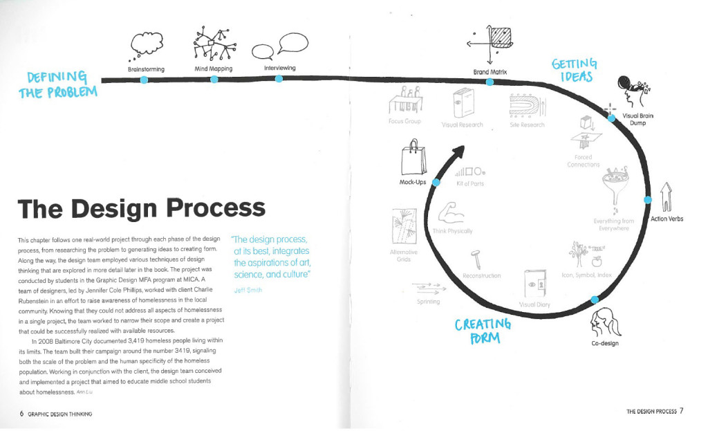
Read Pages 4-25
Use this PDF if you do not have the book yet: GD Thinking Chapter 1
What did you think of the ideas here? Choose a few different pages, concepts, or featured projects and post a quick comment right on this page (not a full post), just a paragraph of your reactions.
20 responses to “READ: GD Thinking Chapter 1”
-
I personally found this section of the text to be pretty enlightening. There was a certain part that stood out to me the most (because I was guilty of this sort of thinking early on), and that was the part about the process of getting your ideas out onto paper in some way, shape or form. When I had first started to take design classes, I didn’t understand the reasons behind crazy brainstorming and drawing out thumbnails because I thought they were unnecessary and a waste of time. Just like the book, I thought, “can’t a creative person just sit down and be creative?”. I had the mentality that once I had settled an idea in my head I was sticking to it, that it was going to be my only option, and that everybody was going to love it as much as I did. Thankfully, over the years I’ve come to realize the benefits of getting everything out and exploring a multitude of different possibilities because limiting yourself is in no way beneficial. None of the courses I’ve taken previous to this class have gone too in-depth with brainstorming and mind-mapping though, so I’m excited to see how these different techniques work out for me in the long run.
-
The first chapter was great start because it had shown me how to brainstorm for problems and solutions. I always had trouble thinking of ideas on the spot, but just like mind mapping the other ideas sounded wicked helpful. Focus Groups were cool because it’s just like surveying questions to the intended audience if your design is working or not. The Baltimarket case study was a great example which showed that you need to have a design that works for the people around the area and not just the designer. Without asking anybody in a focus group, how could you know that your design is actually working for what it was intended to do. You can even get greater new ideas that could work better from an audience member rather than thinking of ideas on your own. Another brainstorming idea that caught my attention was the visual research. I didn’t quiet think this was a type of research until I read this chapter. If you know what your design is going to be about you can look up images online and base your design off of different colors, textures, and patterns that are correlated to your research. Can’t wait to start using these brainstorming methods while designing in the future.
-
This reading was actually pretty eye-opening and interesting in the way that brainstorming can be so simple, but still get results from it. One particular example from the reading that caught my attention was how they used simple action words to act upon an idea. Though there was a consistent idea throughout each of the designs, each one was different and had unique qualities. The use of the words changed each design enough to give it a fresh perspective. I also liked the idea of group brainstorming because even though you may think you have the greatest idea, there’s always going to be someone who doesn’t like it or has an idea for something even better. Sharing your ideas with a group can help to broaden your own perspective and figure out the best solution to a problem. Even if you disagree with some ideas or think that they are boring or cliche, you can still take and build from those ideas by adding creative touches of your own or with the group. Either way, the group will walk away with a fresh new set of ideas to work with.
-
I found this reading to be very interesting and rather shocking at the amount of work really goes into projects. You see things in everyday life and you never really realize how many people were behind this specific thing and how long it really took. I thought the 3419 project was very fascinating. I found it kind of crazy how many things they went through in order to get the message out to the public. When they gave the kits to the children to see what they might find “eye catching” or interesting, I never really thought of that before. Putting things out there and seeing what people really want to look at. Another thing in the chapter was the brainstorming and the different steps involved. I’ve never been amazing at brainstorming because I always think that the things I’m coming up with aren’t going to work. Its almost weird that I never thought of putting down dumb things because you never know, a great idea could come from it! Also giving a time limit when in a group, I think that’s a great idea. It keeps people motivated and more likely to come up with ideas quicker.
-
The reading was very interactive. I love the way the book itself was designed. It does not feel like a textbook. It feels like a Graphic Design book. It is easy to follow and it pops in such a way that is lively and colorful. It teaches, but it also gives off this vibe that it has a story behind it.
I never realized how much work went into design. This book serves as a real eye-opener for just that reason. It talks about some of the concepts we’ve discussed in class, such as mind-mapping, but it also connects it to the real world. I never really knew that mind mapping was a widely used technique. The chapter serves to support the fact that there is so much more to graphic design than I originally thought. -
You can really tell that a bunch of graphic designers wrote this book. It’s very easy to understand and interesting. It’s rare to find a textbook that engages and connects with the world as smoothly and captivatingly as this one does. This reading was very enlightening and again, it proved to me that graphic design is much more complex than I had thought. I always thought brainstorming and the creative process was the least important part of art and design because I figured the idea would just come to you. I never realized the numerous techniques of boosting creativity that are out there and being used by actual graphic designers. I have never spent much time elaborating on my ideas or doing thumbnails or brain maps. This section has taught me that not only are all these things necessary but they are done by many, if not all graphic designers. It makes me think of the amount of work that goes into the ads and graphic art I see everyday that I didn’t even realize was a part of the process. I think having read this section I will take brainstorming and rough drafts such as thumbnails and sketches much more seriously and I am excited to see where that leads me in futures projects.
-
I like the fact that this book about graphic design is a work of graphic design. Its more visually pleasing than say a text book that could contain some of the same information. I also like the case studies, as they are an effective way to show real world application of the way ideas are born. I appreciate the fact that there is a break down of how to brainstorm. There is the normal way to think about it, as in just trying to come up with ideas, then there is the mind map. Its reassuring that you can literally write down anything and it doesn’t matter how far out the idea is from the subject matter. What stuck with me was that working in groups seems to be the best way to come up with the best ideas.
-
I really enjoyed reading this chapter, since it talks about the creative process. There are so many ways to tackle a concept, but this book really breaks it down well. You not only can use these concepts for just graphic design! The image the book uses on page 7 shows the process of an idea in graphic design. In all of the art classes I’ve taken there has always been a visual brain dump done (my favorite portion of the process personally). I really like how the book takes a single project done and it takes the reader step by step, without getting too overwhelming. This book is really going to be a great tool since it has these excellent visuals. I’m still a beginner to graphic design and this book has already taught me greatly on the creative process done, because quite frankly I was unsure of how it was done! I also enjoyed that the
3419 project the book uses as an example was a collaborative effort, just like the Tool Montages we have worked on. -
The ideas in this book gives me a new perspective on how to tackle graphic design, and simply designing in general. Page 10, explained how to create an action word into an object and the thickness, stretching and other ways to manipulate your message. Also page 15, described how every designer starts with a problem; for instances, improving a design, creating a logo ect. This offers me a new way in approaching “problems” throughout my graphic design career.
-
I really enjoyed the layout and design of the images on pages 6-7 and how they seem to be hand drawn to really give a good understanding of the design process. The text goes on to give a better understanding of the visual concepts giving examples such as the homeless awareness project where a team of designers had to go through an extenuating design process of creating problems and solving them. I also enjoy how the book highlights key segments in blue and explains them into further detail on the side of the page. The brainstorming techniques that the book gives examples of are very helpful and seem to be used a lot in today’s graphic design world.
-
I really liked how they chose one project and stuck with it throughout the chapter so the readers could see it go through the entire process start to finish. It really showed how something so small and simple and grow into this large scale project after just producing a few ideas. Personally I’m a visual learner so I enjoyed all of the graphics on each page that showed different ways of thinking such as the action verbs and brain dumping on page 10. I also really liked the book’s version of mind mapping and how it included pictures as well as words and different colors. This chapter showed how much work and ideas and also scrapped ideas that go into projects and what it takes to be a designer.
-
This book is very interesting and visual. I think by being so visual it actually helps to explain and display ideas easier. On page 10 it talked about “Getting Ideas”. I thought it was really cool to see artist take the same object and re-creating many different ways. I usually find some difficulty in coming up with one idea, let alone eleven. I thought the Brainstorming article on page 16 to be rather helpful. It gives you step by step instructions on how to brainstorm correctly. It was also intriguing to see the pictures of the different mind maps people have done and how they approach it differently either with just text or drawings with text. Also how many ideas they could come up with with just a single topic. I think mind maps can be very helpful and fun to do.
-
This is a pretty interesting look at some of the work that graphic designers do. I especially liked the page that showed the back and forth conversation between a graphic designer and a client. It was a good to mention how a client may not always know exactly the best way to shape their ideas and that a graphic designer should be open to and acknowledging of other possible routes the design could take. The part about the origin of brainstorming and how it actually refers to overwhelming a problem with a variety of different ideas was a nifty fact.
-
After reading this chapter, it made me think more about the way I start my design process. I found it to be very helpful and insightful on helping me improve my design skills. Every time I would work on a project I would brainstorm ideas, but I never thought of how important it really is in the design process. In the reading, page 10 and 11 really caught my attention. It talked about the different designs that were created from just brainstorming ideas. I started to realize that brainstorming and mind mapping ideas is the foundation of it all to start the magic. I liked the example of the mind map on page 22. Having the maps have colorful and cool pictures to go with the words makes the process of brainstorming more interesting. I wouldn’t mind trying that more when I create a mind map next time.
-
After reading this chapter I noticed the design precess a graphic designer goes through for every project their involved in is much more extensive than one would originally think. The first quote in the chapter is “The design process at it’s best, integrates the aspirations of art, science, and culture” -Jeff Smith. This quote suggests that graphic designers are so much more than just artists, they’re problem solvers that not only have to makes something aesthetically appealing but effective and sensible as well. The process involves many steps. At first the designer must define the problem, then they need to brainstorm; which they can use techniques such as mind mapping and even interviewing. Mind mapping is a form of mental research where a designer will start with a central term/idea then quickly and efficiently write out associated concepts and images. After thorough brainstorming the designer is able to get ideas and eventually create form, which allows them to experiment with mock-ups and choose the best version. This ongoing process was seen in the example of the 3419 campaign ( a project that aimed to educate middle school students about homelessness, where students were given a kit to create their own pillowcase posters). This chapter excited me about the process of graphic design because there are so many in-depth and exciting steps to reach a final product.
-
In this chapter I had learned a lot about all the work that goes into graphic design, and it is way more than I have ever even considered. Each project take up so much thought, concentration and time. On the streets or in your home or even the store, no one even takes the time to look and examine the design of something on a box or whatever it is they are looking at. It just goes to show how under appreciated graphic designers work is.
This chapter gives me a good understanding on how people make brainstorming seem way more difficult than it is. Personally I used to hate brainstorming because I always felt pressured to have a list out but I had no idea what to write down. I tend to be bad under pressure. But I learned that as a graphic designer I’m going to have to get used to it cause I will be graphic designing for a long time. Also there are so many ways to brainstorm, I’m interested on how each method is going to work for me.
-
After reading this chapter, I have found a new and different way to process a thought into a design. I love all the graphics within the book, as I am more of a visual learner, so it is great to see everything drawn out. I really liked the 3419 project and all the different mind-mapping tools they used, especially the brainstorming of can, want, and are on page 6. I also love the idea of a brain dump, and how everything you think of could be relevant to your project, even though it may not make sense while you are writing it down. How the authors of this textbook used the 3419 project throughout part of the chapter was very interesting as well. I also never realized how many designers went into a single project. So much time is spent on a single campaign. This text is an eyeopener and I will definitely be looking at logos and other various signs with more appreciation.
-
I thought it was interesting that the book said “Brainstorming quickly became a popular way to help people think creatively-even people who don’t consider themselves creative at all.” It also talked about how everyone has the ability to improve their creativity. This inspired me. Often times I feel like I’m not improving at all, but this section gave me hope that I can improve as a designer. I had no idea how much work can go into one project. The ideas of multiple people are often better than one person. It provides a broader view and can provide the client with a better final result. I found mind mapping interesting. Since a problem can take a long time to figure out a solution to, it’s important to get good ideas quickly. Mind mapping allows you to explore your own mind while getting ideas fast. It is an interesting way to brainstorm.
-
To the naked eye, graphic design may seem to be taken for granted. Most graphic designers go unrecognized their whole life and this chapter really demonstrates why designers deserve more credit than they get. Graphic design is a very demanding medium and this specific section of the book really outlines how much work really goes into this art form. I found it interesting when the book discussed the collaboration aspect of design because even I personally considered graphic design to be more of an independent career. I thought it was a good chapter to read especially before mind mapping in class as a group, because it got me to accept the fact that using multiple brains is important before actually having to implement this skill in real life.
-
I thoroughly enjoyed the reading of this chapter as it is rare to find a college level “textbook” that engages so smoothly with its readers as well as with its subject matter. The chapter serves to prove that graphic design is a widely vast and creative career, which includes a lot of collaboration between members of a team. It also gave me an greater understanding and appreciation for the field of graphic design as its own form of an art. This chapter has encouraged my success and thrive for a greater education concerning the ideals of Graphic Design, and I’m excited to employ these skills into modern and current projects.
Leave a Reply
You must be logged in to post a comment.
-
Classroom
-

The reading went over a lot that we have already learned but also covered a lot of small details you do not consider when using type. The reading went down to the nitty gritty of type, which I found really interesting like how subscripts should look, how every detail matters, like parenthesis, even down to drop caps and elevated caps. I found the section about drop caps and elevated caps interesting because it reminded me of children’s books which brings back memories. I liked how it manipulates the text, even the font you use has a purpose. Fonts have a personality and its good to know how to use it to look professional and give the typography a sense of reason. I thought the part that discussed figures was different because I had never considered how numbers should be perceived. I like how the reading made you feel like everything was important also that every detail had a reason and how it showed wrong and right examples.
The reading contained a lot of information to take in. Even though it was a lot, it was very helpful and resourceful. The style guide shows the right and wrongs of type design. Three things that intrigued me the most in the reading is figures, ligatures, and small capitals. Figures is when it is right to use capital letters, lowercase letters, symbols, or when to spell out a word. It gives the text character and makes it correct. Ligature is when two letters are touching each other to make the letters flow and be smooth. That isn’t always the case. It can also make the letters look clumsy, give it a lack of space, and just plain awkward. Small capitals can give a word emphasis. It keeps a word tidy and clean. The reading was interesting and is going to help me in the long run with my future design and my final project.
This reading was rather interesting because not only did it talk about how to space type, like what we have been doing in class , but also how to correctly space special characters. It was pretty much a step by step instructions on how certain design is wrong while others are right. I find it rather interesting that there is so much more happening in a font than most people realize. Most people may believe that there is only one type of a certain font, but when in reality the font itself can be bold, italic, light, black, roman and so much more. The reading within talking about small caps was eye opening because they are not just scaled down of the original large caps. They are in fact different in weight, fit and proportion, which I did not know. The part about subscripts was intriguing because even though a rather small change was made to each word, the appearance was completely different. I truly do enjoy that by a little bit of kerning or line and space can make a world of difference and make it more pleasing to look at.
I found this reading to be really useful and interesting. I learned a lot and the reading also went over lots of important things that we discussed in class this year! This reading talked about every little thing you need to know and be aware of to be the best you can be at typography, which is very valuable and essential. Even the smallest imperfections are a big deal and always need to be looked over and fixed. For example, I never realized how important kerning was until I took this course and how much more effective your type can look when you do it the right way. One thing I found really noteworthy in the reading was Figures. This explains how to use your text the right way when using numbers, typing out dates, etc… Little important things like “If a sentence begins with a number it should be spelled out.” and “Times should be set without punctuation: 10:30 am, not 10:30 a.m.” I thought this was really intriguing because it is the little things like this that you need to know and are crucial when it comes to typography. Another thing that caught my attention is Ligature. Basically, a ligature is made from two or more letters, which appear connected. For example, the “f” and the “i” in the fi ligature are visually connected so that it looks better and flows nicer even though they are obviously two separate letters. Lastly, the third thing I found interesting is Small Caps. These are uppercase letters that are set at the same height and weight as lowercase letters. It is basically a way to emphasize a word instead of using italics or bold and can look really nice. I really enjoyed this reading and I know it will help me in the long run of my future graphic designing.
This reading offered a TON of insight on the stylization of type, which is extremely important to typography in general. It went pretty in depth into a lot of things that are new to me, and I liked that there were examples of which approaches were right and what approaches were wrong. I had never realized (until now) how wrong some of the things I myself had been doing. The section about how to use periods correctly and how to never use double spaces after punctuation was one that stood out to me a bit, because that is something that my teachers had always been a bit back and forth on in high school. I found the part on apostrophes to be interesting as well, especially within the difference between the set that extends straight down and the set that curves the apostrophe, which visually looks a lot better. This also proved to be the case in the section on fractions, where one example showed the fraction as a normal sized set of numbers and the other showed the fraction as a smaller set of numbers. The smaller set of numbers obviously looked better because it showed a contrast between the type (the number and the fraction). You want to have the ability to make whatever text you are working on look the greatest it can look.
The reading discussed a lot of information with regards to typography. I can use this reading for reference as I start my final project. The reading also explains the correct way of doing certain elements of type design. Three elements that caught my eye were “drop caps and elevated caps”, “ligature” and the “display”. Drop caps and elevated caps create a stead flow into the paragraph. Litigation creates flexibility within the text. Display focuses on the finely drawn lines. The reading also mentions what to look for in a post script environment within the display topic.
I like how this reading included a visual example for what is right and wrong for every category they discussed so readers could actually compare the two and notice how much better one looked and worked with the piece compared to the other. As a whole the reading offered a lot of tips and information on how to use different fonts and punctuation and basically everything you need to make a successful work of typography. This will definitely be useful going into the next project and especially for when I take typography next semester.
The reading did a great job explaining what to do and what not to do with text and they give great examples. The paragraph about the apostrophes was very informative explained to not use them to pluralize abbreviations or numerals and gave a good example to back up this statement. Another great example is given when they explain capitalizing letters by saying they may be used in headings or display but should not appear within text settings, small caps
are preferred. Lastly I also found the article about periods intriguing when they said to never use double spaces after the period or other punctuation, except when using mono-spaced fonts.
This reading was all about typography. I found a few parts of this very interesting especially the text under “figures”. I found the information to be useful in writing, when to write numbers out and when to not, what font and text to use when writing dates, times etc. Know how to hyphen properly is also really important to know and useful information. I never really understood the reason why there were small capitals but now i get that they can be used to emphasis and also running heads and chapter headings. Also, when you want to use small caps, you can use a larger capital letting in front. It shows that it’s the start of the sentence, but also helps keep the emphasis when it comes to the smaller caps. There’s also a lot about font families and how you can use the different formats of the font in one whole text and still have the piece look like one whole thing. The words stay harmonized. I found this reading really interesting because now looking back at all of my documents, i realize how wrong i have made them when it comes to small details. Now that i know that I’ve learned, i change these things.
After reading this piece I realized that there are a lot of things that I have been doing wrong. I learned that when you use dashes I should only use the em dash or the en dash and not a hyphen. The hyphen is only used to indicate that part of a word at the end of a line will be carried over to the next line. Fonts are grouped in packages. The four basic styles for the majority of typefaces are Display, Roman, Italic, and Alternate. Family likeness provides harmony and counterpoint exists between the different styles. The larger the family, the more options you have.
This style guide proved to be one of the best resources I’ve been exposed to regarding type. Like the other reading restraint and simplicity lend themselves to creating better type. Reducing the use of periods in cases of abbreviation and titles make text look cleaner. I found the use of small caps to be quite elegant and effective as well. Because they have the same x-height as the lowercase letters they offer an easy transition for the readers eyes. They are particularly visually satisfying when looking at the postal codes or when used in combination with small caps figures. The amount of work and content that is put into a font is also quite fascinating. The different weights, symbols, display, and ligatures each have their own design and spacing. I can only imagine the work it takes to create a complete typeface.
In the reading I found that there are a lot of little details with typeface that can make a huge difference if done right. I thought it was cool how the right and wrong sections in the reading really showed how they’re suppose to be used and what difference it makes visually. The ligature section was interesting to see how blending the type to make it flow and look smooth can affect the visual outcome. In the word spacing example about kerning, it’s crazy how easily you can read the correct kerned paragraph verses the paragraph that isn’t kerned. It’s the little things that go into a design make a huge difference and I will use what I learned in this reading in the future.
I feel as though this reading covered a lot that we have learned throughout the semester and in that respect I believe that this article is incredibly helpful. It covers things such as kerning, the use of periods and also discussed the importance of alignment . Kerning is a very basic skill that is often overlooked, often time the spacing of the letters can make or break a piece of design. Periods are also an interesting subject because the use of them, or lack thereof, can be the deciding factor in whether or not a group of type looks awkward. Finally, alignment comes into play when placing the type in an open space, we have learnt all semester that a designer should let type shape itself. Applying each of these techniques can allow anyone to become a better designer.
This reading definitely covered some things we have already learned this semester, but also added a lot of useful information. We had already learned about kerning, but I thought the use of periods was interesting. I did not know you were not supposed to put a period after things like Dr Mrs or Mr anymore. They look incomplete to me still looking at them now, although I understand with words such as “inc”. I really like the look of small capitals, where the letters and words look cleaner and more organized while really emphasizing on the word. Lastly, I thought that indenting was actually really interesting. I had always been taught to indent the first sentence of every paragraph. I had no idea to not indent sentences beginning a paragraph or under a heading or subheading.
This reading basically just talks about the dos and don’ts of everything typography. It gives clarity and direction on certain minute details that I surely did not pay much attention to prior to reading this. For example, I thought of parentheses and brackets as basically interchangeable. Either or would be used in whatever context it seemed to fit best, but apparently there are rules for using brackets and parentheses. I also find it weird that you’re not supposed to use a period after Ave, Co, Dr, Inc, Messrs, Mr, Mrs, No, St, 8vo, am, and pm. Putting a period at the end seems like it adds a sense of clarity to the reader where they know that that is an abbreviation rather than a word on its own. Also, the usefulness of small capitals is quite interesting. I really only thought of capitals as one size and only really fit well as titles. But in reading this, it made me realize that capitals, especially small ones, play a very distinct role in design and can and should be used in different ways to complement the entire design. Overall, this reading broke down the nitty gritty details about dealing with type and it is a lot to take in. There are so many details to pay attention to when designing.
This really was a wonderful and fascinating reading. It really gave me more appreciation for typography. I loved on the first page the reading says “Good typography is 90% attitude and 10% know how” then on to say it isn’t called “typeFACE” for nothing and to appreciate the effort you put into typography and groom it well. Typography is an art form and should be appreciated. It reminded me of how a designer for my father’s business’s website pretty much butchered it with grammatical errors and poor typeface choices. It’s super important as a designer to know your stuff in typography because you could seriously help or hurt a project for your client. I found it humorous when the reading said that when companies use all caps in their branding since the museum I’m using for my gallery catalog uses all caps for their logo. This reading pretty much informs you for many different instances in using type, it’s quite like a training manual. There were many points where there was review, but it actually gave me tips on things outside of graphic design. I actually learned about properly footnoting, I’m also a minor in Medieval and Early Modern studies and it will be helpful when I’m writing papers!
This text went more in depth to text. We learned some of the ideas presented, such as kerning, but explains how everything in text is important. The apostrophes are important. Each line means something and if you aren’t careful those lines could give the viewer or reader the wrong impression. I also found the drop caps interesting. This is an aspect of typography that I never use. I found it interesting that it can be used effectively in some designs. There are ways to do things that, although they work, they can be improved upon. There are always ways to approve a design.
This was a really informative read compared to previous text. Up until now i hadn’t known what ligatures and i wouldn’t have guessed that they are common styles in most good typefaces. It was insightful learning about exactly what typefaces are made of, which comes down to just style and proportions. I also thought it was interesting learning about small caps. I never knew small caps were even a thing and now i can confidently discern true small caps from fakes, given their distinct squashed look. There were plenty of other interesting details i picked up on such as proper dash use, correct figure forms, and careful superscript usage.
The reading shows great visuals of what is right and wrong in typography. The style guide gives a lot of important steps on how to use the letters/words correctly. Most of the reading I have learned before, but goes just in greater detail and explains why the subject is wrong which is pretty cool. However, I did learn how to drop caps and elevated caps properly thanks to the reading. Also, next to a period never double space unless using mono-spaced fonts. The Expert Font Guide explains many techniques of type styling and the correction of letter placement next to one another. Thus there are plenty of subjects that guide one through the type “culture” and there is always room for improvement.
Although this reading was long and exhausting at some points, it was very informative to me. I was blown away by how much information was in this article and it was a little difficult to find the specifics I wanted to talk about. What really caught my eye was the statement, “Good typography is 90% attitude and 10% know-how.” I thought this to be really interesting. typography is what you make it and how you show yourself through it. A lot of the other things explained in the article have already been discussed in class, but I like how the author goes more in depth and shows examples of what is right and wrong. The article also discusses small capitals and how this typography keeps the world looking sophisticated. Another thing I was glad it mentioned was to always get a second opinion and second look at your work. I have always found this to be an extremely important thing to do.
While reading this article, I thought it was really interesting to see all of the different parts of typography that we don’t even realize is typography sometimes. There was a lot of information within this reading, but there were certain parts that were really interesting to me. For example, the ligatures. I know that I asked you about them in class because I was really confused on why the font you gave us looked so different, but looking at them again they look really awesome. Even though they look pretty sweet, I would be afraid of using them in the wrong place and having them look dumb, so I don’t know how often I would actually use them. I also think that the periods and figures section were also pretty interesting to read.
This reading had a lot of new information in it, but also a lot of stuff that I have learned from class. I enjoyed reading tis piece because it became very information on what not to do. One of the things that I learned and found interesting was figures, which talked about how to pick your typeface correctly when doing certain things such as typing a date out. Another thing that stood out to me was the section about apostrphes and how to only use them for certain things, and how you do not use them for pluralizing an abbreviation , and to not use them for things like quotation marks. another thing that I found interesting was the ligatures, this is something that I have noticed before in some type, but I had no idea what it really was, ligatures create a nice visual flow while reading