- Ê
- Â
fRandall has 61 post(s)
Design a 6″x6″ book that contains the final designs all of your projects.
The book will proceed chronologically featuring the following:
- Cover – A dynamic new design using elements or designs projects with the following text: [your title], Keene State College / Fall 2015 / [your name]. Must use one of typefaces supplied for the class.
- Contents Page – A “half title page” with a list of all projects.
- Project Separates – An interstitial page with project name between each project. All project titles must be visually similar in typeface, color and complexity/simplicity.
- Project Pages – examples of each project at 100% bleeding off the page. Each composition must be set in facing pages to the others. Choose works that compliment and contrast each other for each spread.
- Written Response – 300-400 words on the last recto page that is your personal response to this class experience. Be candid and thorough as you cite specific details of the projects and overall class experience. Set the text with zero tracking with ample margins. Use two pages if necessary.
Book Contents:
- Cover: [your title], [your name], Keene State College, Fall 2015
- 6 Tools of the Near Future
- 6 Two Letters
- 4 Kerning
- 6 Expressive Words
- 12 Black and White Translations + grid of small images
- 8 Color Translations
- A selection of full spreads and thumbnails of Photo Frame Books.
- The 4 best Weather Report Compositions
- A selection of full spreads and thumbnails of Designer Booklets.
- Written response about your experience in this class: Last page, right side (recto).
Use this inDesign template to build your book:
6x6_book_template_singlepage
Dimensions: 6″ x 6″
Binding: Wiro
Due…
10 am class / 10:30 pm, Wednesday December 16
2pm class / 3:30 pm, Wednesday December 16
Two copies of the 6×6″ process book trimmed to size and wire-bound
Two copies of the Final Designer Booklet
B Indesign Tutorials: Working with Text
Leave a Reply Cancel reply
You must be logged in to post a comment.
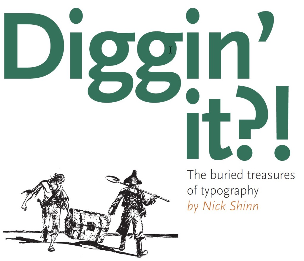
B Digging’ It!
Read an comment on the reading. How does the reading speak to what you have been taught about using typefaces and arranging words? Pick three points in the text that were eye opening or intriguing to you about typography.
B Thinking with Type — TEXT
Read an comment on the reading. How does the reading speak to what you have been taught about using typefaces and arranging words? Pick three points in the text that were eye opening or intriguing to you about typography.
Thinking_With_Type_TEXT_excerpts
26 responses to “Thinking with Type — TEXT”
-
> Jamie Halloran says:
The reading talks about kerning, line spacing, alignment, hierarchy, tracking, paragraph, and word alignment. Everything in the reading relates to what we have been learning in class, especially for our final project. It shows how to make text more interesting, readable, and relatable. Three things that were intriguing in the reading were the flush left and flush right alignment, tracking, and stacked letters. I never thought much about how the sentences aligned from left or the right would affect the reader’s flow in reading it. Having it flush left makes the text lose its organic flow and gives it an illusion of randomness. Flush right pulls away from the familiar way people usually read text. It can be difficult to add a punctuation to the end of lines and weaken the hard right edge. Tracking can give the text and sentences space and fill the space around it better. I never tracked any of my designs until I learned about it in class. Lastly, what I found to be intriguing is the vertical stacking of letters. Stacking capital letters helps even out the width of the column, as well as giving it a stable look to it. Stacking lower case letters gives the text an awkward look to it, as well as give it an uneven look to the columns. This reading made me think more about typography and how I should think about it more when I work with words in my designs.
-
Kelsey Rogers says:
The reading talked about elements of type that we have learned and even used, such as kerning and hierarchy, but it also discussed things I had not really focused on such as tracking, alignment, and paragraph set up. This reading was really resourceful for our current project and influenced some of the decisions I plan on making for my use of text and type in the assignment. Some of the things I found interesting in the text was when it was talking about paragraph alignment such as flush right alignment, which personally I did not like. Even though flush right alignment is difficult for the reader to read I understand its purpose, when its used as a side caption paragraph. I also found the section that went over line spacing very interesting and how you can really manipulate text to be read the way you intend. I like how they link line spacing to how a paragraph can be set up as well. I like the idea that how you set up text influences the way your audience reads it and how they perceive the information. The reading definitely shows that every detail matters, not just pictures but type as well.
-
Kate Jones says:
This reading touches on the most crucial points and things to focus on when arranging text. Thinking with Text elaborates on kerning and tracking, line spacing, and hierarchy, all things we have briefly gone over throughout the semester. Before taking Graphic Design and Typography, I wasn’t even aware kerning and tracking existed. Kerning is the spacing between individual characters in a piece of text. Tracking is the overall letter spacing between all the characters in a piece of text. When letters in a typeface are not spaced properly they create a pattern that doesn’t look uniform enough, which is why proper kerning and tracking are important. Line spacing (leading) is the distance from the baseline of one line of type to another. This is important because as line spacing becomes more extreme, the block of text begins to read as separate lines rather than a group of text. Hierarchy is an important part of typography we’ve been focusing on a lot lately in Graphic Design. Hierarchy expresses an organizational system for type that emphasizes important information, while diminishing the less important. Hierarchy is extremely important because it helps readers scan through a text by guiding their eyes from important to least important.
-
Jess Caldwell says:
This article touched upon all sorts of techniques used to create a successful text layout. Over the past semester we have talked and worked on aligning, kerning and leading. I have learned about alignment, leading, tracking and kerning before in one of my previous Graphic Arts courses before entering in this class. I find it fascinating how a simple kern of a letter or a tracking of a word can make a complete difference. This text was so interesting to me because of all the different names there are for things. Before reading this article I had never heard of the word “rag” or “bad rag” and never knew that there was name for when a soft edge looses its organic look to it. I also found it interesting that when stacking letters on top of one another it is preferred not to stack lowercase’s because the way their ascendants and descendants work it makes them look uneven and weird. I myself really don’t prefer to stack letters all together, but I can see how in some cases they are appropriate. I enjoyed the part of the article when they talked about Hierarchy and how to put emphasis on running text. I agree with the text, when it says using one type of emphasis can get the job done and that adding too many is bad.
-
Christian Alejandre says:
I found the reading on Thinking with Type to be pretty interesting because it truly proved how much goes into creating a flowing set of text, which is something that many people take for granted. When a person (who isn’t a designer) picks up a book of some sort, I don’t think they focus on the amount of work and effort that has gone into text alignment or orientation (unless it’s hard to read, of course). Kerning, line spacing, hierarchy and alignment are all crucial elements that contribute to the readability of a piece of text, and getting those elements correct isn’t always a simple task. Something that I had never heard of prior to reading this article were the terms “ragged right” and “ragged left”. I like how self explanatory their names are. I also enjoyed the little “Type Crime” sections they had on the pages, especially the one they had for the stacked lower case letters. Stacked lower case letters are pretty nasty and awkward, which is something I’ve learned through previous classes as well. Attempting to do it just does not work no matter how hard you try. The section about vertical baselines also stood out to me a bit, due to what we had just worked on within the Weather Report assignment. It’s all about guiding your viewer’s eyes.
-
Courtney Sheehy says:
This reading discusses some of the topics that we have been learning in class with regards to typefaces. Kerning is a major part of this whole process, as it can corrupt the word flow if it is not dealt with in the appropriate manner. There is a difference between lower-case letters and upper-case letters kerning. Tracking is another term mentioned in this reading, it relates to kerning. This process allows the designer to create a more airier feel. Another process mentioned in this reading is line spacing. This effect has the ability to make lines of text become independent rather than an overall texture. This reading really speaks to me as a young immature uneducated designer. It breaks up all the elements that are needed to get typographer to have flow, structure, and ambiance. One point that sticks out to me is the debate of vertical alignment, or vertical baseline. The reading says to move the baseline of the word to a vertical standpoint as it preserves the natural affinity among the letters. Another new term mentioned was flush/right. This concept was intriguing because certain forms of flush/right are welcomed and also “evil”, giving certain points to when it is acceptable and when it isn’t okay to have flush/right. Creating emphasis with running text also popped out to me because there is a lot of text in our final project. They explain how the use of italics, boldface, small caps, and changing the color of the font changes the whole dynamic of the text.
-
Meaghan Casey says:
When reading this, I read about familiar topic but then not so familiar topics. The things we have focused on the most, hierarchy and kerning, went into a bit more detail and gave helpful examples. Kerning is interesting to me that you can’t fully tell how bad the spacing between the letters are until you increase the text. With line spacing, the right amount of spacing is very important. If the lines are sitting right on top of each other, it creates a different feel than if they are spaced apart. When spaced, the lines become their own “elements” rather than part of an entire paragraph, as stated in the reading and when it’s put like that, it makes a lot of sense to me. Alignment is also something very important when it comes to graphic design. The way you decide to align text can really make the difference. If you center the text, will definitely give off a different feel if on a poster because centered text is usually seen on invitations and title pages. Reading this is really going to help me with future projects because now i know how certain alignment and spacing can really make the difference. Also, knowing the importance of hierarchy in text helps with flow of text from important content to not so important.
-
Gabrielle Holveck says:
This reading referred to very basic ideas in typography such as kerning and tracking that make a huge difference in a typographic work and if forgotten can make the work look sloppy. This was a mistake that I had been making not even noticing what the adjustment was at first. It then talked about alignment which is something we discuss often in class and its actually harder than it comes across as being. Most people would just assume that it can be aligned in the middle, left, or right, when really there a tons of different options and each one makes a huge difference. I enjoyed all of the visual examples included in this reading as well because it really shows how everything works different across the page and what looks best. This went into further detail on topics we’ve gone over in class and will definitely be helpful during this project along with the other reading.
-
Brendan Belzil says:
The reading really breaks down and explains each section of type while giving great examples within the text on the pages. It also helped show how they incorporate into the world of text and when they are fitting and when they are not. I thought it was interesting how the reading said that as line spacing gets more extreme it reads as multiple blocks of texts rather than shades of grey, it was interesting because rather than saying a more contrasted paragraph of text they explain it as shades of grey. Another interesting point was when they explain ugly gaps as when the line lengths are too short or too long while creating the image in that same paragraph because it showed how ugly they really look. Lastly I thought it very interesting how they said paragraph indentation wasn’t mandatory until the 17th century.
-
Antonina Robinson says:
This reading talks about how typography is effected by kerning, tracking, stacking and hierarchy. Kerning specifies to the space adjustment between two characters while tracking focuses on the overall space between letters. When the letter size is increased the space between characters becomes greater as well and kerning becomes especially important. When stacking letter is necessary, capitals make a more pleasing visual statement rather than lower case letters. The lower case lettering makes stacking look more awkward. The next important part of typography is hierarchy. It helps distinguish more important content from the rest of the text. Hierarchy can be defined through Bolding the text, changing color, placement within space, and placing text in caps. Each component of typography is important and if one is ignored the rest might look awkward and unpleasing.
-
Matt deWolf says:
This reading reinforces the notions of kerning practices as well as the idea of hierarchy. Kerning is still something I think is a critical concept of good design. It becomes so obvious when something is poorly kerned, it turns into an eye sore. Eye sore can also occur in hierarchy. I love the idea of restraint and simplicity. It only takes a minor change in order to create an effective signal of hierarchy. There is no need for an overdone signal. The text also focused on the use of different alignments. I had never thought about how the rag looked prior to this reading. Like kerning however it becomes apparent when the rag is poorly done and well done. Along with standard alignment is vertical alignment. I thought it was clever to have text running in two different directions while retaining a vertical alignment. It can be an effective tool when trying to manipulate the view of the audience. The text examples towards the end of the reading proved to be another interesting and valuable way to influence the way a body of text is seen. Also the rag of this text is ruined by the apparent wedge that has been created..
-
Christina Lyons says:
This article was really helpful when it came to the technical aspects of typography. It really is helping me with my project. It went over some basic terms we have learned and have worked with, like kearning and text hierarchy. It also explains why these aspects of type are called what they are. For example, I learned that leading received its name from the metal stripes used to separate lines of text. The reading also gave wonderful tips on using type in different ways. I learned that centered text is very formal and classic, so it should be used sparingly since it can create static flow. If you do not, it can “look like a gravestone”. Which I very much agree with. The advice in the reading makes me more conscientious about my type. I also saw to take heed when stacking lowercase letters. It makes the text look uneven due to the stacked ascenders and descenders. I definitely will be saving this reading to refer back to while I’m working not only on the final projects but future projects including type.
-
Cat Avery says:
The reading talks about techniques we have been learning in class and focuses on creating the right flow and adjustments needed with text. Gaps between letters gets more noticeable when the word is enlarged. This is where kerning and tracking comes in and can make the word flow more and become more appealing to the eye. Using line breaks and space in a paragraph allows the viewer to focus or order the information given to them. This is important because how the information is displayed affects how the viewer will interpret it. Hierarchy is another topic that affects how the viewer or reader interprets the information. This concept uses organization and order to display information, while showing greater importance in information using larger text or bold text, and so on. These topics are very useful to think about when designing anything and it’s interesting to think about how these techniques can manipulate how the viewer or reader interprets the information.
-
Todd Gaunt says:
Three points in this text that I payed attention to the most were Kerning, text-alignment, and hierarchy. The examples and lessons in the reading about these elements are reinforcing these points similarly to we’ve been getting taught in class. Some new topics I picked up on were text flushing, and some more verbose explanations of vertical alignment and justification, and how those can be used to create hierarchy of information without even touching the actual text, with a right flushed block of text used for small notes or annotations while a left flushed block of text is used for the main body.
Another interesting thing the reading had to say were some important points about kerning. I didn’t really realize how bad kerning could get on large type. It really emphasizes how important it is to always pay attention to the kerning of letters, as even though it may look good at certain size, if you change its size at all it could end up looking bad.
-
Julia Hannan says:
This reading talks a lot about what we have learned through the semester. Talking about kerning again, I’m realizing how truly important it is. Poorly kerned letters and words become much more noticeable than they ever had been to me. I thought the section on normal, positive and negative tracking was cute. It talked about how letters love each other, but how some work and others do not, especially “V” and “L”. This article also talks about line spacing. This effect can make lines of text become independent and strong rather than being a texture overall. This reading will help me with this next project to make the typography look even better, especially because my artist is a typographer. Kerning, tracking and line spacing will all assist me in creating a better project and making the letters look cleaner and more put together.
-
Julie Elwell says:
This reading talks about all the things that we’ve learned about typography, but puts it into context and shows how different arrangements and ways of displaying type can affect the image you create. In particular, I found it interesting that when using all capital letters, more tracking is required because of the more square form that capitals take on. These shapes want space between them whereas with lowercase letters, the characters want to almost blend together and flow as a continuous thought. I also found it interesting how tight leading versus more loose leading creates totally different images with the text. When the leading is tight, the text itself overall creates its own texture and is seen as a single entity whereas with loose leading, lines are seen separately and break up the flow and texture of the text. Lastly, it is interesting how there are so many different ways to show typographical hierarchy. All of the ways are affective, but in certain contexts, some fit better than others. It all really depends on what you’re designing and who will be viewing it.
-
Mikayla Doggett says:
The text showed me that there are more aspects to typography than I previously thought. It went into Kerning and text Hierarchy, which is something we already explored in class. I found the section on text alignment interesting. I always used the align left option, not even thinking that sometimes it can benefit the design to use the other options. I didn’t realize that different alignments can work better for different designs. I also found the section on vertical alignment interesting. Although I normally don’t vertically align my text, I didn’t realize until after reading that putting lowercase letters up and down doesn’t look as grounded as capital letters. Finally, I found it interesting that there are different ways to indicate a paragraph. There are so many more ways than I originally thought. This can allow me to have more variation in my text.
-
Sean Kiziltan says:
The text introduces and explains the essential elements of typography and shows the importance of how you place text on a page and with purpose. Of course, this reading reminds us of kerning, font size and the variations of typefaces and their typical thicknesses (like medium, bold, and thin, etc). Another major practice is the usage of hierarchy that we’ve been acquainted with. I’ve read the same thing as what I was taught in class, that hierarchy is used to move the eyes in a more purposeful way. Ordering the level of importance to each line of text like the example the reading gave. Think of the lineup of the clergy or biblical symbols and characters.
We are told in more detail how flow matters with words and how they are presented with which typeface we use. Not only is kerning a concern, this tells us of leading, left and right flush, centered, or paragraph styles. I started to see more how letters are being treated more as organic objects that have more character to them than what I would have perceived before. When I start thinking of tracking and leading, I start to see how a whole paragraph might turn from a random look, to a refined block of text. Do the starting points of each line jump too much and distract your eyes from reading? Does the right end of the text lose its edge when placed this way throughout the pages? I never even thought of the difference between vertically stacking capital letters — and lowercase letters. Thinking of the book which took on a poem style format with gray bars framing the text, made me question the creative discretion behind the way they printed it. So whether you are designing a book cover like I did last year, or a brochure — everything is placed with purpose and follows a certain discipline/guideline, as well as your own style and design methods.
-
Dylan Cobelli says:
This reading felt like mostly a retread of things we already learning but there were some things that stood out to me. It was interesting to see what paragraphing looked before line-breaks were a thing, breaking up text with chunks of repeated letters instead. Something that took me by surprise was the fact clean edges on a flushed alignment is considered a type sin. I could think of a couple times recently when i might have made such an alignment and it never struck me as off, it might just be situational though. I really liked the text exercises at the end showing the creative ways people play alignments. The one with randomly spaced words breaking out of the justified block was my personal favorite.
-
Joseph Sullivan says:
Kerning has been a prominent topic throughout the semester and this reading reinforces it’s importance. It is truly interesting to see what the simple spacing of letters can do when applied in certain contexts. Paragraph breaks are also an interesting topic that this reading touched upon, and I also believe thta how they are used are crucial when working with text. Text hierarchy is on of the most important aspects of working with type I believe because the purpose of a piece of design can totally change depending on which letters become an area of focus.
-
Athena Nathan says:
Kerning helps the writers work look more attractive; without a little adjustment on words, the work would appear uneven and unfinished. It would make it look sloppy and makes the artist look careless. One needs to kern to make the work look more uniform with the spacing between the letters, giving it a nice flow. The bigger the letters get, the more likely kerning will have to involved. Smaller letters speak more freely amongst another and conjoin naturally. There for, it is important to know how to kern the proper way.
-
Hailey Carlson says:
I found this reading to be really interesting because it talks about the importance of many things such as kerning, tracking, line spacing, hierarchy, and so much more! Everything that I read in this article is everything that we have discussed and learned in class this year. This text reinforces the importance of typography and everything that comes along with it. It is especially very helpful for the project that we are currently working on. It shows how to make text more appealing and makes you want to read and look at it! I found a lot interesting but one thing that really stood out to me was tracking because this is simply the adjusting the overall space between the letters so make it look more appealing to the eye. There are also different kinds of tracking such as normal tracking, positive tracking, and negative tracking. I also found line spacing to be interesting because this is also important when it comes to making your text look good. This is the distance from the baseline of one line of type to another. I also found vertical alignment interesting because this talks about how to do it the right way when it comes to different kinds of text such as stacked capitals, stacked lowercase, and vertical baselines. All of these readings are extremely helpful for becoming a designer.
-
Patrick Regan says:
One aspect that I fond interesting was the vertical alignment section. There is something about stacked letters that I found off putting. It does seem like an easily yet not effective way to make a word stand out. It is difficult to read and for me personally every time I see that I think an acronym is soon to follow. Another thing I had never thought about is the idea that the paragraphs are just a form of design. Design is there to make the world easier to understand and that is exactly what paragraphs do. They do not occur in nature it is a design construct and that really just shows the power of design. Alignment is also a huge part of this idea of design because it is used to make the text easier to read. It is really kind of nuts to think about how every paper I have ever written had design aspects built into it. It is typography but for the masses.
-
Elizabeth Robinson says:
This article talks about all the different ways to use text in your layout. It informs the readers about the importance of kerning, tracking, line spacing, alignment and more. These techniques will help the designer create a successful layout with text. It explains the pros and cons of many of these typographic resources. Loose tracking and normal tracking are two completely different uses and can be used for specific layouts depending on your design. Another is line spacing, which is the space between each line of text, which has a big impact on how you read the text. All these are going to help us with our project we are beginning.
-
Jenna says:
I think that this article was much more interesting and informative than the last one. It has a lot of things to pay attention to, but I like the way they set this up by saying the “type crime” (aka basically what not to do when working with type). I think the most interesting parts to read though, were the kerning and the hierarchy section. I thought the kerning was interesting because it showed you exactly what happens when you make a font bigger and shows the relationship between letters as you increase the size. The hierarchy part was also interesting because it helped me think of new ideas for the text in the exhibit book that we’re currently working on in class. I learned a lot when reading about the different ways to emphasis something instead of making it italicized.
-
Danielle Vizard says:
This reading has a lot of information to take in as well did the last reading, the first thing that I found intriguing in this reading was the flush left, flush right. This is a subject I have never heard of before, I found it interesting how flush left makes the reading keep an organic flow to the type and right flush pulls away from how people normally read text and its best place for use is as captions or as sidebars. Another thing that I thought was interesting was the section on stacking, how it’s better to use capital letters when stacking because it forms more of a stable stack than lower case. Lastly I found the section on Hierarchy to be fairly interesting, since we got to get a glimpse of working with hierarchy I found this section to be relatable. This section gave me a brief overview and refresher of what hierarchy actually does. It is important where things are placed on a page, it helps readers be able to scan the text and still know where to start and where to end.
Leave a Reply Cancel reply
You must be logged in to post a comment.
You are the designer for an series of national exhibitions about a famous designer from the 20th century. The exhibitions will be held at an art/design institution featuring a panel discussion with four notable women designers of the 21st century. Create the exhibition catalog for an show about a twentieth-century designer.
Biographical Focus
The event focuses on the biographical story of the designer. Focus on one main point — something you discovered about that person. Consider how he or she might have used metaphor, humor, abstraction, structure, or the vernacular to connect with an audience. Teach us but also entertain us. While the work is shown and featured on the interior pages, it is the designer and their life that is foregrounded. Visual solutions must express this biographical focus by including an image of the designer in some way.
Graphic Style
The style of the poster must be rendered in accordance with the designers methodology. No individual works of the designer can be represented on the poster as the exhibition is not so much about the work as it is about the person. How does the designer create form to communicate ideas. Distill the essence of this style into elements you can use in your posters.
Typographic Style
Pay special attention to the way the designer uses typography to create meaning in their works. Are their patterns to the way the type is structured or treated? Is the type generally fat, bold, angled, elegant or positioned in certain ways. Most designers work in a variety of ways typographically but patterns do emerge.
Draw Serious Thumbnails
Required Text
The following text must be on all posters. Additional text may be used as desired to convey the message.
Download Word File: Designer_Series_bios
Title of the Event
Then, Here, Now : [ exhibition sub-title with name of designer ]
The exhibition name should be informed by the designer, his words, a title of a work, or other reference. Think of what is distinctive about that designer. The title or subtitle must have the name of the designer.
Subtitle: should elaborate on the nature of the event.
Time: 7pm
Date: Your birthday in 2016
Place: The event will take place at an art/design organization in the city from the last project (zip code). You are to explore that city and find a suitable venue for this exhibition/lecture to take place.
Your name: Small and out of the way
Designer Works: 10 works with informative captions
Designer Biography: Text of life story and works
Size: 7.44” x 9.68” (crown quarto)
Binding: Saddle Stitch
Pages: 12
Typeface: from assigned list GD_Font_List
Template: Use the following template and grid Exhibition_Template.indd
Text: Use the following text
Due Wednesday, November 18
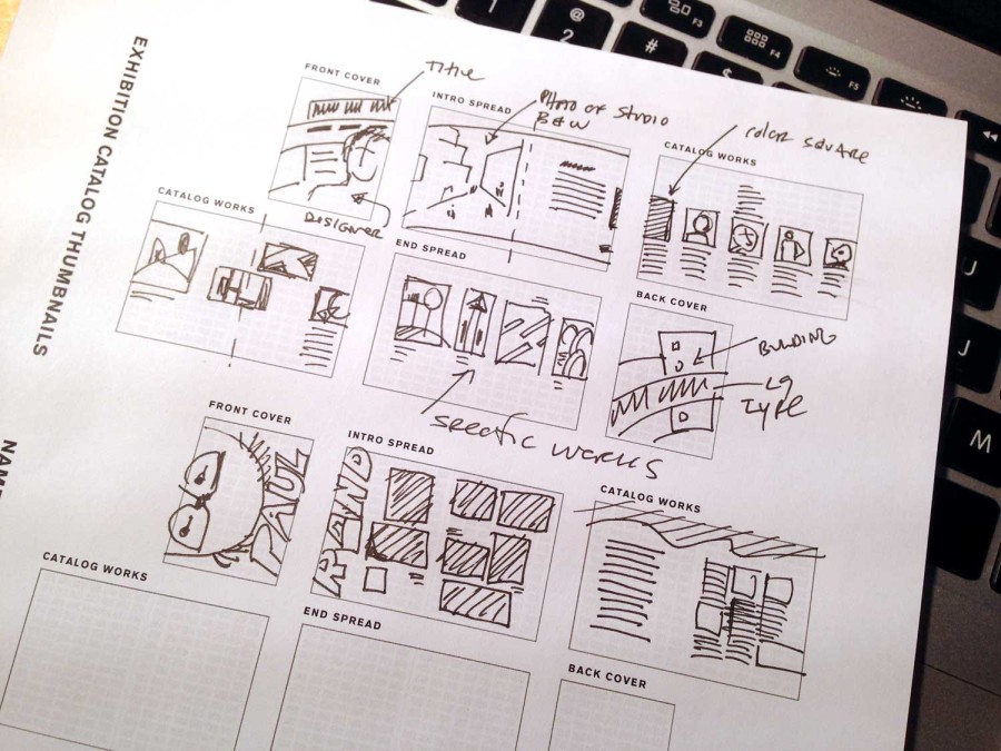
- One page (three sets) of thumbnail Sketches featuring 5 cover designs + interior pages. Use this template: EXHIBIT_CATALOG
- A revised gallery of works with 9-12 works that are thematically linked together in some way.
- Write a paragraph that explains the general relationships you see in the work. Do not overthink this. Find reasonable formal attributes, purpose, and context to link together.
Due Monday, November 23
- A Complete Printed Rough Design: 12 pages with basic cover, your introduction, other texts, speaker images and work images + captions.
- Read and Respond to Thinking with Type and Diggin’ It!?
Download and read the following PDF: Graphic Design History / Chapter 2.
Make note of the various visual styles and movements in this history. Which styles do you respond to? How is the world of graphic design today informed by yesterday? What similarities and differences can you identify in the way graphic design functions? What makes a work of graphic design great?
List of Designers from the twentieth century.
You have been assigned one of these designers to explore in an email. Research this designer and their work.
- Peter Behrens
- Lucien Bernhard
- McKnight Kauffer
- A.M. Cassandre
- Kazimir Malevich
- Laslo Moholy-Nagy
- Max Bill
- Alexander Rodchenko
- El Lissitzky
- Theo Van Doesburg
- Herbert Bayer
- Jan Tschichold
- Piet Zwart
- Herbert Matter
- Lester Beall
- Ladislav Sutnar
- Paul Rand
- Alvin Lustig
- Saul Bass
- Adrian Frutiger
- Bradbury Thompson
- Alexey Brodovitch
- Josef Muller-Brockman
- Armin Hoffman
- Wolfgang Weingart
- Milton Glaser
- Ivan Chermayeff
- Shigio Fukada
- Herb Lubalin
- Massimo Vignelli
- Neville Brody
- David Carson
How to make a gallery on the class site
Create a gallery of work by your designer.
Due Sunday, November 16
Part 1
Write a 200 word paragraph about your assigned graphic designer. Reference published material, but bring your personal insight and thoughts into your writing. Pay particular attention to the the designer’s approach or methodology, the context in which they worked. How did the work of this designer connect to the audience of the period?
Please mind the spelling and grammar. Don’t forget to include your primary research links.
Part 2
Highlight three distinctive and signature points that you learned about that person. These are details which gave you insight into the designer and their work as outlined in the first part above. Be succinct.
Part 3
Create a gallery of 5-9 important works by that designer. Identify the following in the caption:
- Name of Designer
- Name of work
- year
- other relevant details
Example gallery below:
Paula Scher, Name of Piece
-
- Paula Scher, Name of Piece
-

-
-
- Designer Name, name of piece
-

-

-

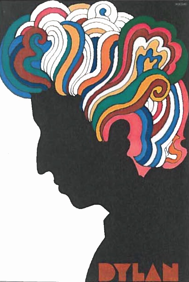
- Milton Glaser, Bob Dylan, 1969
-

-

-

- name, work, year
-

-

-
- Name, work, year
-

-


Leave a Reply Cancel reply
You must be logged in to post a comment.
B Image Book — Print Corrections
Correction to the printing specifications:
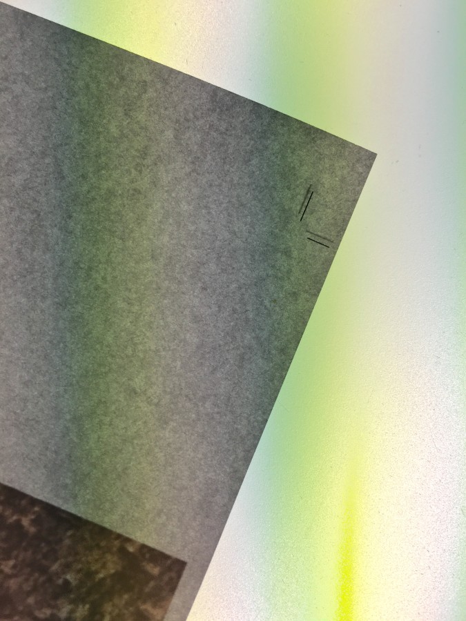
If the registration of the crop marks looks off you should make corrections. See below:
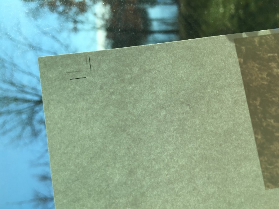
So I made the following correction: I changed the horizontal number from 11” to 10.875”
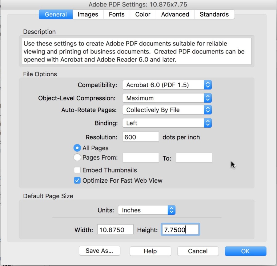
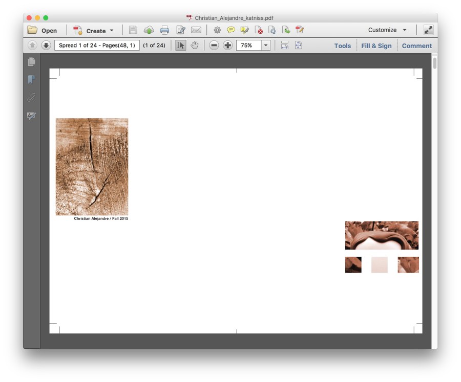
This resulted in the crops being such closer on the right. See PDF image below.
This made the registration better on the final prints. See image.
Leave a Reply Cancel reply
You must be logged in to post a comment.
Santa Fe, New Mexico
87501
Overcast
47°F / 8°C
| Humidity | 71% |
| Wind Speed | SE 5 mph |
| Barometer | 29.96 in (1008.9 mb) |
| Dewpoint | 38°F (3°C) |
| Visibility | 10.00 mi |
| Wind Chill | 45°F (7°C) |
| Last update | 4 Nov 7:53 am MST |
í Weather Report
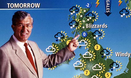 Create a series of compositions that explore the typographic hierarchy of information.
You will be randomly assigned a zip code to use for this project.
List of zip codes:
36101 99801 85001 72201 94203 80201 19901 32301 30301 96801 83701 62701 46201 50301 66601 40601 70801 21401 48901 55101 39201 65101 59601 68501 89701 87501 12201 27601 58501 43201 73101 97301 17101 29201 57501 37201 73301 84101 23218 98501 25301 53701 82001 06101 03301 08601 02108 02901 04330 05601
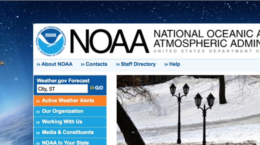
The National Oceanic and Atmospheric Administration (NOAA)
Go to the following NOAA web site http://www.noaa.gov and paste your zip code into the weather.gov forecast field.
Collect and assemble the following 11 information points (the first one is the description):
Sky Obscured
41°F 5°C
Humidity 81%
Wind Speed Calm
Barometer 30.28 in
Dewpoint 36°F (2°C)
Visibility 0.75 mi
Keene
New Hampshire
03435
Note: Do not include the celsius information.
Dimensions: 6″ x 6″
Use the following template for this project: heirarchy_6x6.indd
Univers
You will be using the typeface Univers for this project. Read about Univers and the designer Adrian Frutiger.
Instructions
You will make three types of type compositions for this project to express the information using an increasing broader set of typographic variables. Constraints enforce discipline and having more freedom may or may not increase the power and effectiveness of a design. For each of the three approaches below you are encouraged to experiment with making various elements more important in the typographic hierarchy.
For example, you may choose the emphasize the description in a few, the temperature in a few more, and maybe the place in the rest. Some information types may not lend themselves to being primary but experiment and decide for yourself. This project is about meaning as expressed in typography hierarchy so by all means make it meaningful.
The difference, that is not a difference, makes no difference.
— Gerald Cox
1
No Changes
Typeset the text in black 18 point Univers 55 Roman. Dynamically arrange the words using only direction and position, aligning with the grid. Include the concept of hierarchy and reading order in your decisions.
2
Scale Changes
For the second set of designs, use type scale. You may make the letters smaller or larger and bleed letters. All elements must still align to the grid. The type must still be 18 point Univers 55 Roman.
3
Scale and Style Changes
In the third set of designs, you may change the type weights. Univers has a complete set of weights including expanded, condensed, bold, black, light and italics for each. Be deliberate in your choices. Change one element at a time and take care to note the effects of your choices as you make them. Try using only two weights per design first (regular + bold, bold + light italic, etc) and going to a max of three.
Due Today
Create a post with the category “weather report” that has the information required above for your zip code.
Due Monday, November 9
6 Gravitars uploaded with the best one active on the class site.
5 No Changes: put all compositions in a separate single PDF. You may make more if you need to.
5 Scale Changes: put all compositions in a separate single PDF.
5 Scale and Style Changes: put all compositions in a separate single PDF.
PRINT
Print and trim 2 or each category (6 total) and have them ready to hand in.
Remember
Think about the read. What do you read first. How can you control the way someone experiences the text. Welcome to hierarchy and the manipulation of viewers attention.
Leave a Reply Cancel reply
You must be logged in to post a comment.
í Re-Gravitar
Make Icons for the Class Site
Using the visual material from the following projects create one gravitar icon for each of the following categories:
- Bitmap Tool Image
- Two Letters Combination
- An attractive combination of your initials (5 typefaces)
- B&W Translation #1
- B&W Translation #2
- Color Translation
Process
- Make one large icon image for each category in the supplied Illustrator template. last_first_gravitar.ai
- Export them as .JPG files.
- Upload them to Gravitar. https://en.gravatar.com
Test each one to make sure that it works at both the small and large size in the class site.
Due Monday, November 9
6 icon images posted to Gravitar with the best one selected for the class web site.
Leave a Reply Cancel reply
You must be logged in to post a comment.
-
-
Classroom
-
-
Recent Posts
Recent Comments
- Danielle Vizard on Thinking with Type — TEXT
- Danielle Vizard on Digging’ It!
- Jenna on Thinking with Type — TEXT
- Jenna on Digging’ It!
- Elizabeth Robinson on Digging’ It!
Archives
- November 2023
- August 2023
- May 2023
- April 2023
- March 2023
- February 2023
- January 2023
- December 2022
- November 2022
- October 2022
- September 2022
- August 2022
- July 2022
- June 2022
- May 2022
- February 2022
- December 2021
- November 2021
- October 2021
- September 2021
- August 2021
- June 2020
- February 2018
- December 2015
- November 2015
- October 2015
- September 2015
- August 2015
Categories
-
About
KSC GRAPHIC DESIGN

The reading went over a lot that we have already learned but also covered a lot of small details you do not consider when using type. The reading went down to the nitty gritty of type, which I found really interesting like how subscripts should look, how every detail matters, like parenthesis, even down to drop caps and elevated caps. I found the section about drop caps and elevated caps interesting because it reminded me of children’s books which brings back memories. I liked how it manipulates the text, even the font you use has a purpose. Fonts have a personality and its good to know how to use it to look professional and give the typography a sense of reason. I thought the part that discussed figures was different because I had never considered how numbers should be perceived. I like how the reading made you feel like everything was important also that every detail had a reason and how it showed wrong and right examples.
The reading contained a lot of information to take in. Even though it was a lot, it was very helpful and resourceful. The style guide shows the right and wrongs of type design. Three things that intrigued me the most in the reading is figures, ligatures, and small capitals. Figures is when it is right to use capital letters, lowercase letters, symbols, or when to spell out a word. It gives the text character and makes it correct. Ligature is when two letters are touching each other to make the letters flow and be smooth. That isn’t always the case. It can also make the letters look clumsy, give it a lack of space, and just plain awkward. Small capitals can give a word emphasis. It keeps a word tidy and clean. The reading was interesting and is going to help me in the long run with my future design and my final project.
This reading was rather interesting because not only did it talk about how to space type, like what we have been doing in class , but also how to correctly space special characters. It was pretty much a step by step instructions on how certain design is wrong while others are right. I find it rather interesting that there is so much more happening in a font than most people realize. Most people may believe that there is only one type of a certain font, but when in reality the font itself can be bold, italic, light, black, roman and so much more. The reading within talking about small caps was eye opening because they are not just scaled down of the original large caps. They are in fact different in weight, fit and proportion, which I did not know. The part about subscripts was intriguing because even though a rather small change was made to each word, the appearance was completely different. I truly do enjoy that by a little bit of kerning or line and space can make a world of difference and make it more pleasing to look at.
I found this reading to be really useful and interesting. I learned a lot and the reading also went over lots of important things that we discussed in class this year! This reading talked about every little thing you need to know and be aware of to be the best you can be at typography, which is very valuable and essential. Even the smallest imperfections are a big deal and always need to be looked over and fixed. For example, I never realized how important kerning was until I took this course and how much more effective your type can look when you do it the right way. One thing I found really noteworthy in the reading was Figures. This explains how to use your text the right way when using numbers, typing out dates, etc… Little important things like “If a sentence begins with a number it should be spelled out.” and “Times should be set without punctuation: 10:30 am, not 10:30 a.m.” I thought this was really intriguing because it is the little things like this that you need to know and are crucial when it comes to typography. Another thing that caught my attention is Ligature. Basically, a ligature is made from two or more letters, which appear connected. For example, the “f” and the “i” in the fi ligature are visually connected so that it looks better and flows nicer even though they are obviously two separate letters. Lastly, the third thing I found interesting is Small Caps. These are uppercase letters that are set at the same height and weight as lowercase letters. It is basically a way to emphasize a word instead of using italics or bold and can look really nice. I really enjoyed this reading and I know it will help me in the long run of my future graphic designing.
This reading offered a TON of insight on the stylization of type, which is extremely important to typography in general. It went pretty in depth into a lot of things that are new to me, and I liked that there were examples of which approaches were right and what approaches were wrong. I had never realized (until now) how wrong some of the things I myself had been doing. The section about how to use periods correctly and how to never use double spaces after punctuation was one that stood out to me a bit, because that is something that my teachers had always been a bit back and forth on in high school. I found the part on apostrophes to be interesting as well, especially within the difference between the set that extends straight down and the set that curves the apostrophe, which visually looks a lot better. This also proved to be the case in the section on fractions, where one example showed the fraction as a normal sized set of numbers and the other showed the fraction as a smaller set of numbers. The smaller set of numbers obviously looked better because it showed a contrast between the type (the number and the fraction). You want to have the ability to make whatever text you are working on look the greatest it can look.
The reading discussed a lot of information with regards to typography. I can use this reading for reference as I start my final project. The reading also explains the correct way of doing certain elements of type design. Three elements that caught my eye were “drop caps and elevated caps”, “ligature” and the “display”. Drop caps and elevated caps create a stead flow into the paragraph. Litigation creates flexibility within the text. Display focuses on the finely drawn lines. The reading also mentions what to look for in a post script environment within the display topic.
I like how this reading included a visual example for what is right and wrong for every category they discussed so readers could actually compare the two and notice how much better one looked and worked with the piece compared to the other. As a whole the reading offered a lot of tips and information on how to use different fonts and punctuation and basically everything you need to make a successful work of typography. This will definitely be useful going into the next project and especially for when I take typography next semester.
The reading did a great job explaining what to do and what not to do with text and they give great examples. The paragraph about the apostrophes was very informative explained to not use them to pluralize abbreviations or numerals and gave a good example to back up this statement. Another great example is given when they explain capitalizing letters by saying they may be used in headings or display but should not appear within text settings, small caps
are preferred. Lastly I also found the article about periods intriguing when they said to never use double spaces after the period or other punctuation, except when using mono-spaced fonts.
This reading was all about typography. I found a few parts of this very interesting especially the text under “figures”. I found the information to be useful in writing, when to write numbers out and when to not, what font and text to use when writing dates, times etc. Know how to hyphen properly is also really important to know and useful information. I never really understood the reason why there were small capitals but now i get that they can be used to emphasis and also running heads and chapter headings. Also, when you want to use small caps, you can use a larger capital letting in front. It shows that it’s the start of the sentence, but also helps keep the emphasis when it comes to the smaller caps. There’s also a lot about font families and how you can use the different formats of the font in one whole text and still have the piece look like one whole thing. The words stay harmonized. I found this reading really interesting because now looking back at all of my documents, i realize how wrong i have made them when it comes to small details. Now that i know that I’ve learned, i change these things.
After reading this piece I realized that there are a lot of things that I have been doing wrong. I learned that when you use dashes I should only use the em dash or the en dash and not a hyphen. The hyphen is only used to indicate that part of a word at the end of a line will be carried over to the next line. Fonts are grouped in packages. The four basic styles for the majority of typefaces are Display, Roman, Italic, and Alternate. Family likeness provides harmony and counterpoint exists between the different styles. The larger the family, the more options you have.
This style guide proved to be one of the best resources I’ve been exposed to regarding type. Like the other reading restraint and simplicity lend themselves to creating better type. Reducing the use of periods in cases of abbreviation and titles make text look cleaner. I found the use of small caps to be quite elegant and effective as well. Because they have the same x-height as the lowercase letters they offer an easy transition for the readers eyes. They are particularly visually satisfying when looking at the postal codes or when used in combination with small caps figures. The amount of work and content that is put into a font is also quite fascinating. The different weights, symbols, display, and ligatures each have their own design and spacing. I can only imagine the work it takes to create a complete typeface.
In the reading I found that there are a lot of little details with typeface that can make a huge difference if done right. I thought it was cool how the right and wrong sections in the reading really showed how they’re suppose to be used and what difference it makes visually. The ligature section was interesting to see how blending the type to make it flow and look smooth can affect the visual outcome. In the word spacing example about kerning, it’s crazy how easily you can read the correct kerned paragraph verses the paragraph that isn’t kerned. It’s the little things that go into a design make a huge difference and I will use what I learned in this reading in the future.
I feel as though this reading covered a lot that we have learned throughout the semester and in that respect I believe that this article is incredibly helpful. It covers things such as kerning, the use of periods and also discussed the importance of alignment . Kerning is a very basic skill that is often overlooked, often time the spacing of the letters can make or break a piece of design. Periods are also an interesting subject because the use of them, or lack thereof, can be the deciding factor in whether or not a group of type looks awkward. Finally, alignment comes into play when placing the type in an open space, we have learnt all semester that a designer should let type shape itself. Applying each of these techniques can allow anyone to become a better designer.
This reading definitely covered some things we have already learned this semester, but also added a lot of useful information. We had already learned about kerning, but I thought the use of periods was interesting. I did not know you were not supposed to put a period after things like Dr Mrs or Mr anymore. They look incomplete to me still looking at them now, although I understand with words such as “inc”. I really like the look of small capitals, where the letters and words look cleaner and more organized while really emphasizing on the word. Lastly, I thought that indenting was actually really interesting. I had always been taught to indent the first sentence of every paragraph. I had no idea to not indent sentences beginning a paragraph or under a heading or subheading.
This reading basically just talks about the dos and don’ts of everything typography. It gives clarity and direction on certain minute details that I surely did not pay much attention to prior to reading this. For example, I thought of parentheses and brackets as basically interchangeable. Either or would be used in whatever context it seemed to fit best, but apparently there are rules for using brackets and parentheses. I also find it weird that you’re not supposed to use a period after Ave, Co, Dr, Inc, Messrs, Mr, Mrs, No, St, 8vo, am, and pm. Putting a period at the end seems like it adds a sense of clarity to the reader where they know that that is an abbreviation rather than a word on its own. Also, the usefulness of small capitals is quite interesting. I really only thought of capitals as one size and only really fit well as titles. But in reading this, it made me realize that capitals, especially small ones, play a very distinct role in design and can and should be used in different ways to complement the entire design. Overall, this reading broke down the nitty gritty details about dealing with type and it is a lot to take in. There are so many details to pay attention to when designing.
This really was a wonderful and fascinating reading. It really gave me more appreciation for typography. I loved on the first page the reading says “Good typography is 90% attitude and 10% know how” then on to say it isn’t called “typeFACE” for nothing and to appreciate the effort you put into typography and groom it well. Typography is an art form and should be appreciated. It reminded me of how a designer for my father’s business’s website pretty much butchered it with grammatical errors and poor typeface choices. It’s super important as a designer to know your stuff in typography because you could seriously help or hurt a project for your client. I found it humorous when the reading said that when companies use all caps in their branding since the museum I’m using for my gallery catalog uses all caps for their logo. This reading pretty much informs you for many different instances in using type, it’s quite like a training manual. There were many points where there was review, but it actually gave me tips on things outside of graphic design. I actually learned about properly footnoting, I’m also a minor in Medieval and Early Modern studies and it will be helpful when I’m writing papers!
This text went more in depth to text. We learned some of the ideas presented, such as kerning, but explains how everything in text is important. The apostrophes are important. Each line means something and if you aren’t careful those lines could give the viewer or reader the wrong impression. I also found the drop caps interesting. This is an aspect of typography that I never use. I found it interesting that it can be used effectively in some designs. There are ways to do things that, although they work, they can be improved upon. There are always ways to approve a design.
This was a really informative read compared to previous text. Up until now i hadn’t known what ligatures and i wouldn’t have guessed that they are common styles in most good typefaces. It was insightful learning about exactly what typefaces are made of, which comes down to just style and proportions. I also thought it was interesting learning about small caps. I never knew small caps were even a thing and now i can confidently discern true small caps from fakes, given their distinct squashed look. There were plenty of other interesting details i picked up on such as proper dash use, correct figure forms, and careful superscript usage.
The reading shows great visuals of what is right and wrong in typography. The style guide gives a lot of important steps on how to use the letters/words correctly. Most of the reading I have learned before, but goes just in greater detail and explains why the subject is wrong which is pretty cool. However, I did learn how to drop caps and elevated caps properly thanks to the reading. Also, next to a period never double space unless using mono-spaced fonts. The Expert Font Guide explains many techniques of type styling and the correction of letter placement next to one another. Thus there are plenty of subjects that guide one through the type “culture” and there is always room for improvement.
Although this reading was long and exhausting at some points, it was very informative to me. I was blown away by how much information was in this article and it was a little difficult to find the specifics I wanted to talk about. What really caught my eye was the statement, “Good typography is 90% attitude and 10% know-how.” I thought this to be really interesting. typography is what you make it and how you show yourself through it. A lot of the other things explained in the article have already been discussed in class, but I like how the author goes more in depth and shows examples of what is right and wrong. The article also discusses small capitals and how this typography keeps the world looking sophisticated. Another thing I was glad it mentioned was to always get a second opinion and second look at your work. I have always found this to be an extremely important thing to do.
While reading this article, I thought it was really interesting to see all of the different parts of typography that we don’t even realize is typography sometimes. There was a lot of information within this reading, but there were certain parts that were really interesting to me. For example, the ligatures. I know that I asked you about them in class because I was really confused on why the font you gave us looked so different, but looking at them again they look really awesome. Even though they look pretty sweet, I would be afraid of using them in the wrong place and having them look dumb, so I don’t know how often I would actually use them. I also think that the periods and figures section were also pretty interesting to read.
This reading had a lot of new information in it, but also a lot of stuff that I have learned from class. I enjoyed reading tis piece because it became very information on what not to do. One of the things that I learned and found interesting was figures, which talked about how to pick your typeface correctly when doing certain things such as typing a date out. Another thing that stood out to me was the section about apostrphes and how to only use them for certain things, and how you do not use them for pluralizing an abbreviation , and to not use them for things like quotation marks. another thing that I found interesting was the ligatures, this is something that I have noticed before in some type, but I had no idea what it really was, ligatures create a nice visual flow while reading