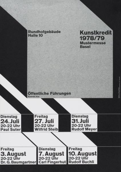
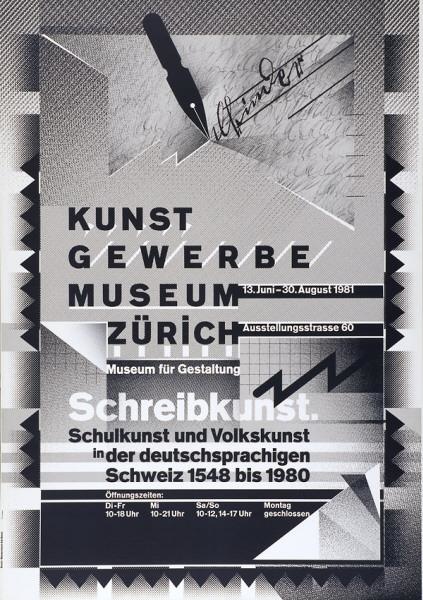
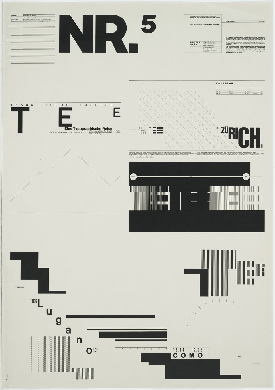
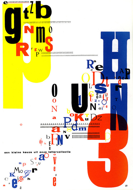
 Create a series of compositions that explore the typographic hierarchy of information.
You will be randomly assigned a zip code to use for this project.
List of zip codes:
36101 99801 85001 72201 94203 80201 19901 32301 30301 96801 83701 62701 46201 50301 66601 40601 70801 21401 48901 55101 39201 65101 59601 68501 89701 87501 12201 27601 58501 43201 73101 97301 17101 29201 57501 37201 73301 84101 23218 98501 25301 53701 82001 06101 03301 08601 02108 02901 04330 05601
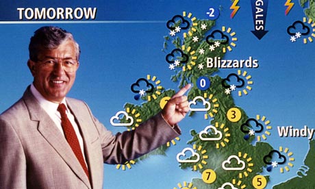
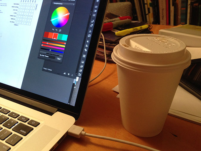
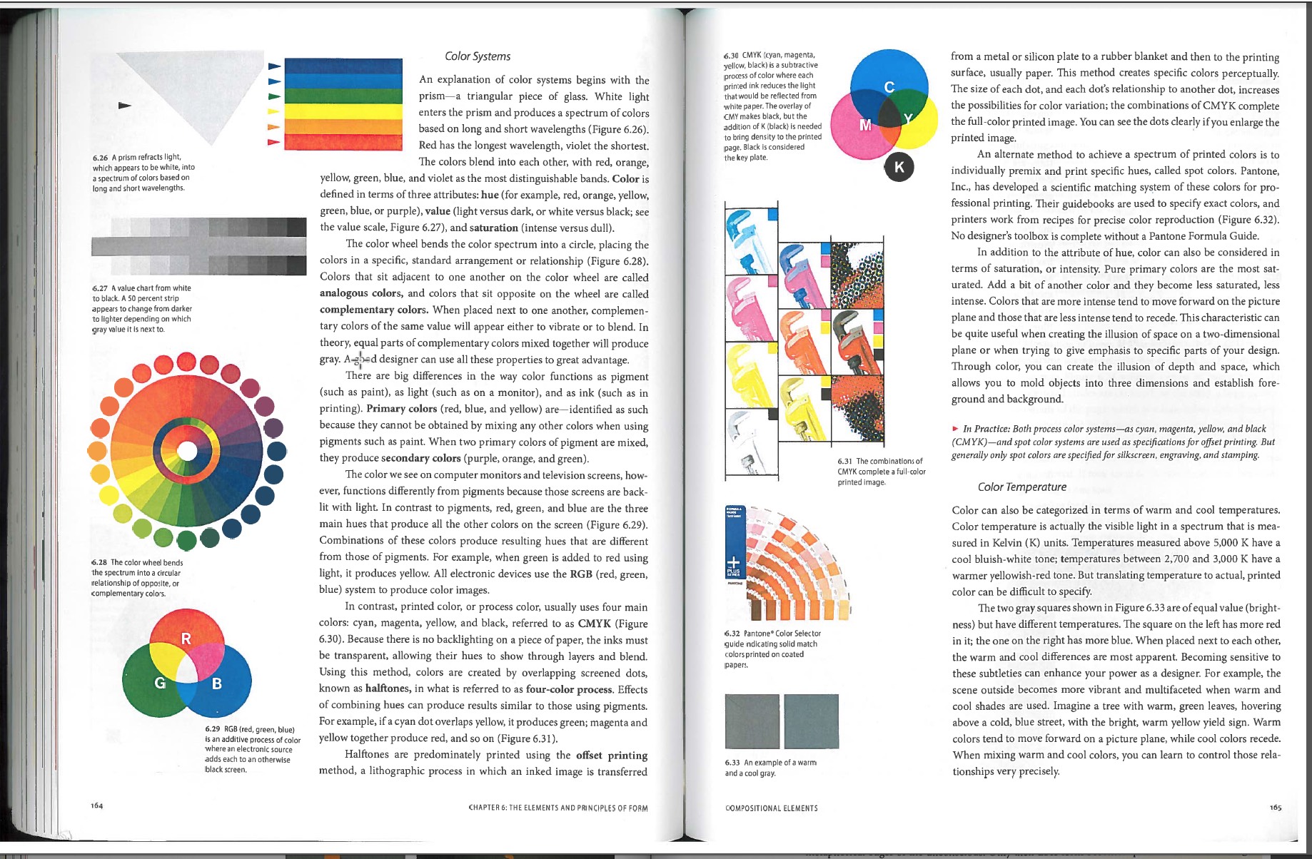
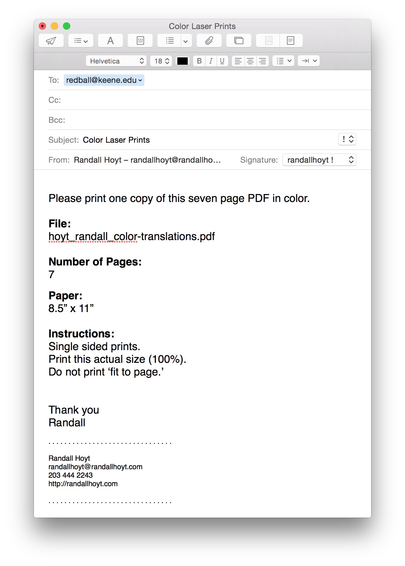
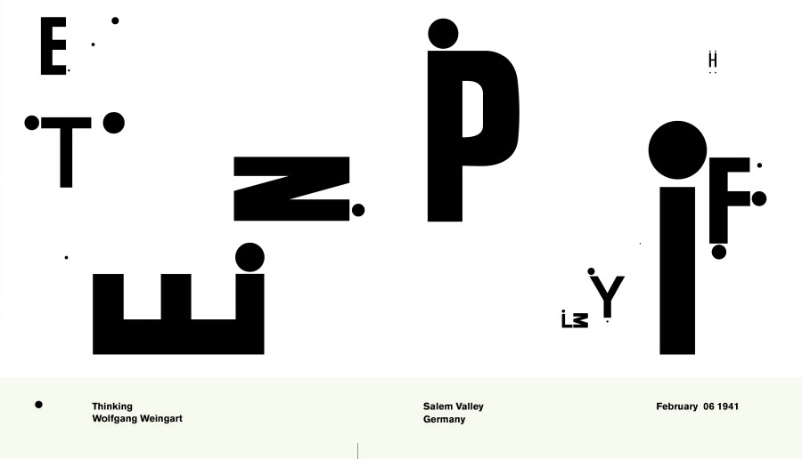
The National Oceanic and Atmospheric Administration (NOAA)
Go to the following NOAA web site http://www.noaa.gov and paste your zip code into the weather.gov forecast field.
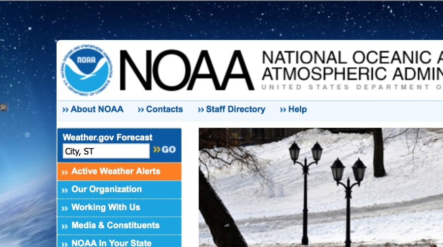
Collect and assemble the following 11 information points (the first one is the description):
Sky Obscured
41°F 5°C
Humidity 81%
Wind Speed Calm
Barometer 30.28 in
Dewpoint 36°F (2°C)
Visibility 0.75 mi
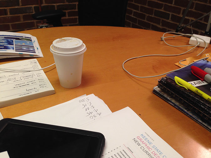
Keene
New Hampshire
03435
Note: Do not include the celsius information.
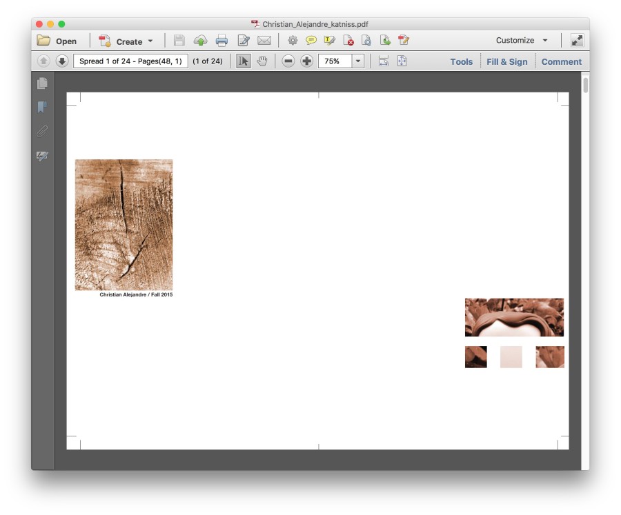
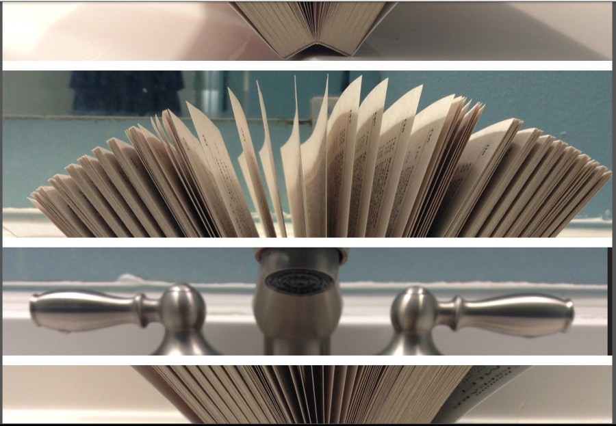
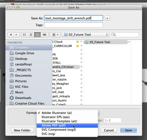
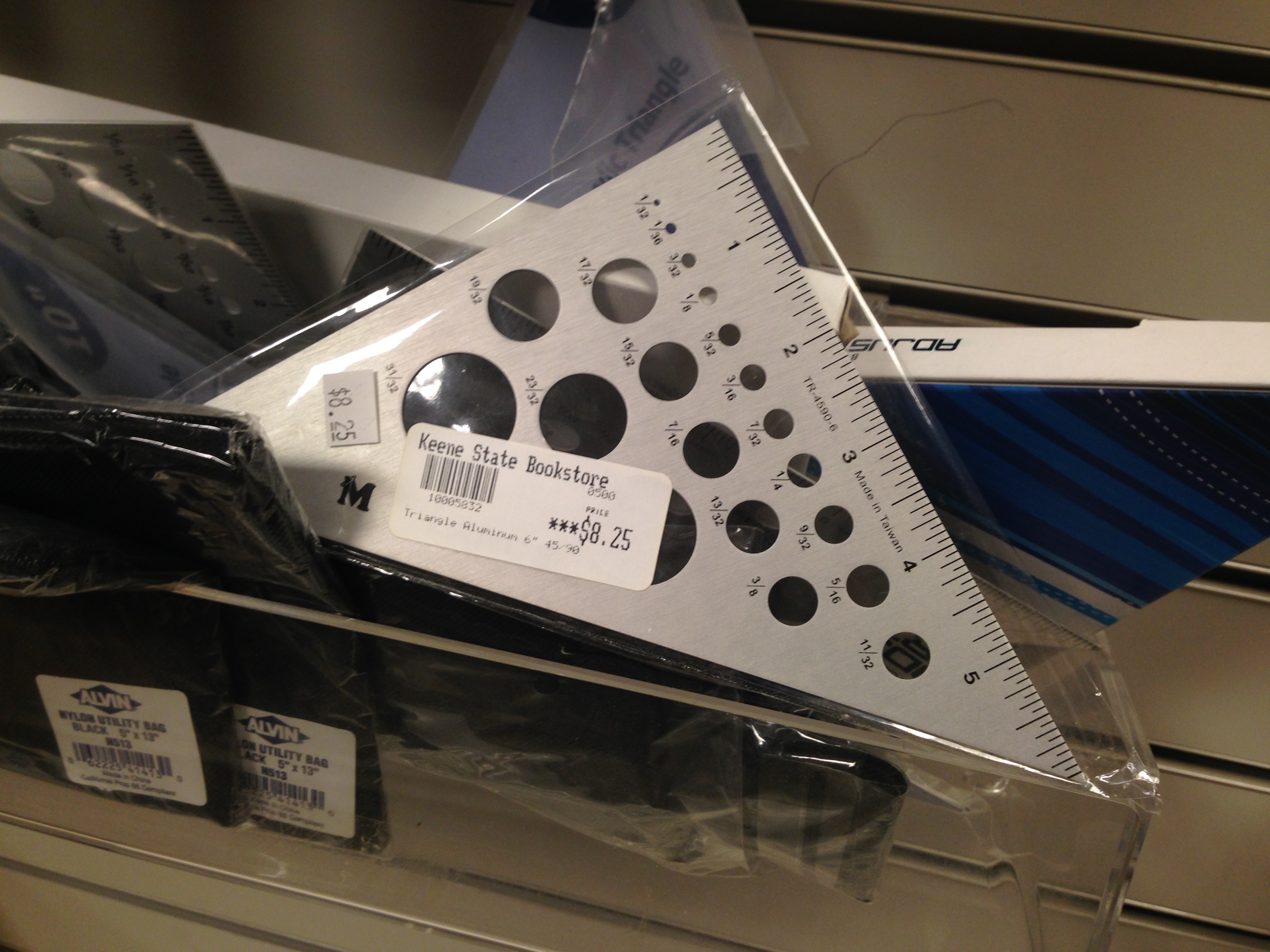
Dimensions: 6″ x 6″
Use the following template for this project: heirarchy_6x6.indd
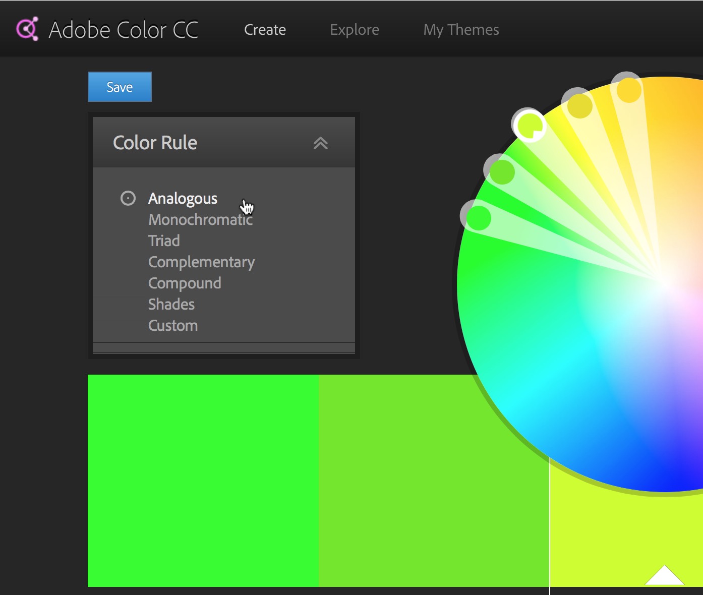
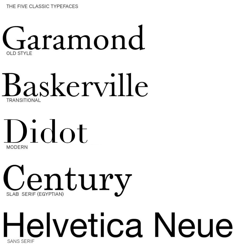
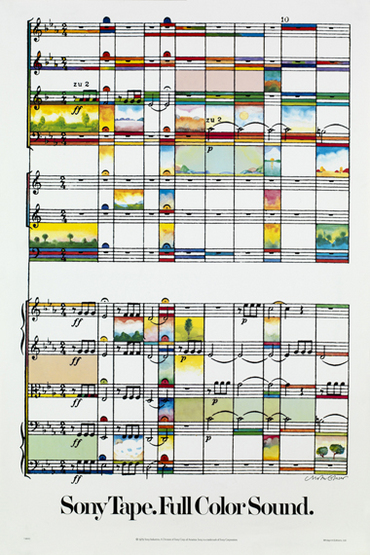
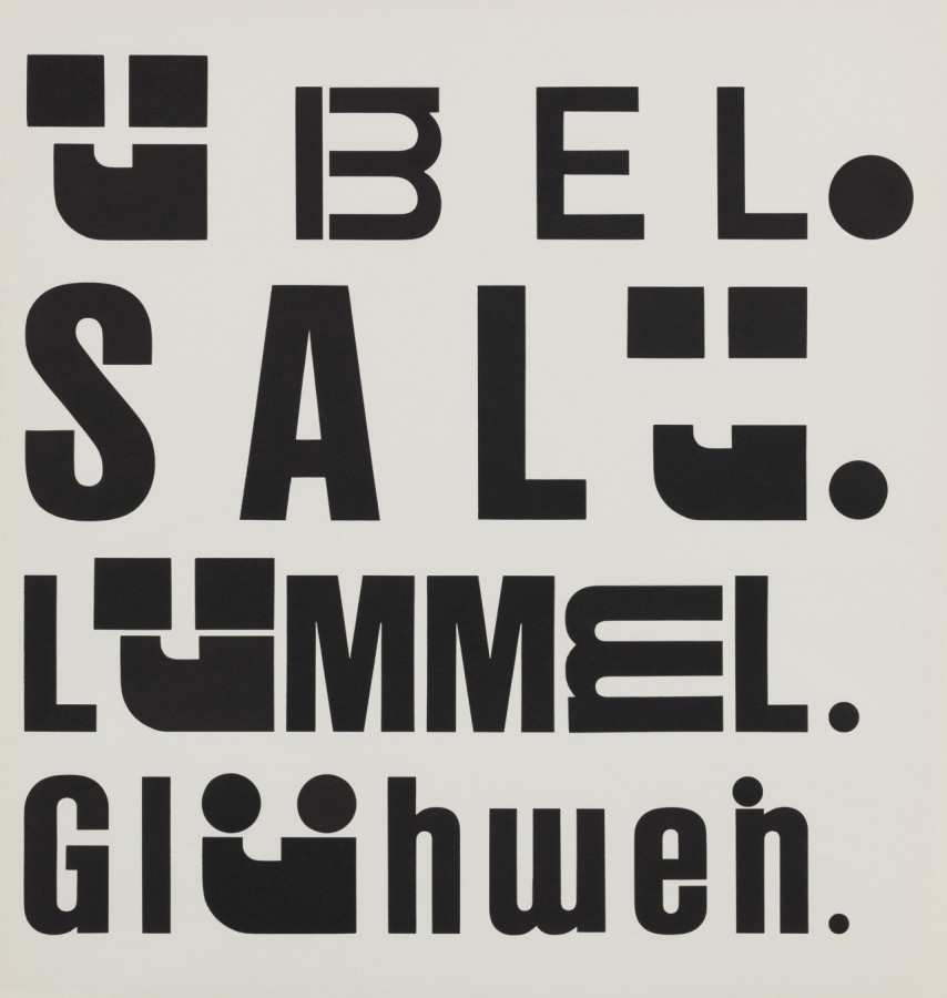
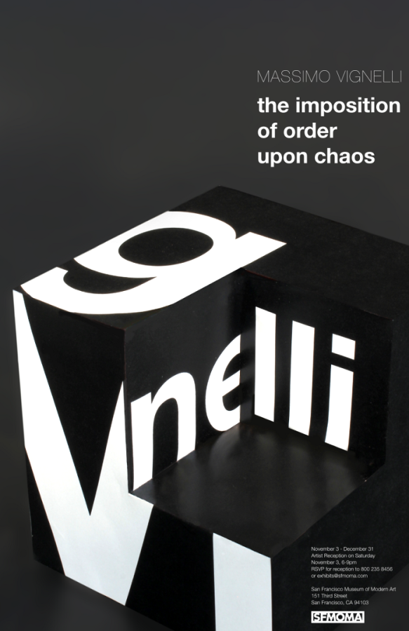
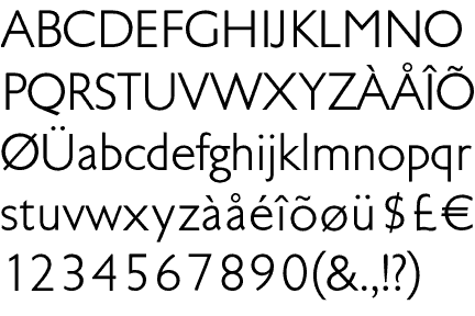
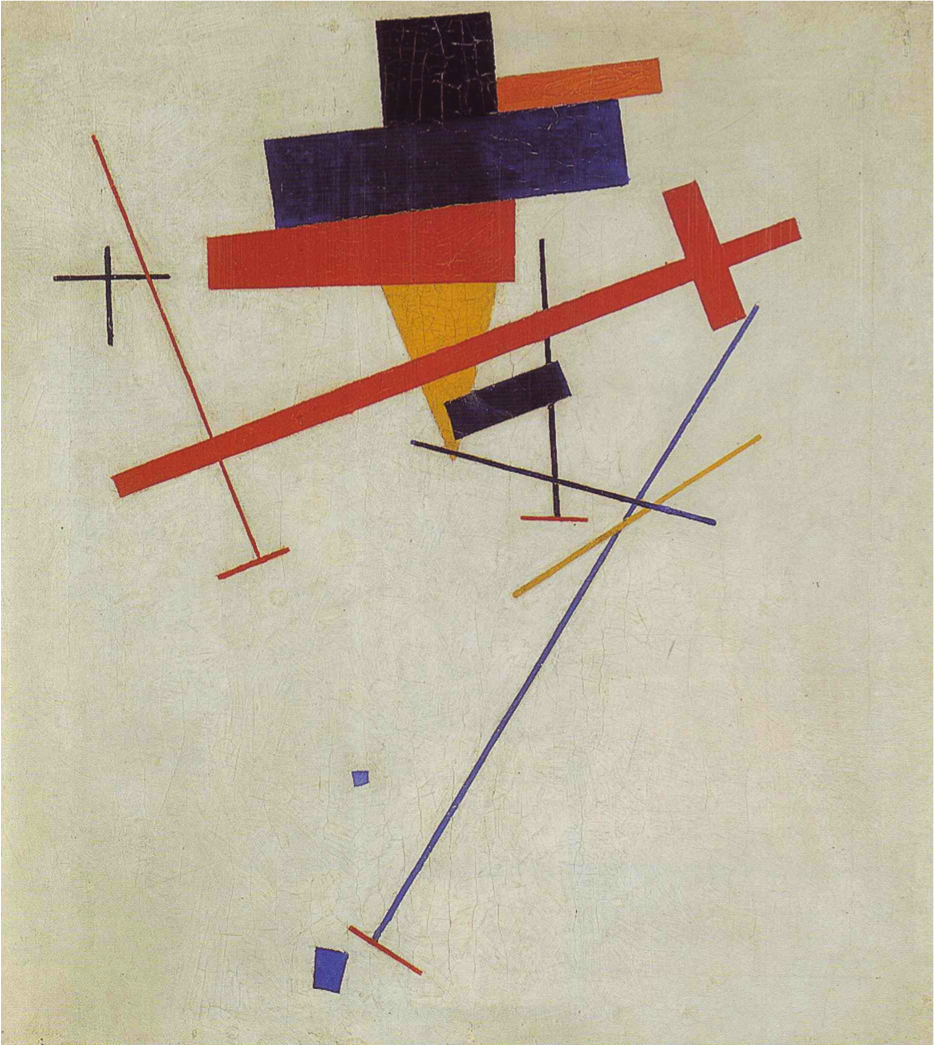
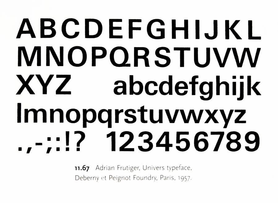
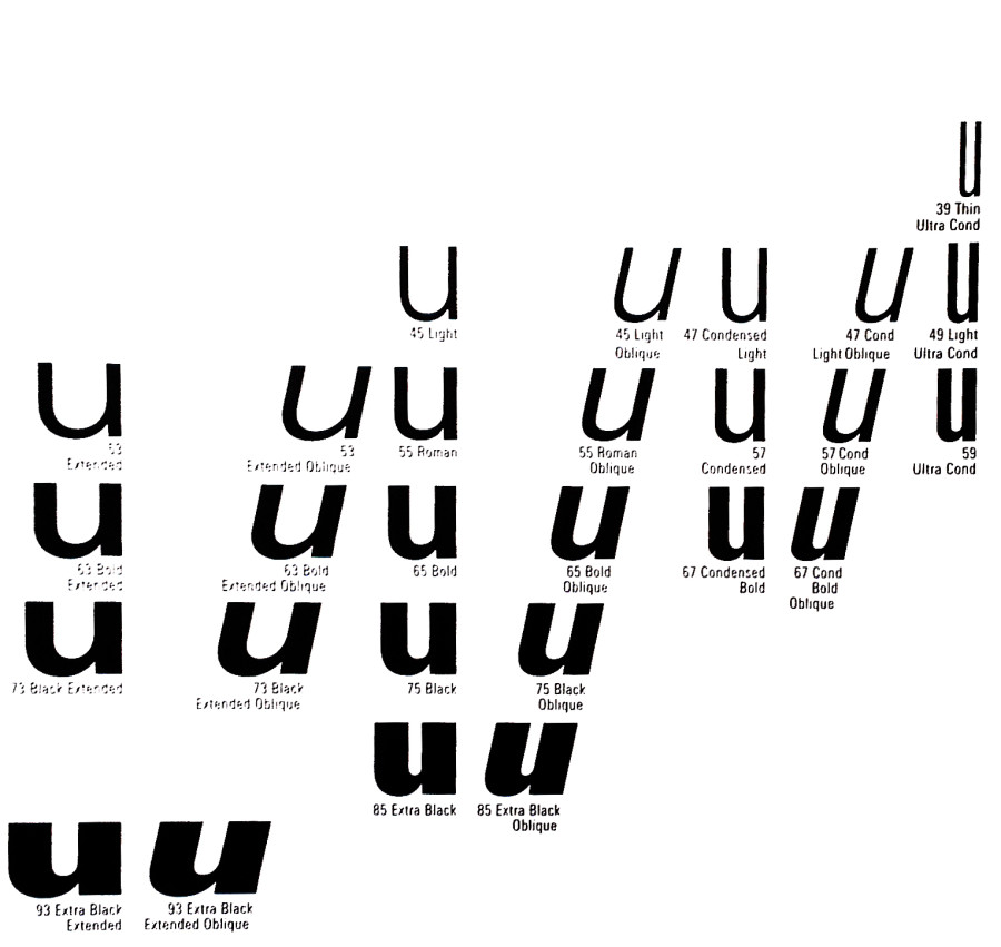
Univers
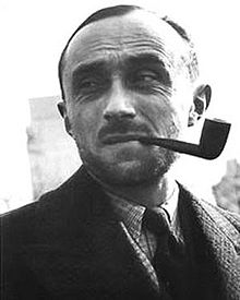
You will be using the typeface Univers for this project. Read about Univers and the designer Adrian Frutiger.
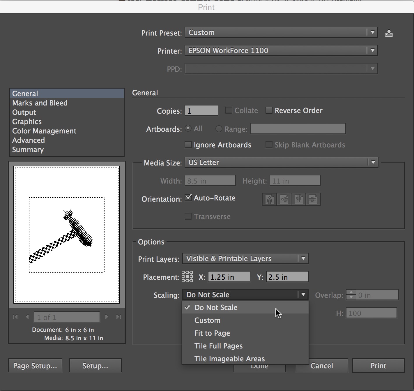
Instructions
You will make three types of type compositions for this project to express the information using an increasing broader set of typographic variables. Constraints enforce discipline and having more freedom may or may not increase the power and effectiveness of a design. For each of the three approaches below you are encouraged to experiment with making various elements more important in the typographic hierarchy.
For example, you may choose the emphasize the description in a few, the temperature in a few more, and maybe the place in the rest. Some information types may not lend themselves to being primary but experiment and decide for yourself. This project is about meaning as expressed in typography hierarchy so by all means make it meaningful.
The difference, that is not a difference, makes no difference.
— Gerald Cox
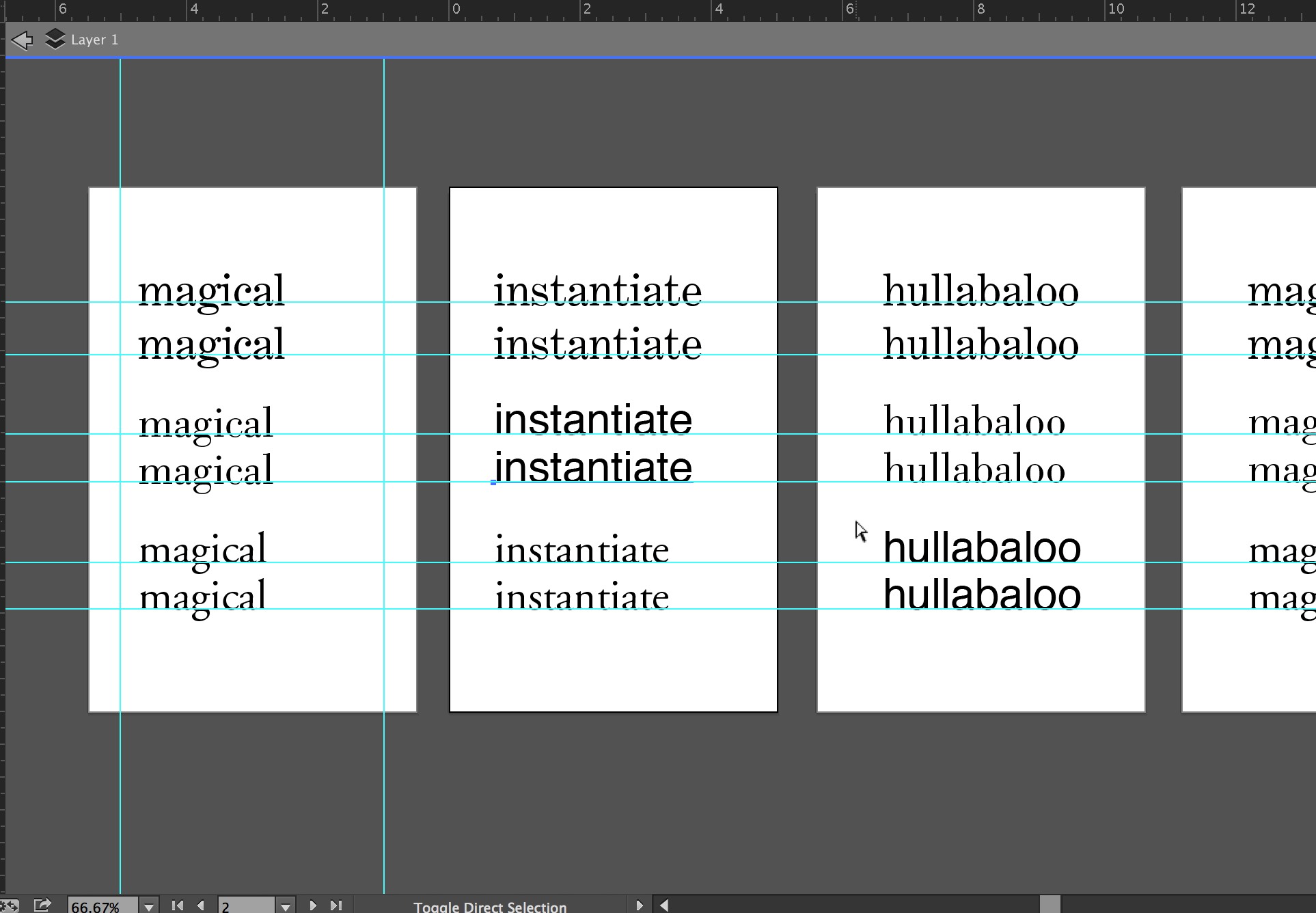
1
No Changes
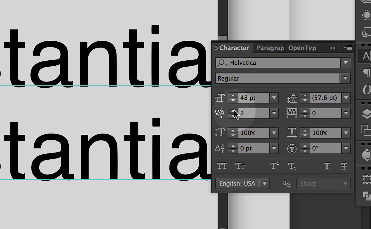
Typeset the text in black 18 point Univers 55 Roman. Dynamically arrange the words using only direction and position, aligning with the grid. Include the concept of hierarchy and reading order in your decisions.
2
Scale Changes
For the second set of designs, use type scale. You may make the letters smaller or larger and bleed letters. All elements must still align to the grid. The type must still be 18 point Univers 55 Roman.
3
Scale and Style Changes
In the third set of designs, you may change the type weights. Univers has a complete set of weights including expanded, condensed, bold, black, light and italics for each. Be deliberate in your choices. Change one element at a time and take care to note the effects of your choices as you make them. Try using only two weights per design first (regular + bold, bold + light italic, etc) and going to a max of three.
Due Today
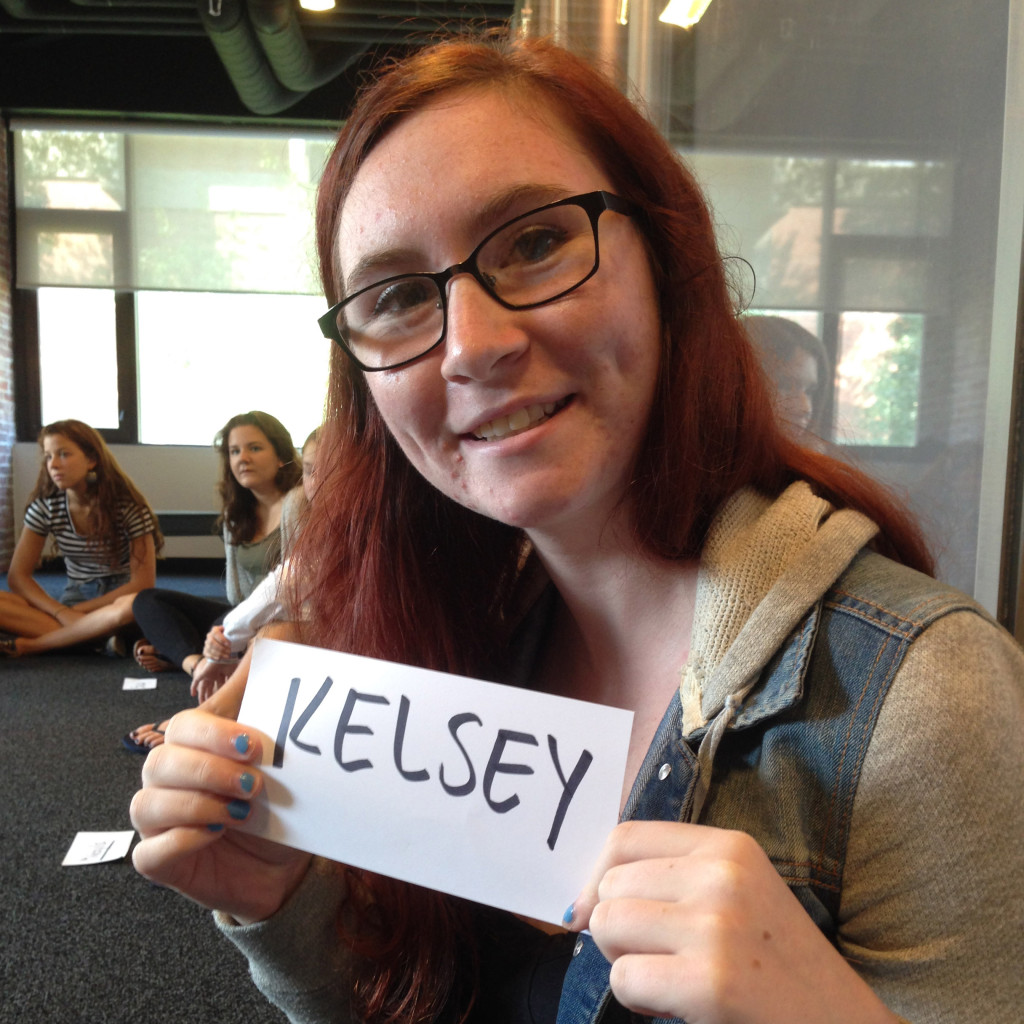
Create a post with the category “weather report” that has the information required above for your zip code.
Due Monday, November 9
6 Gravitars uploaded with the best one active on the class site.
5 No Changes: put all compositions in a separate single PDF. You may make more if you need to.
5 Scale Changes: put all compositions in a separate single PDF.
5 Scale and Style Changes: put all compositions in a separate single PDF.
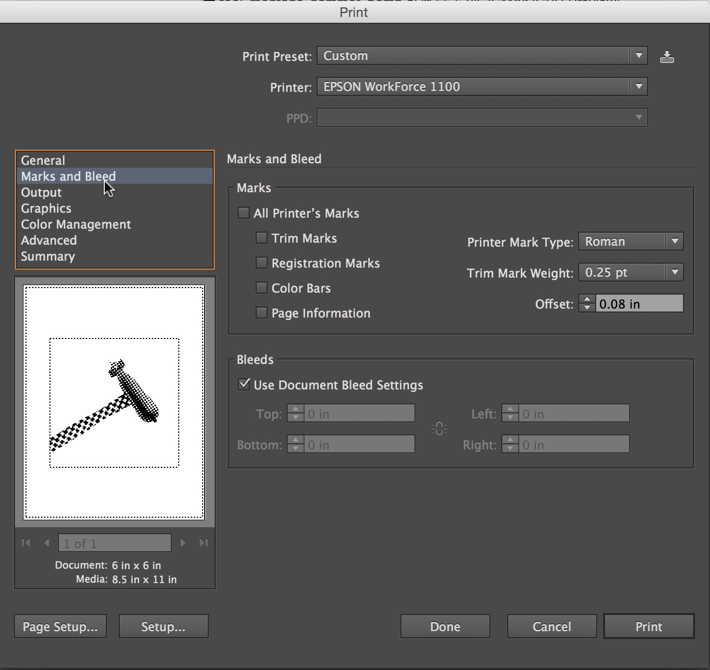
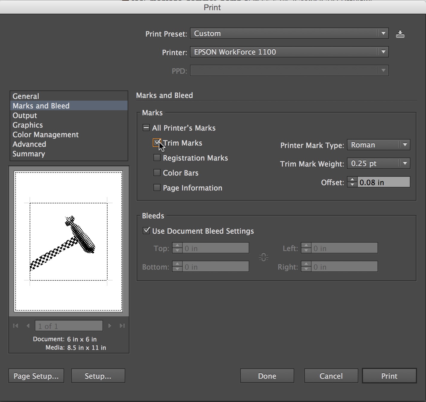
PRINT
Print and trim 2 or each category (6 total) and have them ready to hand in.
Remember
Think about the read. What do you read first. How can you control the way someone experiences the text. Welcome to hierarchy and the manipulation of viewers attention.
f Randall


The reading went over a lot that we have already learned but also covered a lot of small details you do not consider when using type. The reading went down to the nitty gritty of type, which I found really interesting like how subscripts should look, how every detail matters, like parenthesis, even down to drop caps and elevated caps. I found the section about drop caps and elevated caps interesting because it reminded me of children’s books which brings back memories. I liked how it manipulates the text, even the font you use has a purpose. Fonts have a personality and its good to know how to use it to look professional and give the typography a sense of reason. I thought the part that discussed figures was different because I had never considered how numbers should be perceived. I like how the reading made you feel like everything was important also that every detail had a reason and how it showed wrong and right examples.
The reading contained a lot of information to take in. Even though it was a lot, it was very helpful and resourceful. The style guide shows the right and wrongs of type design. Three things that intrigued me the most in the reading is figures, ligatures, and small capitals. Figures is when it is right to use capital letters, lowercase letters, symbols, or when to spell out a word. It gives the text character and makes it correct. Ligature is when two letters are touching each other to make the letters flow and be smooth. That isn’t always the case. It can also make the letters look clumsy, give it a lack of space, and just plain awkward. Small capitals can give a word emphasis. It keeps a word tidy and clean. The reading was interesting and is going to help me in the long run with my future design and my final project.
This reading was rather interesting because not only did it talk about how to space type, like what we have been doing in class , but also how to correctly space special characters. It was pretty much a step by step instructions on how certain design is wrong while others are right. I find it rather interesting that there is so much more happening in a font than most people realize. Most people may believe that there is only one type of a certain font, but when in reality the font itself can be bold, italic, light, black, roman and so much more. The reading within talking about small caps was eye opening because they are not just scaled down of the original large caps. They are in fact different in weight, fit and proportion, which I did not know. The part about subscripts was intriguing because even though a rather small change was made to each word, the appearance was completely different. I truly do enjoy that by a little bit of kerning or line and space can make a world of difference and make it more pleasing to look at.
I found this reading to be really useful and interesting. I learned a lot and the reading also went over lots of important things that we discussed in class this year! This reading talked about every little thing you need to know and be aware of to be the best you can be at typography, which is very valuable and essential. Even the smallest imperfections are a big deal and always need to be looked over and fixed. For example, I never realized how important kerning was until I took this course and how much more effective your type can look when you do it the right way. One thing I found really noteworthy in the reading was Figures. This explains how to use your text the right way when using numbers, typing out dates, etc… Little important things like “If a sentence begins with a number it should be spelled out.” and “Times should be set without punctuation: 10:30 am, not 10:30 a.m.” I thought this was really intriguing because it is the little things like this that you need to know and are crucial when it comes to typography. Another thing that caught my attention is Ligature. Basically, a ligature is made from two or more letters, which appear connected. For example, the “f” and the “i” in the fi ligature are visually connected so that it looks better and flows nicer even though they are obviously two separate letters. Lastly, the third thing I found interesting is Small Caps. These are uppercase letters that are set at the same height and weight as lowercase letters. It is basically a way to emphasize a word instead of using italics or bold and can look really nice. I really enjoyed this reading and I know it will help me in the long run of my future graphic designing.
This reading offered a TON of insight on the stylization of type, which is extremely important to typography in general. It went pretty in depth into a lot of things that are new to me, and I liked that there were examples of which approaches were right and what approaches were wrong. I had never realized (until now) how wrong some of the things I myself had been doing. The section about how to use periods correctly and how to never use double spaces after punctuation was one that stood out to me a bit, because that is something that my teachers had always been a bit back and forth on in high school. I found the part on apostrophes to be interesting as well, especially within the difference between the set that extends straight down and the set that curves the apostrophe, which visually looks a lot better. This also proved to be the case in the section on fractions, where one example showed the fraction as a normal sized set of numbers and the other showed the fraction as a smaller set of numbers. The smaller set of numbers obviously looked better because it showed a contrast between the type (the number and the fraction). You want to have the ability to make whatever text you are working on look the greatest it can look.
The reading discussed a lot of information with regards to typography. I can use this reading for reference as I start my final project. The reading also explains the correct way of doing certain elements of type design. Three elements that caught my eye were “drop caps and elevated caps”, “ligature” and the “display”. Drop caps and elevated caps create a stead flow into the paragraph. Litigation creates flexibility within the text. Display focuses on the finely drawn lines. The reading also mentions what to look for in a post script environment within the display topic.
I like how this reading included a visual example for what is right and wrong for every category they discussed so readers could actually compare the two and notice how much better one looked and worked with the piece compared to the other. As a whole the reading offered a lot of tips and information on how to use different fonts and punctuation and basically everything you need to make a successful work of typography. This will definitely be useful going into the next project and especially for when I take typography next semester.
The reading did a great job explaining what to do and what not to do with text and they give great examples. The paragraph about the apostrophes was very informative explained to not use them to pluralize abbreviations or numerals and gave a good example to back up this statement. Another great example is given when they explain capitalizing letters by saying they may be used in headings or display but should not appear within text settings, small caps
are preferred. Lastly I also found the article about periods intriguing when they said to never use double spaces after the period or other punctuation, except when using mono-spaced fonts.
This reading was all about typography. I found a few parts of this very interesting especially the text under “figures”. I found the information to be useful in writing, when to write numbers out and when to not, what font and text to use when writing dates, times etc. Know how to hyphen properly is also really important to know and useful information. I never really understood the reason why there were small capitals but now i get that they can be used to emphasis and also running heads and chapter headings. Also, when you want to use small caps, you can use a larger capital letting in front. It shows that it’s the start of the sentence, but also helps keep the emphasis when it comes to the smaller caps. There’s also a lot about font families and how you can use the different formats of the font in one whole text and still have the piece look like one whole thing. The words stay harmonized. I found this reading really interesting because now looking back at all of my documents, i realize how wrong i have made them when it comes to small details. Now that i know that I’ve learned, i change these things.
After reading this piece I realized that there are a lot of things that I have been doing wrong. I learned that when you use dashes I should only use the em dash or the en dash and not a hyphen. The hyphen is only used to indicate that part of a word at the end of a line will be carried over to the next line. Fonts are grouped in packages. The four basic styles for the majority of typefaces are Display, Roman, Italic, and Alternate. Family likeness provides harmony and counterpoint exists between the different styles. The larger the family, the more options you have.
This style guide proved to be one of the best resources I’ve been exposed to regarding type. Like the other reading restraint and simplicity lend themselves to creating better type. Reducing the use of periods in cases of abbreviation and titles make text look cleaner. I found the use of small caps to be quite elegant and effective as well. Because they have the same x-height as the lowercase letters they offer an easy transition for the readers eyes. They are particularly visually satisfying when looking at the postal codes or when used in combination with small caps figures. The amount of work and content that is put into a font is also quite fascinating. The different weights, symbols, display, and ligatures each have their own design and spacing. I can only imagine the work it takes to create a complete typeface.
In the reading I found that there are a lot of little details with typeface that can make a huge difference if done right. I thought it was cool how the right and wrong sections in the reading really showed how they’re suppose to be used and what difference it makes visually. The ligature section was interesting to see how blending the type to make it flow and look smooth can affect the visual outcome. In the word spacing example about kerning, it’s crazy how easily you can read the correct kerned paragraph verses the paragraph that isn’t kerned. It’s the little things that go into a design make a huge difference and I will use what I learned in this reading in the future.
I feel as though this reading covered a lot that we have learned throughout the semester and in that respect I believe that this article is incredibly helpful. It covers things such as kerning, the use of periods and also discussed the importance of alignment . Kerning is a very basic skill that is often overlooked, often time the spacing of the letters can make or break a piece of design. Periods are also an interesting subject because the use of them, or lack thereof, can be the deciding factor in whether or not a group of type looks awkward. Finally, alignment comes into play when placing the type in an open space, we have learnt all semester that a designer should let type shape itself. Applying each of these techniques can allow anyone to become a better designer.
This reading definitely covered some things we have already learned this semester, but also added a lot of useful information. We had already learned about kerning, but I thought the use of periods was interesting. I did not know you were not supposed to put a period after things like Dr Mrs or Mr anymore. They look incomplete to me still looking at them now, although I understand with words such as “inc”. I really like the look of small capitals, where the letters and words look cleaner and more organized while really emphasizing on the word. Lastly, I thought that indenting was actually really interesting. I had always been taught to indent the first sentence of every paragraph. I had no idea to not indent sentences beginning a paragraph or under a heading or subheading.
This reading basically just talks about the dos and don’ts of everything typography. It gives clarity and direction on certain minute details that I surely did not pay much attention to prior to reading this. For example, I thought of parentheses and brackets as basically interchangeable. Either or would be used in whatever context it seemed to fit best, but apparently there are rules for using brackets and parentheses. I also find it weird that you’re not supposed to use a period after Ave, Co, Dr, Inc, Messrs, Mr, Mrs, No, St, 8vo, am, and pm. Putting a period at the end seems like it adds a sense of clarity to the reader where they know that that is an abbreviation rather than a word on its own. Also, the usefulness of small capitals is quite interesting. I really only thought of capitals as one size and only really fit well as titles. But in reading this, it made me realize that capitals, especially small ones, play a very distinct role in design and can and should be used in different ways to complement the entire design. Overall, this reading broke down the nitty gritty details about dealing with type and it is a lot to take in. There are so many details to pay attention to when designing.
This really was a wonderful and fascinating reading. It really gave me more appreciation for typography. I loved on the first page the reading says “Good typography is 90% attitude and 10% know how” then on to say it isn’t called “typeFACE” for nothing and to appreciate the effort you put into typography and groom it well. Typography is an art form and should be appreciated. It reminded me of how a designer for my father’s business’s website pretty much butchered it with grammatical errors and poor typeface choices. It’s super important as a designer to know your stuff in typography because you could seriously help or hurt a project for your client. I found it humorous when the reading said that when companies use all caps in their branding since the museum I’m using for my gallery catalog uses all caps for their logo. This reading pretty much informs you for many different instances in using type, it’s quite like a training manual. There were many points where there was review, but it actually gave me tips on things outside of graphic design. I actually learned about properly footnoting, I’m also a minor in Medieval and Early Modern studies and it will be helpful when I’m writing papers!
This text went more in depth to text. We learned some of the ideas presented, such as kerning, but explains how everything in text is important. The apostrophes are important. Each line means something and if you aren’t careful those lines could give the viewer or reader the wrong impression. I also found the drop caps interesting. This is an aspect of typography that I never use. I found it interesting that it can be used effectively in some designs. There are ways to do things that, although they work, they can be improved upon. There are always ways to approve a design.
This was a really informative read compared to previous text. Up until now i hadn’t known what ligatures and i wouldn’t have guessed that they are common styles in most good typefaces. It was insightful learning about exactly what typefaces are made of, which comes down to just style and proportions. I also thought it was interesting learning about small caps. I never knew small caps were even a thing and now i can confidently discern true small caps from fakes, given their distinct squashed look. There were plenty of other interesting details i picked up on such as proper dash use, correct figure forms, and careful superscript usage.
The reading shows great visuals of what is right and wrong in typography. The style guide gives a lot of important steps on how to use the letters/words correctly. Most of the reading I have learned before, but goes just in greater detail and explains why the subject is wrong which is pretty cool. However, I did learn how to drop caps and elevated caps properly thanks to the reading. Also, next to a period never double space unless using mono-spaced fonts. The Expert Font Guide explains many techniques of type styling and the correction of letter placement next to one another. Thus there are plenty of subjects that guide one through the type “culture” and there is always room for improvement.
Although this reading was long and exhausting at some points, it was very informative to me. I was blown away by how much information was in this article and it was a little difficult to find the specifics I wanted to talk about. What really caught my eye was the statement, “Good typography is 90% attitude and 10% know-how.” I thought this to be really interesting. typography is what you make it and how you show yourself through it. A lot of the other things explained in the article have already been discussed in class, but I like how the author goes more in depth and shows examples of what is right and wrong. The article also discusses small capitals and how this typography keeps the world looking sophisticated. Another thing I was glad it mentioned was to always get a second opinion and second look at your work. I have always found this to be an extremely important thing to do.
While reading this article, I thought it was really interesting to see all of the different parts of typography that we don’t even realize is typography sometimes. There was a lot of information within this reading, but there were certain parts that were really interesting to me. For example, the ligatures. I know that I asked you about them in class because I was really confused on why the font you gave us looked so different, but looking at them again they look really awesome. Even though they look pretty sweet, I would be afraid of using them in the wrong place and having them look dumb, so I don’t know how often I would actually use them. I also think that the periods and figures section were also pretty interesting to read.
This reading had a lot of new information in it, but also a lot of stuff that I have learned from class. I enjoyed reading tis piece because it became very information on what not to do. One of the things that I learned and found interesting was figures, which talked about how to pick your typeface correctly when doing certain things such as typing a date out. Another thing that stood out to me was the section about apostrphes and how to only use them for certain things, and how you do not use them for pluralizing an abbreviation , and to not use them for things like quotation marks. another thing that I found interesting was the ligatures, this is something that I have noticed before in some type, but I had no idea what it really was, ligatures create a nice visual flow while reading