 Create a series of compositions that explore the typographic hierarchy of information.
You will be randomly assigned a zip code to use for this project.
List of zip codes:
36101 99801 85001 72201 94203 80201 19901 32301 30301 96801 83701 62701 46201 50301 66601 40601 70801 21401 48901 55101 39201 65101 59601 68501 89701 87501 12201 27601 58501 43201 73101 97301 17101 29201 57501 37201 73301 84101 23218 98501 25301 53701 82001 06101 03301 08601 02108 02901 04330 05601
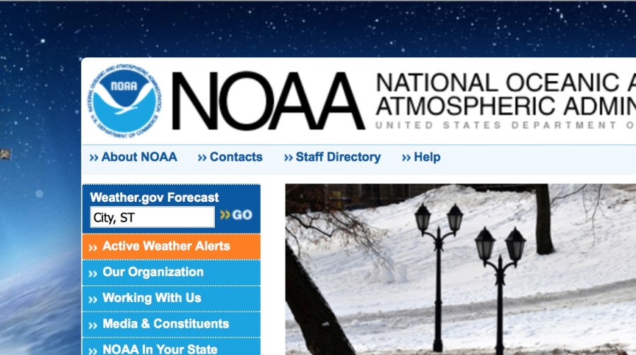
The National Oceanic and Atmospheric Administration (NOAA)
Go to the following NOAA web site http://www.noaa.gov and paste your zip code into the weather.gov forecast field.
Collect and assemble the following 11 information points (the first one is the description):
Sky Obscured
41°F 5°C
Humidity 81%
Wind Speed Calm
Barometer 30.28 in
Dewpoint 36°F (2°C)
Visibility 0.75 mi
Keene
New Hampshire
03435
Note: Do not include the celsius information.
Dimensions: 6″ x 6″
Use the following template for this project: heirarchy_6x6.indd
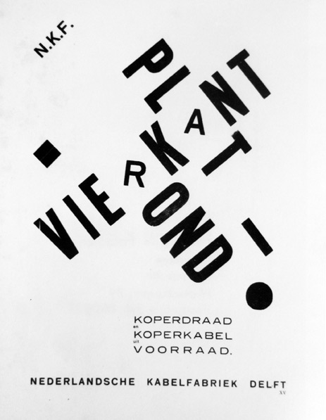
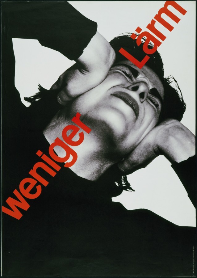
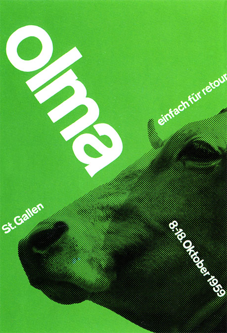
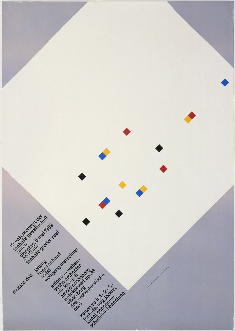
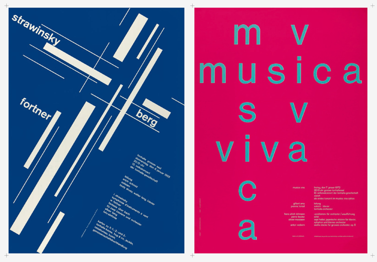
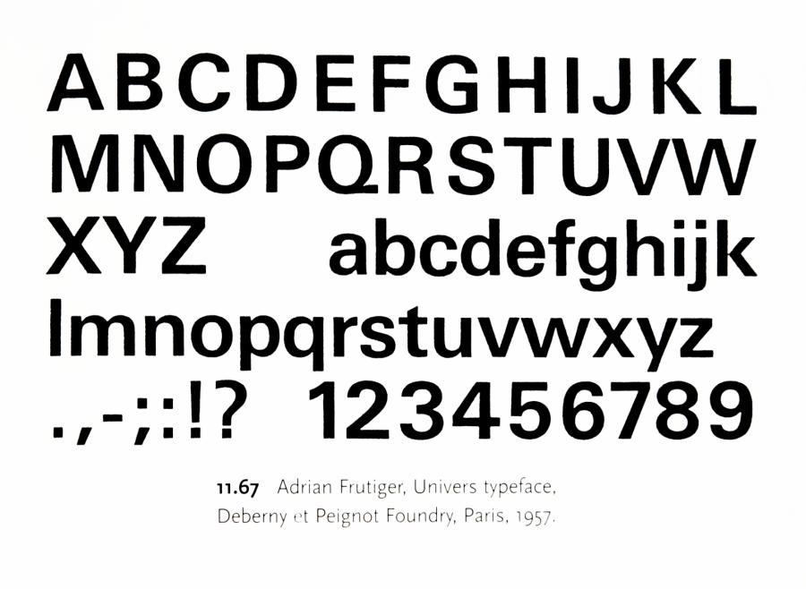
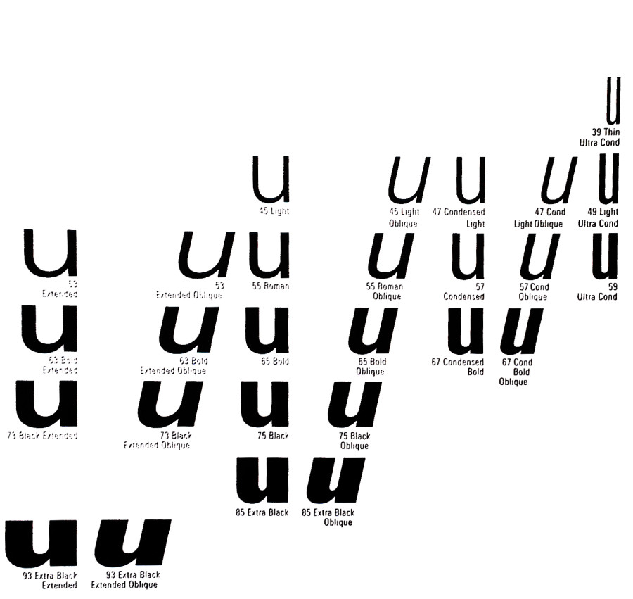
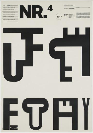
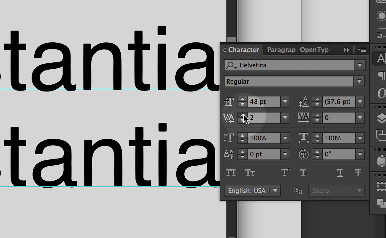
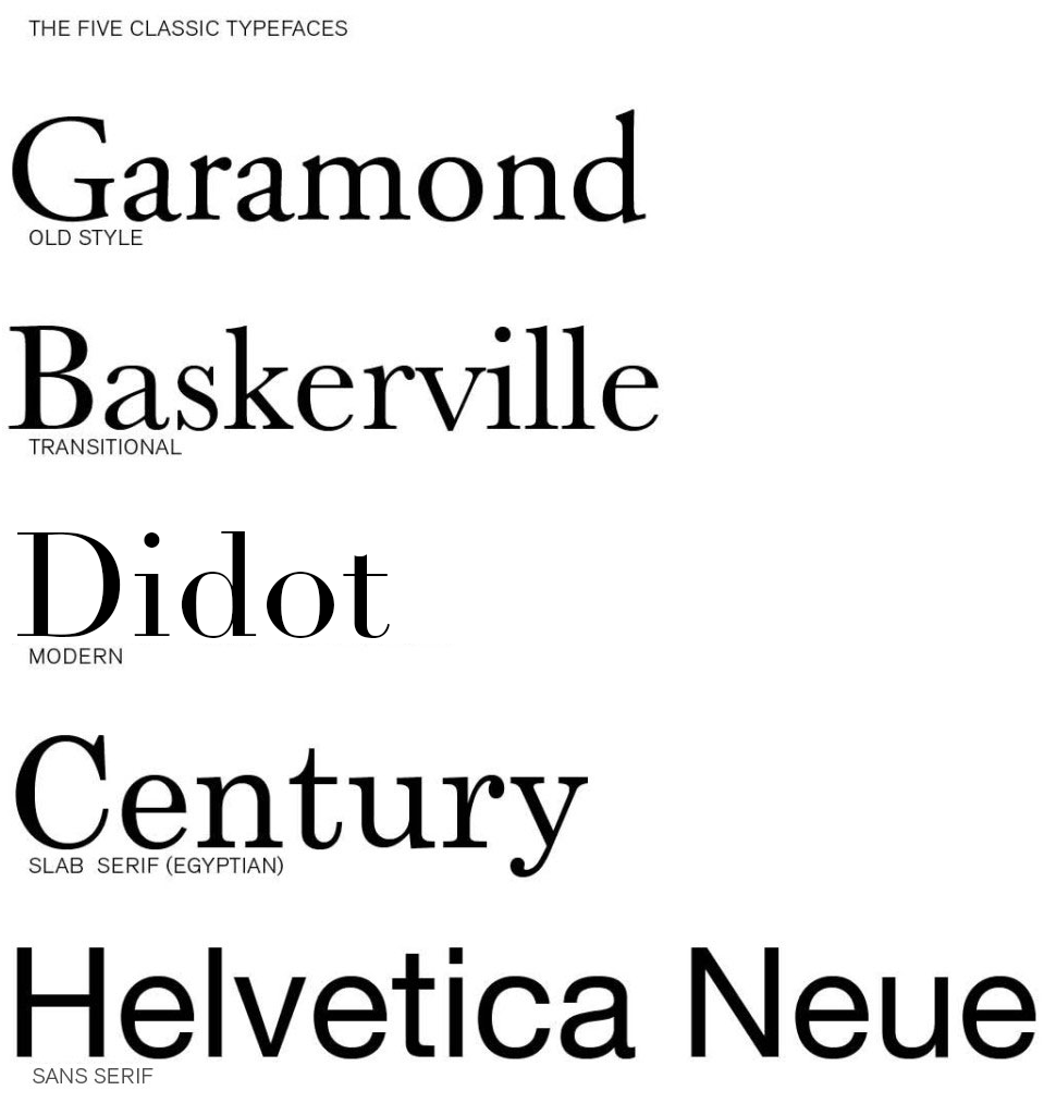
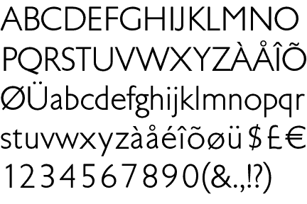
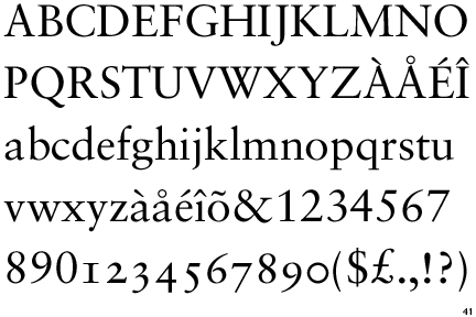
Univers
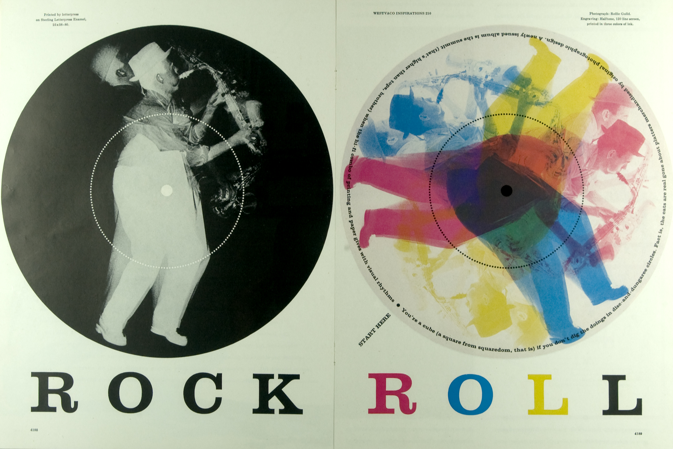
You will be using the typeface Univers for this project. Read about Univers and the designer Adrian Frutiger.
Instructions
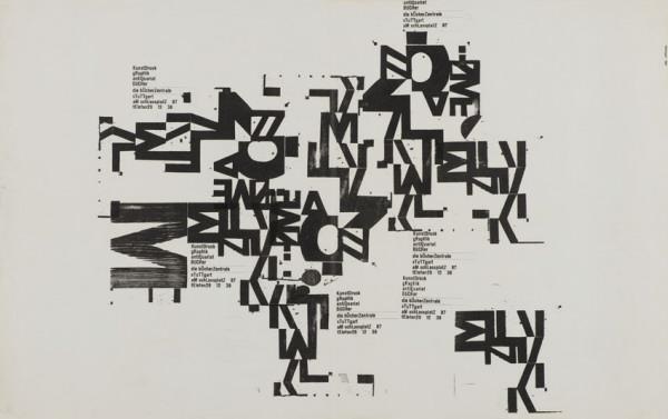
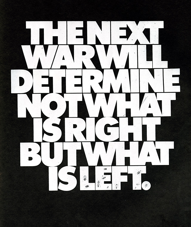
You will make three types of type compositions for this project to express the information using an increasing broader set of typographic variables. Constraints enforce discipline and having more freedom may or may not increase the power and effectiveness of a design. For each of the three approaches below you are encouraged to experiment with making various elements more important in the typographic hierarchy.
For example, you may choose the emphasize the description in a few, the temperature in a few more, and maybe the place in the rest. Some information types may not lend themselves to being primary but experiment and decide for yourself. This project is about meaning as expressed in typography hierarchy so by all means make it meaningful.
The difference, that is not a difference, makes no difference.
— Gerald Cox
1
No Changes
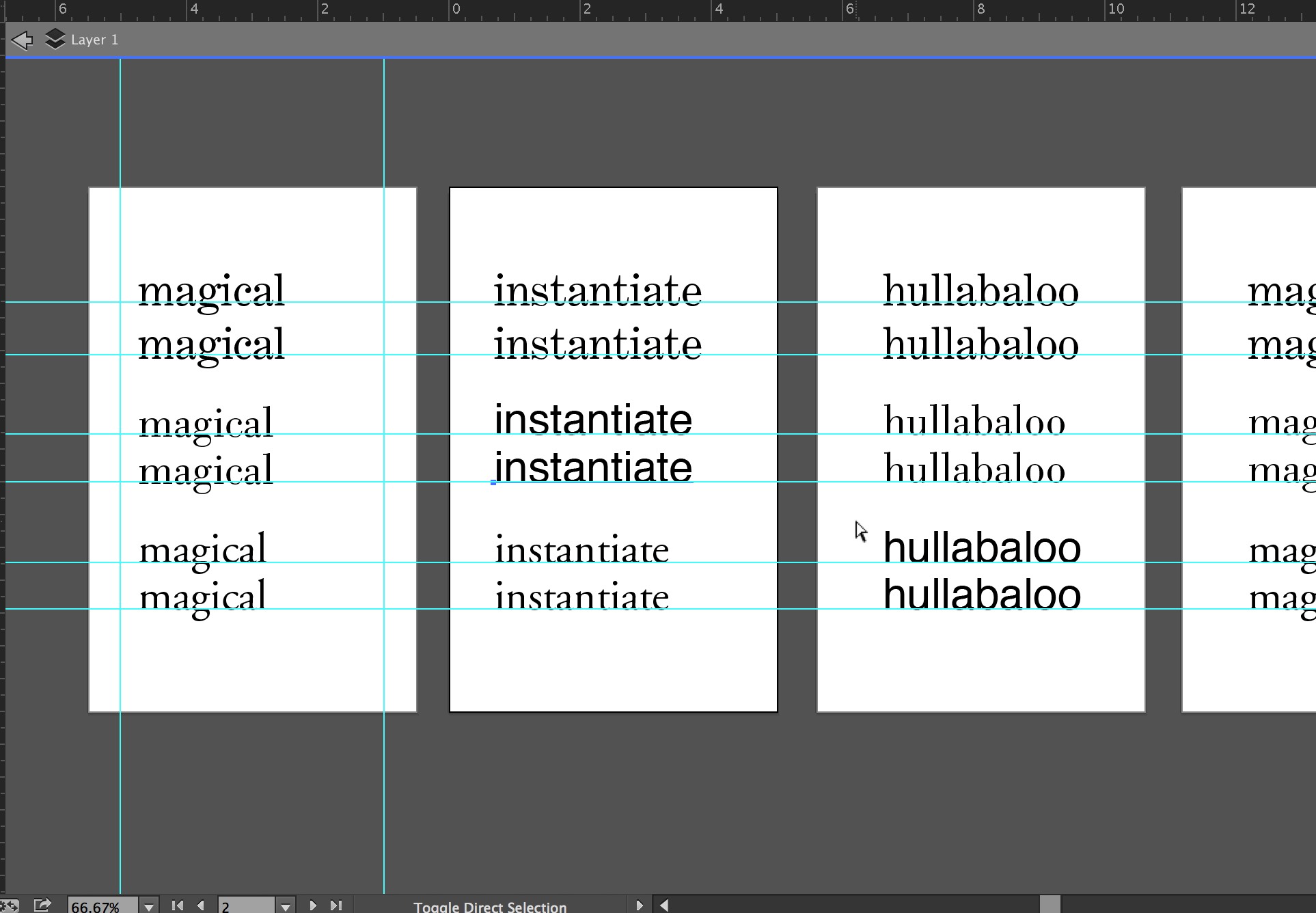
Typeset the text in black 18 point Univers 55 Roman. Dynamically arrange the words using only direction and position, aligning with the grid. Include the concept of hierarchy and reading order in your decisions.
2
Scale Changes
For the second set of designs, use type scale. You may make the letters smaller or larger and bleed letters. All elements must still align to the grid. The type must still be 18 point Univers 55 Roman.
3
Scale and Style Changes
In the third set of designs, you may change the type weights. Univers has a complete set of weights including expanded, condensed, bold, black, light and italics for each. Be deliberate in your choices. Change one element at a time and take care to note the effects of your choices as you make them. Try using only two weights per design first (regular + bold, bold + light italic, etc) and going to a max of three.
Due Today
Create a post with the category “weather report” that has the information required above for your zip code.
Due Monday, November 9
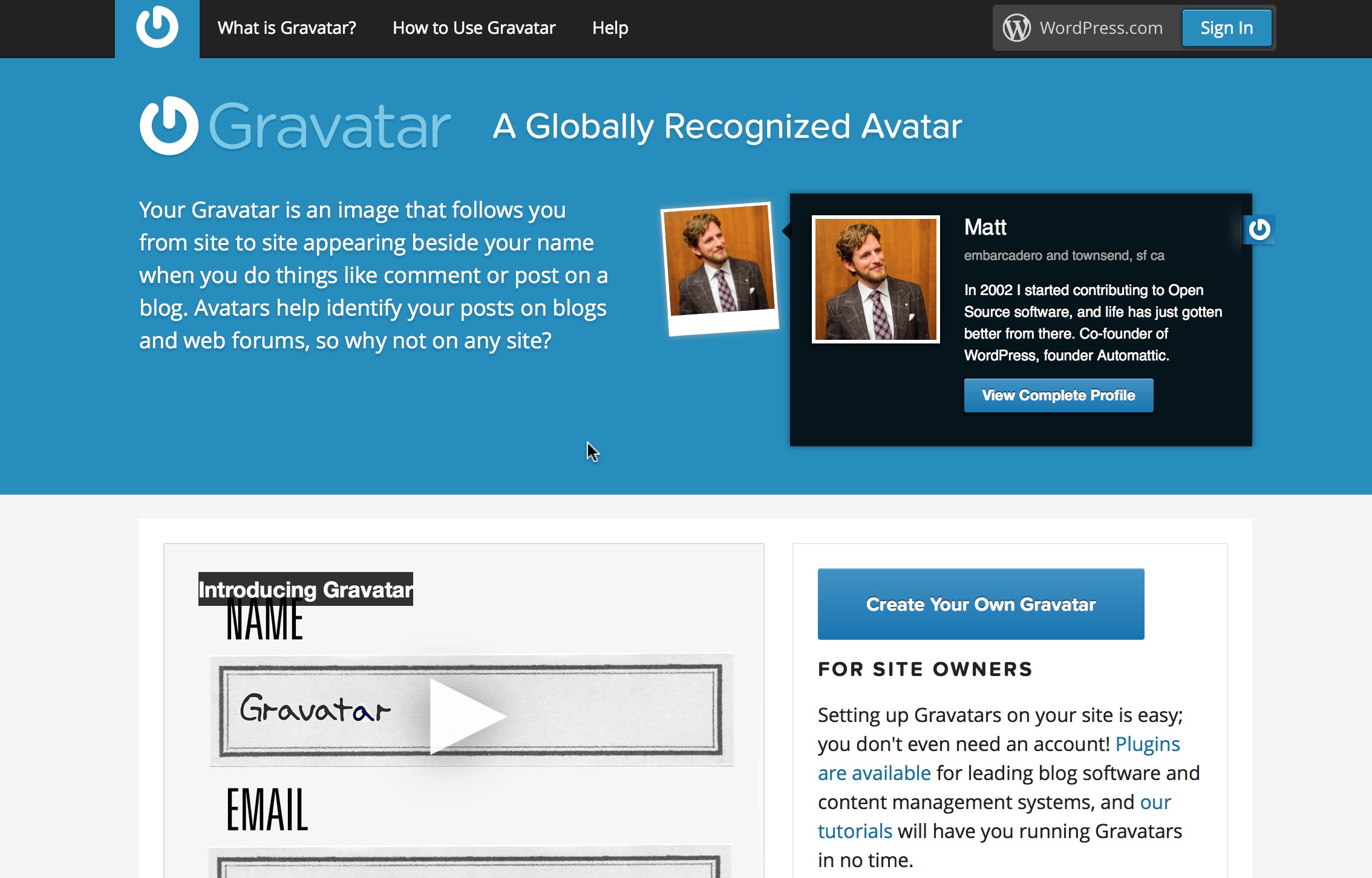
6 Gravitars uploaded with the best one active on the class site.
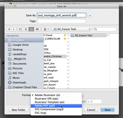
5 No Changes: put all compositions in a separate single PDF. You may make more if you need to.
5 Scale Changes: put all compositions in a separate single PDF.
5 Scale and Style Changes: put all compositions in a separate single PDF.
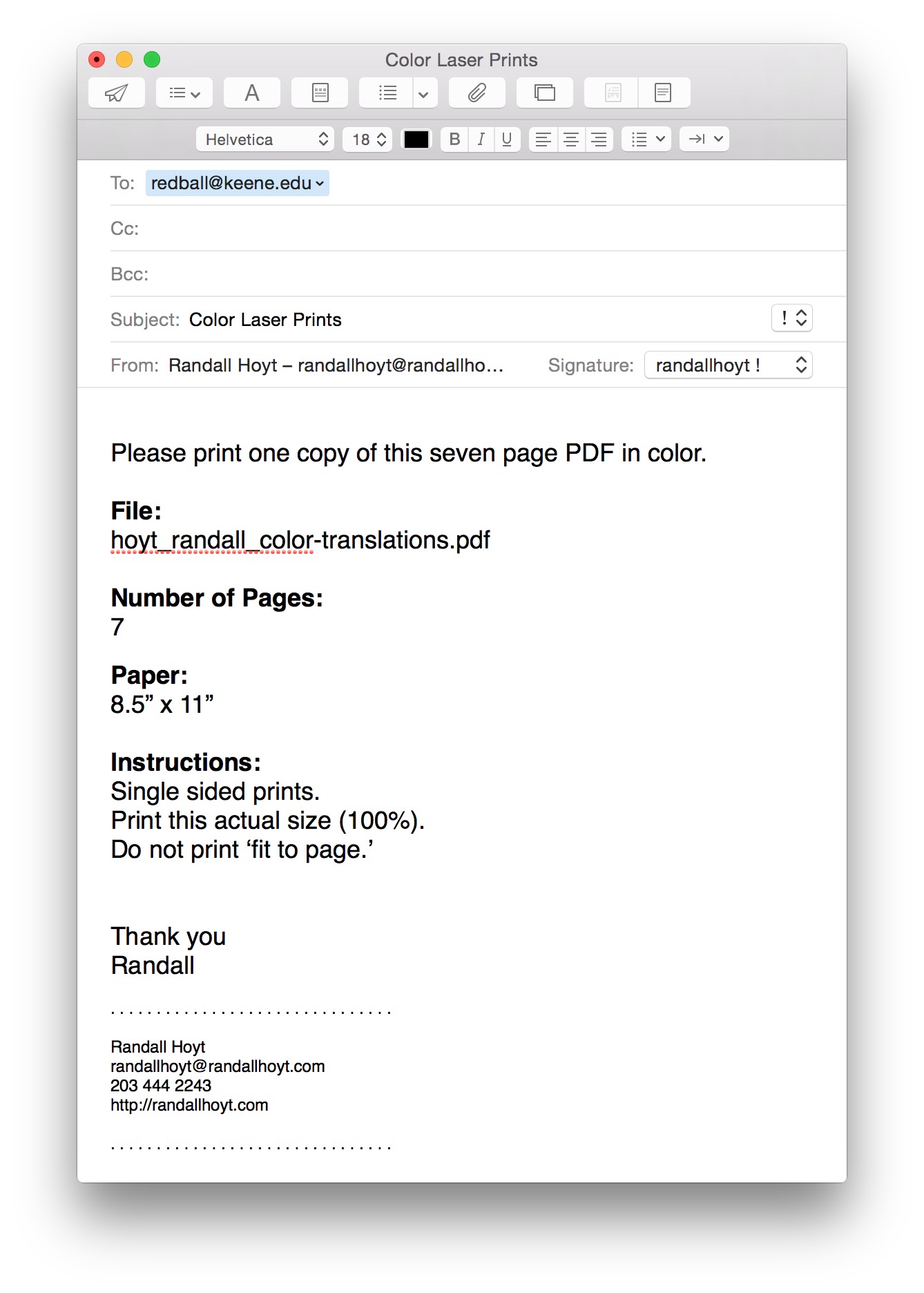
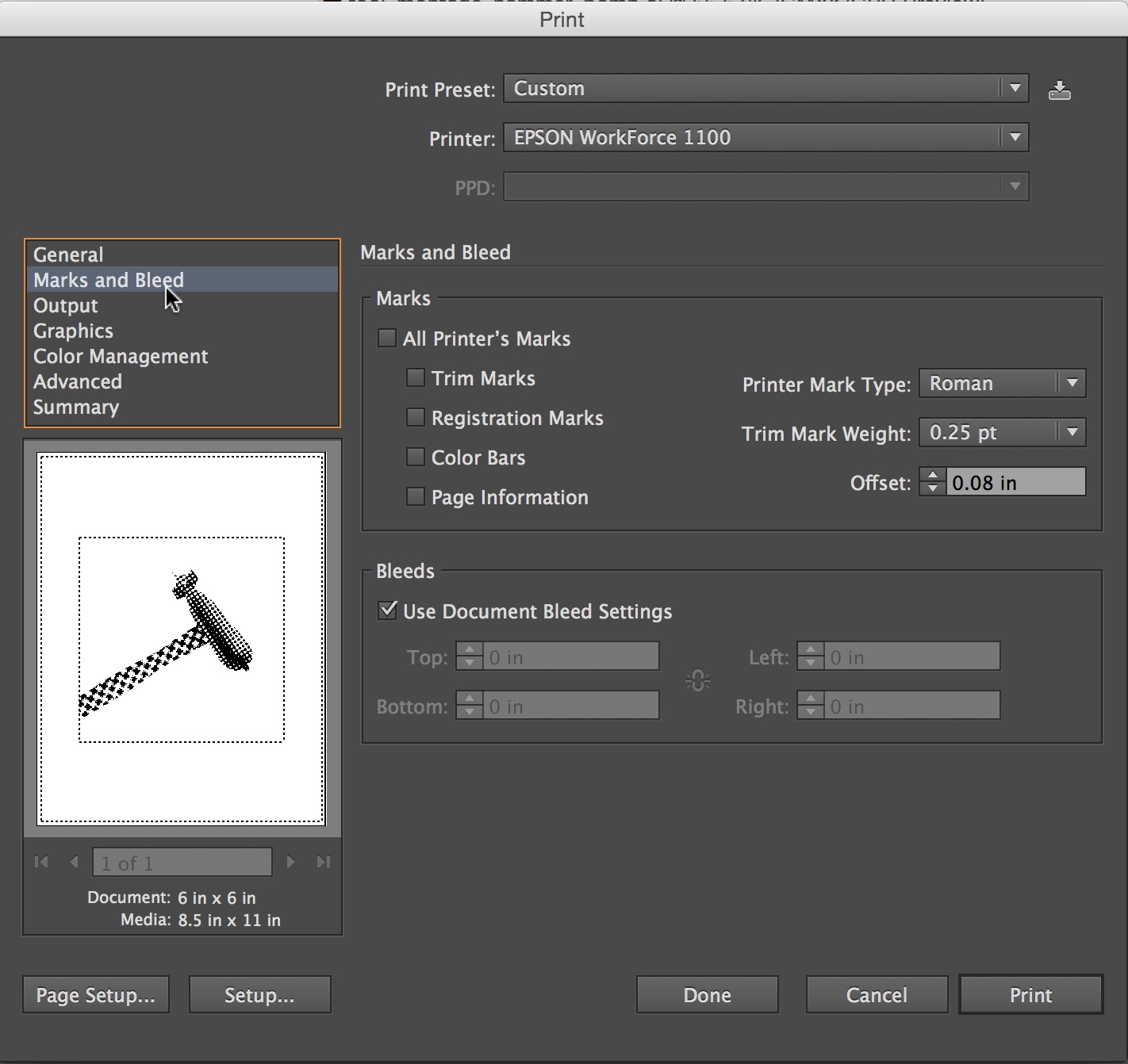
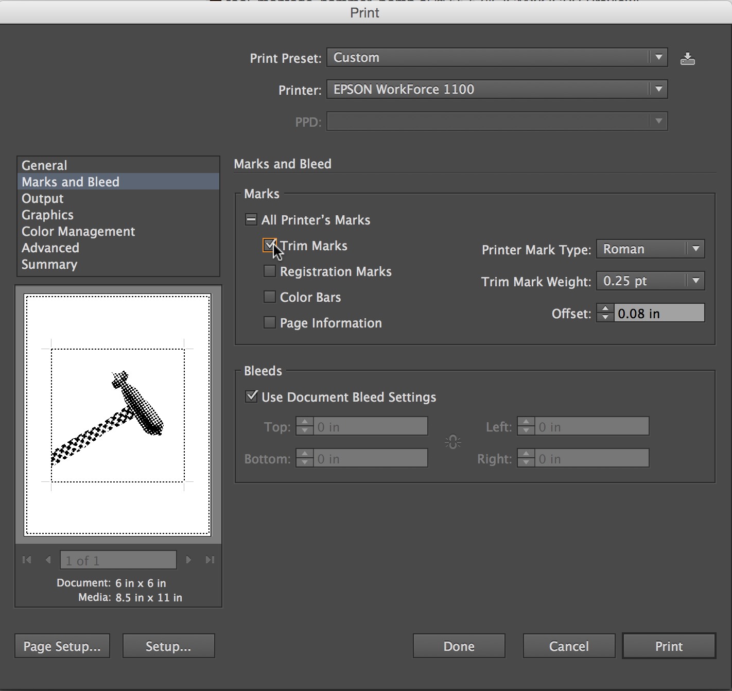
PRINT
Print and trim 2 or each category (6 total) and have them ready to hand in.
Remember
Think about the read. What do you read first. How can you control the way someone experiences the text. Welcome to hierarchy and the manipulation of viewers attention.
f Randall


Leave a Reply
You must be logged in to post a comment.